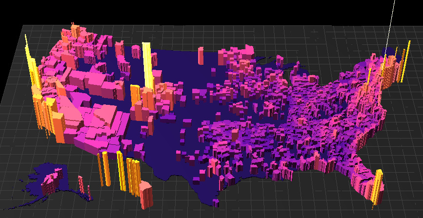
What are the most expensive U.S. housing markets? This interactive 3D map looks at county-level data by price per square foot to provide an answer.
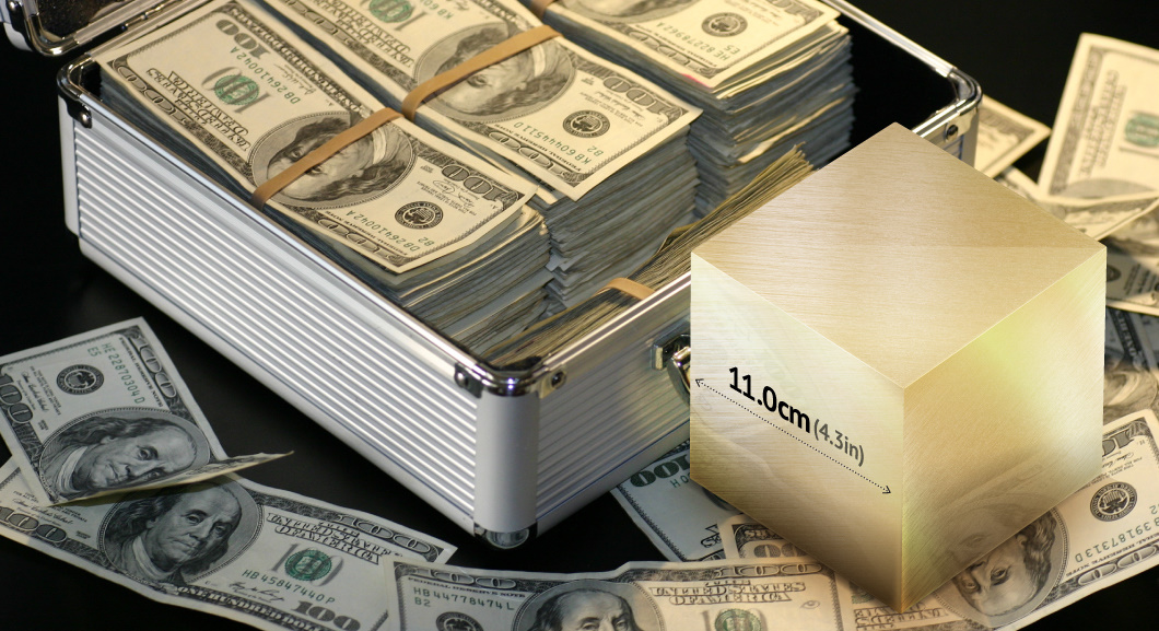
Gold packs a high amount of value in a tiny package - and these gold cube visualizations help put the value and extreme rarity of gold...
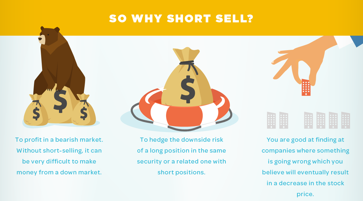
A look at the potential risks and added costs of short selling, but also an explanation where the practice may make sense for some investors.
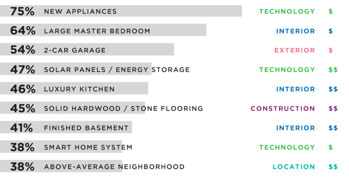
As the tide shifts to a new generation, the real estate sector wants to know what millennials want in a home. Here's what 1,000 young home...
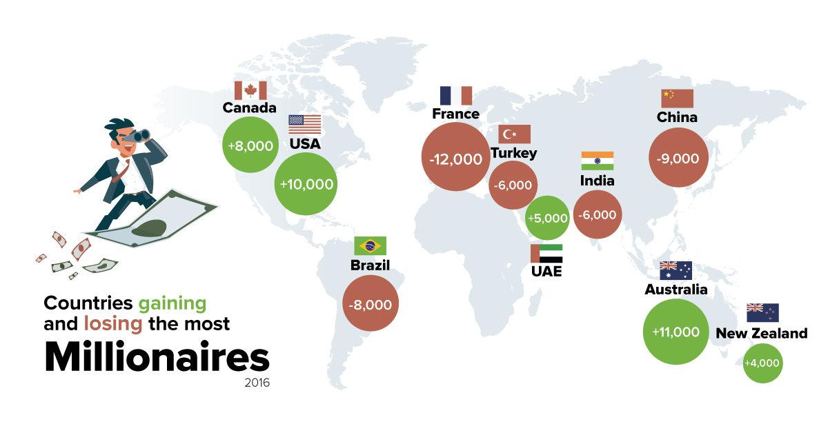
In 2016, there was a 28% increase in millionaire migrants - rich people that moved to new countries. Here's the countries that they fled, and re-located...
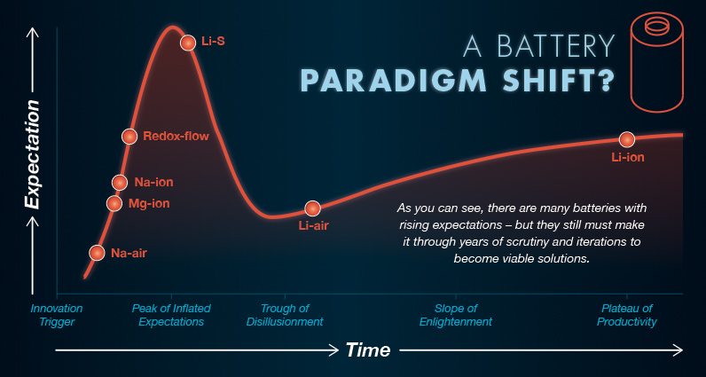
Finding a better battery is crucial to the green energy revolution. What does the future of battery technology look like, and what's in the pipeline?
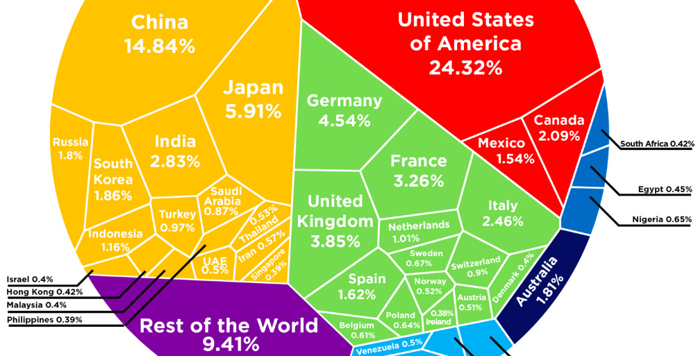
See how the multi-trillion dollar pie of the global economy gets divided between countries, based on the latest data from the World Bank from February 2017.
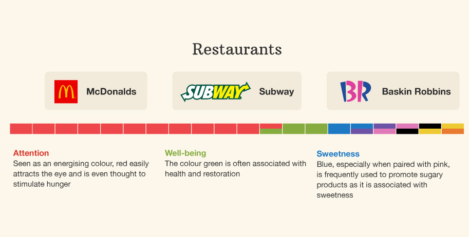
This infographic breaks down the colors used in branding across industries - and it shows how different colors can mean different things based on context.
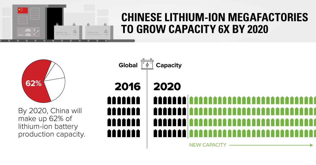
China's li-ion battery production capacity will soon be 6x what it is today - and one of these megafactories may even be bigger than Tesla's famous...
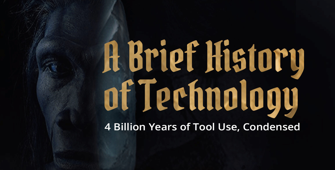
Despite only being around for thousands of years, human technological progress has been pretty incredible. See the history of technology in this infographic.
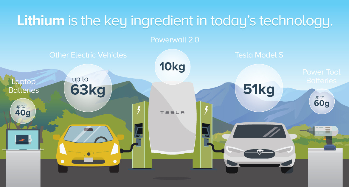
How is lithium-ion powered battery technology fueling the green revolution? See how much of the metal is in various everyday devices in this infographic.
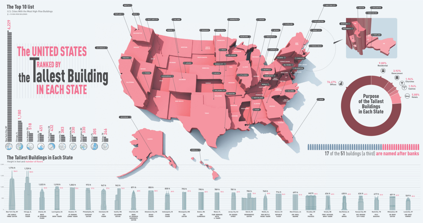
This infographic shows the tallest building in each state, ranging from the 1,776 ft tall One World Trade Center in NYC to the 124 ft Decker...
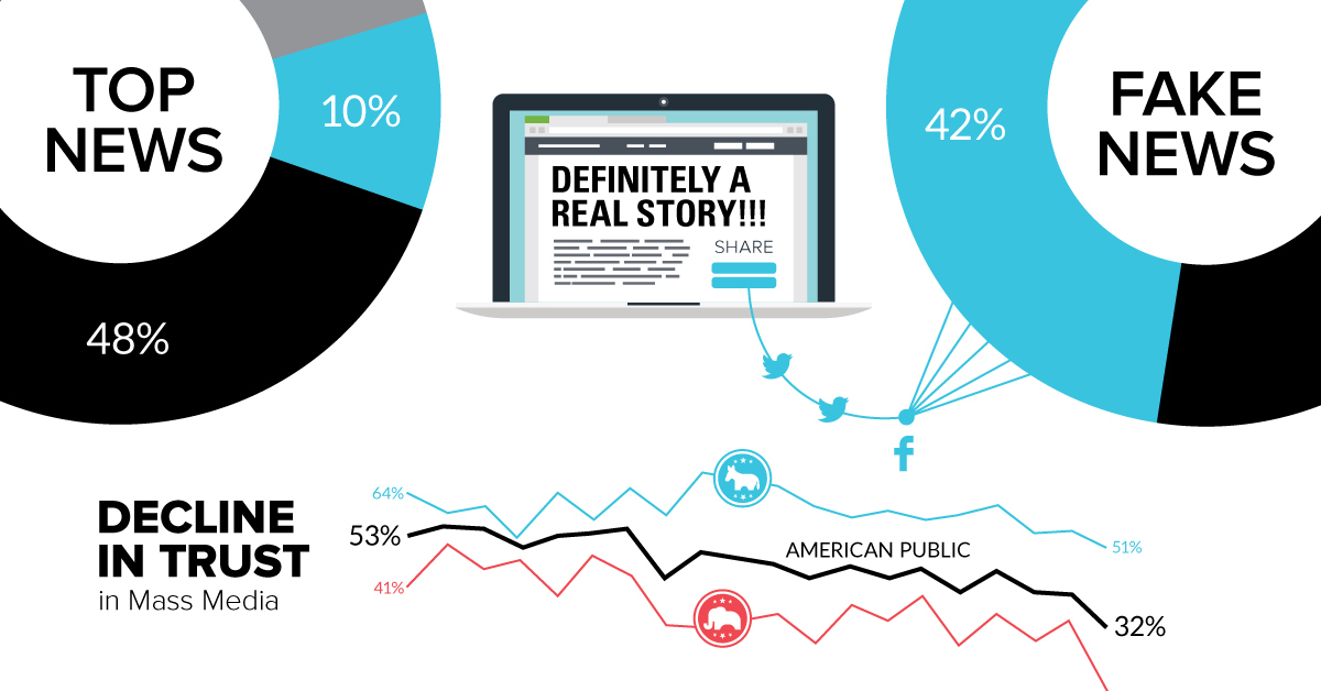
Social media isn't solely to blame for so-called fake news. The rapid decline in the trust of mass media and other institutions are factors as well.
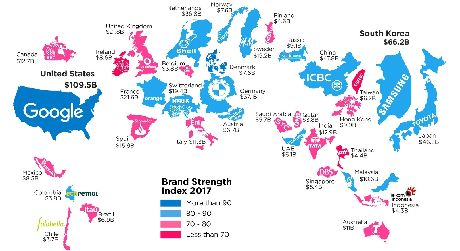
What is a top brand worth? This infographic highlights the most valuable brand in each country, according to the 2017 Brand Finance report.
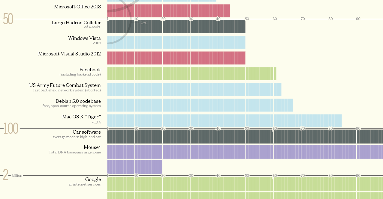
How many lines of code does it take to run a fighter jet, the Large Hadron Collider, a web browser, or Facebook? See the amounts compared...
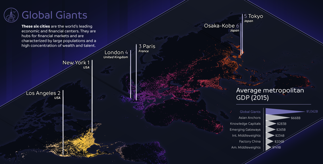
The world's largest 123 cities generate an astonishing $36 trillion in GDP per year. This infographic breaks these global cities down into seven typologies.
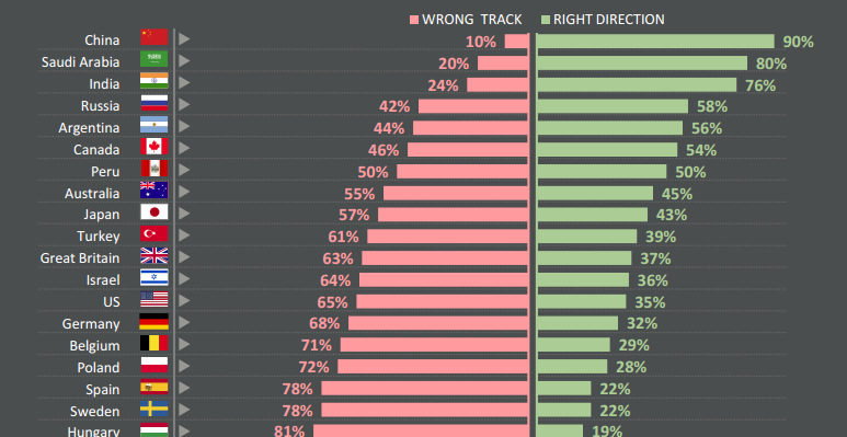
Do citizens think that their countries are heading in the right direction - or are they going down the wrong path? See survey results for 25...
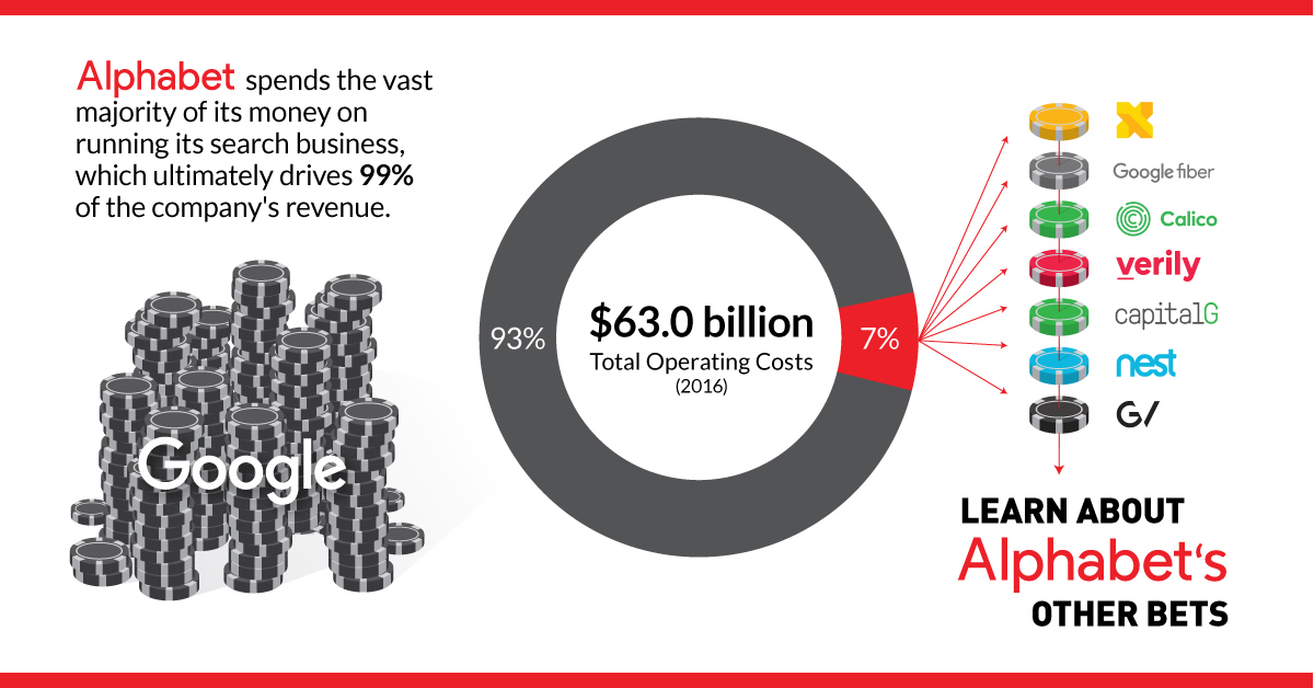
Google's parent company Alphabet spent $4.4 billion in 2016 on 'other bets' - see the new ideas the company is betting on, and if they are...
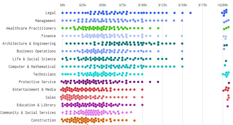
What does income distribution look like for different types of jobs - and how's it changed over time? These charts show the drastic change from 1960...
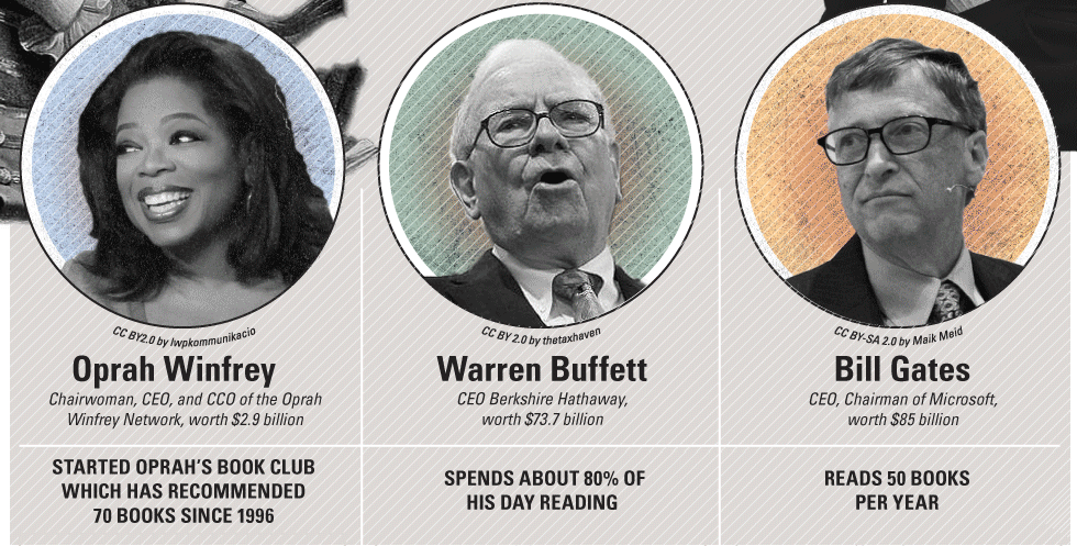
Timeless advice from highly successful entrepreneurs on how to build a business and personal habits that will lead to making a big impact.
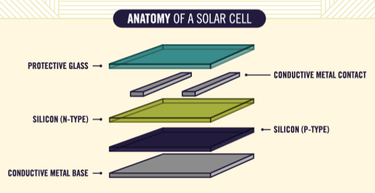
Ever wonder how solar panels work to generate electricity? This animated infographic explains the science behind it, making it easy to understand for anyone.
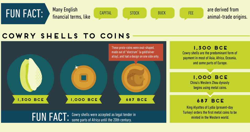
The history of money is filled with trial and error. Some experiments, such as precious metals, stood the test of time - while others have crashed...
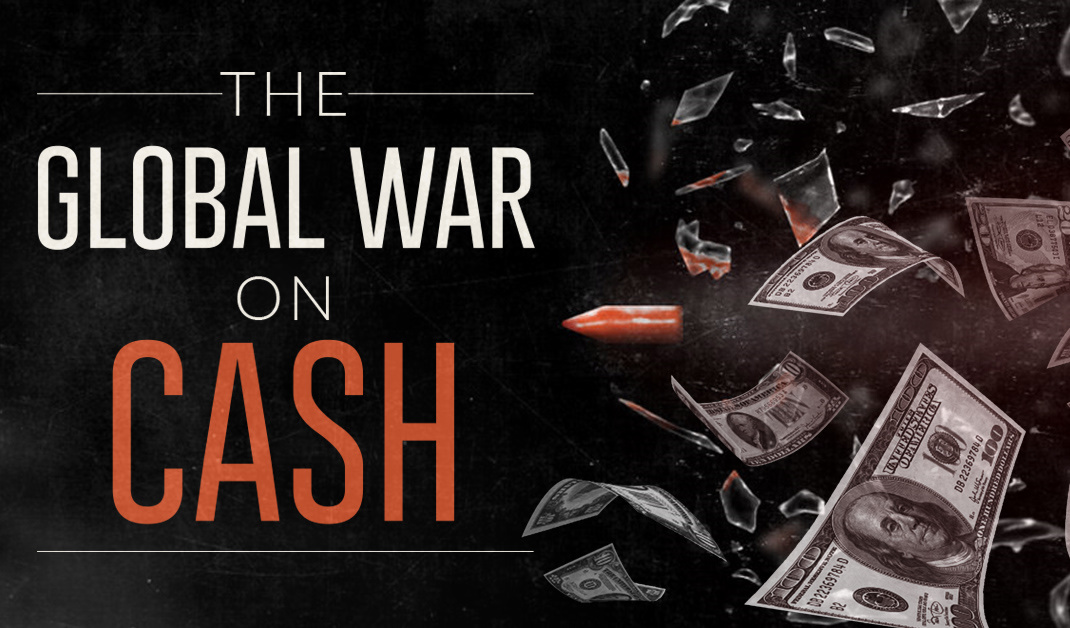
A global push by lawmakers to eliminate the use of physical cash is accelerating. See who's getting targeted in the War on Cash, and who's in...
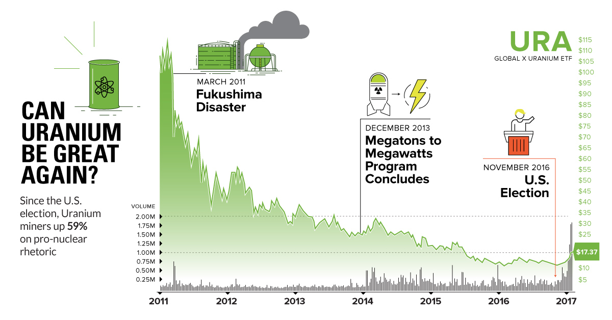
Uranium was the most hated commodity for the last 6 years - but things are changing. Trump could be a boon to the metal, with miners...
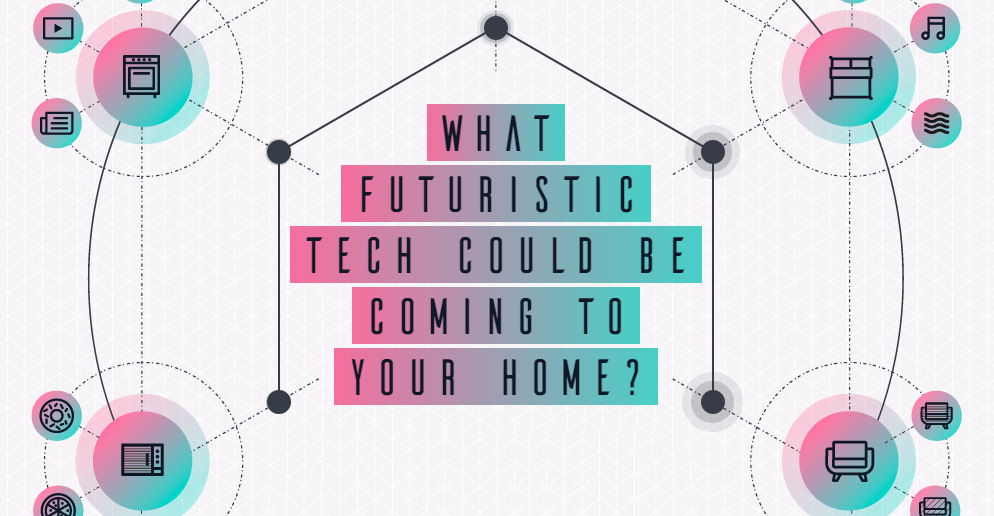
Take a journey into the future in this interactive infographic to see what kind of bizarre technologies your next home may have to offer.
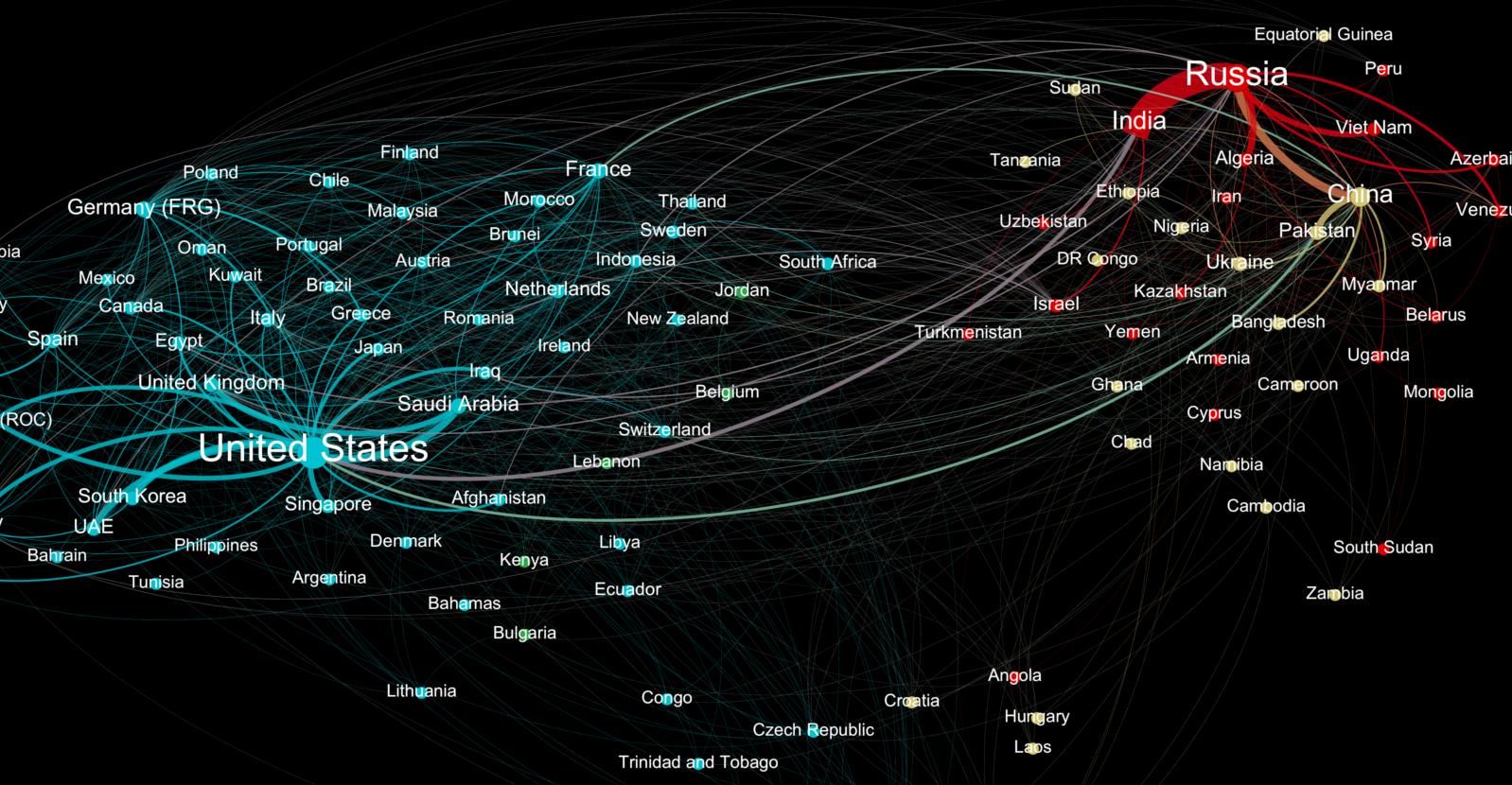
Who sends weapons to who? This data visualization represents the global weapons trade between countries, and it shines a light on two major blocs of trade.
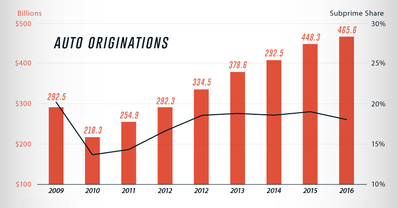
Auto loans have shot up past the $1 trillion mark in the U.S., and delinquencies in subprime auto loans are ticking upwards.
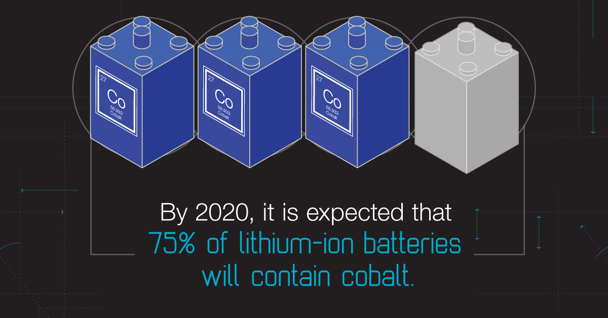
Every once in a while, a previously unappreciated metal rises to prominence. It could be such a time for cobalt - a metal that's fueling the...
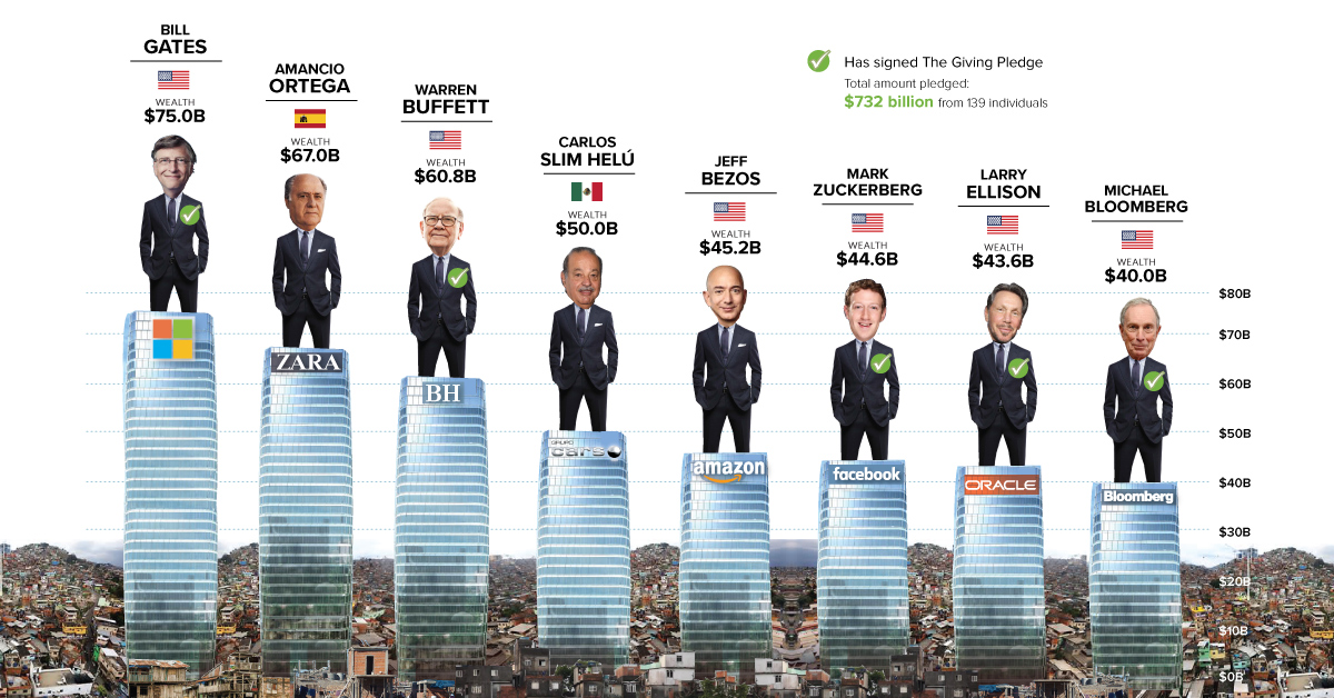
Eight men have the same wealth as the poorest 50% - we use the Oxfam report as a springboard to dive into a discussion on inequality,...
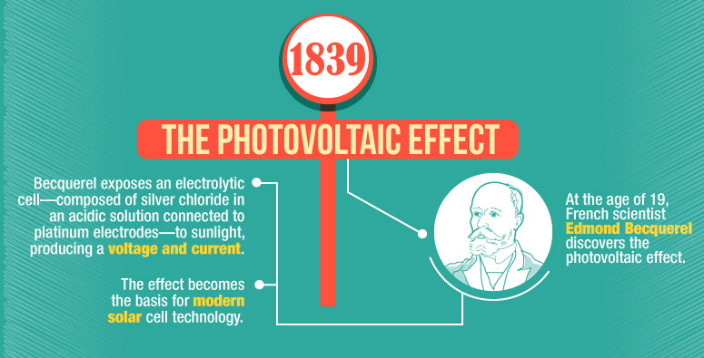
This infographic shows the many technological advances made throughout the history of solar energy - going all the way back to the Neolithic Era in China.
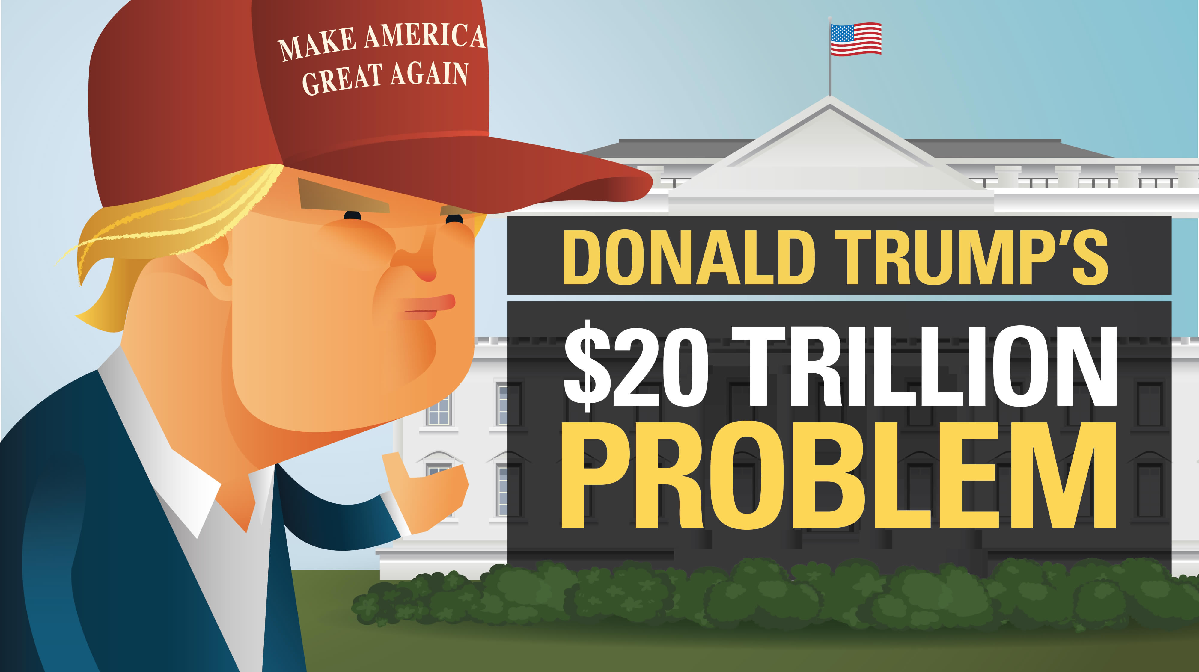
The new president faces many pressing issues - but for many, one looms above all others: how will President Trump deal with a $20 trillion national...
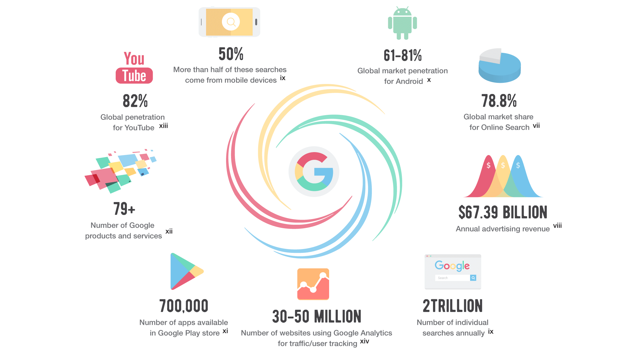
The search giant is everywhere. Here's why and how Google tracks you, what it means for your privacy, and how you can see your information.
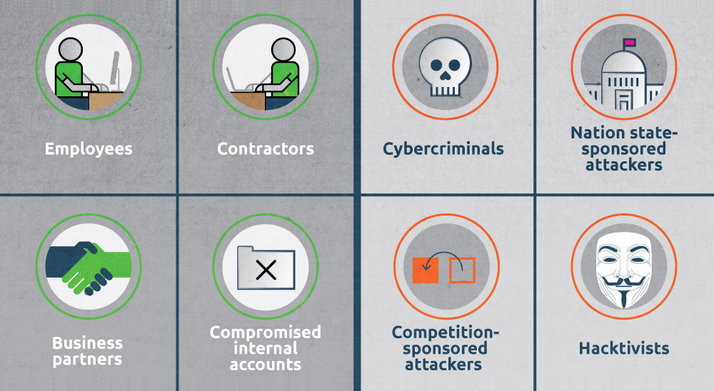
Even though hackers get all the publicity and media attention, the greatest cybersecurity threat may actually come from inside an organization.
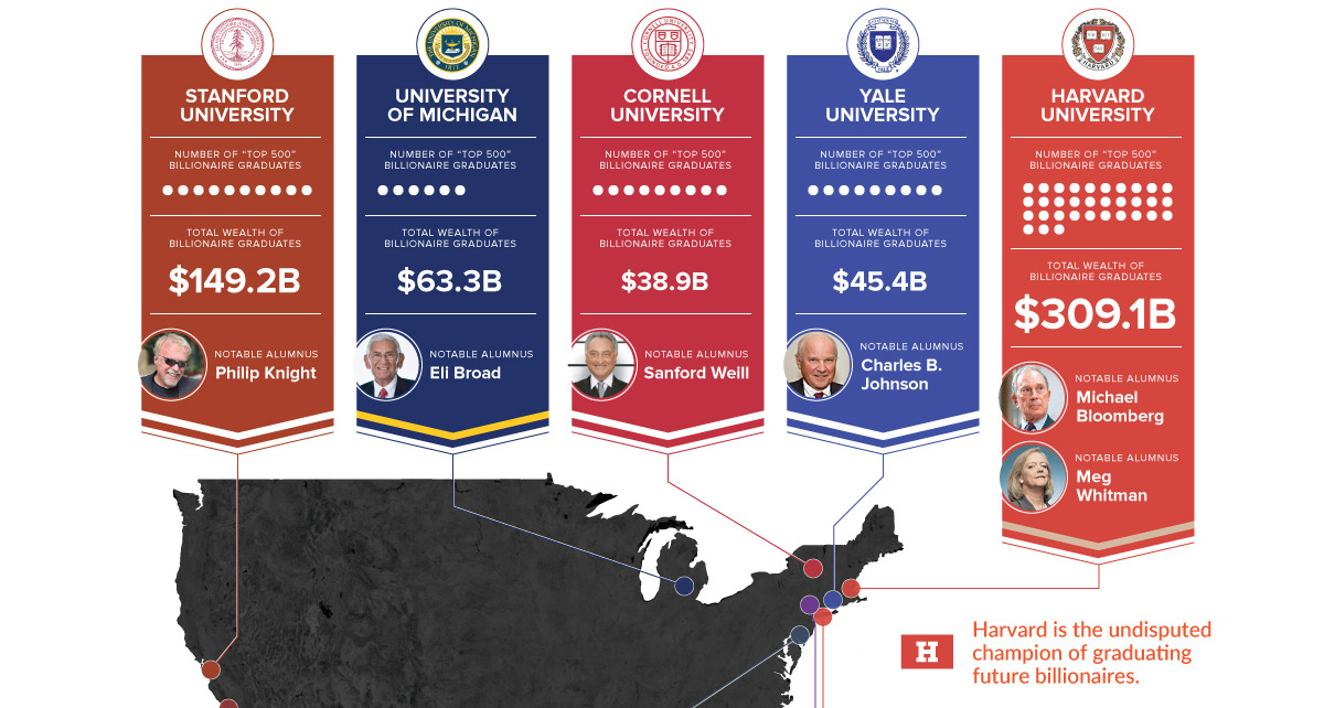
More billionaires graduated from Harvard than those hailing from Saudi Arabia and Spain combined. That makes it Billionaire University.
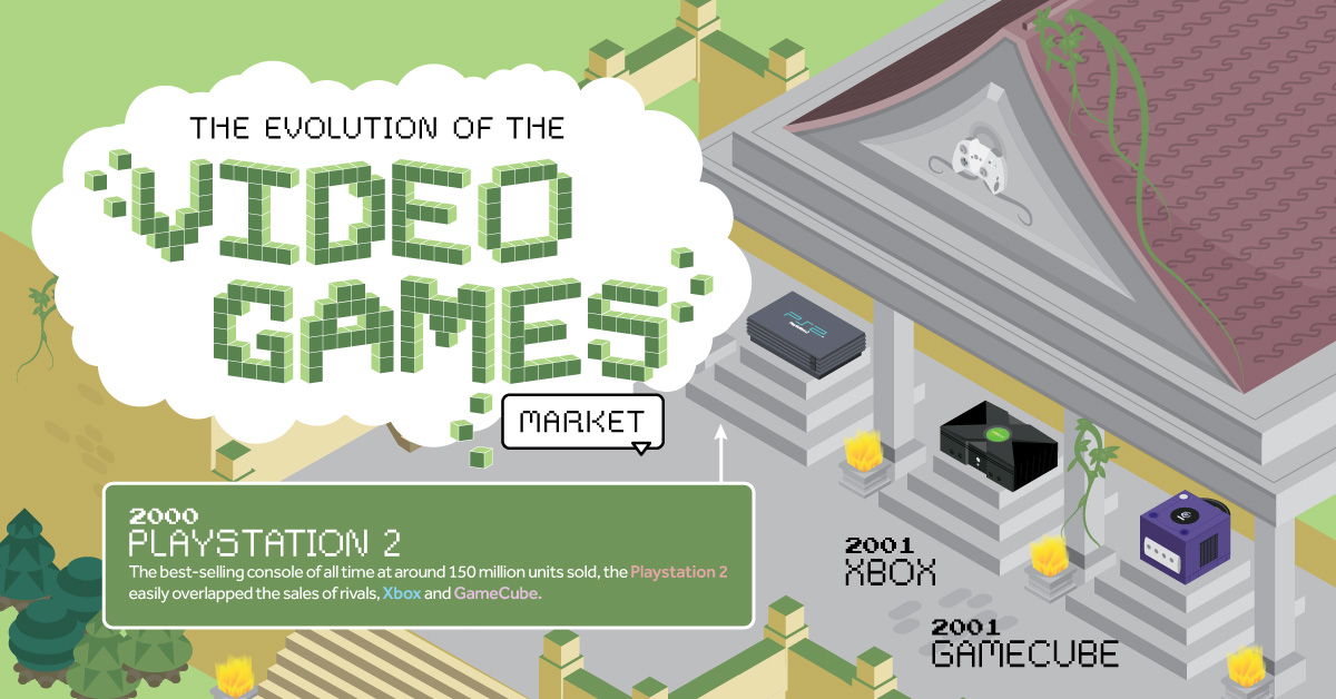
Everything from Pong to the rise of mobile gaming and AR/VR. Learn about the $100 billion video games market in this giant infographic.
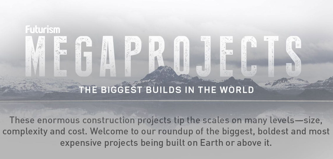
From multi-billion dollar theme parks in Dubai to 48-year long canal projects to divert major rivers in China - these are the world's largest megaprojects.
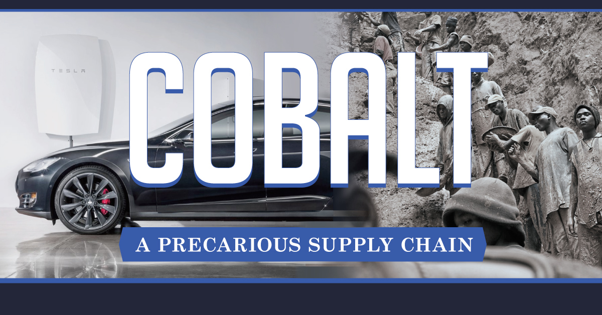
Cobalt helps us to power mobile phones, laptops, and electric cars. But while the metal is high in demand for green technology, getting it is the...
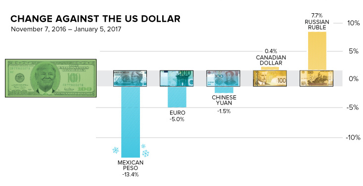
How does the Trump Effect impact currencies? Over the last two months, the peso has lost -13.4% in value, and the Russian ruble has gained 7.7%.
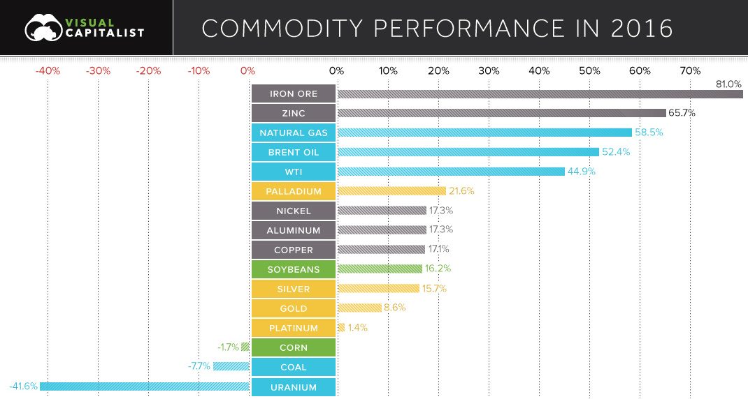
See the winning and losing commodities for 2016 in this chart.
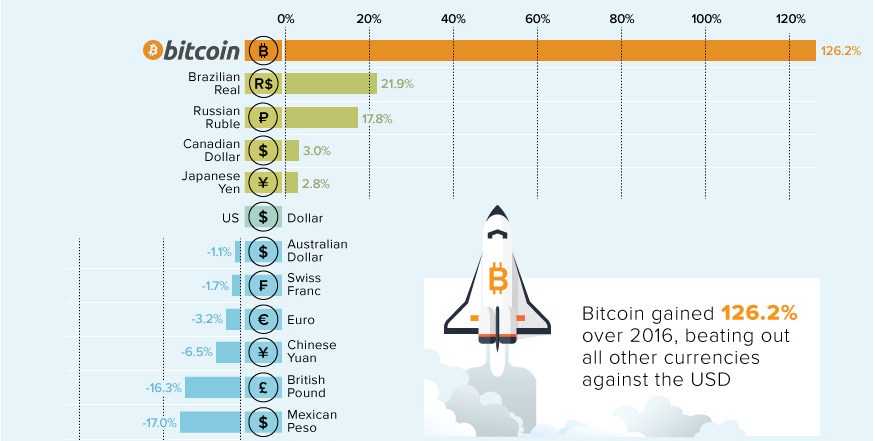
Bitcoin is no stranger to extremes: in each of the last four years, it has been either the best or worst performing currency, with nothing in...
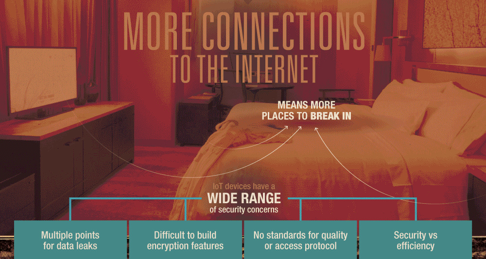
With billions of new devices being connected to the IoT, many of them are opening the door to hackers. Here's how to protect your personal information.
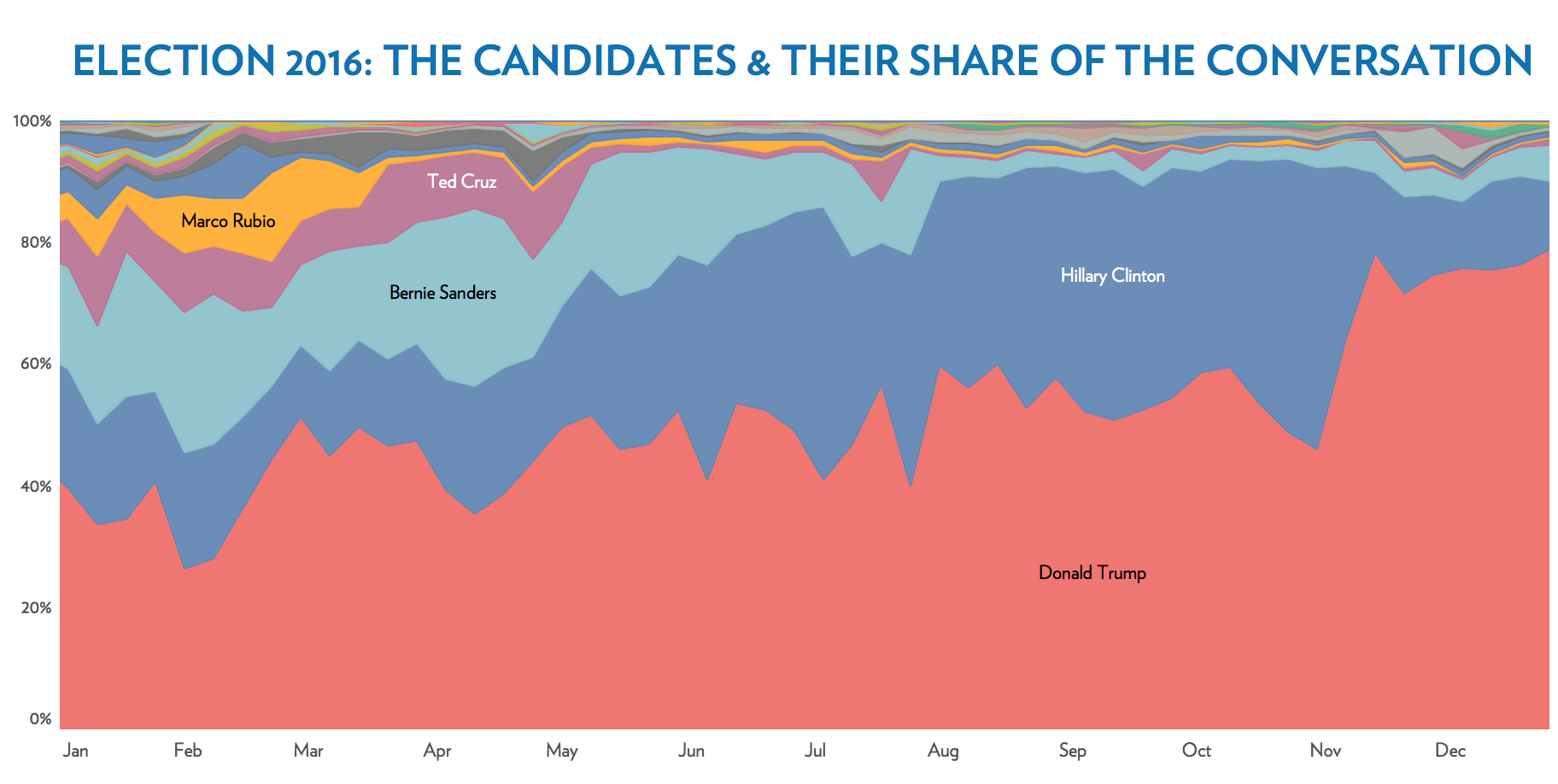
An in-depth analysis of over 2 billion tweets shows who and what dominated the news cycle of 2016 in the United States.
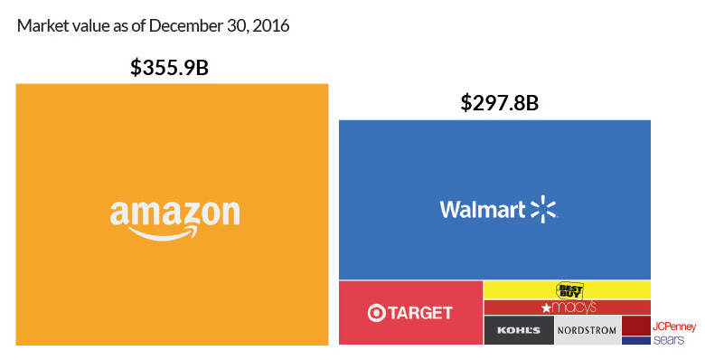
Amazon is worth more than many of the biggest retailers in the U.S. - like Walmart, Norstrom, Best Buy, Sears, JCPenney, and Target - combined together.
We roundup the best infographics, charts, and data visualizations that were posted over the year. Don't miss Visual Capitalist's Top Infographics of 2016!
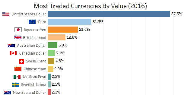
Here are the world's most traded currencies in 2016 - and the surprisingly low spot in which bitcoin fits into the mix.
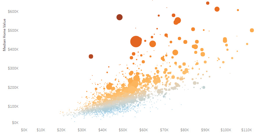
It's no surprise that New York and San Francisco are insanely expensive, but here's some other enclaves that have the least affordable housing in the U.S.

Since its introduction 5 years ago, Siri has been the undisputed champion of smartphone personal assistants. But a new competitor has emerged: Google Assistant.
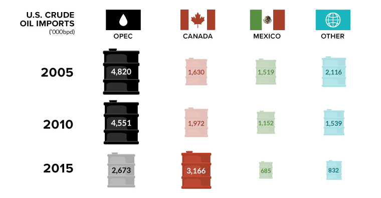
Canada is in, and OPEC is out. In this week's chart on oil imports, we also look at the declining influence of the world's most infamous...
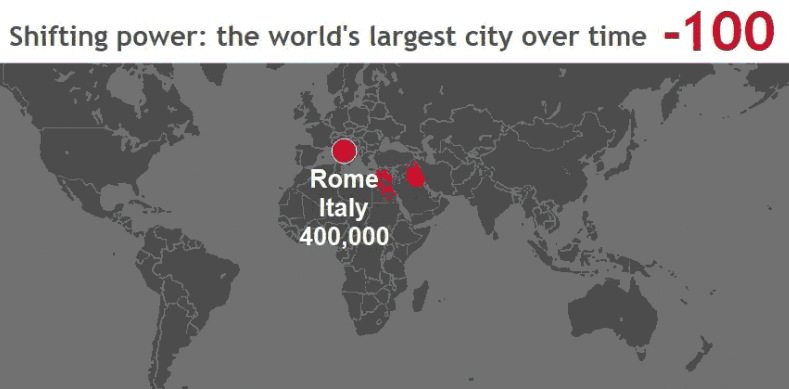
These stunning animations and interactive maps show the changing title for the world's largest city, as well as the rapid pace of urbanization in today's world.

Everything you ever wanted to know about consumer debt in one infographic. We show the historical context, as well as the latest numbers for each category.


