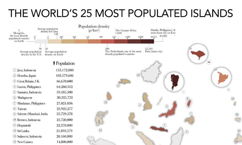
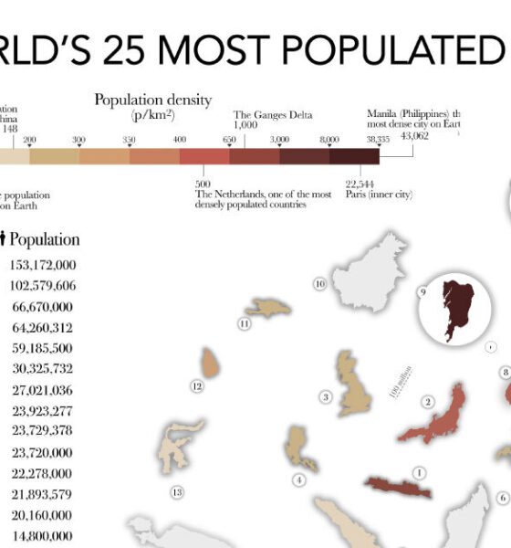

The most populated islands of the earth are teeming hubs of human activity, a far cry from the remote paradises...
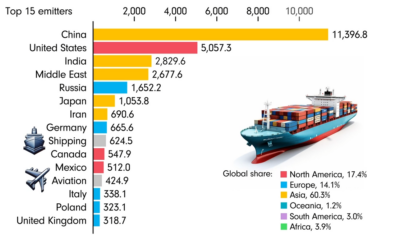

This animated chart by James Eagle uses data from Our World in Data to show the 15 largest carbon emitters between 1850 and 2022.
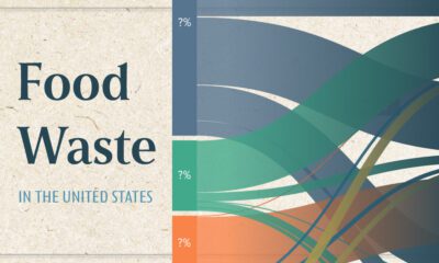

This chart visualizes the flow of the 80 millions tons of food waste in the United States in 2021, using data from ReFED.
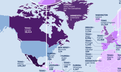

This map identifies the biggest U.S. export markets by state, showing the top partner of each country by value of goods imported.
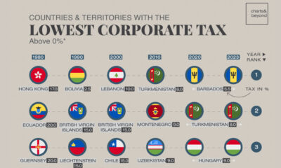

Many countries with the lowest corporate tax rates are clustered in Europe and Asia, with tax rates far below the global average.
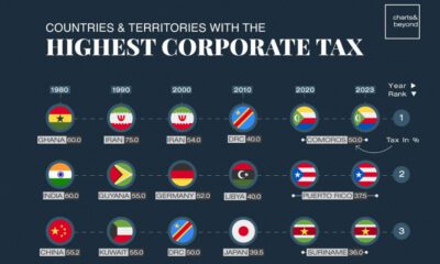

The world's top corporate tax rate stands at 50%, far higher than the global average. Here are the top 10 countries with the highest rates.
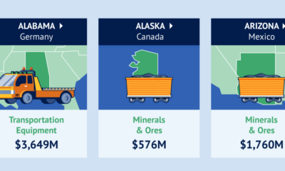

Canada is the top destination for products from 21 states.
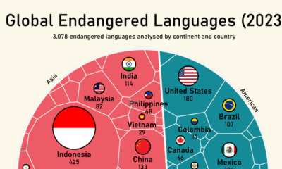

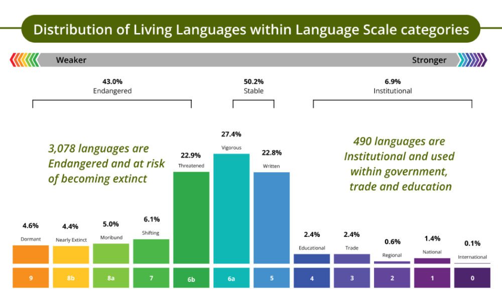
Almost half of the world’s approximately 7,000 languages are considered endangered.
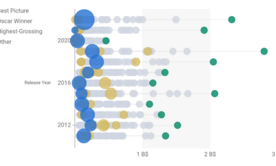

This data-driven exploration examines the relationship between Best Picture Oscar winners and box office performance over the past 30 years.
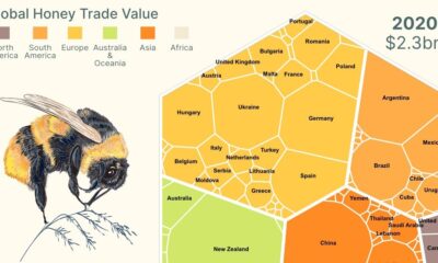

This infographic breaks down global honey exports and shows the power of Mānuka honey exports from New Zealand.