Misc
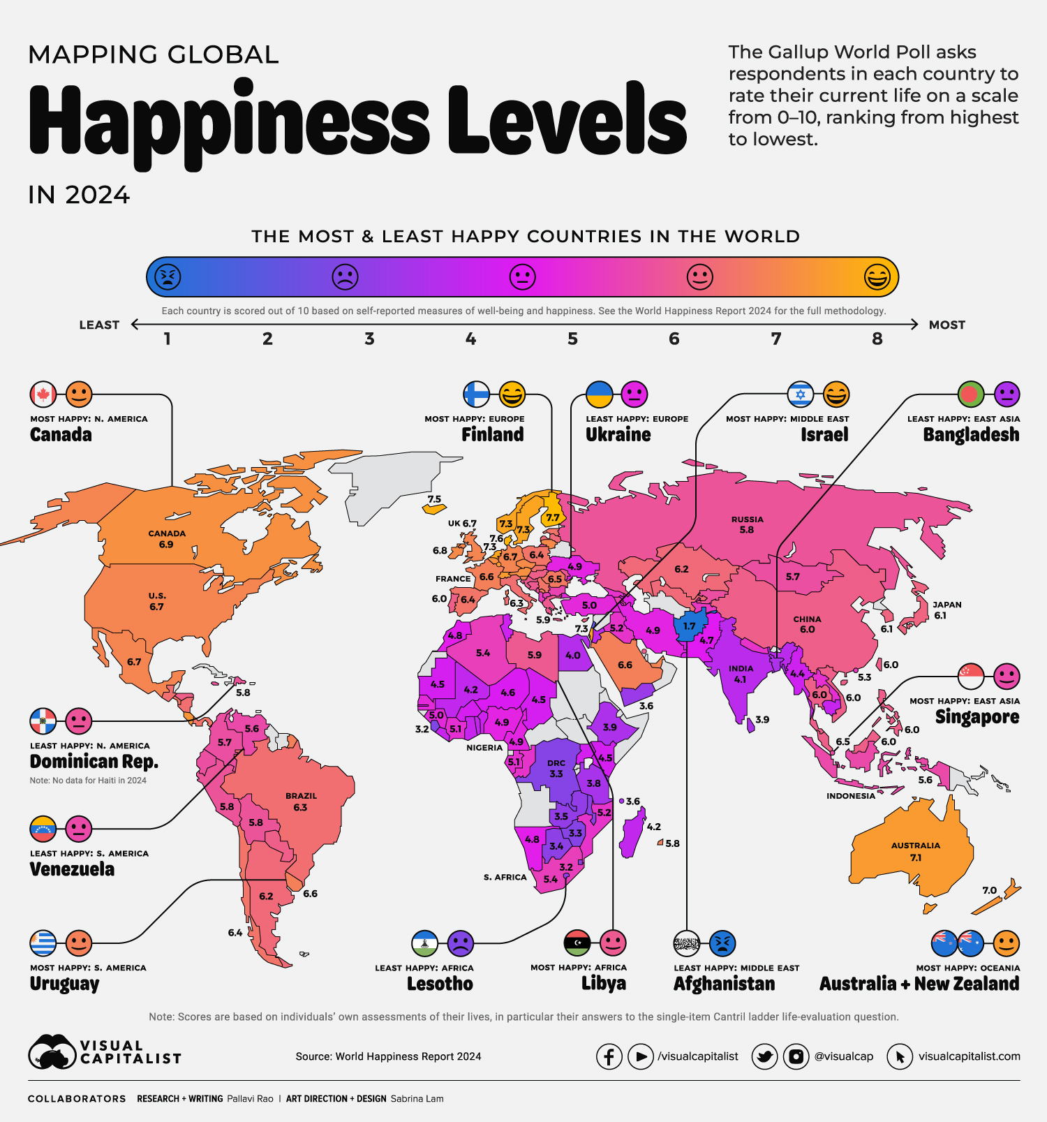
A Map of Global Happiness By Country in 2024
![]() See this visualization first on the Voronoi app.
See this visualization first on the Voronoi app.
A Map of Global Happiness By Country in 2024
This was originally posted on our Voronoi app. Download the app for free on iOS or Android and discover incredible data-driven charts from a variety of trusted sources.
Happiness, like love, is perhaps one of the least understood and most sought-after emotions and experiences in human life.
And while many inspiring teachings exist about attaining individual happiness, it’s worthwhile to consider how happy entire countries are on a collective scale.
Happiness is when what you think, what you say, and what you do are in harmony. — Mahatma Gandhi
We visualize the findings from the World Happiness Report 2024, an enduring attempt to measure, quantify, and compare happiness levels around the world, sourcing data from Gallup.
The Gallup World Poll surveys approximately 1,000 respondents in nearly every country on a variety of issues, one of which is to evaluate their current life on a scale from 0–10.
The World Happiness Report then averages the score from life evaluations per country over a three-year period (2021–2023 for this year’s edition) and ranks from highest to lowest. For a full breakdown of how this works, please see the end of this article.
Ranked: The Most & Least Happy Countries in 2024
The top 10 happiest countries—led by Finland, Denmark, and Iceland—have remained largely unchanged since 2023’s findings.
| Rank | Country | Region | Average Happiness Score (2021–2023) |
|---|---|---|---|
| 1 | 🇫🇮 Finland | Europe | 7.7 |
| 2 | 🇩🇰 Denmark | Europe | 7.6 |
| 3 | 🇮🇸 Iceland | Europe | 7.5 |
| 4 | 🇸🇪 Sweden | Europe | 7.3 |
| 5 | 🇮🇱 Israel | Middle East | 7.3 |
| 6 | 🇳🇱 Netherlands | Europe | 7.3 |
| 7 | 🇳🇴 Norway | Europe | 7.3 |
| 8 | 🇱🇺 Luxembourg | Europe | 7.1 |
| 9 | 🇨🇭 Switzerland | Europe | 7.1 |
| 10 | 🇦🇺 Australia | Oceania | 7.1 |
| 11 | 🇳🇿 New Zealand | Oceania | 7.0 |
| 12 | 🇨🇷 Costa Rica | Central America | 7.0 |
| 13 | 🇰🇼 Kuwait | Middle East | 7.0 |
| 14 | 🇦🇹 Austria | Europe | 6.9 |
| 15 | 🇨🇦 Canada | North America | 6.9 |
| 16 | 🇧🇪 Belgium | Europe | 6.9 |
| 17 | 🇮🇪 Ireland | Europe | 6.8 |
| 18 | 🇨🇿 Czechia | Europe | 6.8 |
| 19 | 🇱🇹 Lithuania | Europe | 6.8 |
| 20 | 🇬🇧 UK | Europe | 6.7 |
| 21 | 🇸🇮 Slovenia | Europe | 6.7 |
| 22 | 🇦🇪 UAE | Middle East | 6.7 |
| 23 | 🇺🇸 U.S. | North America | 6.7 |
| 24 | 🇩🇪 Germany | Europe | 6.7 |
| 25 | 🇲🇽 Mexico | North America | 6.7 |
| 26 | 🇺🇾 Uruguay | South America | 6.6 |
| 27 | 🇫🇷 France | Europe | 6.6 |
| 28 | 🇸🇦 Saudi Arabia | Middle East | 6.6 |
| 29 | 🇽🇰 Kosovo | Europe | 6.6 |
| 30 | 🇸🇬 Singapore | Asia | 6.5 |
| 31 | 🇹🇼 Taiwan | Asia | 6.5 |
| 32 | 🇷🇴 Romania | Europe | 6.5 |
| 33 | 🇸🇻 El Salvador | Central America | 6.5 |
| 34 | 🇪🇪 Estonia | Europe | 6.4 |
| 35 | 🇵🇱 Poland | Europe | 6.4 |
| 36 | 🇪🇸 Spain | Europe | 6.4 |
| 37 | 🇷🇸 Serbia | Europe | 6.4 |
| 38 | 🇨🇱 Chile | South America | 6.4 |
| 39 | 🇵🇦 Panama | Central America | 6.4 |
| 40 | 🇲🇹 Malta | Europe | 6.3 |
| 41 | 🇮🇹 Italy | Europe | 6.3 |
| 42 | 🇬🇹 Guatemala | Central America | 6.3 |
| 43 | 🇳🇮 Nicaragua | Central America | 6.3 |
| 44 | 🇧🇷 Brazil | South America | 6.3 |
| 45 | 🇸🇰 Slovakia | Europe | 6.3 |
| 46 | 🇱🇻 Latvia | Europe | 6.2 |
| 47 | 🇺🇿 Uzbekistan | Asia | 6.2 |
| 48 | 🇦🇷 Argentina | South America | 6.2 |
| 49 | 🇰🇿 Kazakhstan | Asia | 6.2 |
| 50 | 🇨🇾 Cyprus | Europe | 6.1 |
| 51 | 🇯🇵 Japan | Asia | 6.1 |
| 52 | 🇰🇷 South Korea | Asia | 6.1 |
| 53 | 🇵🇭 Philippines | Asia | 6.0 |
| 54 | 🇻🇳 Vietnam | Asia | 6.0 |
| 55 | 🇵🇹 Portugal | Europe | 6.0 |
| 56 | 🇭🇺 Hungary | Europe | 6.0 |
| 57 | 🇵🇾 Paraguay | South America | 6.0 |
| 58 | 🇹🇭 Thailand | Asia | 6.0 |
| 59 | 🇲🇾 Malaysia | Asia | 6.0 |
| 60 | 🇨🇳 China | Asia | 6.0 |
| 61 | 🇭🇳 Honduras | Central America | 6.0 |
| 62 | 🇧🇭 Bahrain | Middle East | 6.0 |
| 63 | 🇭🇷 Croatia | Europe | 5.9 |
| 64 | 🇬🇷 Greece | Europe | 5.9 |
| 65 | 🇧🇦 Bosnia & Herzegovina | Europe | 5.9 |
| 66 | 🇱🇾 Libya | Africa | 5.9 |
| 67 | 🇯🇲 Jamaica | North America | 5.8 |
| 68 | 🇵🇪 Peru | South America | 5.8 |
| 69 | 🇩🇴 Dominican Republic | Central America | 5.8 |
| 70 | 🇲🇺 Mauritius | Africa | 5.8 |
| 71 | 🇲🇩 Moldova | Europe | 5.8 |
| 72 | 🇷🇺 Russia | Europe | 5.8 |
| 73 | 🇧🇴 Bolivia | South America | 5.8 |
| 74 | 🇪🇨 Ecuador | South America | 5.7 |
| 75 | 🇰🇬 Kyrgyzstan | Asia | 5.7 |
| 76 | 🇲🇪 Montenegro | Europe | 5.7 |
| 77 | 🇲🇳 Mongolia | Asia | 5.7 |
| 78 | 🇨🇴 Colombia | South America | 5.7 |
| 79 | 🇻🇪 Venezuela | South America | 5.6 |
| 80 | 🇮🇩 Indonesia | Asia | 5.6 |
| 81 | 🇧🇬 Bulgaria | Europe | 5.5 |
| 82 | 🇦🇲 Armenia | Asia | 5.5 |
| 83 | 🇿🇦 South Africa | Africa | 5.4 |
| 84 | 🇲🇰 North Macedonia | Europe | 5.4 |
| 85 | 🇩🇿 Algeria | Africa | 5.4 |
| 86 | 🇭🇰 Hong Kong | Asia | 5.3 |
| 87 | 🇦🇱 Albania | Europe | 5.3 |
| 88 | 🇹🇯 Tajikistan | Asia | 5.3 |
| 89 | 🇨🇬 Congo | Africa | 5.2 |
| 90 | 🇲🇿 Mozambique | Africa | 5.2 |
| 91 | 🇬🇪 Georgia | Europe | 5.2 |
| 92 | 🇮🇶 Iraq | Middle East | 5.2 |
| 93 | 🇳🇵 Nepal | Asia | 5.2 |
| 94 | 🇱🇦 Laos | Asia | 5.1 |
| 95 | 🇬🇦 Gabon | Africa | 5.1 |
| 96 | 🇨🇮 Ivory Coast | Africa | 5.1 |
| 97 | 🇬🇳 Guinea | Africa | 5.0 |
| 98 | 🇹🇷 Turkey | Asia | 5.0 |
| 99 | 🇸🇳 Senegal | Africa | 5.0 |
| 100 | 🇮🇷 Iran | Middle East | 4.9 |
| 101 | 🇦🇿 Azerbaijan | Asia | 4.9 |
| 102 | 🇳🇬 Nigeria | Africa | 4.9 |
| 103 | 🇵🇸 Palestine | Middle East | 4.9 |
| 104 | 🇨🇲 Cameroon | Africa | 4.9 |
| 105 | 🇺🇦 Ukraine | Europe | 4.9 |
| 106 | 🇳🇦 Namibia | Africa | 4.8 |
| 107 | 🇲🇦 Morocco | Africa | 4.8 |
| 108 | 🇵🇰 Pakistan | Asia | 4.7 |
| 109 | 🇳🇪 Niger | Africa | 4.6 |
| 110 | 🇧🇫 Burkina Faso | Africa | 4.5 |
| 111 | 🇲🇷 Mauritania | Africa | 4.5 |
| 112 | 🇬🇲 Gambia | Africa | 4.5 |
| 113 | 🇹🇩 Chad | Africa | 4.5 |
| 114 | 🇰🇪 Kenya | Africa | 4.5 |
| 115 | 🇹🇳 Tunisia | Africa | 4.4 |
| 116 | 🇧🇯 Benin | Africa | 4.4 |
| 117 | 🇺🇬 Uganda | Africa | 4.4 |
| 118 | 🇲🇲 Myanmar | Asia | 4.4 |
| 119 | 🇰🇭 Cambodia | Asia | 4.3 |
| 120 | 🇬🇭 Ghana | Africa | 4.3 |
| 121 | 🇱🇷 Liberia | Africa | 4.3 |
| 122 | 🇲🇱 Mali | Africa | 4.2 |
| 123 | 🇲🇬 Madagascar | Africa | 4.2 |
| 124 | 🇹🇬 Togo | Africa | 4.2 |
| 125 | 🇯🇴 Jordan | Middle East | 4.2 |
| 126 | 🇮🇳 India | Asia | 4.1 |
| 127 | 🇪🇬 Egypt | Africa | 4.0 |
| 128 | 🇱🇰 Sri Lanka | Asia | 3.9 |
| 129 | 🇧🇩 Bangladesh | Asia | 3.9 |
| 130 | 🇪🇹 Ethiopia | Africa | 3.9 |
| 131 | 🇹🇿 Tanzania | Africa | 3.8 |
| 132 | 🇰🇲 Comoros | Africa | 3.6 |
| 133 | 🇾🇪 Yemen | Middle East | 3.6 |
| 134 | 🇿🇲 Zambia | Africa | 3.5 |
| 135 | 🇸🇿 Eswatini | Africa | 3.5 |
| 136 | 🇲🇼 Malawi | Africa | 3.4 |
| 137 | 🇧🇼 Botswana | Africa | 3.4 |
| 138 | 🇿🇼 Zimbabwe | Africa | 3.3 |
| 139 | 🇨🇩 DRC | Africa | 3.3 |
| 140 | 🇸🇱 Sierra Leone | Africa | 3.2 |
| 141 | 🇱🇸 Lesotho | Africa | 3.2 |
| 142 | 🇱🇧 Lebanon | Middle East | 2.7 |
| 143 | 🇦🇫 Afghanistan | Asia | 1.7 |
However the top 20 has some new entrants—Costa Rica and Kuwait—matched by the departures of the U.S. and Germany from the same ranks.
A correlation between population size and happiness can be seen clearly when looking at the first 20 spots on the happiness rankings.
In the top 10 only the Netherlands and Australia have populations over 15 million. In the top 20, only Canada and the UK have populations over 30 million.
Afghanistan, ranked last, has the lowest happiness on the scale (1.7) and is the only Asian country in the bottom 10, which is mostly populated by nations in Africa.
We explore some regional highlights as well:
Happiness Levels in North & South America and Europe
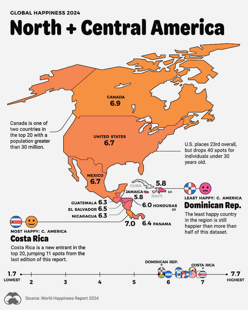
Previously mentioned Costa Rica, ranked 12th, is North and Central America’s happiest country, beating Canada by a 0.1 score, or three ranks.
The report highlights an interesting phenomenon for the two most developed economies in the region, the U.S., (23rd) and Canada (15th), where the old are significantly more happy than the young, a pattern seen in Nordic Europe as well.
The Dominican Republic continues to be the least happy country in the region, but it’s worthwhile noting it’s still happier than more than half of the other nations in the dataset.
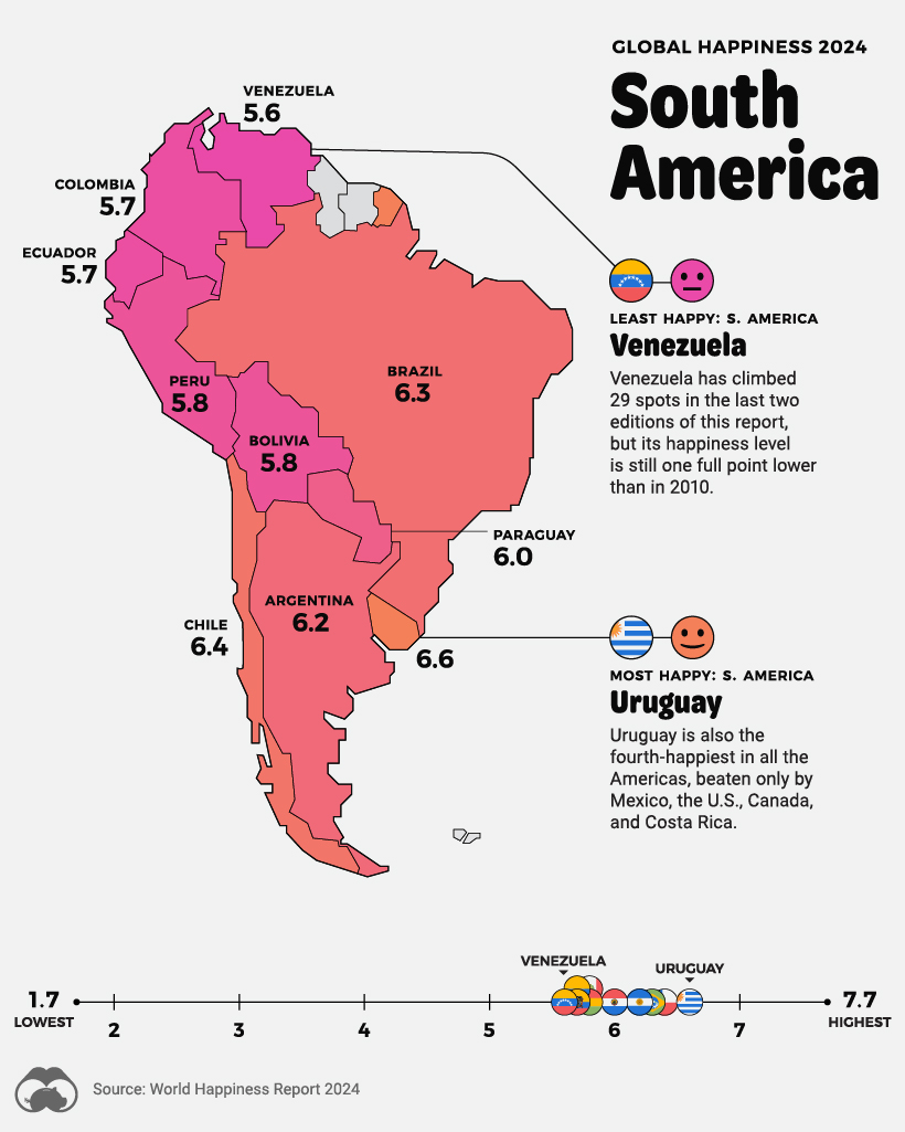
Uruguay, ranked 26th, once again leads South America’s happiest countries, and is in the fifth-happiest in the entire Americas, beaten only by Mexico, the U.S., Canada, and Costa Rica.
And, once again, Venezuela, ranked 79th, is South America’s unhappiest country, despite climbing more than 29 spots in the last two editions of this report.
While recent trends are encouraging, the Venezuelan populace is still significantly unhappier than in 2010, a full point lower on the scale, and the fourth-worst fall in the dataset.
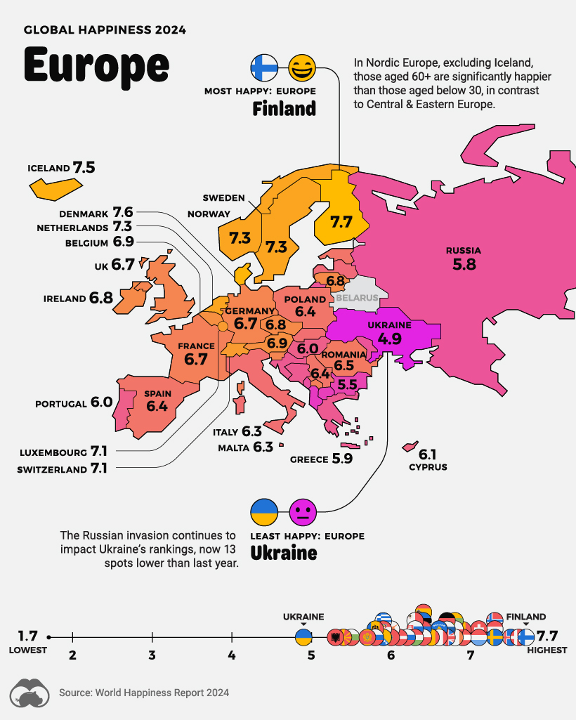
Aside from the top happiness ranks populated by small, wealthy European nations, the report also notes that the continent is seeing a convergence in happiness levels between Central & Eastern Europe and Western Europe—when in previous decades Western Europe was significantly happier.
In fact those under the age of 30 are equally happy across the continent, with only the older age groups seeing a gap.
Ukraine, now with two full years of battling the Russian invasion, is the unhappiest country in Europe, ranked 105th overall.
Happiness Levels in Asia, the Middle East, Oceania and Africa
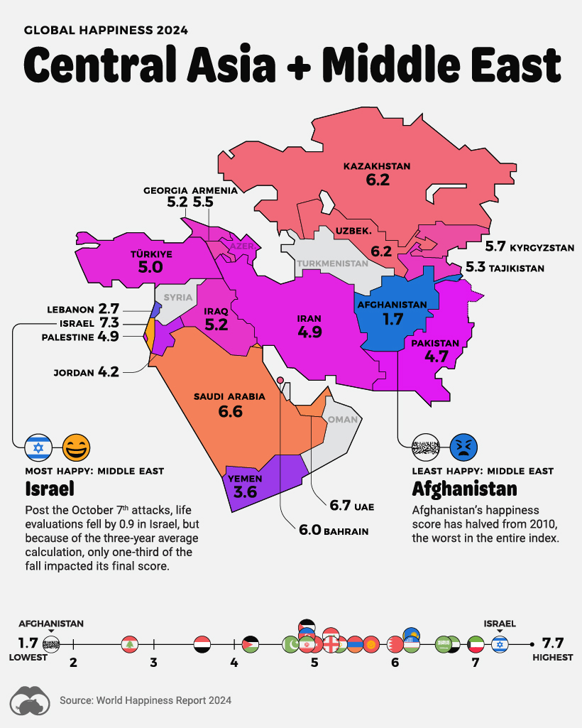
In the Middle East and Central Asia, Israel, at fifth place, leads the region’s happiness levels, dropping one spot since 2023.
The report notes that Gallup’s survey in Israel occurred after October 7th, but before much of the subsequent warfare. Thus, life evaluations fell by 0.9 for the year, of which only one-third impacted their final score.
However, the survey in Palestine (ranked 103rd globally) took place earlier in the year, before October 7th.
In Central Asia, Afghanistan’s happiness is not only the lowest measured in the world, its score has also halved since 2010, the worst of all countries in the same time period.
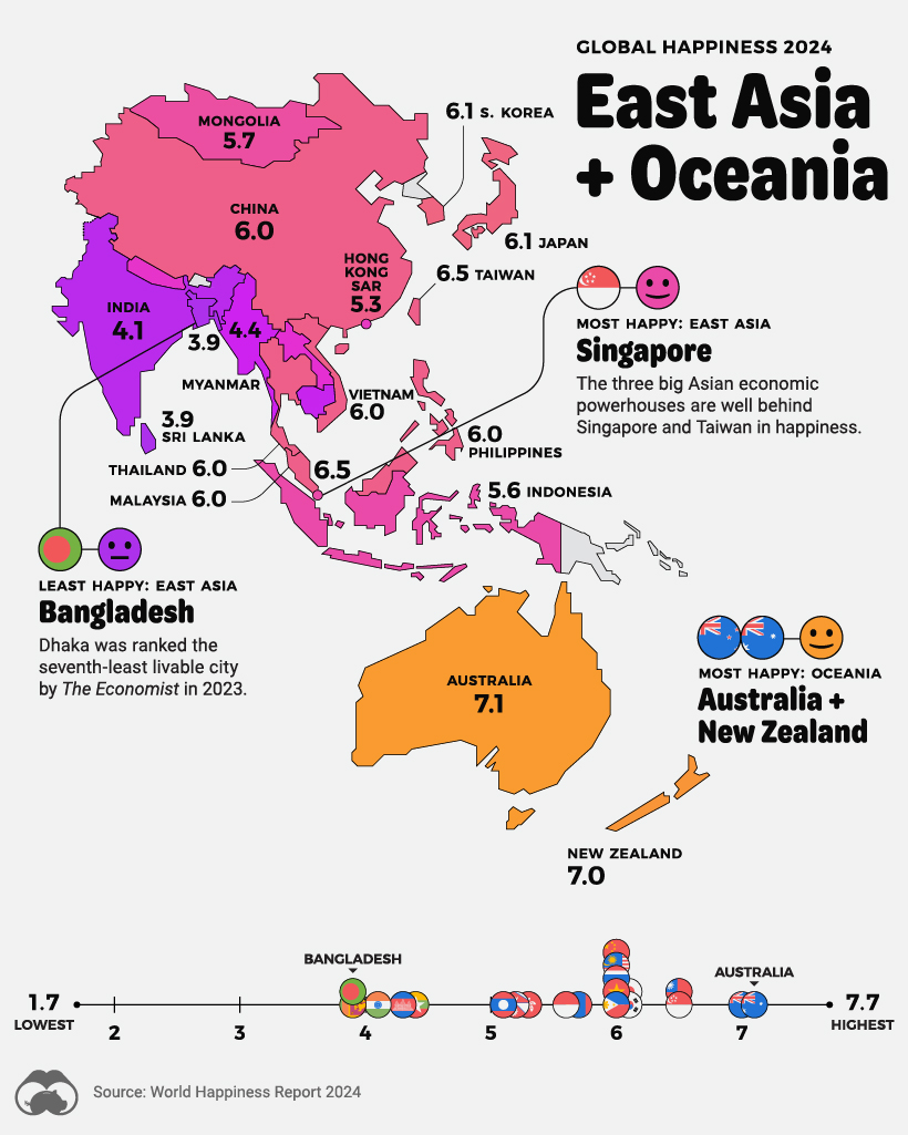
Meanwhile, in South and East Asia, Singapore (30th) and Taiwan (31st), are well ahead of regional economic heavyweights, China (60th), Japan (51st), and India (126th), when it comes to happiness levels.
In Oceania, Australia (10th) and New Zealand (11th), happiness dispersion mirrors the U.S., Canada, and the Nordics, in that the old are much happier than the young.
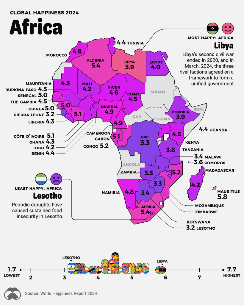
The world’s second largest continent, Africa, accounts for nine of the bottom 10 least happiest countries in the world, many of them clustered around Africa’s Great Lakes.
Lesotho is the unhappiest country in Africa and third-worst overall. The country’s residents often immigrate to neighboring South Africa, both in search of opportunities as well as escaping persistent food insecurity from recurring droughts.
On the other hand, Africa’s happiest country, Libya has seen a resurgence in political stability recently. The country’s second civil war ended in 2020, and recently the three main ruling factions have agreed on a framework for a unified government.
Where does this data come from?
Source: The World Happiness Report which leverages data from the Gallup World Poll.
Methodology: A nationally representative group of approximately 1,000 people is asked a series of questions relating to their life satisfaction, as well as positive and negative emotions they are experiencing. The life evaluation question is based on the Cantril ladder, wherein the top of the ladder represents the best possible life for a person (a score of 10/10) and on the flipside, the worst possible life (scored as 0/10). The main takeaway is that the scores result from self-reported answers by citizens of each of these countries. The results received a confidence interval of 95%, meaning that there is a 95% chance that the answers and population surveyed represent the average. As well, scores are averaged over the past three years in order to increase the sample size of respondents in each country.
Criticisms: Critics of the World Happiness Report point out that survey questions measure satisfaction with socioeconomic conditions as opposed to individual emotional happiness. As well, there are myriad cultural differences around the world that influence how people think about happiness and life satisfaction. Finally, there can be big differences in life satisfaction between groups within a country, which are averaged out even in a nationally representative group. The report does acknowledge inequality as a factor by measuring the “gap” between the most and least happy halves of each country.


VC+
VC+: Get Our Key Takeaways From the IMF’s World Economic Outlook
A sneak preview of the exclusive VC+ Special Dispatch—your shortcut to understanding IMF’s World Economic Outlook report.

Have you read IMF’s latest World Economic Outlook yet? At a daunting 202 pages, we don’t blame you if it’s still on your to-do list.
But don’t worry, you don’t need to read the whole April release, because we’ve already done the hard work for you.
To save you time and effort, the Visual Capitalist team has compiled a visual analysis of everything you need to know from the report—and our VC+ Special Dispatch is available exclusively to VC+ members. All you need to do is log into the VC+ Archive.
If you’re not already subscribed to VC+, make sure you sign up now to access the full analysis of the IMF report, and more (we release similar deep dives every week).
For now, here’s what VC+ members get to see.
Your Shortcut to Understanding IMF’s World Economic Outlook
With long and short-term growth prospects declining for many countries around the world, this Special Dispatch offers a visual analysis of the key figures and takeaways from the IMF’s report including:
- The global decline in economic growth forecasts
- Real GDP growth and inflation forecasts for major nations in 2024
- When interest rate cuts will happen and interest rate forecasts
- How debt-to-GDP ratios have changed since 2000
- And much more!

Get the Full Breakdown in the Next VC+ Special Dispatch
VC+ members can access the full Special Dispatch by logging into the VC+ Archive, where you can also check out previous releases.
Make sure you join VC+ now to see exclusive charts and the full analysis of key takeaways from IMF’s World Economic Outlook.
Don’t miss out. Become a VC+ member today.
What You Get When You Become a VC+ Member
VC+ is Visual Capitalist’s premium subscription. As a member, you’ll get the following:
- Special Dispatches: Deep dive visual briefings on crucial reports and global trends
- Markets This Month: A snappy summary of the state of the markets and what to look out for
- The Trendline: Weekly curation of the best visualizations from across the globe
- Global Forecast Series: Our flagship annual report that covers everything you need to know related to the economy, markets, geopolitics, and the latest tech trends
- VC+ Archive: Hundreds of previously released VC+ briefings and reports that you’ve been missing out on, all in one dedicated hub
You can get all of the above, and more, by joining VC+ today.

-

 Education1 week ago
How Hard Is It to Get Into an Ivy League School?
-

 Technology2 weeks ago
Ranked: Semiconductor Companies by Industry Revenue Share
-

 Markets2 weeks ago
Ranked: The World’s Top Flight Routes, by Revenue
-

 Demographics2 weeks ago
Population Projections: The World’s 6 Largest Countries in 2075
-

 Markets2 weeks ago
The Top 10 States by Real GDP Growth in 2023
-

 Demographics2 weeks ago
The Smallest Gender Wage Gaps in OECD Countries
-

 Economy2 weeks ago
Where U.S. Inflation Hit the Hardest in March 2024
-

 Environment2 weeks ago
Top Countries By Forest Growth Since 2001