

Just two countries account for half of the top 20 cities with the most billionaires. And the majority of the other half are found in Asia.


Older, better-educated adults are winning the savings game, reveals a January survey by the National Opinion Research Center at the University of Chicago.


Tracking Gallup survey data for more than a decade reveals some countries are witnessing big happiness declines, reflecting their shifting socio-economic conditions.


Tracking Gallup survey data for more than a decade reveals insights into the regions seeing happiness gains.


China has grown its nuclear capacity over the last decade, now ranking second on the list of top nuclear energy producers.


One country is taking reforestation very seriously, registering more than 400,000 square km of forest growth in two decades.


Nvidia is coming for Intel’s crown. Samsung is losing ground. AI is transforming the space. We break down revenue for semiconductor companies.


The country with the most forest loss since 2001 lost as much forest cover as the next four countries combined.


In this map, we visualize average hourly wages across a variety of European countries, based on data from Eurostat.


This graphic breaks down America's most preferred smartphone brands, according to a December 2023 consumer survey.
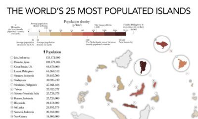

The most populated islands of the earth are teeming hubs of human activity, a far cry from the remote paradises in popular imaginations.


Advanced economies are the happiest countries for older people, likely due to their stronger social security systems.


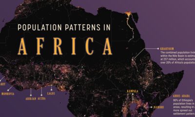
We visualize Asia’s population patterns to see where 4.6 billion people, or two-thirds of the world’s population, actually live.


While many inspiring teachings exist about attaining individual happiness, it's worthwhile to consider how happy entire countries are on a collective scale.


Considering there are tens of millions of flights per year, major plane crashes are actually extremely rare.
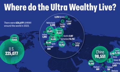

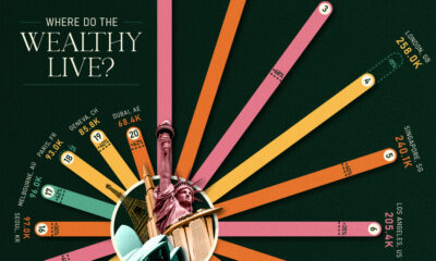
There are over 600,000 individuals worldwide with a net worth surpassing $30 million, representing the wealthiest people on the planet. Here's where they live.


South Korea's most valuable companies are familiar names: large conglomerates with diverse holdings in different parts of the economy.


The top three economic powerhouses of Africa contribute more than one-third to the African economy. We rank the nations of the world's second-largest continent by 2024...
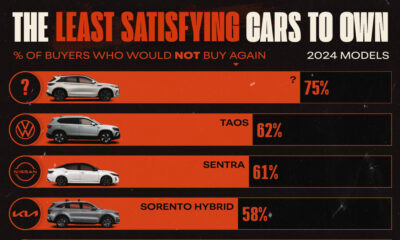

Automakers with models on the most disappointing cars list include: Volkswagen, Kia, Mercedes-Benz, and Nissan.
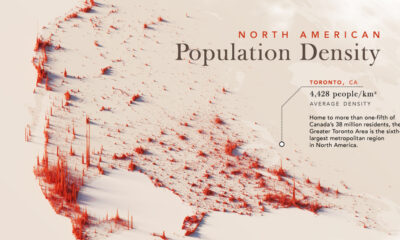

Nearly half a billion people live on the third-largest continent. We take a closer look in this population map of North America.
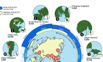

Many major coastal cities are experiencing local land subsidence where underground soil and rock collapse, causing the surface above to sink.
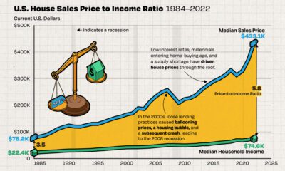

We chart the ever-widening gap between median incomes and the median price of houses in America, using data from the Federal Reserve from 1984 to 2022.
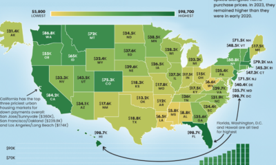

From coast to coast, the median down payment on a single family home can be close to $100,000 or less than $10,000.
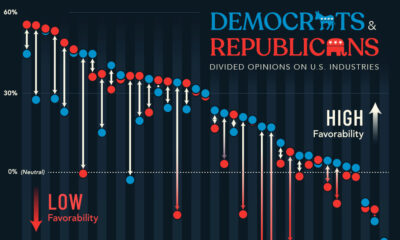

A survey looked at U.S. industry favorability across political lines, showing where Democrats and Republicans are divided over the economy.

Glassdoor’s annual list is determined by an algorithm that converts reviews to ratings—here are America's 15 best places to work since 2020.

We map out Africa’s population density, spotlighting the continent’s most populous countries and cities.
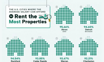

Visualizing the most affordable U.S. cities for renters by the percentage of affordable rentals available on an average salary.
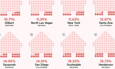

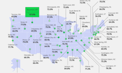
Visualizing the least affordable U.S. cities for renters by the percentage of affordable rentals available on an average salary.
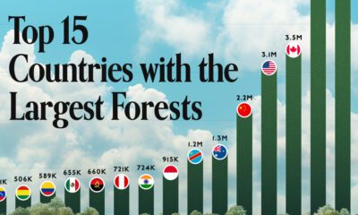

Together, the top five countries with the largest forests account for more than half of the world’s entire forest cover.
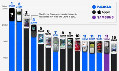

Samsungs, Motorolas, and iPhones, but which model tops the list of most sold mobile phones of all time?
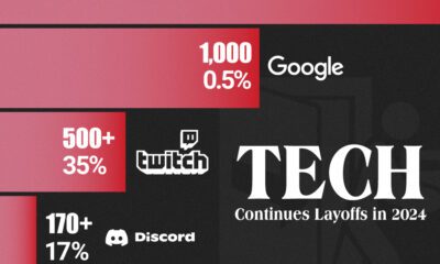

We visualize some of the bigger tech layoffs in the year so far, from video game software provider Unity to big tech bastion Google.


Of the 44 nations analyzed for retirement welfare, these 25 score well on health, financial, and social support for their aging populations.


From someone born in the 19th century, in the midst of historic population growth, comes this vintage visualization showing world cities growing ever bigger.
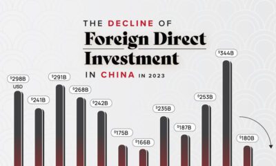

Geopolitical tensions, the closure of due diligence firms, and falling offshore IPOs lead to declining Chinese FDI Inflows.
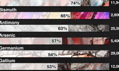

The U.S. Geological Survey estimates that in 2022, China was the world’s leading producer of 30 out of 50 entries on the U.S. critical minerals list.

Good pay can help manage first-job worries. We visualize how geography affects entry-level pay across the U.S.
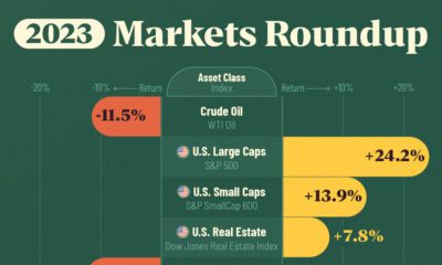

Between equities, real estate, commodities, bonds, and emerging markets, we track which major asset class ended the year on a positive note.
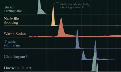

The top 10 news stories of 2023 according to Google Search trends, including two wars, three hurricanes, and a new moon landing.
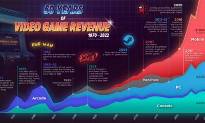

As technology has evolved, so too has the video game industry, consumer preferences, and drivers of growth. We do a deep dive.
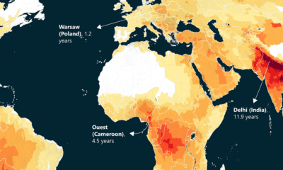

This world map of life expectancy gains shows how much longer people could potentially live by reducing pollution.
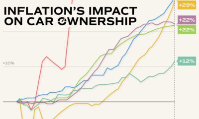

Inflation has impacted various car ownership costs in America, including prices for new and used cars, parts, and insurance.
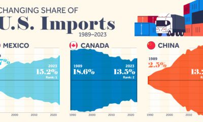

We highlight seven key U.S. trade partners and their changing share in the sources of U.S. imports from 1989–2023.
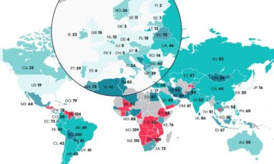

The Digital Quality of Life Index shows which countries are doing a better job than others in providing accessible and affordable internet.


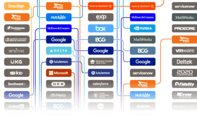
Social network Blind polled 13,000+ respondents on whether they approved or disapproved of the way their CEO handled the job, generating the approval rating of more...


Thanks to the ubiquity of their products and services, these Big Tech companies have revenues bigger than many national GDPs.
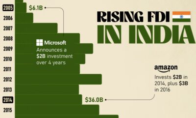

Mirroring the country's rapid economic growth, India's FDI (foreign direct investment) inflows have skyrocketed over the last twenty years.

Major financial centers—London, Singapore, and Hong Kong—feature in these rankings of cities with the most millionaires.
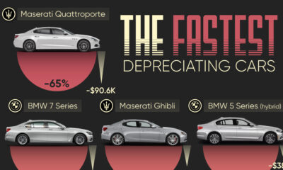

We visualize which cars depreciate the fastest based on the rate their value drops over five years. Spoiler: luxury cars don't do well.
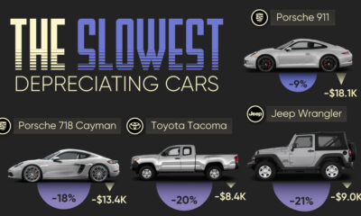

We visualize which cars have the best resale value based on the rate their value drops over five years. Spoiler: Porsche is King.
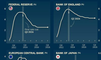

Which economies are expected to see interest rates rise, or fall? We highlight IMF forecasts for international interest rates through 2028.


 Creator Program