population
Vintage Viz: World Cities With 1 Million Residents (1800–1930)
The vintage visualization below is in German and was published in 1930. For a full explanation, read the accompanying article.

World Cities With At Least 1 Million Residents (1800–1930)
This chart is the latest in our Vintage Viz series, which presents historical visualizations along with the context needed to understand them.
The explosive world population boom in the last 300 years is common knowledge today. Much and more has been written about how and why it happened, why it was unusual, and how the specter of a declining population for the first time in three centuries could impact human society.
However, equally compelling, is how people in the past—those living in the midst of the early waves of this boom—were fascinated by what they were witnessing.
Evidence of this comes from today’s vintage visualization, denoting the increasing number of world cities with at least one million inhabitants through the years.
The above pictogram was made by Austrian philosopher and sociologist Otto Neurath (1882–1945), found in his book, Society and Economy, published in 1930.
World Population Doubles Between 1800 and 1930
In 1800, the world population crossed 1 billion for the first time ever.
In the next 130 years, it doubled past 2 billion.
The Second Agricultural Revolution, characterized by massive land and labor productivity, grew agricultural output more than the population and is one of the key drivers of this population growth.
And in the pictogram above, where one silhouette indicates one million inhabitants, this exponential population growth becomes far more vivid.
In 1800, for example, according to the creator’s estimates, only London had at least million residents. A century later, 15 cities now boasted of the same number. Then, three decades hence, 37 cities across the world had one million inhabitants.
| Year | Cities with One Million Residents |
|---|---|
| 1800 | 1 |
| 1900 | 15 |
| 1930 | 37 |
Importantly, the data above is based on the creator’s estimates from a century ago, and does not include Beijing (then referred to as Peking in English) in 1800. Historians now agree that the city had more than a million residents, and was the largest city in the world at the time.
Another phenomenon becoming increasingly apparent is growing urbanization—food surplus frees up large sections of the population from agriculture, driving specialization in other skills and trade, in turn leading to congregations in urban centers.
Other visualizations in the same book covered migration, Indigenous peoples, labor, religion, trade, and natural resources, reflecting the creator’s interest in the social life of individuals and their well-being.
Who Was Otto Neurath and What is His Legacy?
This vintage visualization might seem incredibly simple, simplistic even, considering how we map out population data today. But the creator Otto Neurath, and his wife Marie, were pioneers in the field of visual communication.
One of their notable achievements was the creation of the Vienna Method of pictorial statistics, which aimed to represent statistical information in a visually accessible way—the forerunner to modern-day infographics.
The Neuraths believed in using clear and simple visual language to convey complex information to a broad audience, an approach that laid the foundation for modern information design.
They fled Austria during the rise of the Nazi regime and spent their later years in various countries, including the UK. Otto Neurath’s influence on graphic design, visual communication, and the philosophy of language has endured, and his legacy is still recognized in these fields today.


population
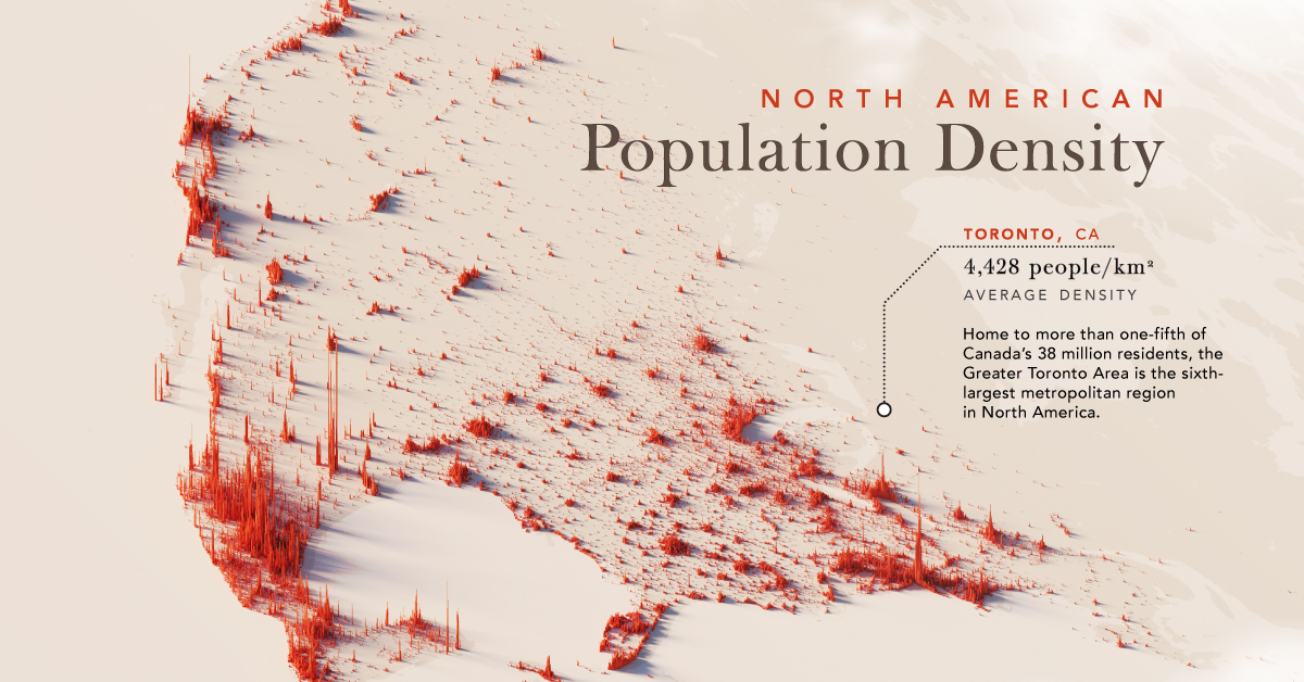
Mapped: North America Population Patterns by Density
Nearly half a billion people live on the third-largest continent. We take a closer look in this population map of North America.
Mapped: North America Population Patterns by Density
This was originally posted on our Voronoi app. Download the app for free on iOS or Android and discover incredible data-driven charts from a variety of trusted sources.
From the icy expanses of the Arctic to the warm Caribbean sea, the North American continent covers nearly 25 million square kilometers, or about 15% of the Earth’s land area. Populating this vast region are nearly half a billion people, spread out from coast to valley, along the edges of arid scrublands and rainforests.
We visualize a map of North America population patterns, including Central America and the Caribbean, with spikes illustrating densely populated areas.
Data for this map is sourced from Statistics Canada, the World Bank, and WorldPop—a research group based out of the University of Southampton that tracks population growth and movement across the globe.
Ranked: Countries and Territories by Population Density
Deep in the Atlantic, seen as a small dot near Haiti on the map, the island state of Bermuda is the most densely populated jurisdiction on the continent. Measuring just 53 km² in area, and home to 65,000 people, results in an average population density of 1,266 people per km².
Also in the Caribbean, Barbados ranks second with an average population density 642 people/km², followed by Aruba, ranked third-highest at 550 people/km².
| Rank | Country/Territory | Average Population Density (per km²) | Area (km²) |
|---|---|---|---|
| 1 | 🇧🇲 Bermuda | 1,226 | 53 |
| 2 | 🇧🇧 Barbados | 642 | 439 |
| 3 | 🇦🇼 Aruba | 550 | 193 |
| 4 | 🇭🇹 Haiti | 423 | 27,750 |
| 5 | 🇵🇷 Puerto Rico | 360 | 8,897 |
| 6 | 🇲🇶 Martinique | 325 | 1,130 |
| 7 | 🇸🇻 El Salvador | 303 | 21,040 |
| 8 | 🇱🇨 Saint Lucia | 292 | 617 |
| 9 | 🇻🇮 Virgin Islands | 285 | 346 |
| 10 | 🇻🇨 Saint Vincent & the Grenadines | 267 | 389 |
| 11 | 🇯🇲 Jamaica | 257 | 10,992 |
| 12 | 🇬🇵 Guadeloupe | 252 | 1,628 |
| 13 | 🇩🇴 Dominican Republic | 234 | 48,442 |
| 14 | 🇧🇶 Netherlands Antilles | 229 | 800 |
| 15 | 🇹🇹 Trinidad & Tobago | 212 | 5,128 |
| 16 | 🇦🇬 Antigua & Barbuda | 214 | 440 |
| 17 | 🇻🇬 British Virgin Islands | 206 | 153 |
| 18 | 🇰🇳 Saint Kitts & Nevis | 176 | 269 |
| 19 | 🇦🇮 Anguilla | 175 | 91 |
| 20 | 🇰🇾 Cayman Islands | 168 | 264 |
| 21 | 🇬🇹 Guatemala | 165 | 108,889 |
| 22 | 🇨🇷 Costa Rica | 101 | 51,100 |
| 23 | 🇨🇺 Cuba | 102 | 109,884 |
| 24 | 🇭🇳 Honduras | 94 | 112,492 |
| 25 | 🇩🇲 Dominica | 91 | 750 |
| 26 | 🇲🇸 Montserrat | 91 | 103 |
| 27 | 🇹🇨 Turks & Caicos Islands | 75 | 616 |
| 28 | 🇲🇽 Mexico | 65 | 1,972,550 |
| 29 | 🇵🇦 Panama | 60 | 74,177 |
| 30 | 🇳🇮 Nicaragua | 54 | 130,370 |
| 31 | 🇺🇸 U.S. | 35 | 9,834,000 |
| 32 | 🇧🇸 The Bahamas | 29 | 13,880 |
| 33 | 🇵🇲 Saint-Pierre & Miquelon | 24 | 242 |
| 34 | 🇧🇿 Belize | 17 | 22,966 |
| 35 | 🇨🇦 Canada | 4 | 9,984,670 |
| 36 | 🇬🇱 Greenland | 0 | 2,166,086 |
| 37 | 🇺🇸 Navassa Island | 0 | 5 |
Naturally the largest countries on the continent—Canada, the U.S., and Mexico—have some of the lowest average population densities compared to other nations in the region.
However, thanks to their size, their overall population distribution is more apparent on a map of this scale. In Canada, the Greater Toronto Area is home to one-fifth the country’s entire population. In stark contrast, the rest of the country seems almost empty—averaging just 4 people/km².
Major U.S. cities—New York, Chicago, and San Francisco—also stand out, though the more regular dispersion of Americans, particularly in the Northeast, South, and Midwest can also be seen.
Interestingly, Monterrey in Mexico jumps out on the map; the city is built at the foot of Cerro de la Silla, and several districts are densely populated as a result.
Ranked: Continents by Population Density
How does North America compare to the other continents by population density?
Unsurprisingly, thanks to its large land area, as well as comparatively smaller population, North America is one of the least densely populated continents in the world, beaten only by Oceania, which averages 5 people/km², and Antarctica.
| Rank | Continent | Average Population Density (per/km²) |
|---|---|---|
| 1 | Asia | 149 |
| 2 | Africa | 49 |
| 3 | Europe | 32 |
| 4 | South America | 25 |
| 5 | North America | 25 |
| 6 | Oceania | 5 |
| 7 | Antarctica | 0 |
Source: World Population Review.
In comparison, Asia, while being the largest continent, is also home to 60% of the global population, and averages 149 people/km².

-

 Misc1 week ago
How Hard Is It to Get Into an Ivy League School?
-

 Technology2 weeks ago
Ranked: Semiconductor Companies by Industry Revenue Share
-

 Markets2 weeks ago
Ranked: The World’s Top Flight Routes, by Revenue
-

 Countries2 weeks ago
Population Projections: The World’s 6 Largest Countries in 2075
-

 Markets2 weeks ago
The Top 10 States by Real GDP Growth in 2023
-

 Demographics2 weeks ago
The Smallest Gender Wage Gaps in OECD Countries
-

 United States2 weeks ago
Where U.S. Inflation Hit the Hardest in March 2024
-

 Green2 weeks ago
Top Countries By Forest Growth Since 2001