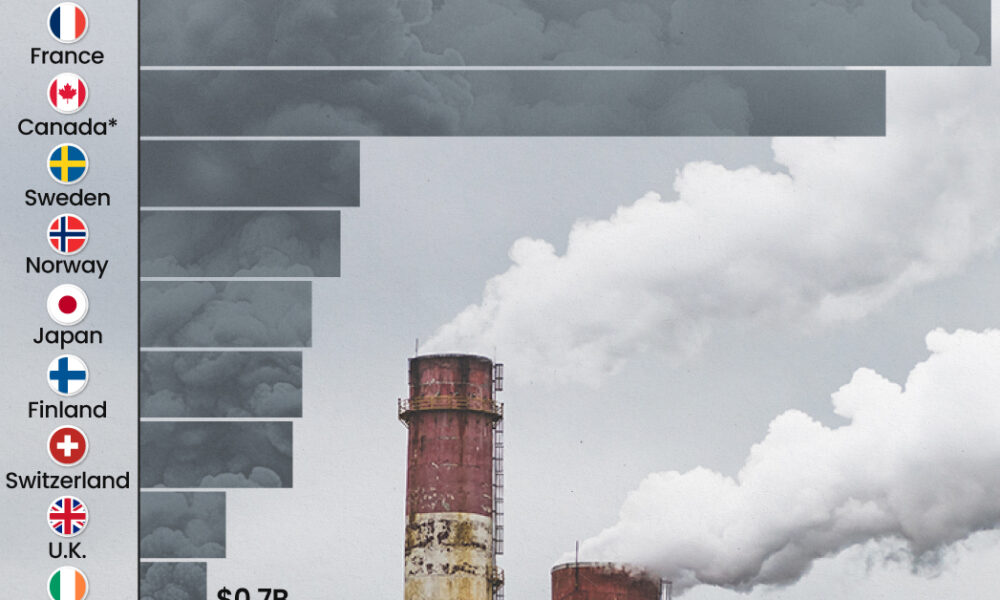
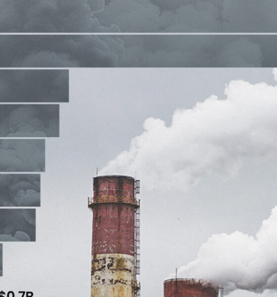
This graphic highlights France and Canada as the global leaders when it comes to generating carbon tax revenue.
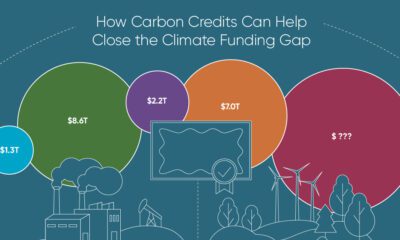

To keep a 1.5℃ world within reach, global emissions need to fall by as much as 45% by 2030, and carbon credits could help close the...


South Asian nations are the global hotspot for pollution. In this graphic, we rank the world’s most polluted countries according to IQAir.
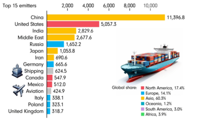

This animated chart by James Eagle uses data from Our World in Data to show the 15 largest carbon emitters between 1850 and 2022.


One country is taking reforestation very seriously, registering more than 400,000 square km of forest growth in two decades.
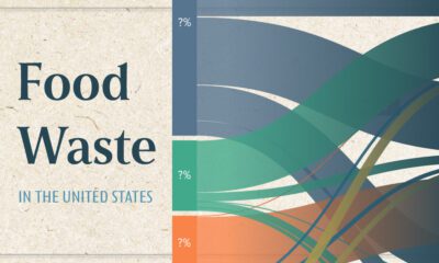

This chart visualizes the flow of the 80 millions tons of food waste in the United States in 2021, using data from ReFED.


The country with the most forest loss since 2001 lost as much forest cover as the next four countries combined.
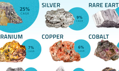

We’ve partnered with Sprott to visualize nine critical minerals for the clean energy transition and their projected compound annual growth rates between 2022–2027.
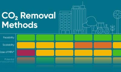

Here's how carbon dioxide removal methods could help us meet net-zero targets and and stabilize the climate.
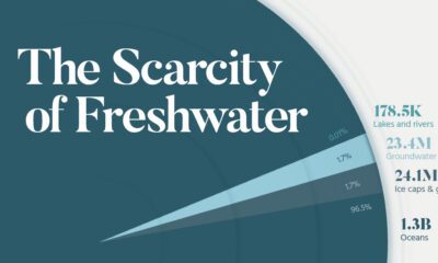

See all of the world's water in one chart, as well as which regions will suffer the greatest from water scarcity.


 Creator Program