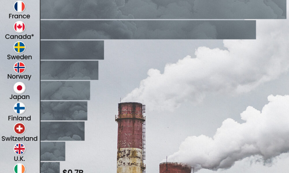
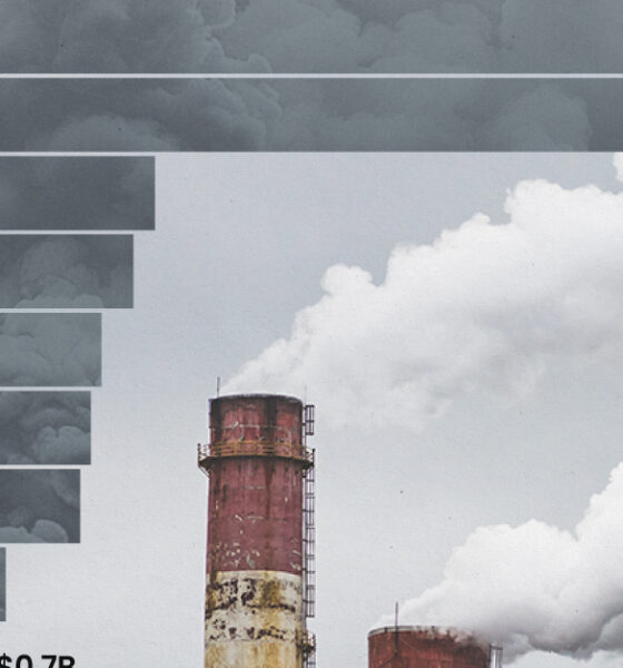
This graphic highlights France and Canada as the global leaders when it comes to generating carbon tax revenue.
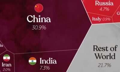

China, India, and the U.S. together account for roughly half of the world's CO₂. This visual breaks down all carbon emissions by country.
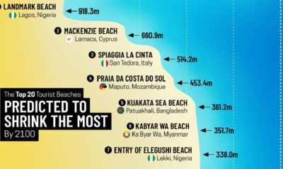

Sandy beaches make up over one-third of the world's coastline, yet nearly half of them could disappear by 2100.
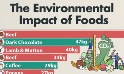

Which foods are linked with high CO2 emissions and high water use? We look at the environmental impacts of food production in this chart.
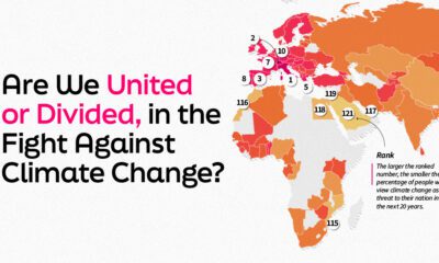

This graphic explores 121 nations thoughts on climate change and ranks them by the volume of their population who views it as a threat.
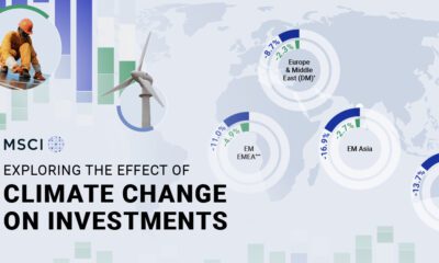

This infographic shows the effects of climate change on investments, and how climate risks may affect a portfolio's value.
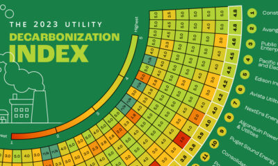

Here's a preview of the 2023 Utility Decarbonization Index, which tracks the decarbonization progress of the largest U.S. utilities.
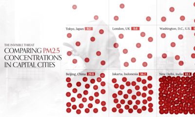

This visual compares air quality in 50 capital cities around the world by average PM2.5 concentrations in 2022.

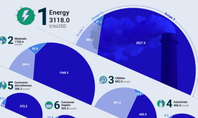
Comparing average Scope 1 emission intensities by sector according to an analysis done by S&P Global Inc.

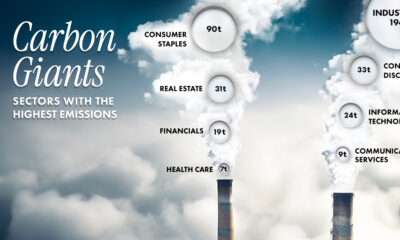
Which sectors are the largest contributors to emissions? From energy to tech, this graphic shows carbon emissions by sector in 2023.
Antarctica's ice extent has reached record lows. This visual details and maps Antarctica sea ice loss over the last two years.


 Creator Program