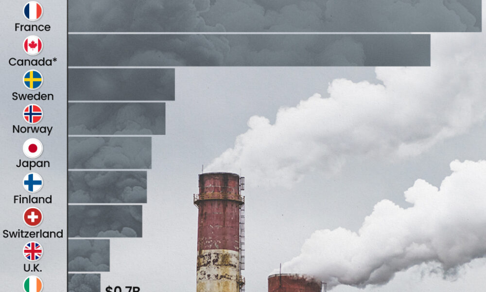
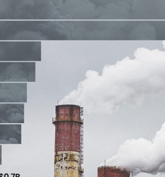
This graphic highlights France and Canada as the global leaders when it comes to generating carbon tax revenue.
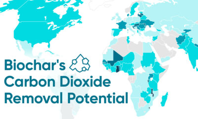

Biochar has the remarkable potential to absorb roughly 6% of the world's greenhouse gas emissions, here's how.


Despite contributing over half of global GDP, biodiversity is under severe pressure, and key species and ecosystems continue to be lost.
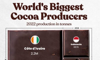

Here are the largest cocoa producing countries globally—from Côte d'Ivoire to Brazil—as cocoa prices hit record highs.
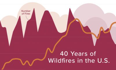

Wildfires are blazing across the U.S with unprecedented intensity. Here is how activity has evolved over four decades.
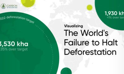

Global deforestation in 2022 rose by 4%, reaching 6.6 million hectares.
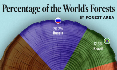

We visualize which countries have the biggest share of world forests by area—and while country size plays a factor, so too, does the environment.
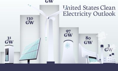

In this graphic, we explore the projected generation capacity of different clean electricity technologies in the U.S. for 2023 and 2024.


This graphic shows high levels of investment in U.S. clean infrastructure between 2021 and 2023.
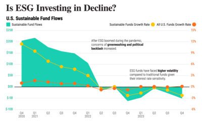

After the pandemic boom, ESG investments lost their luster amid high interest rates. Could they make a comeback?
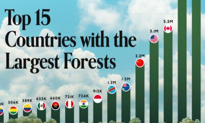

Together, the top five countries with the largest forests account for more than half of the world’s entire forest cover.


