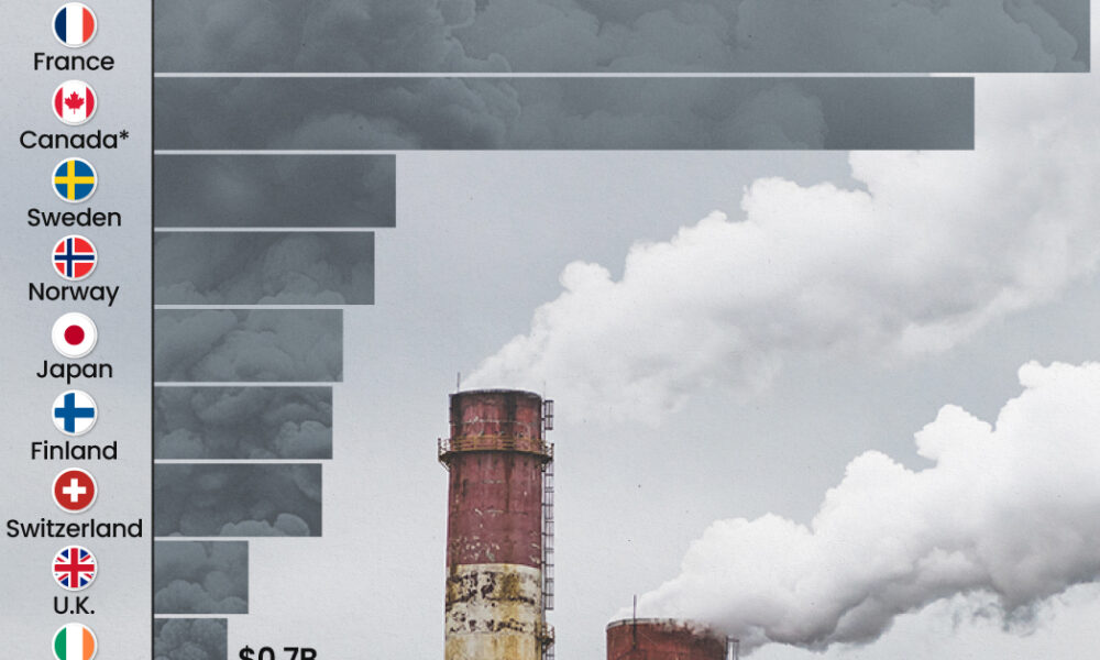
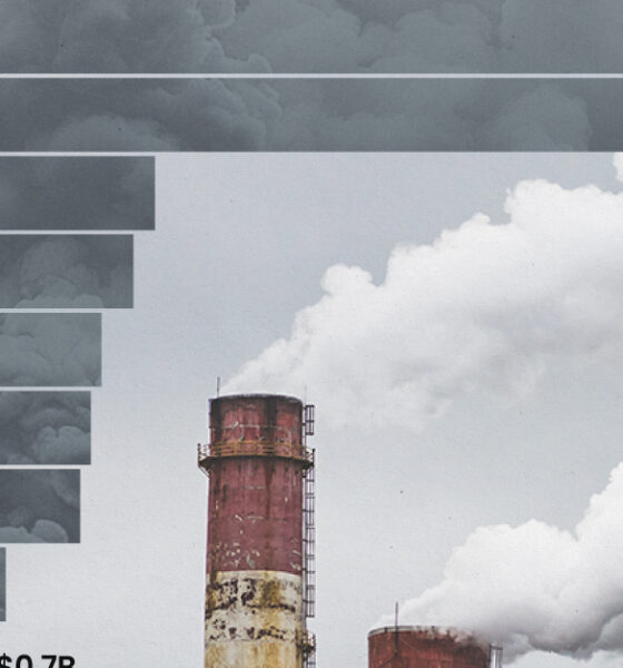
This graphic highlights France and Canada as the global leaders when it comes to generating carbon tax revenue.
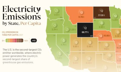

This graphic showcases electricity emissions by state, highlighting each state's largest source of power.
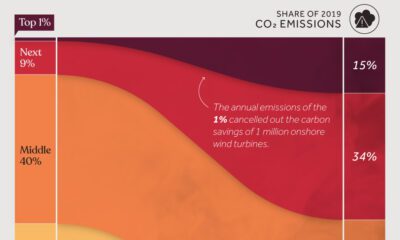

We visualize global CO2 emissions by income group, showing the impact of different wealth brackets on carbon generation.
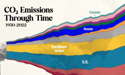

In this streamgraph, we break down global CO2 emissions between 1950 and 2022 using data from Berkeley Earth and Global Carbon Project.
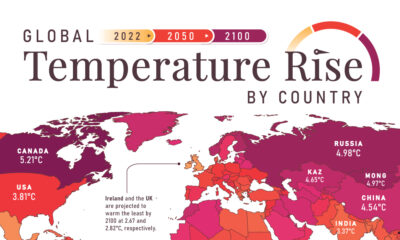

In this set of three maps, we show the global temperature rise on a national level for 2022, 2050, and 2100 based on an analysis by...
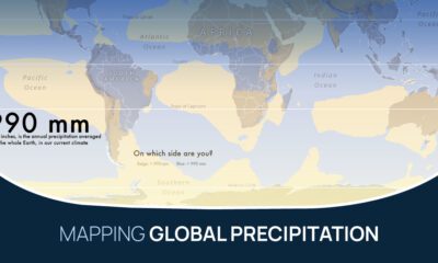

What does the global precipitation map look like if we split it in two, one half with below average rainfall and the other above?
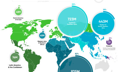

In this graphic, we map the number of people relying on harmful cooking fuels by region, using data from the World Health Organization.
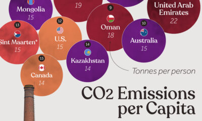

Which countries rank the highest in per capita carbon emissions, and how do they impact the world's total carbon emissions?
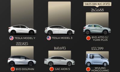

Today, electric vehicle sales make up 18% of global vehicle sales. Here are the leading models by sales as of August 2023.
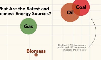

What are the safest energy sources? This graphic shows both GHG emissions and accidental deaths caused by different energy sources.
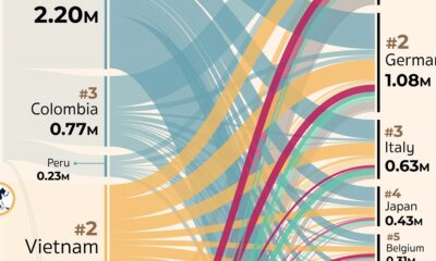

Which countries export, and import, the most coffee? This visual highlights the global coffee trade by export flows in 2019.


 Creator Program