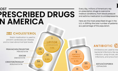
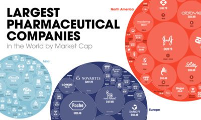
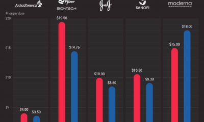
Healthcare
Charted: The Average Cost of Insulin By Country
Charted: The Average Cost of Insulin By Country
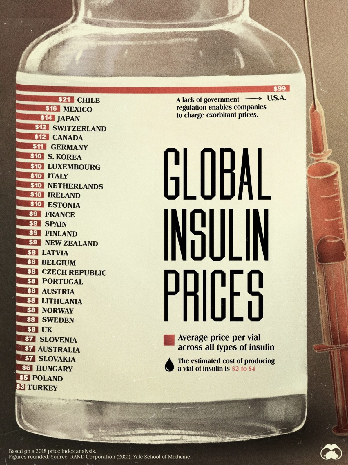
Drug prices in the U.S. are notoriously high for many important medications, including insulin. When comparing the cost of insulin by country, we see that the difference is not even close.
This chart shows the average cost of insulin across OECD countries, based on a 2021 publication by RAND Corporation.
Comparing the Cost of Insulin By Country
The study analyzed the average price per vial of all types of insulin from 2018 across numerous countries.
The findings? The U.S. had the highest price per vial of insulin at $99.
Here are the prices per vial across 32 countries:
| Rank | Country | Average Insulin Price (2018, USD) |
|---|---|---|
| 1 | 🇺🇸 U.S. | $99 |
| 2 | 🇨🇱 Chile | $21 |
| 3 | 🇲🇽 Mexico | $16 |
| 4 | 🇯🇵 Japan | $14 |
| 5 | 🇨🇭 Switzerland | $12 |
| 6 | 🇨🇦 Canada | $12 |
| 7 | 🇩🇪 Germany | $11 |
| 8 | 🇰🇷 Korea | $10 |
| 9 | 🇱🇺 Luxembourg | $10 |
| 10 | 🇮🇹 Italy | $10 |
| 11 | 🇳🇱 Netherlands | $10 |
| 12 | 🇮🇪 Ireland | $10 |
| 13 | 🇪🇪 Estonia | $10 |
| 14 | 🇫🇷 France | $9 |
| 15 | 🇪🇸 Spain | $9 |
| 16 | 🇫🇮 Finland | $9 |
| 17 | 🇳🇿 New Zealand | $9 |
| 18 | 🇱🇻 Latvia | $8 |
| 19 | 🇧🇪 Belgium | $8 |
| 20 | 🇨🇿 Czechia | $8 |
| 21 | 🇵🇹 Portugal | $8 |
| 22 | 🇦🇹 Austria | $8 |
| 23 | 🇱🇹 Lithuania | $8 |
| 24 | 🇳🇴 Norway | $8 |
| 25 | 🇸🇪 Sweden | $8 |
| 26 | 🇬🇧 UK | $8 |
| 27 | 🇸🇮 Slovenia | $7 |
| 28 | 🇦🇺 Australia | $7 |
| 29 | 🇸🇰 Slovakia | $7 |
| 30 | 🇭🇺 Hungary | $6 |
| 31 | 🇵🇱 Poland | $5 |
| 32 | 🇹🇷 Türkiye | $3 |
Chile and Mexico had the second and third-highest insulin prices in the OECD, at $21 per vial and $16 per vial respectively.
The majority of countries had insulin prices hovering between $8 to $10 per vial, one-tenth the cost of the life-saving medication in the United States. The lowest, Türkiye at $3 per vial of insulin, was 33 times more affordable.
The Human Cost of Diabetes
According to a 2020 report from the World Health Organization, diabetes is a top 10 cause of death globally. Additionally, deaths attributed to diabetes have climbed 70% since 2000.
In early 2023, major pharmaceutical companies announced that they would implement price limits on insulin medication in the U.S.
However, whether or not those cost reductions are all going to consumers remains up in the air, due to the complex American health insurance market.


Healthcare
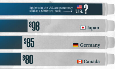
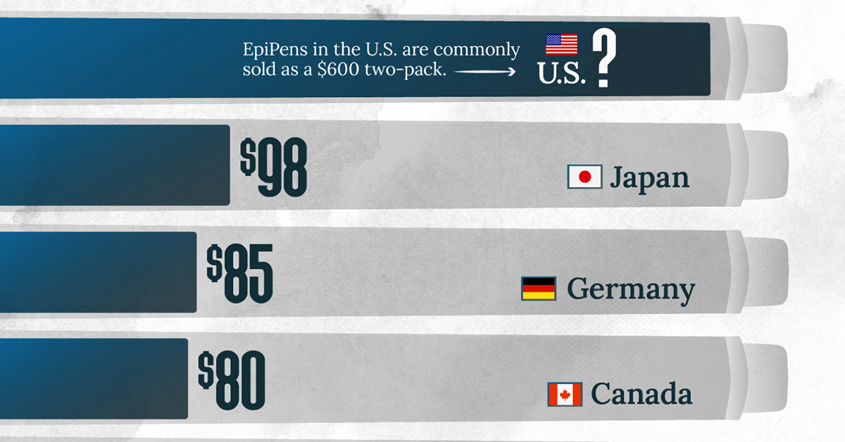
The Cost of an EpiPen in Major Markets
This visualization compares EpiPen prices around the world, with the U.S. having the highest prices by far.
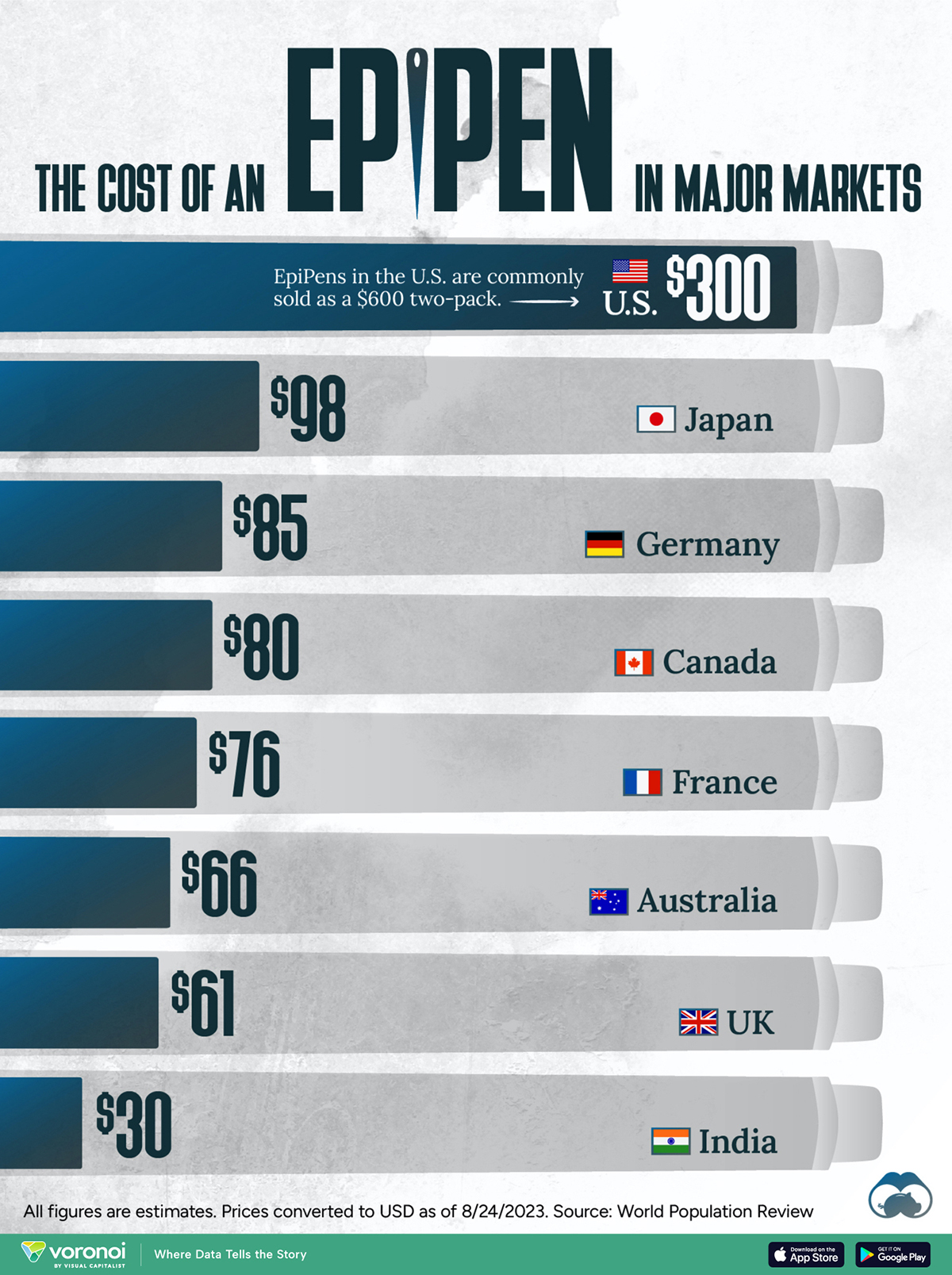
The Cost of an EpiPen in Major Markets
This was originally posted on our Voronoi app. Download the app for free on iOS or Android and discover incredible data-driven charts from a variety of trusted sources.
EpiPens are auto-injectors containing epinephrine, a drug that can treat or reverse severe allergic reactions, potentially preventing death.
The global epinephrine market was valued at $1.75 billion in 2022 and is projected to reach $4.08 billion by 2030. North America represents over 60% of the market.
EpiPens, however, can be prohibitively expensive in some regions.
In this graphic, we present estimated EpiPen prices in major global markets, compiled by World Population Review and converted to U.S. dollars as of August 2023.
Why are U.S. Prices so High?
The U.S. stands out as the most expensive market for EpiPens, despite over 1 million Americans having epinephrine prescriptions. After Mylan (now part of Pfizer) acquired the rights to produce EpiPens in the U.S. in 2007, the cost of a two-pack skyrocketed to $600, up from about $60.
| Country | Price (USD) |
|---|---|
| 🇺🇸 U.S. | 300* |
| 🇯🇵 Japan | 98 |
| 🇩🇪 Germany | 85 |
| 🇨🇦 Canada | 80 |
| 🇫🇷 France | 76 |
| 🇦🇺 Australia | 66 |
| 🇬🇧 UK | 61 |
| 🇮🇳 India | 30 |
*Per unit cost. Commonly sold as a two-pack, meaning total cost is equal to $600
Former Mylan CEO Heather Bresch defended the price hikes to Congress, citing minimal profit margins. Mylan eventually settled with the U.S. government for a nine-figure sum.
Notably, EpiPens are available at a fraction of the cost in other developed countries like Japan, Germany, and Canada.
Making EpiPens More Affordable
Efforts to improve EpiPen affordability are underway in several U.S. states. For instance, the Colorado House approved a $60 price cap on epinephrine, now under review by the state Senate.
Similar measures in Rhode Island, Delaware, Missouri, and Vermont aim to ensure insurance coverage for epinephrine, which is not currently mandatory, although most health plans cover it.

-

 Education1 week ago
How Hard Is It to Get Into an Ivy League School?
-

 Technology2 weeks ago
Ranked: Semiconductor Companies by Industry Revenue Share
-

 Markets2 weeks ago
Ranked: The World’s Top Flight Routes, by Revenue
-

 Demographics2 weeks ago
Population Projections: The World’s 6 Largest Countries in 2075
-

 Markets2 weeks ago
The Top 10 States by Real GDP Growth in 2023
-

 Demographics2 weeks ago
The Smallest Gender Wage Gaps in OECD Countries
-

 Economy2 weeks ago
Where U.S. Inflation Hit the Hardest in March 2024
-

 Green2 weeks ago
Top Countries By Forest Growth Since 2001