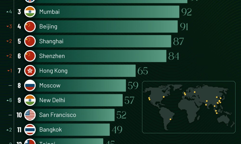
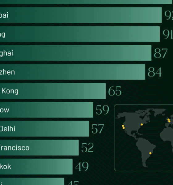
Just two countries account for half of the top 20 cities with the most billionaires. And the majority of the...


Older, better-educated adults are winning the savings game, reveals a January survey by the National Opinion Research Center at the University of Chicago.


See how much the debt-to-GDP ratios of advanced economies have grown (or shrank) since the year 2000.


Which OECD countries have the smallest gender wage gaps? We look at the 10 countries with gaps lower than the average.


Here's where workers earn the highest minimum wage in America as 22 states implement wage increases in 2024.


Listing the many programs—health, defense, veterans benefits—that U.S. federal taxes fund, in the form of a single federal tax dollar.

In this graphic, we show asset class returns across U.S. equities, bonds, real estate, gold and cash since 1970.
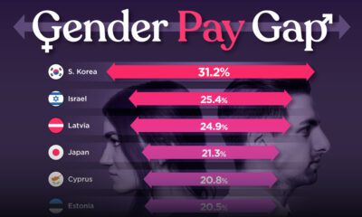

Which OECD countries have the largest gender pay gaps? We look at the 10 countries with gaps higher than the average.


See how the Nasdaq debut of Trump Media & Technology Group has influenced Trump's net worth, according to Forbes estimates.


Compound interest is a powerful force in building wealth. Here's how it impacts even the most modest portfolio over the long term.


