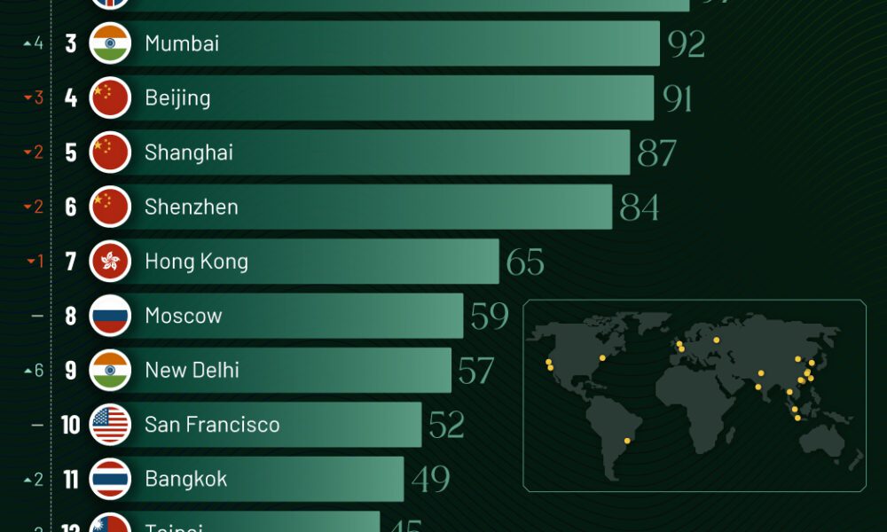
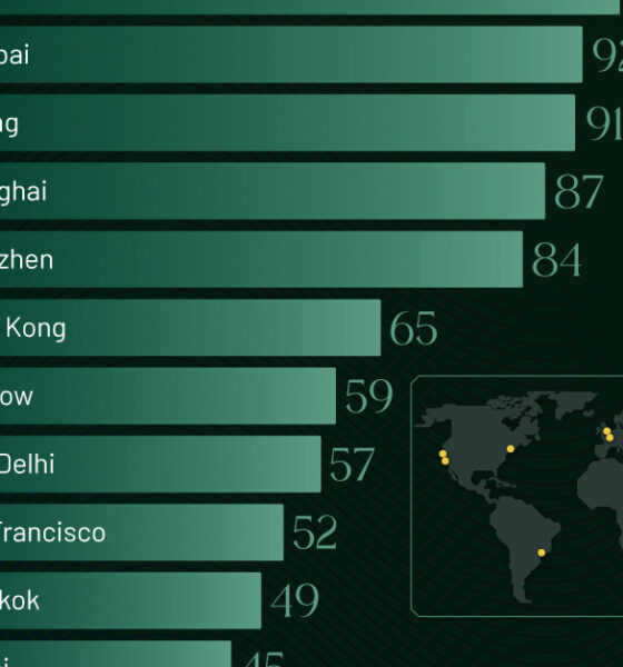
Just two countries account for half of the top 20 cities with the most billionaires. And the majority of the...
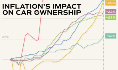

Inflation has impacted various car ownership costs in America, including prices for new and used cars, parts, and insurance.
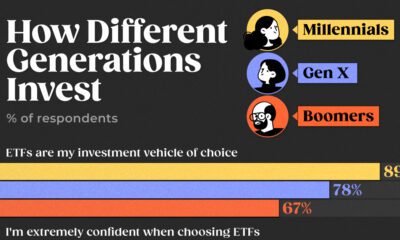

How personal are your investments? We chart investment preferences by generation in the U.S. based on a survey of 2,200 investors in 2023.
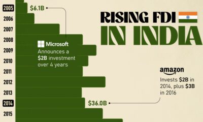

Mirroring the country's rapid economic growth, India's FDI (foreign direct investment) inflows have skyrocketed over the last twenty years.
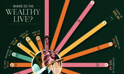

Major financial centers—London, Singapore, and Hong Kong—feature in these rankings of cities with the most millionaires.
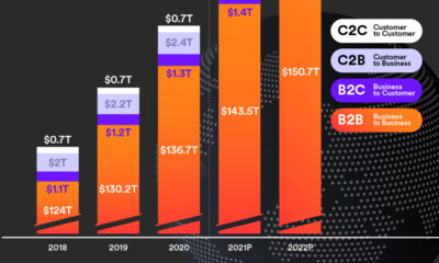

Cross-border payments grew to $150 trillion in 2022—nearly 30x the size of the global tech industry—and could hit $250 trillion by 2027.
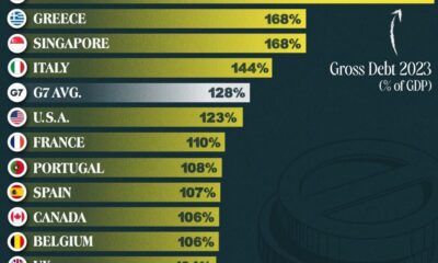

This graphic ranks government debt by country for advanced economies, using their gross debt-to-GDP ratio.
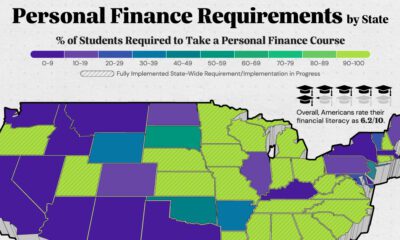

Here are the states that require high school students to take a personal finance course in order to graduate.
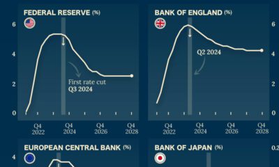

Which economies are expected to see interest rates rise, or fall? We highlight IMF forecasts for international interest rates through 2028.


Donald Trump, Mitt Romney, J.B. Pritzker. This infographic is a snapshot of the richest politicians in the U.S.
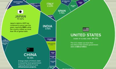

Global debt has soared since the pandemic. Which countries have the biggest stockpile of debt outstanding in 2023?


