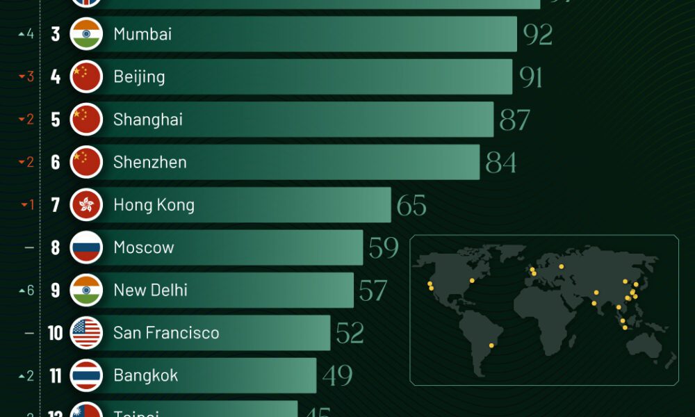
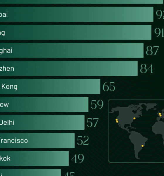
Just two countries account for half of the top 20 cities with the most billionaires. And the majority of the...


Services-producing industries account for the majority of U.S. GDP in 2023, followed by other private industries and the government.
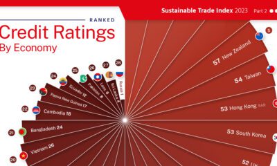

This graphic visualizes 30 country's credit ratings, using data from the 2023 Sustainable Trade Index.
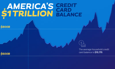

Americans’ collective credit card debt surpassed $1 trillion for the first time in 2023.


Here are the most common investing mistakes to avoid, from emotionally-driven investing to paying too much in fees.
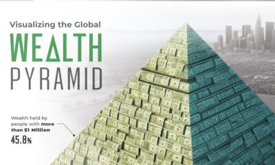

Global wealth stands at over $454 trillion. This graphic shows how it's distributed, by various levels of net worth.


This graphic shows how the ultra-wealthy invest their fortunes, from real estate and equities to luxury items.
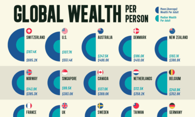

Here's how wealth per person compares by country to reveal differences in average and median wealth around the world.
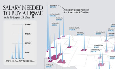

What does it take to own a home in the U.S. in 2023? Here's a look at the salary needed for home ownership in the top...


In this graphic, we visualize the destinations that saw the biggest influx of seasonal centi-millionaire residents in 2022.
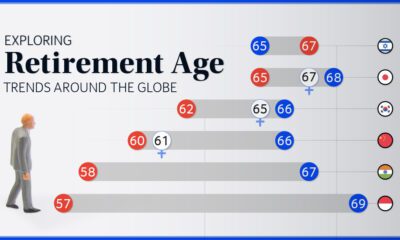

We chart current and effective retirement ages for 45 countries, revealing some stark regional differences.


