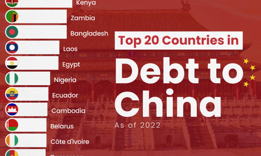
The 20 nations featured in this graphic each owe billions in debt to China, posing concerns for their economic future.
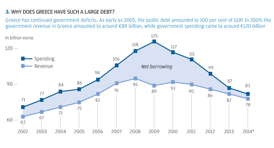
The story of Greece's debt crisis through charts. The origin of the Greek crisis shown in bond yields, population, unemployment, timeline, and more.
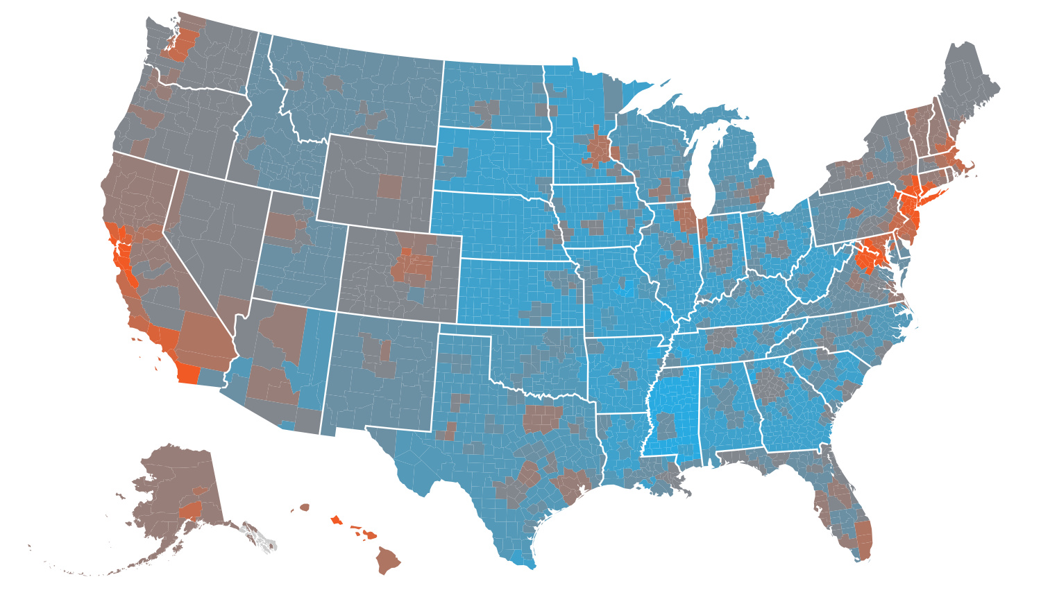
The cost of living by state and county varies significantly. Here's how far $100 will go in every part of America.
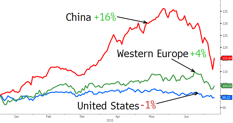
China's stock market is a roller coaster, creating and destroying trillions of wealth in the matter of months. See how China's ultra rich fared in the...
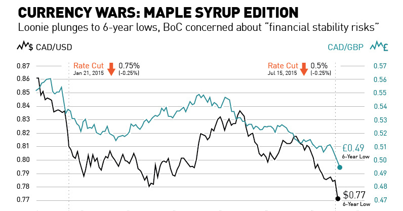
With the Canadian dollar plunging to 6-year lows after the second rate cut in six months, we look at the Maple Syrup version of a currency...
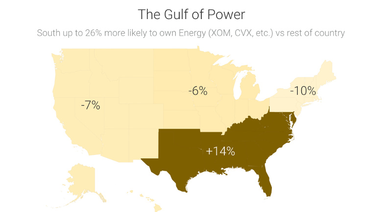
Recent data shows that investment portfolios are strongly biased to certain sectors based on where investors live.
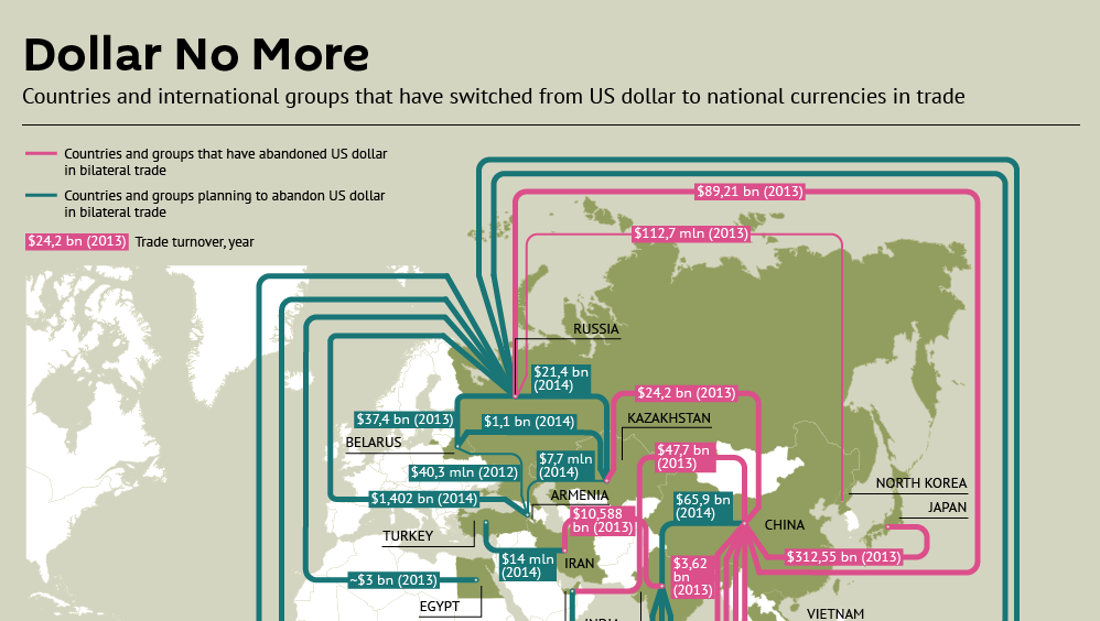
Recent trade deals and the creation of the Asian Infrastructure Investment Bank show the dollar is slowly losing its status as the primary reserve currency.
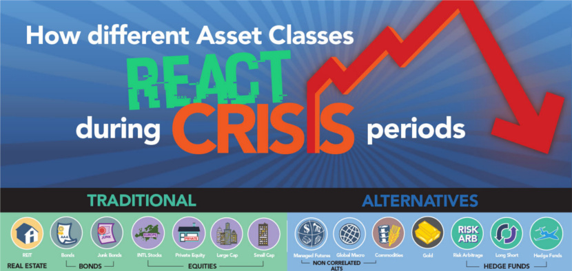
This infographic compares 14 different conventional and alternative asset classes during five times of distress. See the history of crisis investing here.

The performance of this elite group of investors was the worst since the 2008 Financial Crisis. See who made the Hedge Fund Rich List in this...
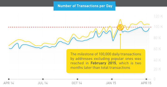
In previous years, Bitcoin received attention as an investment commodity. However, transaction data and top items bought show it's now for "everyday use"
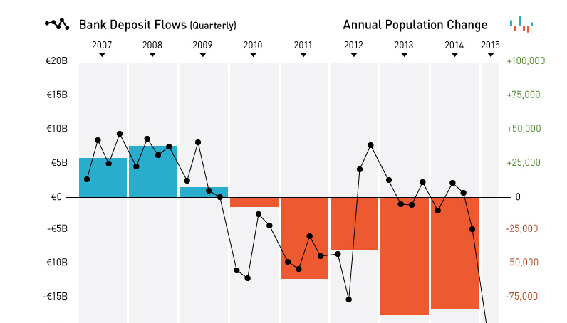
Today's chart shows the Greek exodus, as capital and people flee the sinking Greek economic ship in unprecedented numbers.


