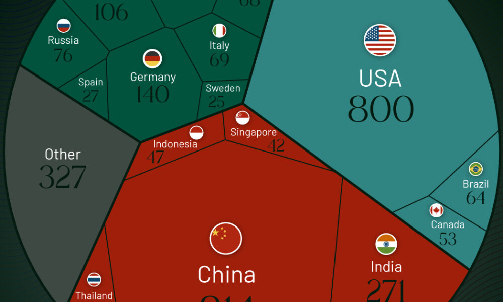
According to the annual Hurun Global Rich List, the U.S. and China are home to nearly half of the world's...
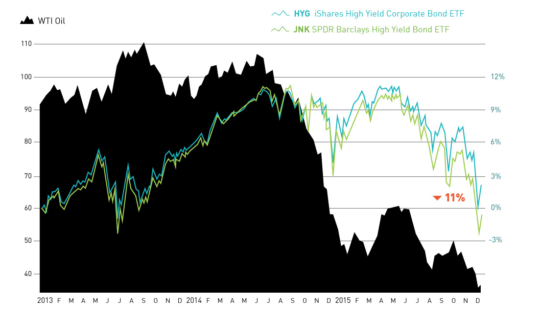
The month of December so far has seen a mini-meltdown in the junk bond market. The culprit? Fringe oil and gas producers that are struggling with...
The Money Project uses rich visuals such as infographics and data visualizations to explore the concept and implications of money.
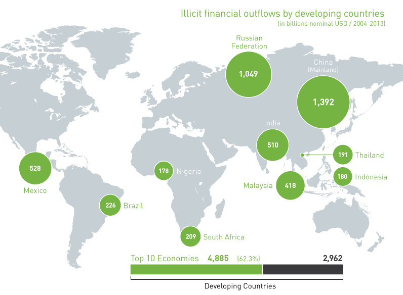
In the last decade, over $7.8 trillion of illicit financial outflows have come out of developing countries. We follow the world's "hot" money in this chart.
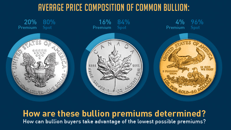
The price that investors pay for gold or silver bullion depends on two things: spot price and bullion premiums. How are the premiums calculated?

The 15.5 million affluent Millennials in the US already spend $2T per year, but they are set to inherit much more. How must finance change to...
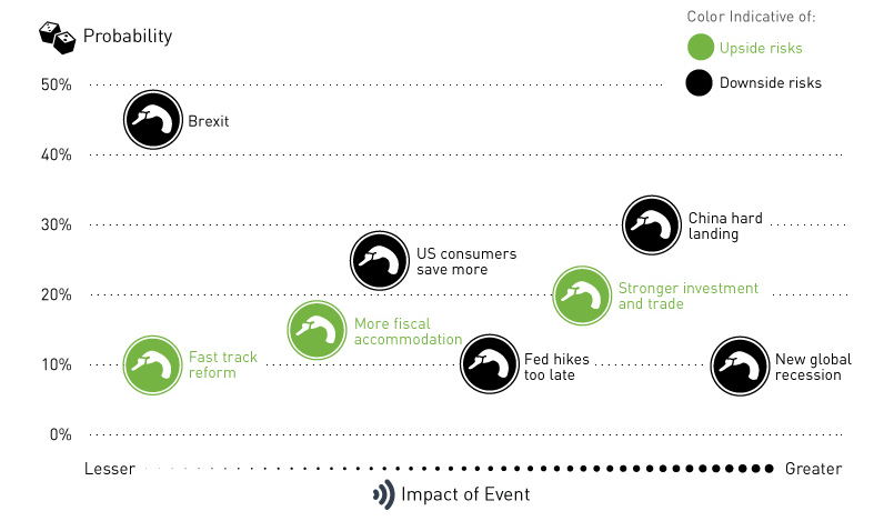
What possible events are adding upside and downside risks to the market? We chart SocGen's latest black swan list as we edge towards 2016.
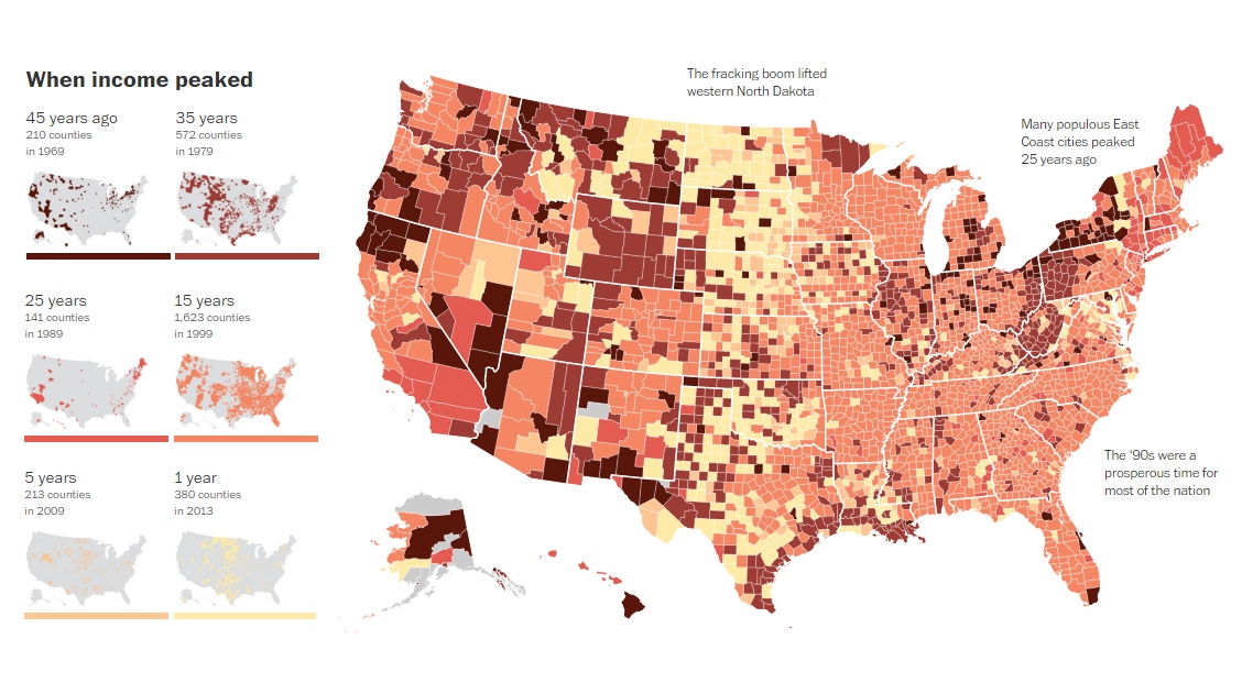
This map visualizes when the household median incomes of U.S. counties reached "peak income". For more than 80% of counties, this was over 15 years ago.
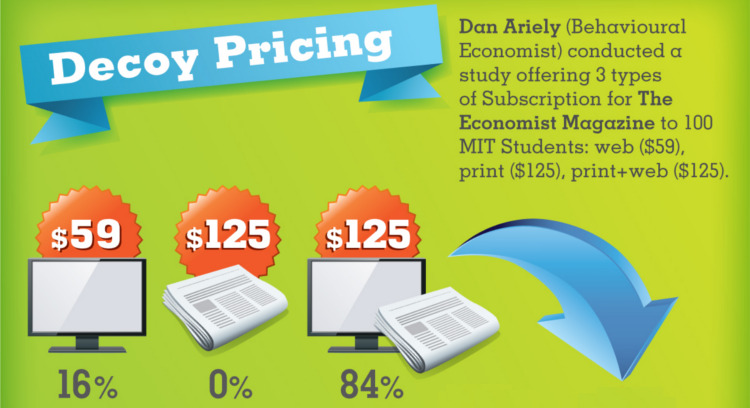
How does the psychology of prices affect buying behavior? In this infographic, some typical methods are shown, and we ask if it applies to investing.

How new media has ushered in a better experience for investors. Welcome to the modern era of investor relations.
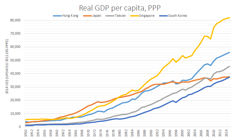
After 25 years of economic stagnation, Japan has finally been leapfrogged by all four so-called Asian Tigers: Hong Kong, Singapore, S. Korea, and Taiwan.


