Green
Visualized: Food Waste in the United States
![]() See this visualization first on the Voronoi app.
See this visualization first on the Voronoi app.

Visualized: Food Waste in the United States
This was originally posted on the Voronoi app. Download the app for free on iOS or Android and discover incredible data-driven charts from a variety of trusted sources.
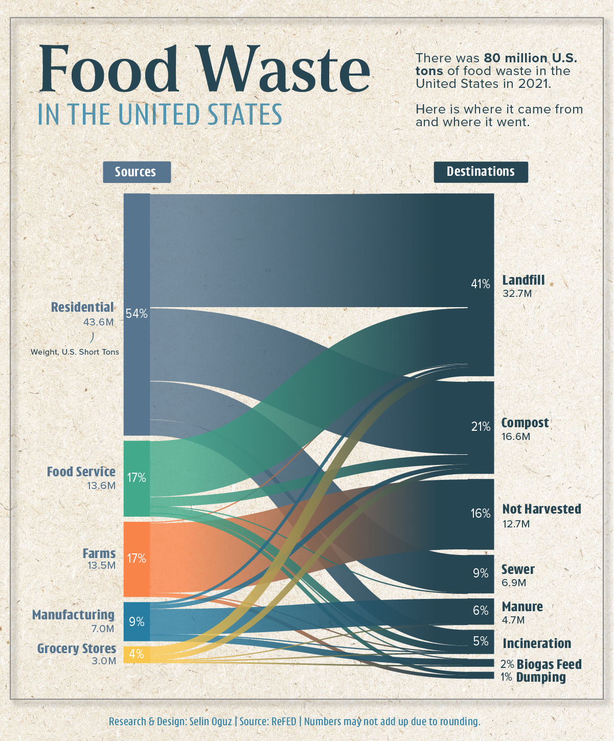
Did you know that there is more than 80 million tons of food wasted in the U.S. every year?
To explore where this waste came from and where it went, this graphic by Selin Oğuz visualizes the flow of food waste in the U.S. in 2021 using data from ReFED.
Following Waste from Source to Destination
The biggest source of food waste in the U.S. stemmed from residential households in 2021, accounting for more than 50% of the total.
Farms and the food service industry followed, each accounting for more than 13 million U.S. tons (short tons) of food waste in the same year.
| Sources | Weight, U.S. Short Tons | Share of Total |
|---|---|---|
| Residential | 43.6M | 54.0% |
| Food Service | 13.6M | 16.9% |
| Farm | 13.5M | 16.7% |
| Manufacturing | 7.02M | 8.7% |
| Retail | 3.01M | 3.8% |
| Total | 80.73M | 100% |
But where did all of this food waste end up?
The data shows us that the answer is primarily landfills, followed by compost and being left unharvested, which occurs due to reasons such as market variability, insufficient labor, or food safety concerns.
What Food Waste Means for the Environment
Whether it’s as a result of spoilage, poor planning, or unrealistic cosmetic standards for produce, food waste squanders valuable resources—such as water, energy, and labor—and intensifies global hunger and food insecurity, according to the United Nations.
Food waste is also a huge source of greenhouse gas (GHG) emissions, contributing to climate change. According to the U.S. Environmental Protection Agency, an estimated 190 million U.S. tons of GHG emissions result from food waste annually.
To put that number into perspective, that is equivalent to the annual emissions of 42 coal power plants.
Overall, the data highlights that food waste occurs at every stage of the food supply chain. Reducing this waste, especially where it is prominently high, can be crucial in achieving food system sustainability in the U.S. and beyond.

This article was published as a part of Visual Capitalist's Creator Program, which features data-driven visuals from some of our favorite Creators around the world.


Green
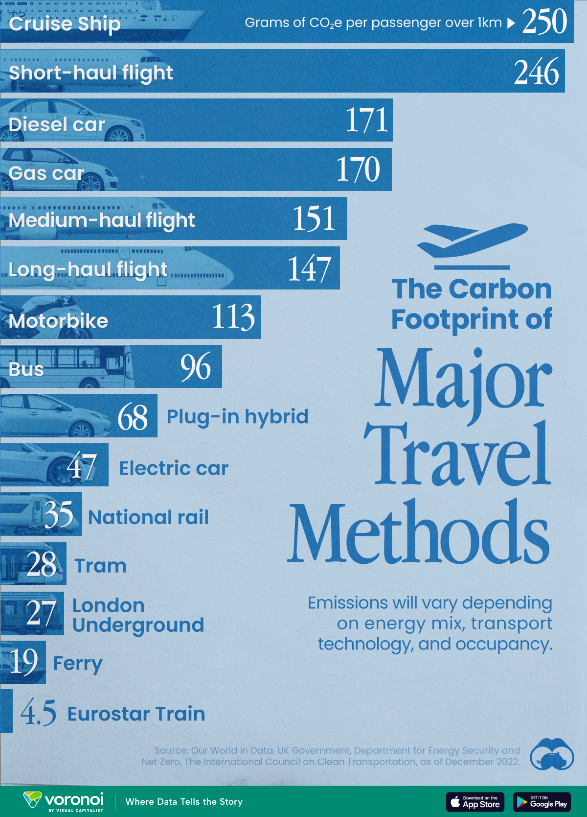
The Carbon Footprint of Major Travel Methods
Going on a cruise ship and flying domestically are the most carbon-intensive travel methods.

The Carbon Footprint of Major Travel Methods
This was originally posted on our Voronoi app. Download the app for free on iOS or Android and discover incredible data-driven charts from a variety of trusted sources.
Did you know that transport accounts for nearly one-quarter of global energy-related carbon dioxide (CO₂) emissions?
This graphic illustrates the carbon footprints of major travel methods measured in grams of carbon dioxide equivalent (CO₂e) emitted per person to travel one kilometer. This includes both CO₂ and other greenhouse gases.
Data is sourced from Our World in Data, the UK Government’s Department for Energy Security and Net Zero, and The International Council on Clean Transportation, as of December 2022.
These figures should be interpreted as approximations, rather than exact numbers. There are many variables at play that determine the actual carbon footprint in any individual case, including vehicle type or model, occupancy, energy mix, and even weather.
Cruise Ships are the Most Carbon-Intensive Travel Method
According to these estimates, taking a cruise ship, flying domestically, and driving alone are some of the most carbon-intensive travel methods.
Cruise ships typically use heavy fuel oil, which is high in carbon content. The average cruise ship weighs between 70,000 to 180,000 metric tons, meaning they require large engines to get moving.
These massive vessels must also generate power for onboard amenities such as lighting, air conditioning, and entertainment systems.
Short-haul flights are also considered carbon-intensive due to the significant amount of fuel consumed during initial takeoff and climbing altitude, relative to a lower amount of cruising.
| Transportation method | CO₂ equivalent emissions per passenger km |
|---|---|
| Cruise Ship | 250 |
| Short-haul flight (i.e. within a U.S. state or European country) | 246 |
| Diesel car | 171 |
| Gas car | 170 |
| Medium-haul flight (i.e. international travel within Europe, or between U.S. states) | 151 |
| Long-haul flight (over 3,700 km, about the distance from LA to NY) | 147 |
| Motorbike | 113 |
| Bus (average) | 96 |
| Plug-in hybrid | 68 |
| Electric car | 47 |
| National rail | 35 |
| Tram | 28 |
| London Underground | 27 |
| Ferry (foot passenger) | 19 |
| Eurostar (International rail) | 4.5 |
Are EVs Greener?
Many experts agree that EVs produce a lower carbon footprint over time versus traditional internal combustion engine (ICE) vehicles.
However, the batteries in electric vehicles charge on the power that comes straight off the electrical grid—which in many places may be powered by fossil fuels. For that reason, the carbon footprint of an EV will depend largely on the blend of electricity sources used for charging.
There are also questions about how energy-intensive it is to build EVs compared to a comparable ICE vehicle.

-

 Demographics7 days ago
The Countries That Have Become Sadder Since 2010
-

 Green2 weeks ago
Ranked: The Countries With the Most Air Pollution in 2023
-

 Green2 weeks ago
Ranking the Top 15 Countries by Carbon Tax Revenue
-

 Markets2 weeks ago
U.S. Debt Interest Payments Reach $1 Trillion
-

 Mining2 weeks ago
Gold vs. S&P 500: Which Has Grown More Over Five Years?
-

 Energy2 weeks ago
The World’s Biggest Nuclear Energy Producers
-

 Misc2 weeks ago
How Hard Is It to Get Into an Ivy League School?
-

 Debt2 weeks ago
How Debt-to-GDP Ratios Have Changed Since 2000