Green
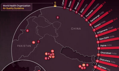
Mapped: Air Pollution Levels Around the World in 2022
![]() Subscribe to the Elements free mailing list for more like this
Subscribe to the Elements free mailing list for more like this
Mapped: Air Pollution Levels Around the World
This was originally posted on Elements. Sign up to the free mailing list to get beautiful visualizations on natural resource megatrends in your email every week.
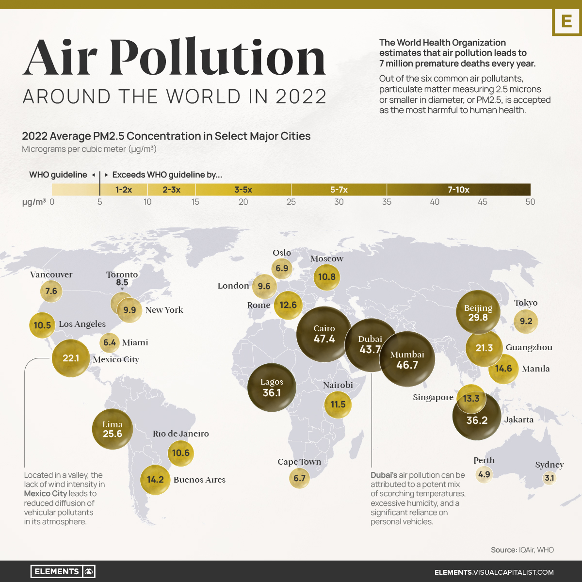
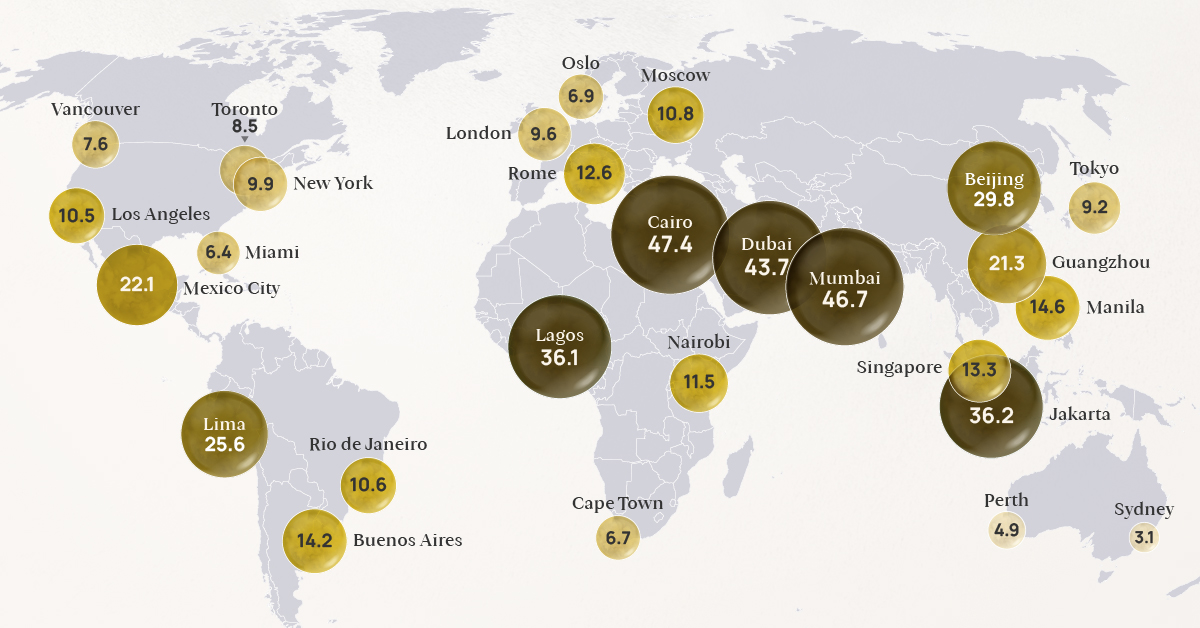
The World Health Organization (WHO) estimates that air pollution leads to 7 million premature deaths every year.
Out of the six common air pollutants, particulate matter measuring 2.5 microns or smaller in diameter, or PM2.5, is accepted as the most harmful to human health. This is due to its prevalence in the atmosphere and the broad range of adverse health effects associated with its exposure, such as heart disease, stroke, lung cancer and chronic respiratory diseases.
With that context in mind, this visualization uses IQAir’s World Air Quality Report to map out the 2022 average PM2.5 concentrations in select major cities around the globe, expressed in micrograms per cubic meter (μg/m³).
Understanding the WHO Air Pollution Guidelines
Did you know that in 2019, only 1% of the global population lived in places where WHO global air quality guidelines were met?
Designed to protect public health from the harmful effects of air pollution, the guidelines cover a range of air pollutants, including particulate matter, ozone, nitrogen dioxide, sulfur dioxide, and carbon monoxide.
The healthy limits for PM2.5 are set at an annual average of 0-5 μg/m³.
| WHO Classification | Annual Average PM2.5 Concentration (μg/m³) | % of countries within classification, 2022* |
|---|---|---|
| WHO Air Quality Guideline | 0 - 5 | 9.9% |
| Interim Target 4 | 5.1 - 10 | 18.3% |
| Interim Target 3 | 10.1 - 15 | 19.8% |
| Interim Target 2 | 15.1 - 25 | 28.2% |
| Interim Target 1 | 25.1 - 35 | 9.9% |
| Exceeds Target Levels | 35.1 - 50 | 7.6% |
| Exceeds Target Levels | > 50 | 6.1% |
*Percentages are calculated as a proportion of the 131 countries that had sufficient air quality data and were included in IQAir’s World Air Quality Report in 2022.
According to IQAir’s World Air Quality Report, only 13 countries or territories met the recommended concentration of PM2.5 in 2022. Among them were Australia, Finland, Puerto Rico, Iceland, Bermuda, and Guam.
Above this guideline, many countries fell within the four interim targets, while nearly 14% recorded air pollution levels that exceeded all target levels.
The Effects of Air Quality on Mortality
While it can be a little difficult to grasp what the above concentrations represent, thinking of them in terms of their effect on mortality can shed some light on their significance.
According to the WHO, non-accidental mortality rates multiply by 1.08 per 10 µg/m³ increase in PM2.5 concentration, but only up to 35 μg/m³. Above that, mortality growth rates may not be linear, resulting in many more deaths.
Here is an example to highlight what that means.
- Say that, for a population living within the WHO PM2.5 guideline, the non-accidental mortality rate is arbitrarily set to 100 deaths for a given period.
- If this area’s PM2.5 concentration goes up to 10 μg/m³, putting them at Interim Target 4, they would see 104 deaths in that same amount of time.
- At Interim Target 3, where their PM2.5 concentration would be 15 μg/m³, they would see 108 deaths.
- At Interim Target 2, they’d see 117.
- Finally, at Interim Target 1, they’d see 126.
Beyond Interim Target 1 (above 35 μg/m³), deaths would potentially grow much faster. As of 2022, around 14% of countries report levels above this threshold, including Chad, India, Pakistan, Qatar, and Nigeria.
The State of Air Pollution Around the World
While many cities in North America and Europe have seen steady and relatively lower PM2.5 concentrations during the last few years, many cities (especially those in Asia) have been making strides in lowering their air pollution levels.
Nonetheless, many of them still record PM2.5 concentrations that are more than six times the WHO guideline.
| City | 2022 annual average PM2.5 concentration (μg/m³) | 2018 annual average PM2.5 concentration (μg/m³) |
|---|---|---|
| 🇪🇬 Cairo, Egypt | 47.4 | N/A |
| 🇮🇳 Mumbai, India | 46.7 | 58.6 |
| 🇦🇪 Dubai, UAE | 43.7 | 55.3 |
| 🇮🇩 Jakarta, Indonesia | 36.2 | 45.3 |
| 🇳🇬 Lagos, Nigeria | 36.1 | N/A |
| 🇨🇳 Beijing, China | 29.8 | 50.9 |
| 🇵🇪 Lima, Peru | 25.6 | 28 |
| 🇲🇽 Mexico City, Mexico | 22.1 | 19.7 |
| 🇨🇳 Guangzhou, China | 21.3 | 33.2 |
| 🇵🇭 Manila, Philippines | 14.6 | N/A |
| 🇦🇷 Buenos Aires, Argentina | 14.2 | 12.4 |
| 🇸🇬 Singapore, Singapore | 13.3 | 14.8 |
| 🇮🇹 Rome, Italy | 12.6 | N/A |
| 🇰🇪 Nairobi, Kenya | 11.5 | N/A |
| 🇷🇺 Moscow, Russia | 10.8 | 10.1 |
| 🇧🇷 Rio de Janeiro, Brazil | 10.6 | N/A |
| 🇺🇸 Los Angeles, USA | 10.5 | 14.4 |
| 🇺🇸 New York, USA | 9.9 | N/A |
| 🇬🇧 London, UK | 9.6 | 12 |
| 🇯🇵 Tokyo, Japan | 9.2 | 13.1 |
| 🇨🇦 Toronto, Canada | 8.5 | 7.8 |
| 🇨🇦 Vancouver, Canada | 7.6 | N/A |
| 🇳🇴 Oslo, Norway | 6.9 | 8.2 |
| 🇿🇦 Cape Town, South Africa | 6.7 | N/A |
| 🇺🇸 Miami, USA | 6.4 | 7.8 |
| 🇦🇺 Perth, Australia | 4.9 | N/A |
| 🇦🇺 Sydney, Australia | 3.1 | 7.6 |
Most parts of the world did not meet the annual WHO recommendation for clean and healthy air in 2022.
However, the cost of inaction toward cleaner air is very high. In addition to the millions of premature deaths each year, the global cost of health damages associated with air pollution currently sits at $8.1 trillion.
Unfortunately, things that are integral to our quality of life, such as industrial activities, transportation, energy production, and agricultural practices, are also the leading causes of air pollution around the world.
As such, a multi-faceted approach to lowering pollution is essential to protect lives, especially to benefit those already more vulnerable to poor air quality, such as kids and the elderly.


Green
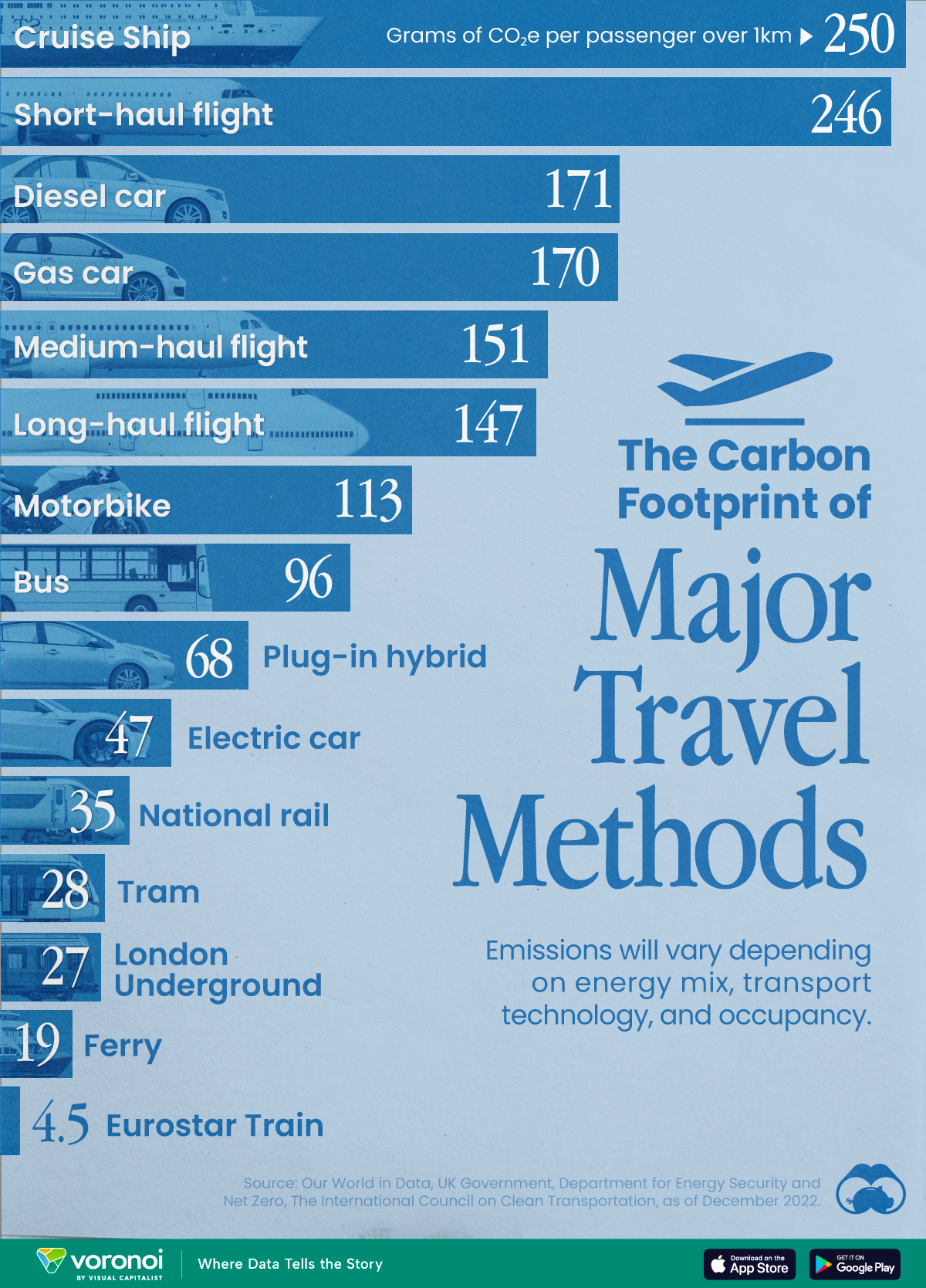
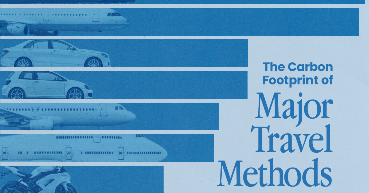
The Carbon Footprint of Major Travel Methods
Going on a cruise ship and flying domestically are the most carbon-intensive travel methods.
The Carbon Footprint of Major Travel Methods
This was originally posted on our Voronoi app. Download the app for free on iOS or Android and discover incredible data-driven charts from a variety of trusted sources.
Did you know that transport accounts for nearly one-quarter of global energy-related carbon dioxide (CO₂) emissions?
This graphic illustrates the carbon footprints of major travel methods measured in grams of carbon dioxide equivalent (CO₂e) emitted per person to travel one kilometer. This includes both CO₂ and other greenhouse gases.
Data is sourced from Our World in Data, the UK Government’s Department for Energy Security and Net Zero, and The International Council on Clean Transportation, as of December 2022.
These figures should be interpreted as approximations, rather than exact numbers. There are many variables at play that determine the actual carbon footprint in any individual case, including vehicle type or model, occupancy, energy mix, and even weather.
Cruise Ships are the Most Carbon-Intensive Travel Method
According to these estimates, taking a cruise ship, flying domestically, and driving alone are some of the most carbon-intensive travel methods.
Cruise ships typically use heavy fuel oil, which is high in carbon content. The average cruise ship weighs between 70,000 to 180,000 metric tons, meaning they require large engines to get moving.
These massive vessels must also generate power for onboard amenities such as lighting, air conditioning, and entertainment systems.
Short-haul flights are also considered carbon-intensive due to the significant amount of fuel consumed during initial takeoff and climbing altitude, relative to a lower amount of cruising.
| Transportation method | CO₂ equivalent emissions per passenger km |
|---|---|
| Cruise Ship | 250 |
| Short-haul flight (i.e. within a U.S. state or European country) | 246 |
| Diesel car | 171 |
| Gas car | 170 |
| Medium-haul flight (i.e. international travel within Europe, or between U.S. states) | 151 |
| Long-haul flight (over 3,700 km, about the distance from LA to NY) | 147 |
| Motorbike | 113 |
| Bus (average) | 96 |
| Plug-in hybrid | 68 |
| Electric car | 47 |
| National rail | 35 |
| Tram | 28 |
| London Underground | 27 |
| Ferry (foot passenger) | 19 |
| Eurostar (International rail) | 4.5 |
Are EVs Greener?
Many experts agree that EVs produce a lower carbon footprint over time versus traditional internal combustion engine (ICE) vehicles.
However, the batteries in electric vehicles charge on the power that comes straight off the electrical grid—which in many places may be powered by fossil fuels. For that reason, the carbon footprint of an EV will depend largely on the blend of electricity sources used for charging.
There are also questions about how energy-intensive it is to build EVs compared to a comparable ICE vehicle.

-

 Education1 week ago
How Hard Is It to Get Into an Ivy League School?
-

 Technology2 weeks ago
Ranked: Semiconductor Companies by Industry Revenue Share
-

 Markets2 weeks ago
Ranked: The World’s Top Flight Routes, by Revenue
-

 Demographics2 weeks ago
Population Projections: The World’s 6 Largest Countries in 2075
-

 Markets2 weeks ago
The Top 10 States by Real GDP Growth in 2023
-

 Demographics2 weeks ago
The Smallest Gender Wage Gaps in OECD Countries
-

 Economy2 weeks ago
Where U.S. Inflation Hit the Hardest in March 2024
-

 Green2 weeks ago
Top Countries By Forest Growth Since 2001