Green
Animated Chart: The World’s Top 15 Carbon Emitters (1850-2022)
Article/Editing:
The World’s Top 15 Carbon Emitters (1850-2022)
Carbon emissions worldwide have shifted over the past centuries. However, what remains consistent is that the biggest economies have been the major emitters since the 19th century.
This chart by James Eagle uses data from Our World in Data to show the 15 largest carbon dioxide (CO₂) emitters between 1850 and 2022.
U.S. the Top Emitter for Over 100 Years
As the pioneer of the Industrial Revolution, the United Kingdom spent most of the 19th century at the top of the carbon emissions ranking.
| Rank - 1850 | Emitter | CO2 (million tonnes) |
|---|---|---|
| 1 | 🇬🇧 United Kingdom | 122.4 |
| 2 | 🇺🇸 United States | 19.8 |
| 3 | 🇫🇷 France | 19.6 |
| 4 | 🇩🇪 Germany | 15.1 |
| 5 | 🇧🇪 Belgium | 9.3 |
| 6 | 🇵🇱 Poland | 3.2 |
In 1888, however, the United States surpassed the UK to become the largest emitter of carbon. The American Civil War was over, and the country saw significant infrastructure expansion while focusing on settling the West.
Interestingly, America’s CO₂ emissions back then were small compared to today’s: for example, California’s current emissions are more than the entire country’s in 1888.
Throughout the first five decades of the 20th century, the U.S., UK, and Germany dominated the top of the rankings.
In the 1950s, with the increase in merchant traffic, the shipping sector became one of the major contributors to carbon emissions. During the same period, with the expansion of the Soviet Union, Russia surpassed Germany to become the second-largest carbon emitter. China also rose to occupy the fourth place.
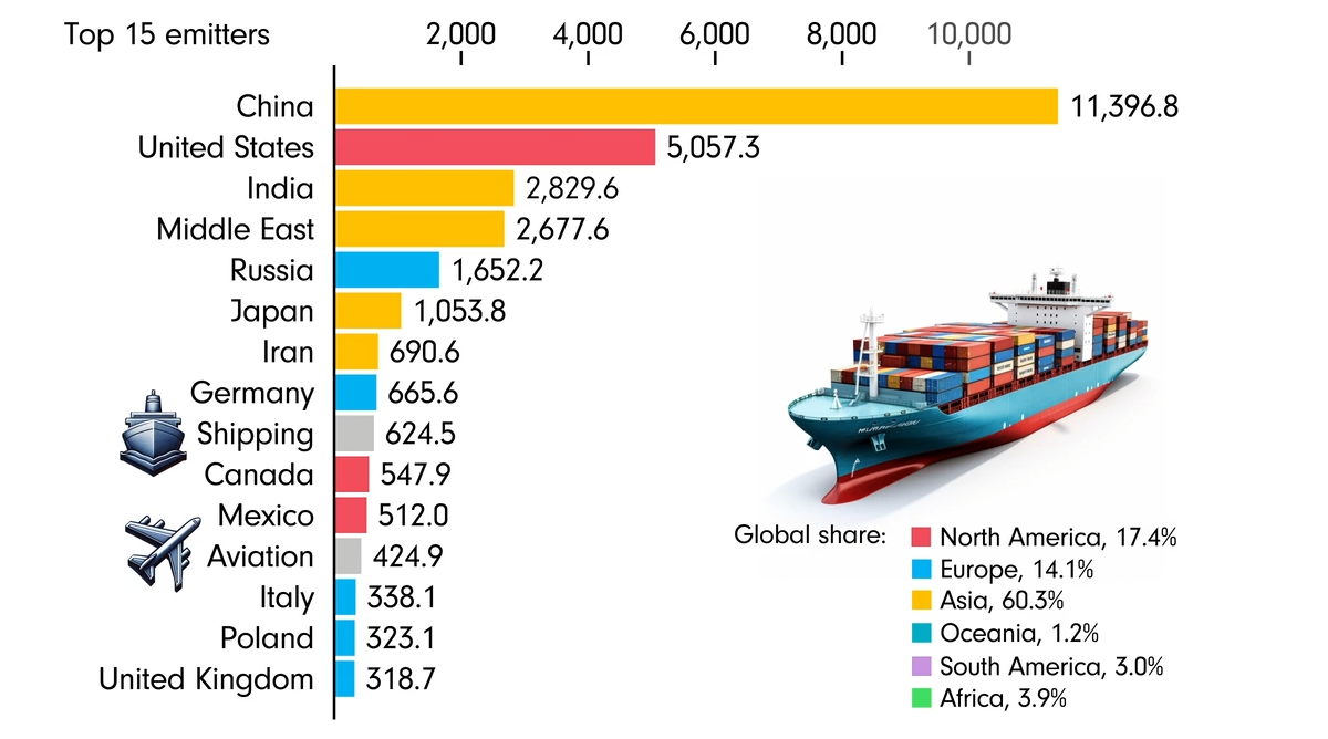
China Tops CO₂ Emissions Since 2006
In the 1990s, China saw carbon emissions soar due to industrial growth, while the Middle East saw them rise due to strong global oil demand.
In 2006, China surpassed the United States as the world’s largest emitter. The aviation sector also became one of the top 15 emitters in the same decade.
| Rank - 2022 | Emitter | CO2 (million tonnes) |
|---|---|---|
| 1 | 🇨🇳 China | 11,396.8 |
| 2 | 🇺🇸 United States | 5,057.3 |
| 3 | 🇮🇳 India | 2,829.6 |
| 4 | 🌍 Middle East | 2,677.6 |
| 5 | 🇷🇺 Russia | 1,652.2 |
| 6 | 🇯🇵 Japan | 1,053.8 |
| 7 | 🇮🇷 Iran | 690.6 |
| 8 | 🇩🇪 Germany | 665.6 |
| 9 | 🚢 Shipping | 624.5 |
| 10 | 🇨🇦 Canada | 547.9 |
| 11 | 🇲🇽 Mexico | 512.0 |
| 12 | ✈️ Aviation | 424.9 |
| 13 | 🇮🇹 Italy | 338.1 |
| 14 | 🇵🇱 Poland | 323.1 |
| 15 | 🇬🇧 United Kingdom | 318.7 |
Currently, the volume of Chinese carbon emissions is more than double that of the U.S. Historically, however, the U.S. has emitted more CO₂ in cumulative terms.

This article was published as a part of Visual Capitalist's Creator Program, which features data-driven visuals from some of our favorite Creators around the world.


Green
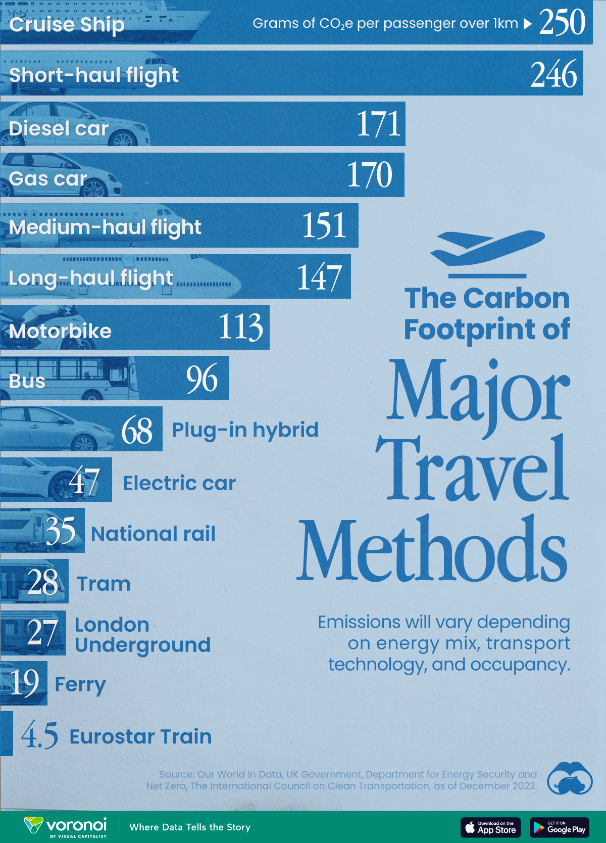
The Carbon Footprint of Major Travel Methods
Going on a cruise ship and flying domestically are the most carbon-intensive travel methods.

The Carbon Footprint of Major Travel Methods
This was originally posted on our Voronoi app. Download the app for free on iOS or Android and discover incredible data-driven charts from a variety of trusted sources.
Did you know that transport accounts for nearly one-quarter of global energy-related carbon dioxide (CO₂) emissions?
This graphic illustrates the carbon footprints of major travel methods measured in grams of carbon dioxide equivalent (CO₂e) emitted per person to travel one kilometer. This includes both CO₂ and other greenhouse gases.
Data is sourced from Our World in Data, the UK Government’s Department for Energy Security and Net Zero, and The International Council on Clean Transportation, as of December 2022.
These figures should be interpreted as approximations, rather than exact numbers. There are many variables at play that determine the actual carbon footprint in any individual case, including vehicle type or model, occupancy, energy mix, and even weather.
Cruise Ships are the Most Carbon-Intensive Travel Method
According to these estimates, taking a cruise ship, flying domestically, and driving alone are some of the most carbon-intensive travel methods.
Cruise ships typically use heavy fuel oil, which is high in carbon content. The average cruise ship weighs between 70,000 to 180,000 metric tons, meaning they require large engines to get moving.
These massive vessels must also generate power for onboard amenities such as lighting, air conditioning, and entertainment systems.
Short-haul flights are also considered carbon-intensive due to the significant amount of fuel consumed during initial takeoff and climbing altitude, relative to a lower amount of cruising.
| Transportation method | CO₂ equivalent emissions per passenger km |
|---|---|
| Cruise Ship | 250 |
| Short-haul flight (i.e. within a U.S. state or European country) | 246 |
| Diesel car | 171 |
| Gas car | 170 |
| Medium-haul flight (i.e. international travel within Europe, or between U.S. states) | 151 |
| Long-haul flight (over 3,700 km, about the distance from LA to NY) | 147 |
| Motorbike | 113 |
| Bus (average) | 96 |
| Plug-in hybrid | 68 |
| Electric car | 47 |
| National rail | 35 |
| Tram | 28 |
| London Underground | 27 |
| Ferry (foot passenger) | 19 |
| Eurostar (International rail) | 4.5 |
Are EVs Greener?
Many experts agree that EVs produce a lower carbon footprint over time versus traditional internal combustion engine (ICE) vehicles.
However, the batteries in electric vehicles charge on the power that comes straight off the electrical grid—which in many places may be powered by fossil fuels. For that reason, the carbon footprint of an EV will depend largely on the blend of electricity sources used for charging.
There are also questions about how energy-intensive it is to build EVs compared to a comparable ICE vehicle.

-

 Economy7 days ago
VC+: Get Our Key Takeaways From the IMF’s World Economic Outlook
-

 Maps2 weeks ago
The Largest Earthquakes in the New York Area (1970-2024)
-

 Green2 weeks ago
Ranked: The Countries With the Most Air Pollution in 2023
-

 Green2 weeks ago
Ranking the Top 15 Countries by Carbon Tax Revenue
-

 Markets2 weeks ago
U.S. Debt Interest Payments Reach $1 Trillion
-

 Mining2 weeks ago
Gold vs. S&P 500: Which Has Grown More Over Five Years?
-

 Energy2 weeks ago
The World’s Biggest Nuclear Energy Producers
-

 Misc2 weeks ago
How Hard Is It to Get Into an Ivy League School?