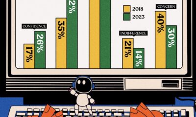

Opinions about using AI in the workplace have undergone a transformation from 2018, and so have the AI tools themselves.
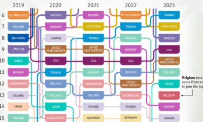

What are the most competitive countries when it comes to business? This visual highlights the top 20 economies over the last five years.
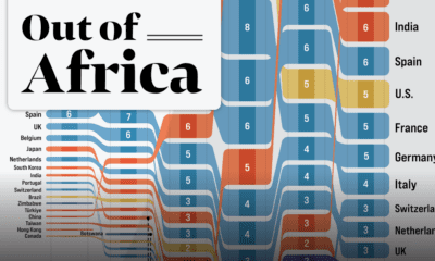

In 2020 the African continent exported nearly $378 billion worth of goods. Here are the top destinations for 25 years of Africa’s exports.
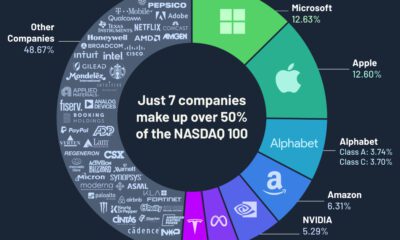

Just seven companies make up over 50% of the Nasdaq 100 by weight, and most of them are from the technology sector.

Which states and industries in the U.S. pay a good internship salary? Which pay the worst, or none at all?
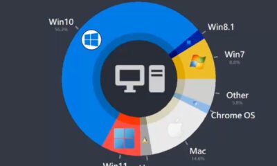

This animated chart that tracks market share of the most popular desktop operating systems between 2003 and 2022.

What are the world's top countries by GDP per capita? How do those rankings change when we adjust for purchasing power parity?
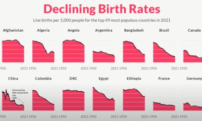

For the last 70 years, birth rates for the 49 most populous countries of the world have fallen sharply, heralding an uncertain future.
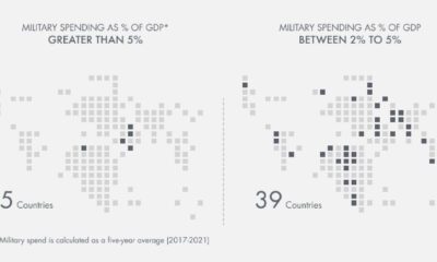

Which countries have the highest military spend relative to their economy? This visual breaks down the amount spent in each country by GDP.
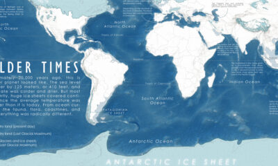

A map of the Earth 20,000 years ago, at the peak of the last ice age, when colder temperatures transformed the planet we know so well.
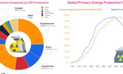

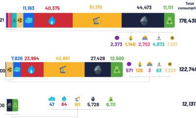
These visuals highlight the uranium mining industry and its output, as well as the trajectory of nuclear energy from 1960 to today.
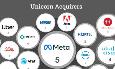

Roughly 30% of unicorns making an exit get acquired. But which companies have made the most U.S. unicorn acquisitions in the last 25 years?
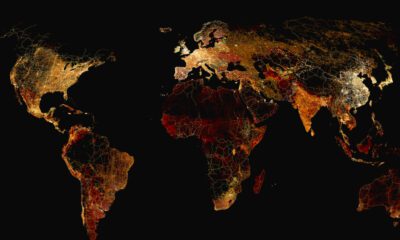

What does a road map of the world look like? Here’s a deep view of roads visualized by type across countries and continents.
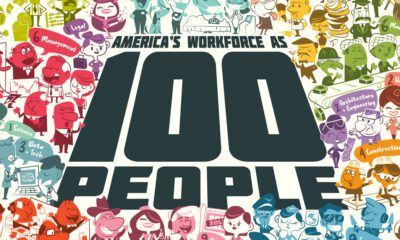

Reimagining all 200 million of the American workforce as 100 people: where do they all work, what positions they hold, and what jobs they do?
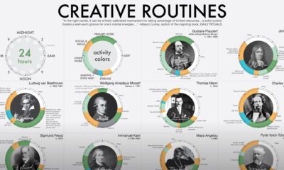

The daily routines of 16 famous creatives—poets, thinkers, scientists and even politicians—are charted for comparison with each other.
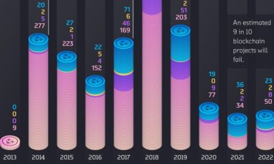

We visualize over 2,000 crypto failures by year of death, and year of project origin. See how and why crypto projects die in these charts.
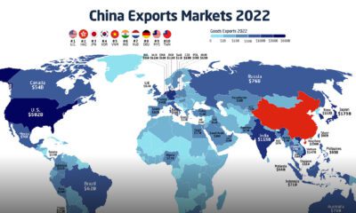

In 2022, China exported $3.6 trillion of goods, more than the GDP of the UK or India. Here's how Chinese exports have evolved since 2001.
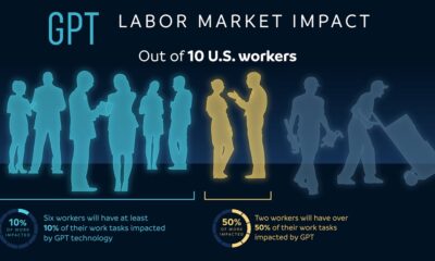

OpenAI, the creators of ChatGPT, have authored a research paper that tries to predict the impact of AI on the job market.
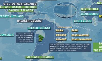

This massive map highlights overseas territories and dependencies around the world and their sovereign states.
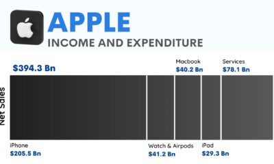

How does the world's largest tech company make its billions? This graphic charts Apple's profit in 2022 totaling $100 billion.
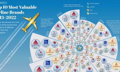

Airline brands have seen big up and down swings in valuation as of late. See how the 10 largest brand have changed from 2013 to 2022.
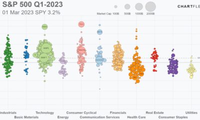

Track the S&P 500’s performance in 2023, including all 500 companies, and the sectors they belong to, in this animated video.


In this graphic we explore the world’s declining fertility rate over the last 60 years and the disparity in fertility rates between nations
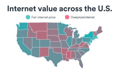

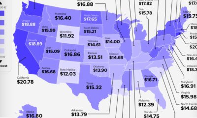
Which U.S. state has the best internet value? Browse this interactive map to see where states rank on the Internet Value Index.
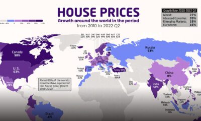

Which countries have seen the biggest spikes in housing prices? These maps show the change in real and nominal housing prices since 2010.
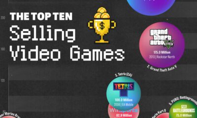

This chart shows the top ten best selling video games, ranked by software units sold. Six of them have been released in the last 12 years.
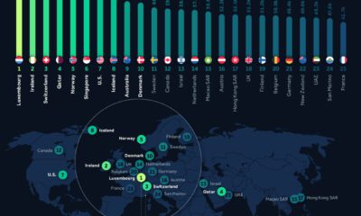

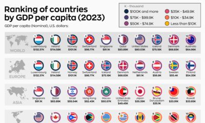
Analyzing 2023 per capita GDP numbers from the International Monetary Fund lets us know where the richest countries in the world are.
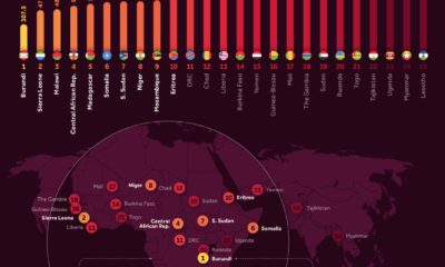

Analyzing 2023 per capita GDP numbers from the International Monetary Fund lets us know where the poorest countries are.
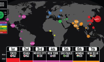

Where were the largest cities in the world throughout history? This video details the rise (and fall) of the largest cities by population from 3,000 BCE.

Despite the advent of renewable sources of energy, fossil fuels and their carbon emissions, haven’t gone anywhere.
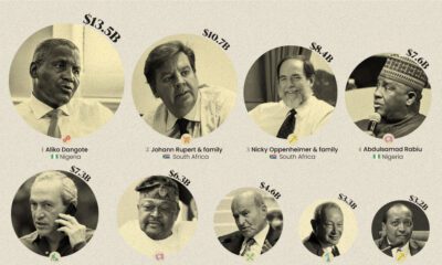

This infographic ranks the wealthiest 15 billionaires on the African continent.
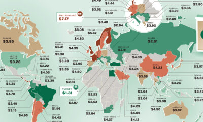

Where would you find the most and least expensive Starbucks coffee? These maps show the price of a Tall Latte in every country.
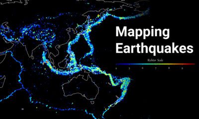

Where do the world's major earthquakes happen? This map highlights the epicenters of earthquakes on record between 1956 and 2022.


After the latest Grammy Awards, which artist claims the crown for most wins? This graphic shows the artists with the most Grammys as of 2023.
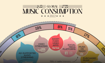

How do people around the world consume their music, and how are these consumption habits changing as technology evolves?
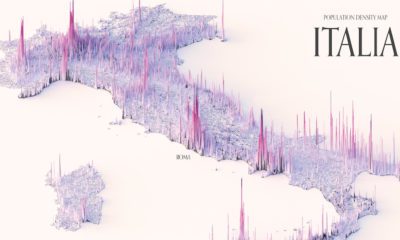

These maps show the population density of several countries, using 3D spikes to denote where more people live.
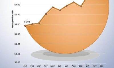

This chart shows the increase in the national average price of a dozen Grade A eggs in the U.S. in 2022.
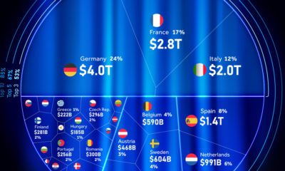

This chart shows the contributors to the EU economy through a percentage-wise distribution of country-level GDP.
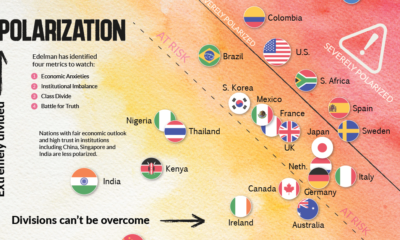

This chart plots polarization for various countries based on the Edelman Trust Institute's annual survey of 32,000+ people.


 Creator Program