population
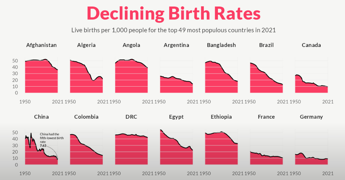
Charted: The Rapid Decline of Global Birth Rates
Article/Editing:
Charted: The Rapid Decline in Global Birth Rates
In 1798, British economist Thomas Malthus proposed a groundbreaking theory now known as the “Malthusian Trap”—suggesting that human population growth is exponential and thus would outpace the linear growth of resources such as food supply.
He worried that this runaway population growth would become unsustainable, eventually relying on sudden shock events—wars, disasters, famines—to reset the population to more sustainable levels. And over the next 200 years, the world population skyrocketed from 1 billion to 8 billion people on the planet.
However, as it turns out, no such shock events were required to turn the tide of population growth. Instead, it’s been rapidly declining birth rates across the world that seem to be leading to an unthinkable outcome for Malthus: a gradually plateauing or even shrinking global population.
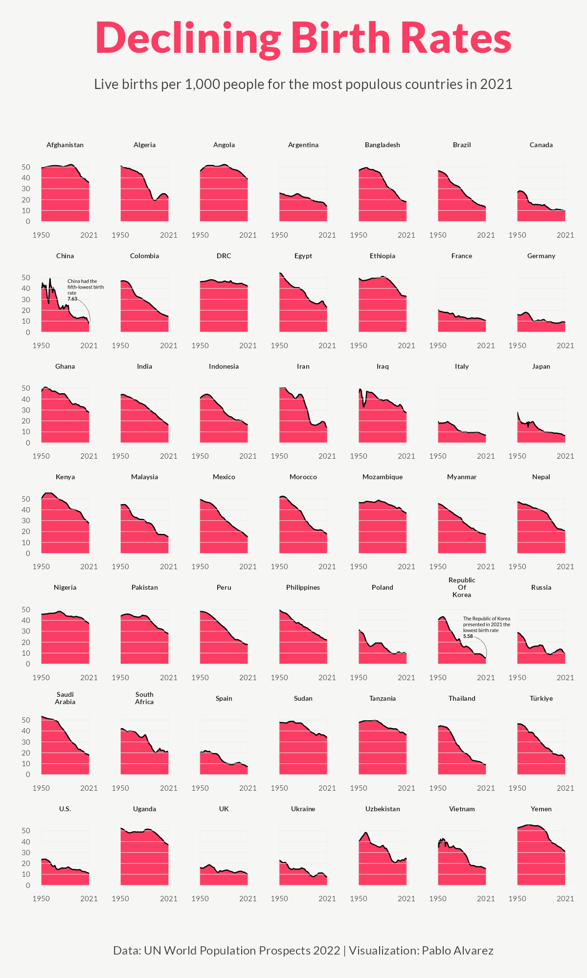
In the visualization above, Pablo Alvarez has visualized the crude birth rate for the 49 most populous countries of the world in 2021, using data from the UN’s World Population Prospects 2022 to examine changes since 1950.
Understanding Birth Rates vs Fertility Rates
Birth rates are commonly measured using a metric called the “crude birth rate” (CBR), which represents the number of live births per 1,000 individuals in a given population during a specific period—usually one year.
The measured decline in CBR is also a result of plummeting fertility rates across the globe. Not to be confused with birth rates, fertility rates measure how many children a woman will have over the course of her lifetime.
While a country’s birth rate is directly impacted by the fertility rate, it also takes into account other factors: population size, age structure of the population, access to contraception, cultural norms, government policies, and socioeconomic conditions.
Birth Rates of the Most Populated Countries
Here’s a snapshot of the CBR for the 49 most populous countries of the world at different years from 1950 to 2021.
| Country | 1950 | 1990 | 2021 | % Change (1950-2021) |
|---|---|---|---|---|
| 🇦🇫 Afghanistan | 48.87 | 51.42 | 35.84 | -27% |
| 🇩🇿 Algeria | 51.05 | 30.76 | 21.52 | -58% |
| 🇦🇴 Angola | 46.15 | 51.34 | 38.81 | -16% |
| 🇦🇷 Argentina | 26.00 | 21.99 | 13.90 | -47% |
| 🇧🇩 Bangladesh | 46.52 | 34.97 | 17.82 | -62% |
| 🇧🇷 Brazil | 46.43 | 24.84 | 12.88 | -72% |
| 🇨🇦 Canada | 26.80 | 15.46 | 9.82 | -63% |
| 🇨🇳 China | 41.05 | 24.44 | 7.63 | -81% |
| 🇨🇴 Colombia | 46.74 | 27.37 | 14.20 | -70% |
| 🇨🇩 DRC | 46.02 | 46.01 | 42.05 | -9% |
| 🇪🇬 Egypt | 54.20 | 33.21 | 22.56 | -58% |
| 🇪🇹 Ethiopia | 49.40 | 50.05 | 32.38 | -34% |
| 🇫🇷 France | 20.77 | 13.34 | 10.50 | -49% |
| 🇩🇪 Germany | 16.22 | 11.30 | 9.17 | -43% |
| 🇬🇭 Ghana | 46.76 | 40.37 | 27.55 | -41% |
| 🇮🇳 India | 43.84 | 31.82 | 16.42 | -63% |
| 🇮🇩 Indonesia | 40.64 | 25.52 | 16.42 | -60% |
| 🇮🇷 Iran | 50.14 | 32.46 | 13.70 | -73% |
| 🇮🇶 Iraq | 45.73 | 39.41 | 27.37 | -40% |
| 🇮🇹 Italy | 19.70 | 10.01 | 6.93 | -65% |
| 🇯🇵 Japan | 28.34 | 9.91 | 6.57 | -77% |
| 🇰🇪 Kenya | 49.47 | 43.52 | 27.68 | -44% |
| 🇲🇾 Malaysia | 44.31 | 27.89 | 15.24 | -66% |
| 🇲🇽 Mexico | 49.31 | 29.30 | 14.86 | -70% |
| 🇲🇦 Morocco | 51.08 | 29.23 | 17.55 | -66% |
| 🇲🇿 Mozambique | 46.66 | 46.38 | 36.60 | -22% |
| 🇲🇲 Myanmar | 45.58 | 27.48 | 17.10 | -62% |
| 🇳🇵 Nepal | 47.06 | 38.11 | 20.40 | -57% |
| 🇳🇬 Nigeria | 45.61 | 43.79 | 37.12 | -19% |
| 🇵🇰 Pakistan | 43.72 | 43.15 | 27.52 | -37% |
| 🇵🇪 Peru | 48.16 | 30.90 | 17.62 | -63% |
| 🇵🇭 Philippines | 49.84 | 33.26 | 21.81 | -56% |
| 🇵🇱 Poland | 30.85 | 14.28 | 9.49 | -69% |
| 🇷🇺 Russia | 28.80 | 13.52 | 9.64 | -67% |
| 🇸🇦 Saudi Arabia | 53.34 | 34.41 | 17.47 | -67% |
| 🇿🇦 South Africa | 41.65 | 31.15 | 19.82 | -52% |
| 🇰🇷 South Korea | 40.03 | 15.69 | 5.58 | -86% |
| 🇪🇸 Spain | 20.01 | 10.30 | 7.55 | -62% |
| 🇸🇩 Sudan | 47.75 | 43.09 | 33.60 | -30% |
| 🇹🇿 Tanzania | 47.75 | 43.78 | 36.21 | -24% |
| 🇹🇭 Thailand | 43.84 | 19.73 | 9.00 | -79% |
| 🇹🇷 Türkiye | 46.39 | 25.87 | 14.68 | -68% |
| 🇺🇸 U.S. | 22.81 | 16.73 | 11.06 | -52% |
| 🇺🇬 Uganda | 52.42 | 51.37 | 36.80 | -30% |
| 🇬🇧 UK | 16.44 | 13.88 | 10.08 | -39% |
| 🇺🇦 Ukraine | 22.95 | 12.76 | 7.72 | -66% |
| 🇺🇿 Uzbekistan | 39.85 | 33.98 | 23.55 | -41% |
| 🇻🇳 Vietnam | 38.82 | 28.51 | 15.01 | -61% |
| 🇾🇪 Yemen | 52.59 | 50.64 | 30.54 | -42% |
Every country on the list has seen a decline in birth rates in the last 70 years, with some declines more staggering than others. For example, China recorded 41 births per 1,000 people in 1950. By 2021, that number had fallen to just 7.6, a 81% decrease.
South Korea, the 29th most populous country in the world in 2021, saw an even larger 86% drop in its birth rate since 1950. In fact, almost every single country in this dataset has seen a double-digit fall in their birth rates over the past 70 years. Only the Democratic Republic of Congo has seen a single-digit percentage decline between 1950 and 2021.
Why are Global Birth Rates Falling?
For the 49 most populated countries in 2021, birth rates have halved on average in the last 70 years:
| 49 Most Populated Countries | 1950 | 1990 | 2021 |
|---|---|---|---|
| Average Birth Rate | 40.99 | 30.18 | 19.50 |
| Median Birth Rate | 45.73 | 30.76 | 17.10 |
But while the thought of a shrinking world population may seem worrisome, declining birth rates are generally thought of as a triumph of rapid socio-economic development.
As countries progress and living standards improve, there is a shift in societal norms and aspirations. For example, expanded education and career opportunities for women allow the pursuit of professional growth and personal goals, with some women choosing to delay starting a family or having smaller families.
Growing urbanization is another key driver of declining birth rates, characterized by smaller living spaces, increased focus on careers, and limited support networks. Another is the growing access to family planning services and contraceptives, particularly since the 1970s.
What are the Future Consequences?
The biggest consequence of declining birth rates—and one that is already being seen in many parts of the world—is a rapidly aging population.
With fewer children being born, the proportion of elderly individuals increases relative to the working-age population. This demographic imbalance poses challenges for social welfare systems, healthcare, and pension schemes.
Declining birth rates can also impact the labor market and economic productivity. A smaller workforce may lead to labor shortages, skill gaps, and reduced innovation. And shrinking populations reduce consumer demand, a cornerstone of the global economy, which may trigger a restructure of the current growth model of development.

This article was published as a part of Visual Capitalist's Creator Program, which features data-driven visuals from some of our favorite Creators around the world.


population
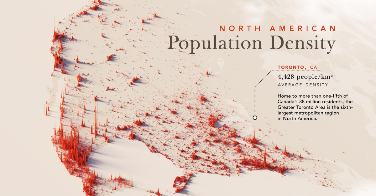
Mapped: North America Population Patterns by Density
Nearly half a billion people live on the third-largest continent. We take a closer look in this population map of North America.
Mapped: North America Population Patterns by Density
This was originally posted on our Voronoi app. Download the app for free on iOS or Android and discover incredible data-driven charts from a variety of trusted sources.
From the icy expanses of the Arctic to the warm Caribbean sea, the North American continent covers nearly 25 million square kilometers, or about 15% of the Earth’s land area. Populating this vast region are nearly half a billion people, spread out from coast to valley, along the edges of arid scrublands and rainforests.
We visualize a map of North America population patterns, including Central America and the Caribbean, with spikes illustrating densely populated areas.
Data for this map is sourced from Statistics Canada, the World Bank, and WorldPop—a research group based out of the University of Southampton that tracks population growth and movement across the globe.
Ranked: Countries and Territories by Population Density
Deep in the Atlantic, seen as a small dot near Haiti on the map, the island state of Bermuda is the most densely populated jurisdiction on the continent. Measuring just 53 km² in area, and home to 65,000 people, results in an average population density of 1,266 people per km².
Also in the Caribbean, Barbados ranks second with an average population density 642 people/km², followed by Aruba, ranked third-highest at 550 people/km².
| Rank | Country/Territory | Average Population Density (per km²) | Area (km²) |
|---|---|---|---|
| 1 | 🇧🇲 Bermuda | 1,226 | 53 |
| 2 | 🇧🇧 Barbados | 642 | 439 |
| 3 | 🇦🇼 Aruba | 550 | 193 |
| 4 | 🇭🇹 Haiti | 423 | 27,750 |
| 5 | 🇵🇷 Puerto Rico | 360 | 8,897 |
| 6 | 🇲🇶 Martinique | 325 | 1,130 |
| 7 | 🇸🇻 El Salvador | 303 | 21,040 |
| 8 | 🇱🇨 Saint Lucia | 292 | 617 |
| 9 | 🇻🇮 Virgin Islands | 285 | 346 |
| 10 | 🇻🇨 Saint Vincent & the Grenadines | 267 | 389 |
| 11 | 🇯🇲 Jamaica | 257 | 10,992 |
| 12 | 🇬🇵 Guadeloupe | 252 | 1,628 |
| 13 | 🇩🇴 Dominican Republic | 234 | 48,442 |
| 14 | 🇧🇶 Netherlands Antilles | 229 | 800 |
| 15 | 🇹🇹 Trinidad & Tobago | 212 | 5,128 |
| 16 | 🇦🇬 Antigua & Barbuda | 214 | 440 |
| 17 | 🇻🇬 British Virgin Islands | 206 | 153 |
| 18 | 🇰🇳 Saint Kitts & Nevis | 176 | 269 |
| 19 | 🇦🇮 Anguilla | 175 | 91 |
| 20 | 🇰🇾 Cayman Islands | 168 | 264 |
| 21 | 🇬🇹 Guatemala | 165 | 108,889 |
| 22 | 🇨🇷 Costa Rica | 101 | 51,100 |
| 23 | 🇨🇺 Cuba | 102 | 109,884 |
| 24 | 🇭🇳 Honduras | 94 | 112,492 |
| 25 | 🇩🇲 Dominica | 91 | 750 |
| 26 | 🇲🇸 Montserrat | 91 | 103 |
| 27 | 🇹🇨 Turks & Caicos Islands | 75 | 616 |
| 28 | 🇲🇽 Mexico | 65 | 1,972,550 |
| 29 | 🇵🇦 Panama | 60 | 74,177 |
| 30 | 🇳🇮 Nicaragua | 54 | 130,370 |
| 31 | 🇺🇸 U.S. | 35 | 9,834,000 |
| 32 | 🇧🇸 The Bahamas | 29 | 13,880 |
| 33 | 🇵🇲 Saint-Pierre & Miquelon | 24 | 242 |
| 34 | 🇧🇿 Belize | 17 | 22,966 |
| 35 | 🇨🇦 Canada | 4 | 9,984,670 |
| 36 | 🇬🇱 Greenland | 0 | 2,166,086 |
| 37 | 🇺🇸 Navassa Island | 0 | 5 |
Naturally the largest countries on the continent—Canada, the U.S., and Mexico—have some of the lowest average population densities compared to other nations in the region.
However, thanks to their size, their overall population distribution is more apparent on a map of this scale. In Canada, the Greater Toronto Area is home to one-fifth the country’s entire population. In stark contrast, the rest of the country seems almost empty—averaging just 4 people/km².
Major U.S. cities—New York, Chicago, and San Francisco—also stand out, though the more regular dispersion of Americans, particularly in the Northeast, South, and Midwest can also be seen.
Interestingly, Monterrey in Mexico jumps out on the map; the city is built at the foot of Cerro de la Silla, and several districts are densely populated as a result.
Ranked: Continents by Population Density
How does North America compare to the other continents by population density?
Unsurprisingly, thanks to its large land area, as well as comparatively smaller population, North America is one of the least densely populated continents in the world, beaten only by Oceania, which averages 5 people/km², and Antarctica.
| Rank | Continent | Average Population Density (per/km²) |
|---|---|---|
| 1 | Asia | 149 |
| 2 | Africa | 49 |
| 3 | Europe | 32 |
| 4 | South America | 25 |
| 5 | North America | 25 |
| 6 | Oceania | 5 |
| 7 | Antarctica | 0 |
Source: World Population Review.
In comparison, Asia, while being the largest continent, is also home to 60% of the global population, and averages 149 people/km².

-

 Science1 week ago
Visualizing the Average Lifespans of Mammals
-

 Markets2 weeks ago
The Top 10 States by Real GDP Growth in 2023
-

 Demographics2 weeks ago
The Smallest Gender Wage Gaps in OECD Countries
-

 United States2 weeks ago
Where U.S. Inflation Hit the Hardest in March 2024
-

 Green2 weeks ago
Top Countries By Forest Growth Since 2001
-

 United States2 weeks ago
Ranked: The Largest U.S. Corporations by Number of Employees
-

 Maps2 weeks ago
The Largest Earthquakes in the New York Area (1970-2024)
-

 Green2 weeks ago
Ranked: The Countries With the Most Air Pollution in 2023