

A sneak preview of the exclusive VC+ Special Dispatch—your shortcut to understanding IMF's World Economic Outlook report.


Asia dominates this ranking of the world's largest EV battery manufacturers in 2023.


While smaller animals such as weasels typically live 1-2 years, larger counterparts can thrive for decades.


We detail the admission rates and average annual cost for Ivy League schools, as well as the median SAT scores required to be accepted.


The earthquake that shook buildings across New York in April 2024 was the third-largest quake in the Northeast U.S. over the past 50 years.


In this graphic, we show the highest earning flight routes globally as air travel continued to rebound in 2023.


We compiled the performance of 10 pure play EV stocks into one chart, revealing one company that bucked the broader trend.
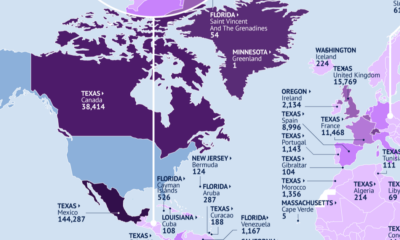

This map identifies the biggest U.S. export markets by state, showing the top partner of each country by value of goods imported.


In this map, we visualize average hourly wages across a variety of European countries, based on data from Eurostat.


Tesla and BYD have once again swapped places as the global leader in BEV sales.


 Creator Program