

A sneak preview of the exclusive VC+ Special Dispatch—your shortcut to understanding IMF's World Economic Outlook report.
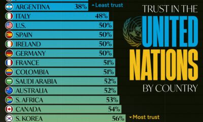

Which countries trust the United Nations to do the right thing the most, and the least?
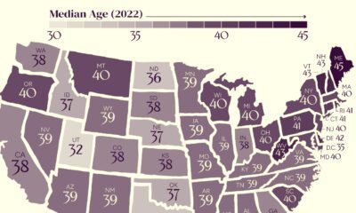

The U.S. might have a median age of 39, but the median age by state ranges from the low 30s to the mid 40s.


From someone born in the 19th century, in the midst of historic population growth, comes this vintage visualization showing world cities growing ever bigger.
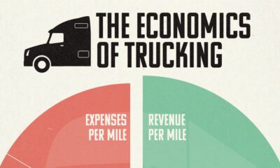

Trucking companies have narrow margins given high costs of labor and fuel. Here's how their revenue and expenses break down.
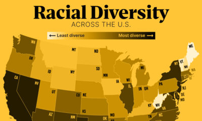

In this graphic, we show the most diverse states in the U.S. based on the Census Bureau's Diversity Index.
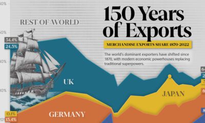

Today, China dominates the trade market, accounting for almost 15% of all merchandise.
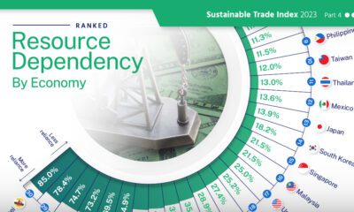

High resource dependency in trade makes countries more susceptible to market fluctuations and climate change.


Commercial jet purchases boomed in 2023. Here are the top airlines that ordered aircraft amid surging travel demand last year.


To offer perspective on the population of U.S. states, this map compares them to countries that share similar population sizes.
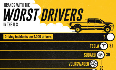

Analyzing a year's worth of insurance quotes for driving incidents (including accidents, DUIs, speeding tickets, and other citations) to find America's worst drivers, and the cars...


 Creator Program