

The country with the most forest loss since 2001 lost as much forest cover as the next four countries combined.


While many inspiring teachings exist about attaining individual happiness, it's worthwhile to consider how happy entire countries are on a collective scale.


In this visualization, we map the populations of major regions at three different points in time: 1900, 2000, and 2050 (forecasted).


The top three economic powerhouses of Africa contribute more than one-third to the African economy. We rank the nations of the world's second-largest continent by 2024...
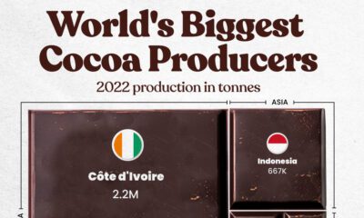

Here are the largest cocoa producing countries globally—from Côte d'Ivoire to Brazil—as cocoa prices hit record highs.
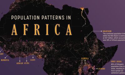

We map out Africa’s population density, spotlighting the continent’s most populous countries and cities.
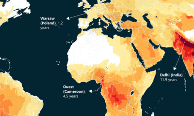

This world map of life expectancy gains shows how much longer people could potentially live by reducing pollution.
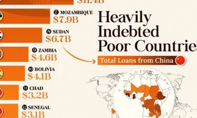

This infographic lists countries in Africa and other developing regions that received billions in loans from China.
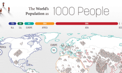

How would all the people in the world be spread out if there were only 1,000 people on Earth? This interactive map examines the breakdown.
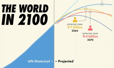

Population projections from the UN suggest that there will be over 10 billion people by 2060, though other organizations disagree.


 Creator Program