

We visualize Asia’s population patterns to see where 4.6 billion people, or two-thirds of the world’s population, actually live.


While many inspiring teachings exist about attaining individual happiness, it's worthwhile to consider how happy entire countries are on a collective scale.


Japan’s birth rate has been declining. Here, we illustrate the number of live births each year compared to the number of annual deaths.


In this visualization, we map the populations of major regions at three different points in time: 1900, 2000, and 2050 (forecasted).


See all of the world's water in one chart, as well as which regions will suffer the greatest from water scarcity.
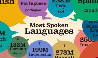

Here are the top languages spoken in the world by number of speakers in 2023.
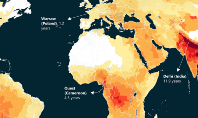

This world map of life expectancy gains shows how much longer people could potentially live by reducing pollution.
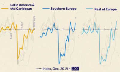

We visualize monthly foreign visitor arrivals, indexed to December 2019, indicating global tourism has all but recovered from COVID-19 disruptions.
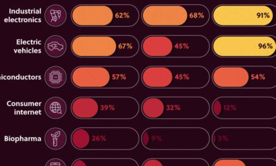

We look at the share of Asian companies in the top 3,000 global firms—measured by market capitalization in 2020—broken down by industry.
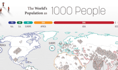

How would all the people in the world be spread out if there were only 1,000 people on Earth? This interactive map examines the breakdown.


 Creator Program