

While many inspiring teachings exist about attaining individual happiness, it's worthwhile to consider how happy entire countries are on a collective scale.


Will the global economy be stronger in 2024 than in 2023?
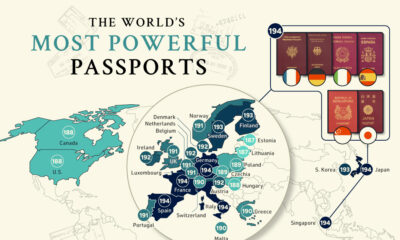

The most powerful passports have changed over the last decade, driven by political and economic factors. Here are the top 30 worldwide.
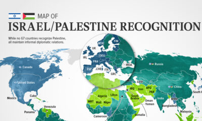

In this visualization, we look at how international recognition of Israel and Palestine breaks down among the 193 UN member states.
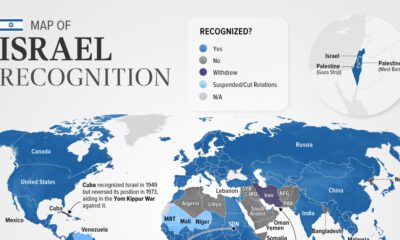

Belize is the latest country to suspend relations with Israel as of November. In this graphic we map the recognition of Israel by country.
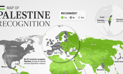

As of November 2023, 138 of the 193 UN members recognized Palestine. This map shows the recognition of the State of Palestine by country.
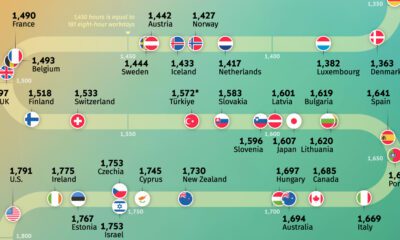

Where do people work the most? Explore our analysis of the average annual working hours across OECD countries.
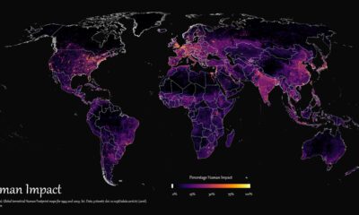

How far has humanity spread, and where haven't we gone? This graphic maps the extent of humanity’s impact on the world from 1993 to 2009.
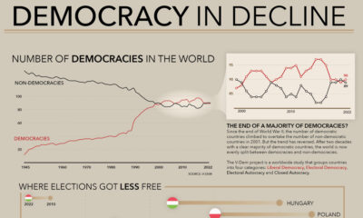

How many democracies does the world have? This visual shows the change since 1945 and the top nations becoming more (and less) democratic.
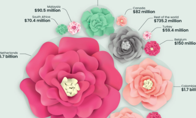

This graphic highlights global flower bouquet sales in 2021 and how a few countries dominate the entire flower export market.


 Creator Program