Business
Visualizing Annual Working Hours in OECD Countries
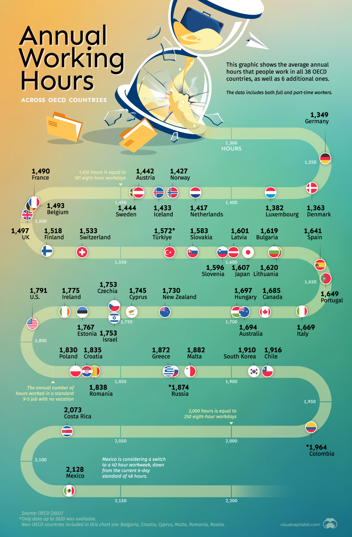


Visualizing Annual Working Hours in OECD Countries
Comparing the number of hours people work in different countries can provide insight into cultural work norms, economic productivity, and even labor laws.
With this in mind, we’ve ranked OECD countries (plus a few others) based on their average annual hours worked. Note that this data includes both full-time and part-time workers.
Data and Highlights
The data we sourced from OECD is listed in the table below. All figures are as of 2021 (latest available), with the exception of Colombia, Russia, and Türkiye which are as of 2020.
| Country | Average annual hours worked |
|---|---|
| 🇲🇽 Mexico | 2,128 |
| 🇨🇷 Costa Rica | 2,073 |
| 🇨🇴 Colombia | 1,964 |
| 🇨🇱 Chile | 1,916 |
| 🇰🇷 South Korea | 1,910 |
| 🇲🇹 Malta* | 1,882 |
| 🇷🇺 Russia* | 1,874 |
| 🇬🇷 Greece | 1,872 |
| 🇷🇴 Romania* | 1,838 |
| 🇭🇷 Croatia* | 1,835 |
| 🇵🇱 Poland | 1,830 |
| 🇺🇸 United States | 1,791 |
| 🇮🇪 Ireland | 1,775 |
| 🇪🇪 Estonia | 1,767 |
| 🇨🇿 Czech Republic | 1,753 |
| 🇮🇱 Israel | 1,753 |
| 🇨🇾 Cyprus* | 1,745 |
| 🇳🇿 New Zealand | 1,730 |
| 🌐 OECD average | 1,716 |
| 🇭🇺 Hungary | 1,697 |
| 🇦🇺 Australia | 1,694 |
| 🇨🇦 Canada | 1,685 |
| 🇮🇹 Italy | 1,669 |
| 🇵🇹 Portugal | 1,649 |
| 🇪🇸 Spain | 1,641 |
| 🇱🇹 Lithuania | 1,620 |
| 🇧🇬 Bulgaria* | 1,619 |
| 🇯🇵 Japan | 1,607 |
| 🇱🇻 Latvia | 1,601 |
| 🇸🇮 Slovenia | 1,596 |
| 🇸🇰 Slovakia | 1,583 |
| 🇹🇷 Türkiye | 1,572 |
| 🇨🇭 Switzerland | 1,533 |
| 🇫🇮 Finland | 1,518 |
| 🇬🇧 United Kingdom | 1,497 |
| 🇧🇪 Belgium | 1,493 |
| 🇫🇷 France | 1,490 |
| 🇸🇪 Sweden | 1,444 |
| 🇦🇹 Austria | 1,442 |
| 🇮🇸 Iceland | 1,433 |
| 🇳🇴 Norway | 1,427 |
| 🇳🇱 Netherlands | 1,417 |
| 🇱🇺 Luxembourg | 1,382 |
| 🇩🇰 Denmark | 1,363 |
| 🇩🇪 Germany | 1,349 |
*Non-OECD country
At the top is Mexico, where the average worker clocks over 2,000 hours per year. This reflects the country’s labor dynamics, which typically involves a six-day workweek. For context, 2,128 hours is equal to 266 eight-hour workdays.
The only other country to surpass 2,000 annual hours worked per worker is Costa Rica, which frequently tops the World Economic Forum’s Happy Planet Index (HPI). The HPI is a measure of wellbeing, life expectancy, and ecological footprint.
Looking at the other end of the list, the two countries that work the fewest hours are Germany and Denmark. This is reflective of the strong labor laws in these countries as well as their emphasis on work-life balance.
For example, the German Working Hours Act (Arbeitszeitgesetz) states that daily hours of work may not exceed eight hours. Days can be extended to 10 hours, but only if it averages out to eight hours per working day over a six-month period.
Working fewer hours doesn’t mean that a country is becoming less productive, though. Germany is known for its high value industries like automotive and pharmaceuticals, where robotics and other technologies can greatly enhance productivity.
This is supported by GDP per capita, in which Germany has grown substantially since 2000.
Limitations of this Data
A limitation of this dataset is that it aggregates both full-time and part-time workers. This means that in a country like Japan, where almost 40% of the workforce is non-regular (part-time, contract, etc.), the average figure could be skewed downwards.
Japan is known for its grueling office culture, and it’s likely that many workers are logging significantly more hours than the 1,607 figure reported.
If you enjoy comparisons like these, consider taking a look at our ranking of cities with the best work-life balance.


Brands
How Tech Logos Have Evolved Over Time
From complete overhauls to more subtle tweaks, these tech logos have had quite a journey. Featuring: Google, Apple, and more.


How Tech Logos Have Evolved Over Time
This was originally posted on our Voronoi app. Download the app for free on iOS or Android and discover incredible data-driven charts from a variety of trusted sources.
One would be hard-pressed to find a company that has never changed its logo. Granted, some brands—like Rolex, IBM, and Coca-Cola—tend to just have more minimalistic updates. But other companies undergo an entire identity change, thus necessitating a full overhaul.
In this graphic, we visualized the evolution of prominent tech companies’ logos over time. All of these brands ranked highly in a Q1 2024 YouGov study of America’s most famous tech brands. The logo changes are sourced from 1000logos.net.
How Many Times Has Google Changed Its Logo?
Google and Facebook share a 98% fame rating according to YouGov. But while Facebook’s rise was captured in The Social Network (2010), Google’s history tends to be a little less lionized in popular culture.
For example, Google was initially called “Backrub” because it analyzed “back links” to understand how important a website was. Since its founding, Google has undergone eight logo changes, finally settling on its current one in 2015.
| Company | Number of Logo Changes |
|---|---|
| 8 | |
| HP | 8 |
| Amazon | 6 |
| Microsoft | 6 |
| Samsung | 6 |
| Apple | 5* |
Note: *Includes color changes. Source: 1000Logos.net
Another fun origin story is Microsoft, which started off as Traf-O-Data, a traffic counter reading company that generated reports for traffic engineers. By 1975, the company was renamed. But it wasn’t until 2012 that Microsoft put the iconic Windows logo—still the most popular desktop operating system—alongside its name.
And then there’s Samsung, which started as a grocery trading store in 1938. Its pivot to electronics started in the 1970s with black and white television sets. For 55 years, the company kept some form of stars from its first logo, until 1993, when the iconic encircled blue Samsung logo debuted.
Finally, Apple’s first logo in 1976 featured Isaac Newton reading under a tree—moments before an apple fell on his head. Two years later, the iconic bitten apple logo would be designed at Steve Jobs’ behest, and it would take another two decades for it to go monochrome.

-

 Debt1 week ago
How Debt-to-GDP Ratios Have Changed Since 2000
-

 Markets2 weeks ago
Ranked: The World’s Top Flight Routes, by Revenue
-

 Countries2 weeks ago
Population Projections: The World’s 6 Largest Countries in 2075
-

 Markets2 weeks ago
The Top 10 States by Real GDP Growth in 2023
-

 Demographics2 weeks ago
The Smallest Gender Wage Gaps in OECD Countries
-

 United States2 weeks ago
Where U.S. Inflation Hit the Hardest in March 2024
-

 Green2 weeks ago
Top Countries By Forest Growth Since 2001
-

 United States2 weeks ago
Ranked: The Largest U.S. Corporations by Number of Employees