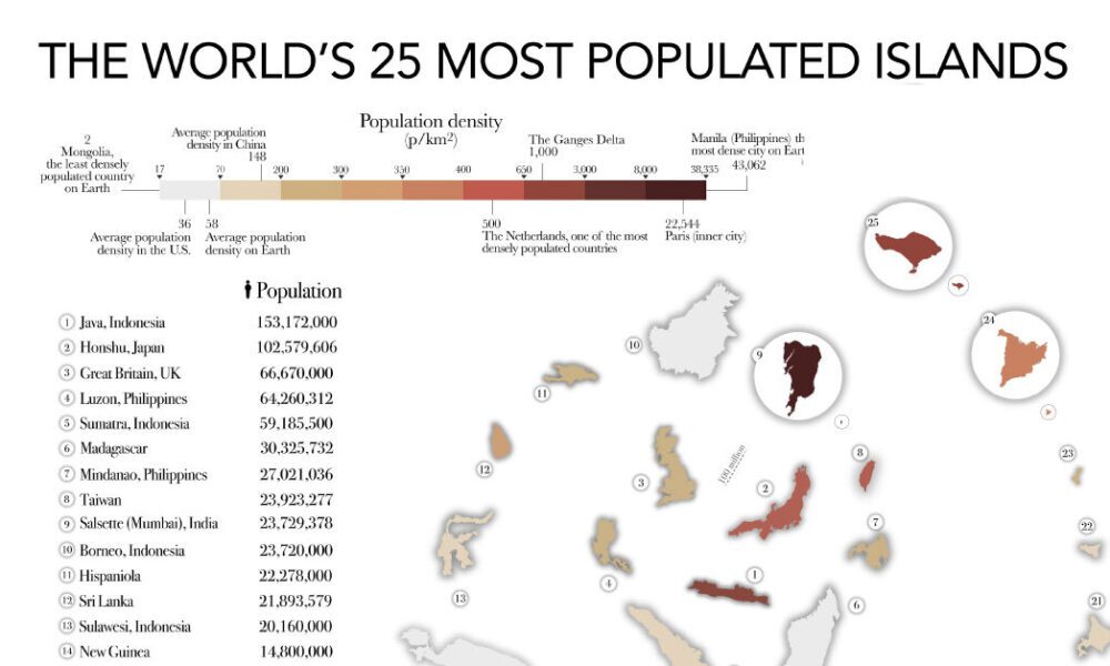
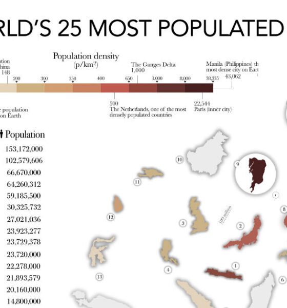

The most populated islands of the earth are teeming hubs of human activity, a far cry from the remote paradises...
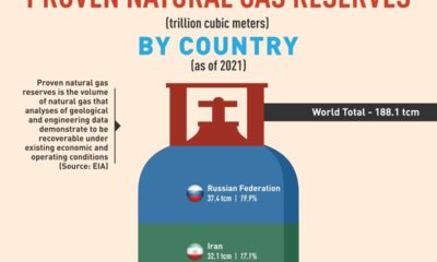

Russia has the biggest reserves, accounting for around 20% of the global total.
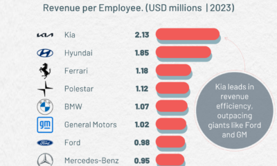

Kia leads in revenue per employee, outpacing other carmakers such as GM and Ford.
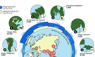

Many major coastal cities are experiencing local land subsidence where underground soil and rock collapse, causing the surface above to sink.
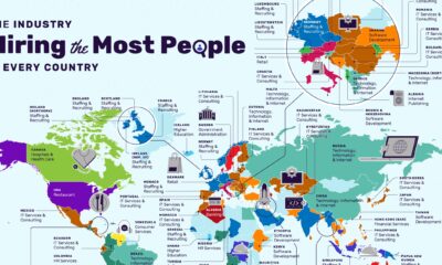

The restaurant industry has the most vacancies in the U.S., followed by non-profit organizations.
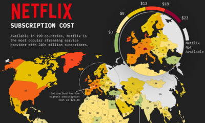

This map of Netflix price by country shows how much a basic subscription package costs around the world.
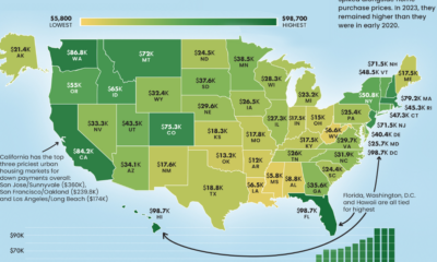

From coast to coast, the median down payment on a single family home can be close to $100,000 or less than $10,000.
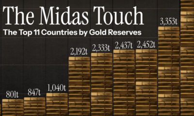

The U.S. holds the world's largest gold reserves, totaling 8,133 tonnes. This graphic showcases the top 11 gold reserves by country.


Visualizing the most affordable U.S. cities for renters by the percentage of affordable rentals available on an average salary.
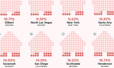

Visualizing the least affordable U.S. cities for renters by the percentage of affordable rentals available on an average salary.
