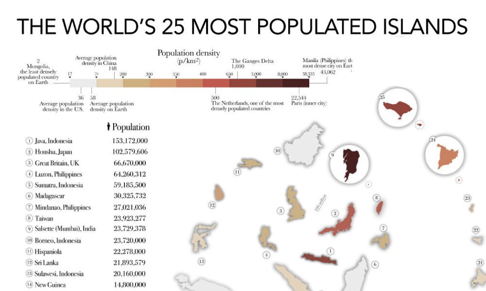
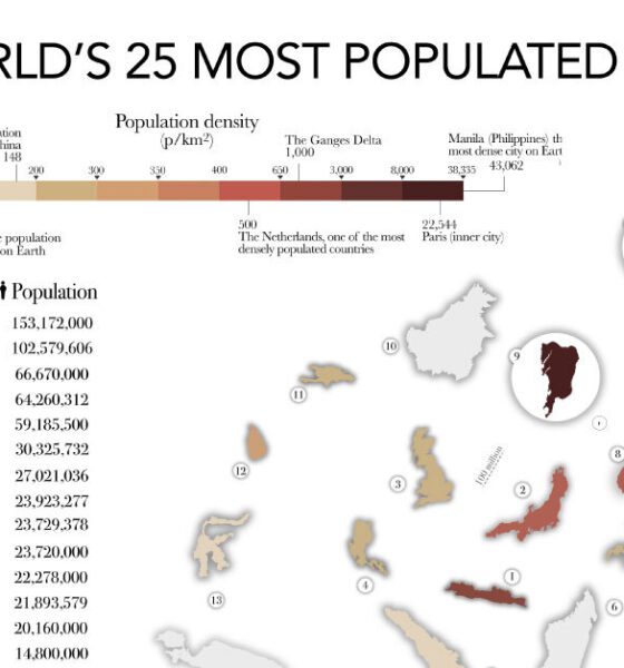

The most populated islands of the earth are teeming hubs of human activity, a far cry from the remote paradises...
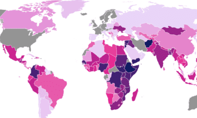

The U.S. provides over $50 billion in aid to more than 150 countries and territories annually.
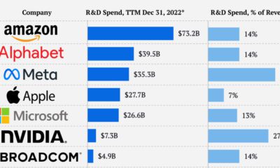

Each year, companies spend billions on innovation. Here's how much the top 10 Nasdaq companies by market cap allocate to R&D investment.
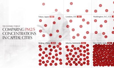

This visual compares air quality in 50 capital cities around the world by average PM2.5 concentrations in 2022.


Since the beginning of the space race, only four countries have successfully accomplished missions to the moon.
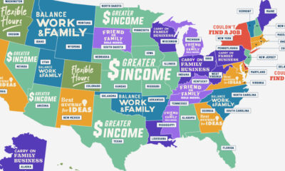

Is it for greater flexibility, more income, or something else? These graphics answer the question, why do people start businesses?
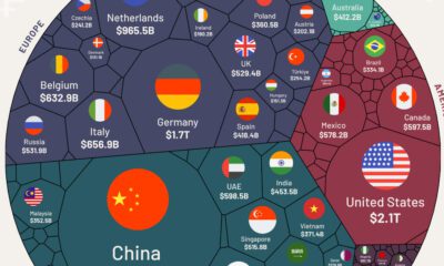

We visualize nearly $25 trillion of global exports by country, showing you the top exporting nations and the data behind it all.
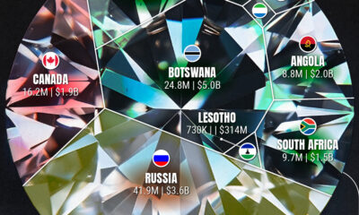

Who are the leaders in rough diamond production and how much is their diamond output worth?
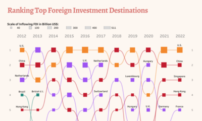

Take a look at changes in foreign direct investment flows over a decade, analyzing the top destinations and biggest investors.
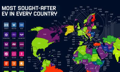

Industry stars, new entrants, and local models all populate this map of the most searched-for electric vehicles by country in 2022.
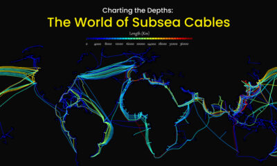

Hidden beneath the waves and sprawling along the ocean floor, subsea cables account for approximately 95% of international data transmitted.