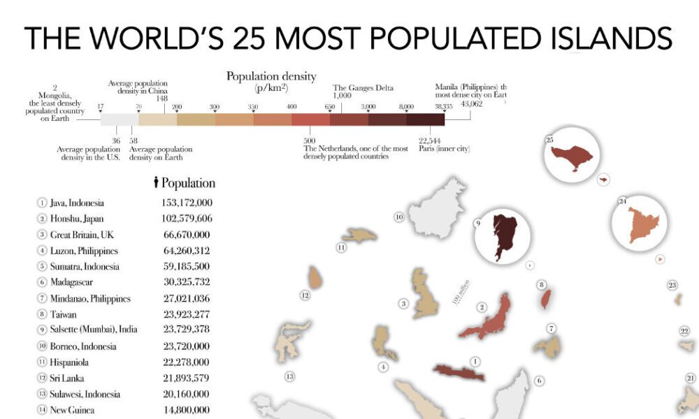
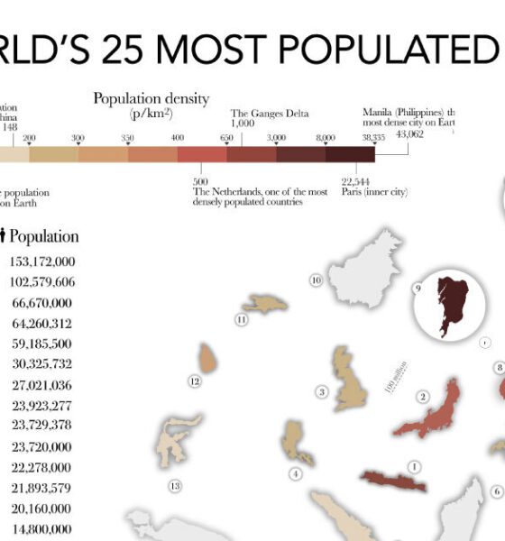

The most populated islands of the earth are teeming hubs of human activity, a far cry from the remote paradises...
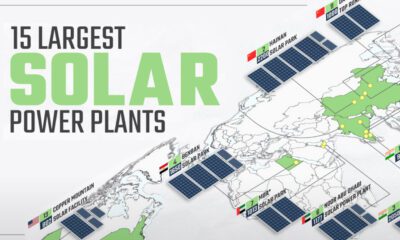

Solar power has grown rapidly over the last decade, and so have solar plants. This map shows the world's 15 largest solar power plants.
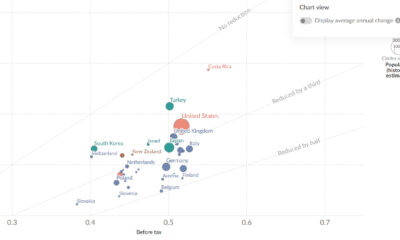

This chart shows how taxes offset income inequality by country, revealing differences in living standards around the world.
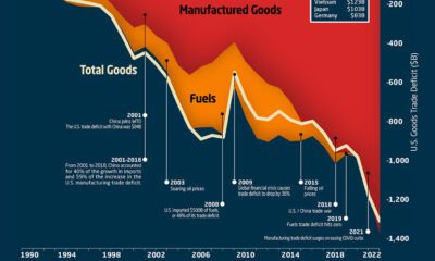

This graphic the U.S. trade deficit growth since 1990, and how manufactured goods and fuels factor in over the last three decades.

The Digital Quality of Life Index shows which countries are doing a better job than others in providing accessible and affordable internet.
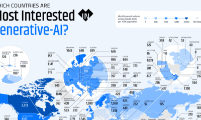

These graphics highlight interest in generative AI by country, covering interest in text, image, video, or audio generation.
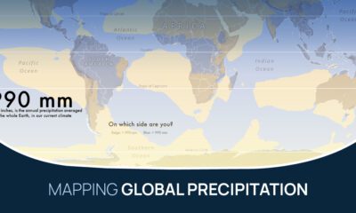

What does the global precipitation map look like if we split it in two, one half with below average rainfall and the other above?
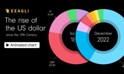

This animated graphic shows the U.S. dollar, the world's primary reserve currency, as a share of foreign reserves since 1900.
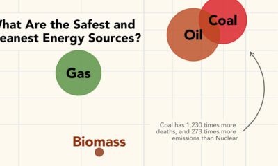

What are the safest energy sources? This graphic shows both GHG emissions and accidental deaths caused by different energy sources.
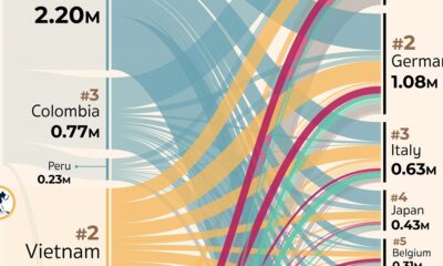

Which countries export, and import, the most coffee? This visual highlights the global coffee trade by export flows in 2019.