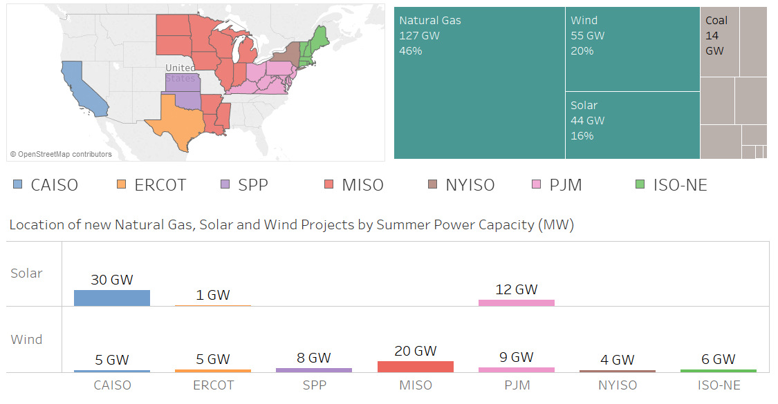
Nearly 100 GW of new power coming online is from solar and wind, making up 36% of new electrical capacity being added in these jurisdictions.
Consumers are the foundation of the economy, and how they spend money is telling. See what's changed with how Americans spend their money over the years.
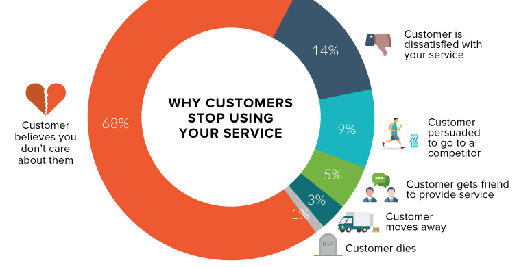
An astonishing two-thirds of your customers leave because they think you don't care about them. Here's how to change that.
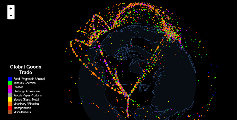
Use this interactive map to explore fascinating data on international trade. Which countries trade with each other, and which are stuck as hermits?
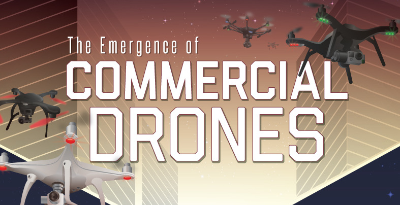
The market for commercial drones is soaring at an astonishing 19% annual growth rate - see the history of drones, and how they will impact you.
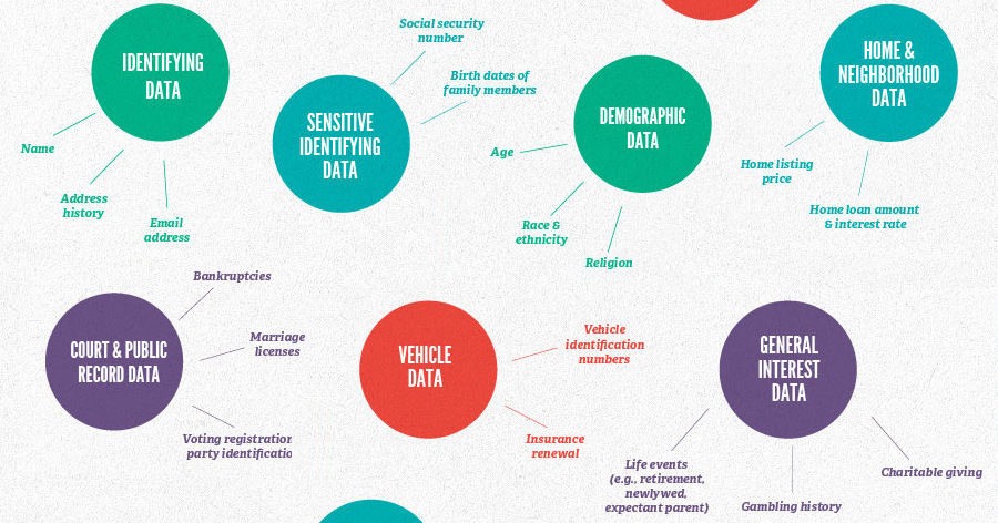
Services like Google and Facebook may seem free, but they actually come at a cost: your personal data. Find out what it's worth to marketers and...
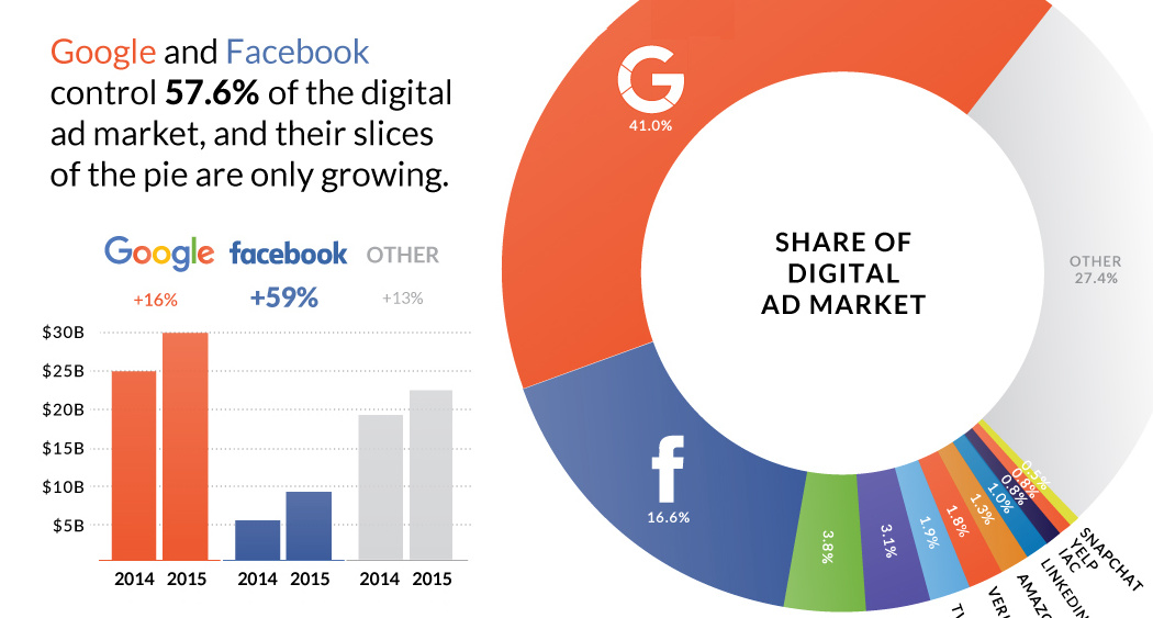
Nearly $0.60 of every $1.00 spent on digital advertising goes to Google and Facebook.
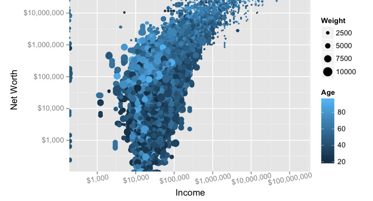
Does making a lot of money translate to actual net worth? We look at the data, and the link (or lack thereof) between income and wealth...
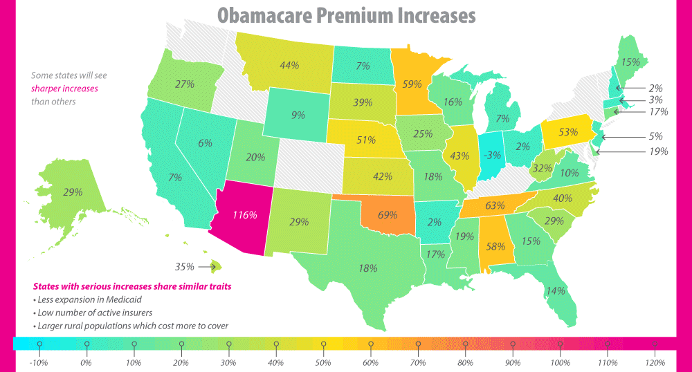
The future of Obamacare is uncertain, to say the least. See the major issues that have surfaced, including the skyrocketing premiums, in this infographic.
Want to learn about how different energy sources work? Check out these short, fact-driven videos on topics like oil, hydro, solar, wind, LNG, or fracking.
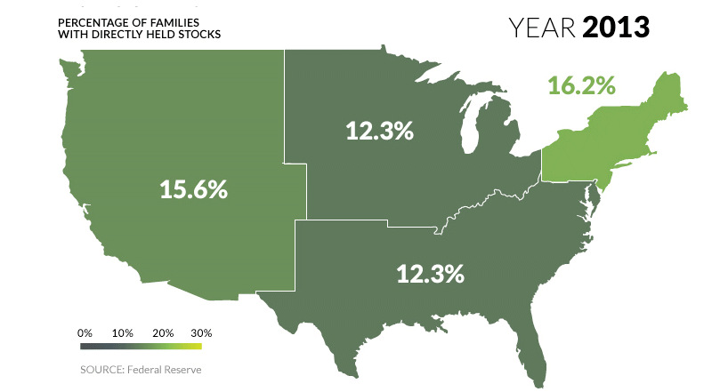
U.S. markets continue to hit all-time highs, but what percentage of population actually benefits? See stock ownership across the U.S. on this animated map.
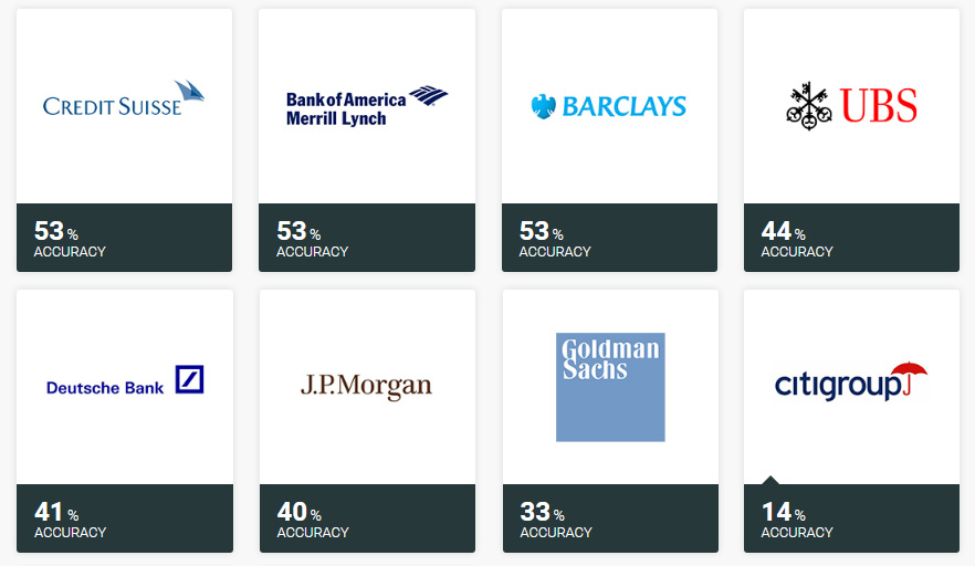
Ever wonder how accurate investment banks are with their stock picks? Here's the answer to that question, and it's not pretty.
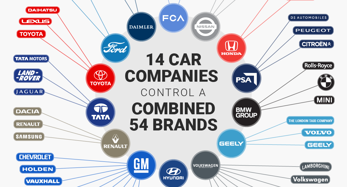
Looking to buy a new vehicle? You may have less choice than you might think - a total of 14 companies actually control 54 brands in...
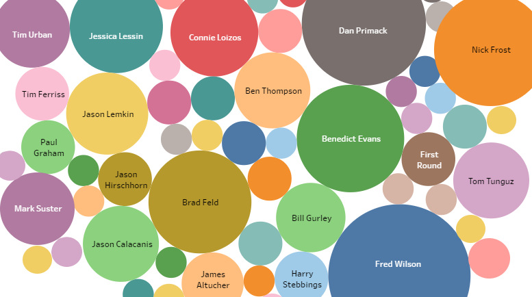
What blogs do the world's top venture capitalists read? These are the most recommended blogs by top tech investors, and most are free.
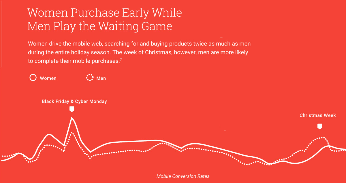
Is there correlation between mobile searches and Black Friday foot traffic? This infographic uses Google data to make 4 predictions about Black Friday shoppers.
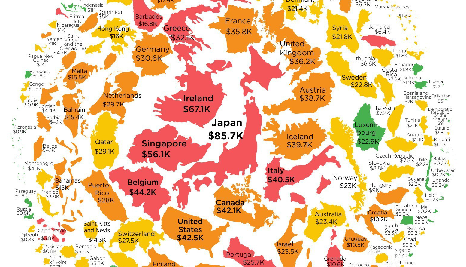
Want to know how much money the government has borrowed on your behalf? This infographic shows government debt per capita for every country in the world.
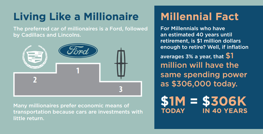
The preferred car for millionaires is a Ford, and most millionaires expect to continue working all the way until retirement.

Lasers, railguns, and hypersonic weapons may sound like they are from science fiction - but in fact, they are just the near future of military technology.
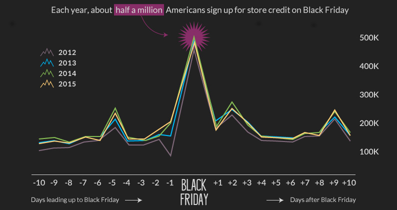
Black Friday kicks off the U.S. holiday shopping season, during which consumers will spend $655.8 billion this year. Where do they get that extra cash from?

Instant messaging crossed into the mainstream in the 1990s, allowing friends and like-minded thinkers from all over the world to connect in real-time.
Every “thing” comes from somewhere. Whether we are talking about an iPhone or a battery, even the most complex technological device is made up of the...
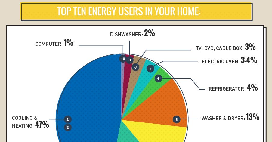
The average U.S. household spends $1,368 per year on energy, and a whopping 35% of that is wasted by appliances. See what uses the most energy...
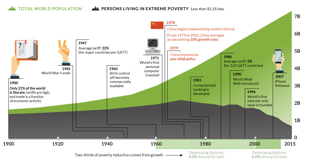
Population is growing, but world poverty isn't. See how the amount of people living in extreme poverty has been cut in half since 1990.
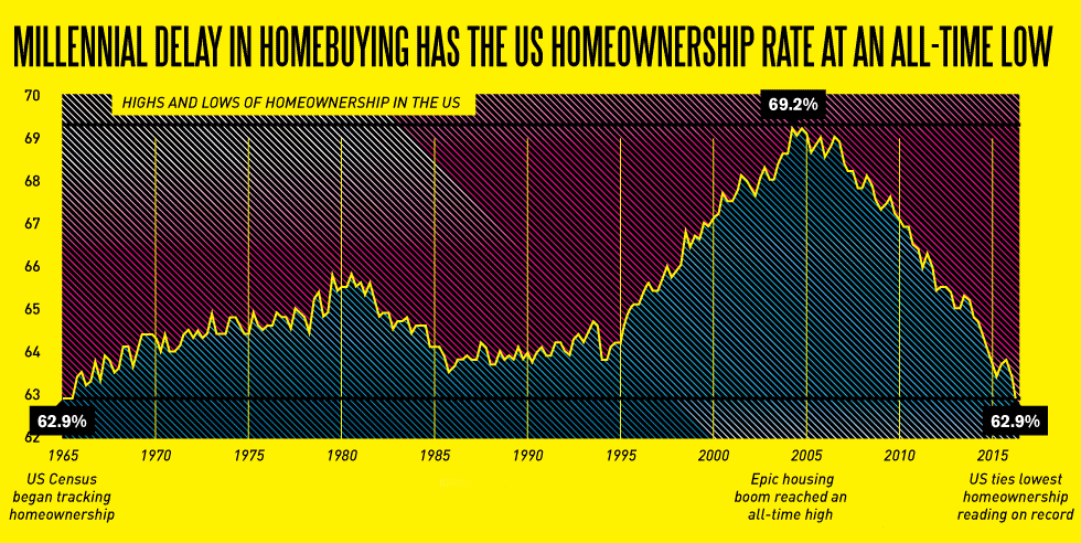
Millennial home buyers are going to send ripples through the real estate market... if they ever have the cash to make it happen.
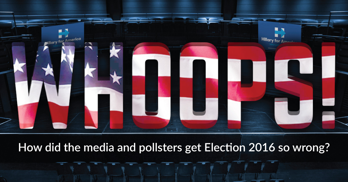
The day before the election, pollsters had pegged Hillary Clinton’s chances of winning at greater than 90%. They were wrong. Very wrong.

Election day is finally here. Here's 10 charts and maps that will be central to the story as America makes its historical decision.
As consumers, we're used to approaching buying decisions in a certain way. However, it turns out that process makes little sense for picking investments.
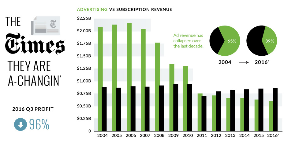
The New York Times just announced a 95.7% decrease in quarterly profits - we look at the numbers and context around the NYT's digital transition.
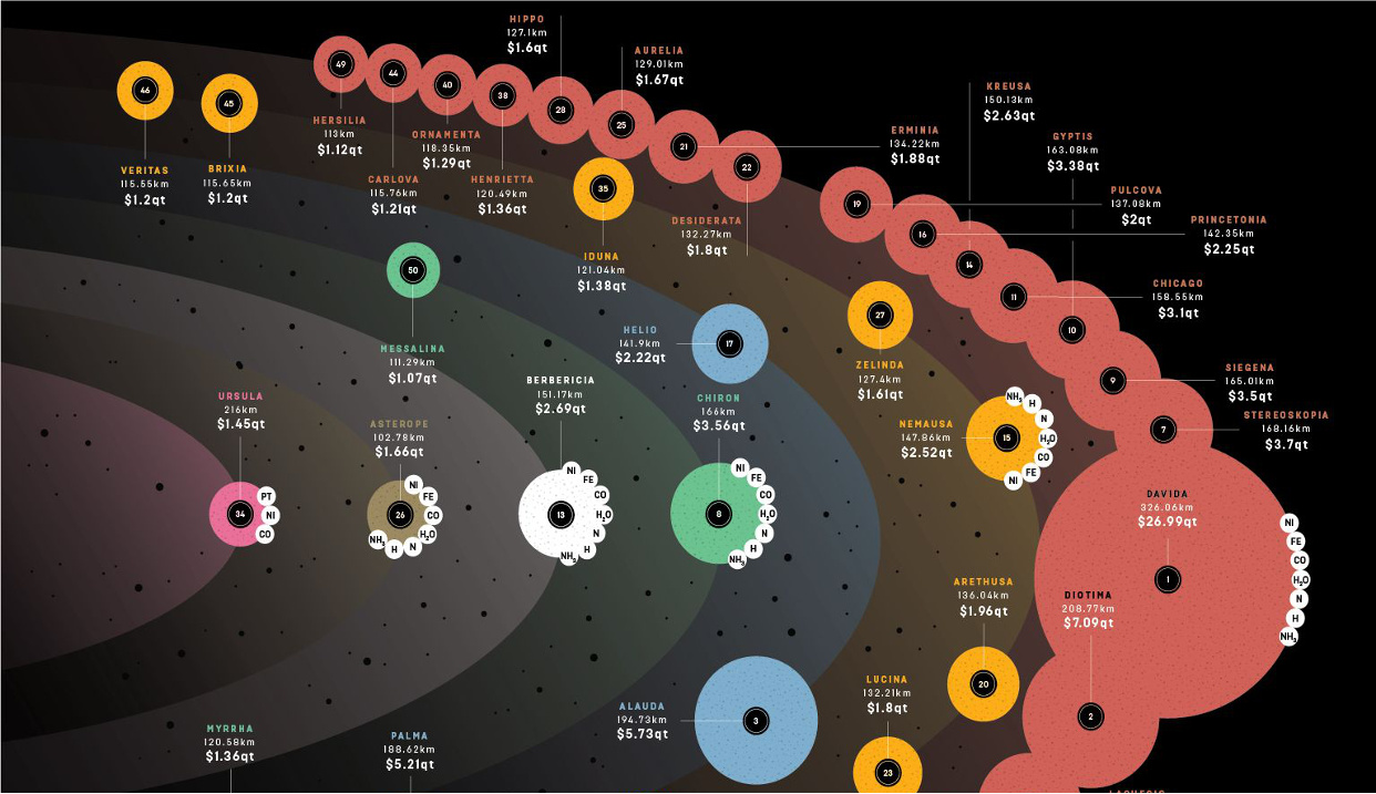
How much money is there to be made in asteroid mining? In many cases - the value of an asteroid is measured in the quintillions of...
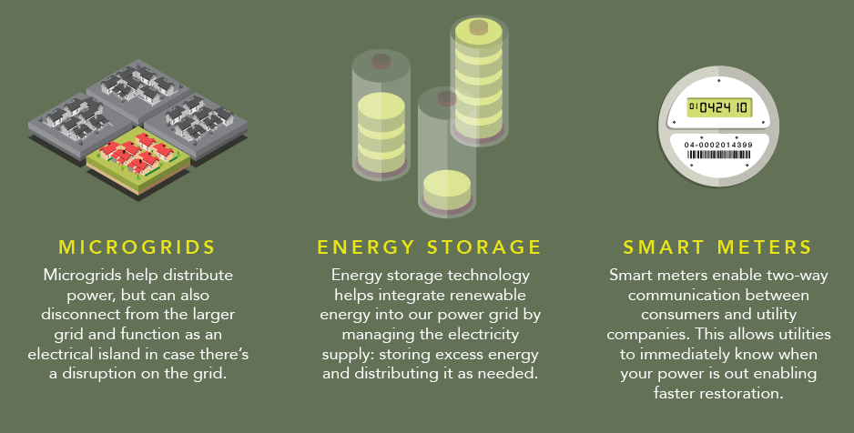
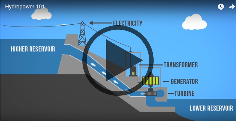
How does electricity to your home? This infographic shows how the power grid works, along with the brand new innovations coming to a grid near you.
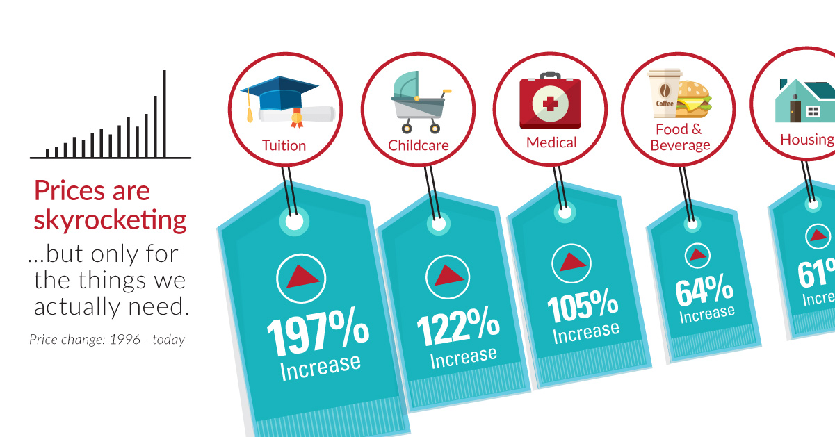
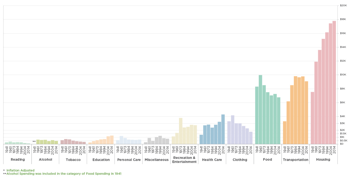
Over the last 20 years, the things that are the most important to us, such as healthcare, education, food, and shelter, have skyrocketing prices.
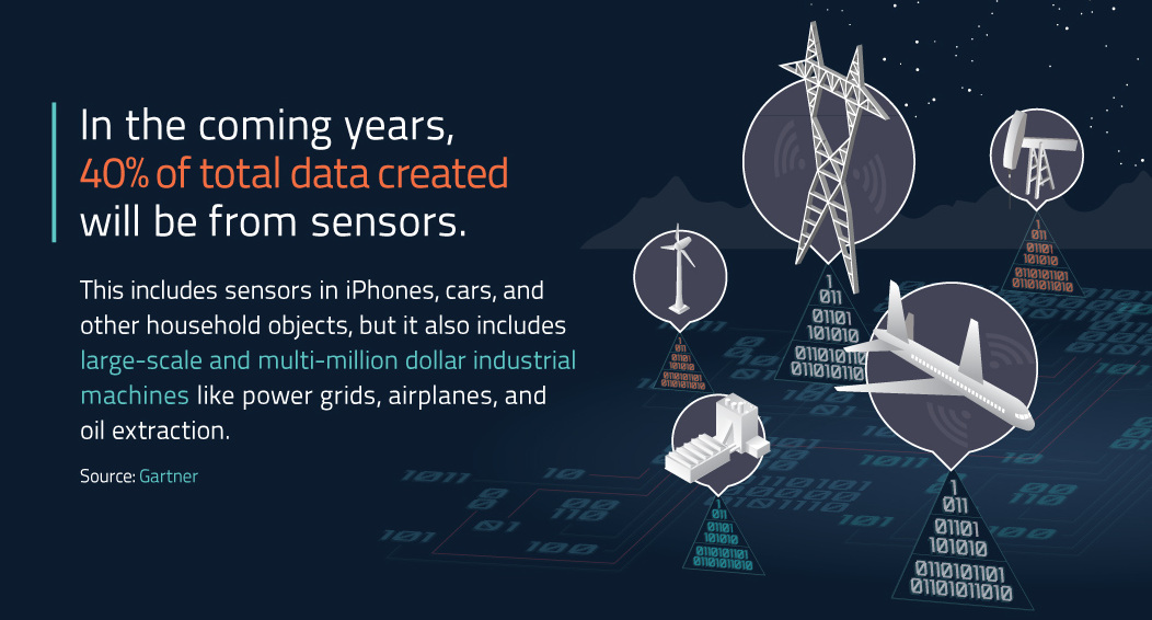
The Industrial Internet of Things (IIoT) presents a huge opportunity on an industrial scale - but are companies prepared to adopt it yet?
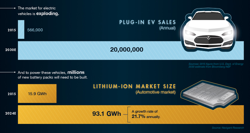
The explosion in demand for electric cars means we need more batteries. But where do the raw materials of batteries come from, and do we have...
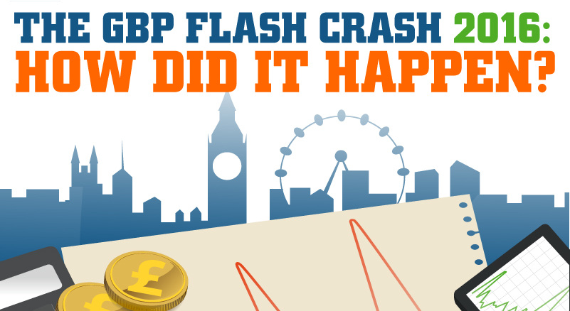
Roughly 75% of all financial market volume comes from automated trading. Here's how algorithms caused the flash crash in the British pound in early October.
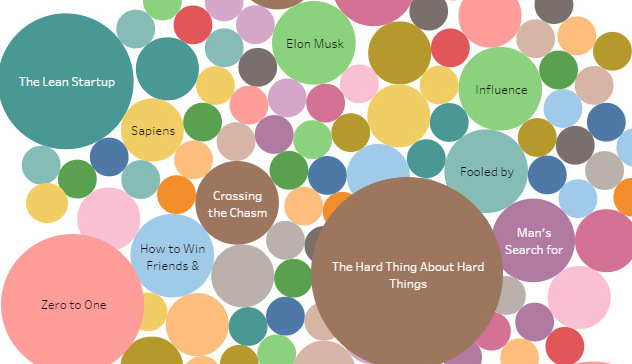
The world's most elite startup investors come in all shapes and sizes. But there's at least one thing they all have in common: they're extremely well-read.
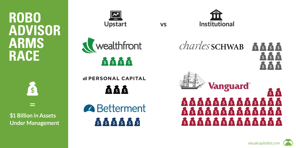
Can upstart robo-advisors compete against the scale of financial behemoths like Vanguard or Blackrock? See in this week's chart.
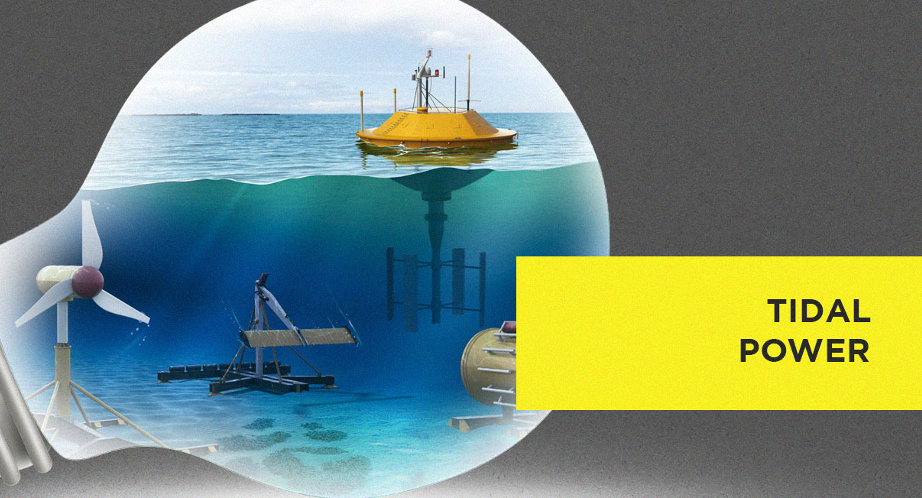
Which new sources of energy have promise? This infographic highlights the upcoming technologies that may provide the alternative energy sources of the future.
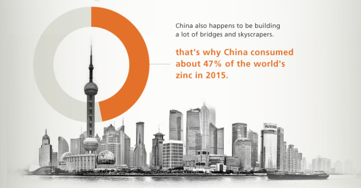
With zinc prices up over 35% in 2016, many metal investors are taking a second look at zinc. See 11 reasons to re-think zinc in this...
Did you know that Google was started in a garage owned by Susan Wojcicki, the now CEO of Youtube? For other interesting Google facts, see this...
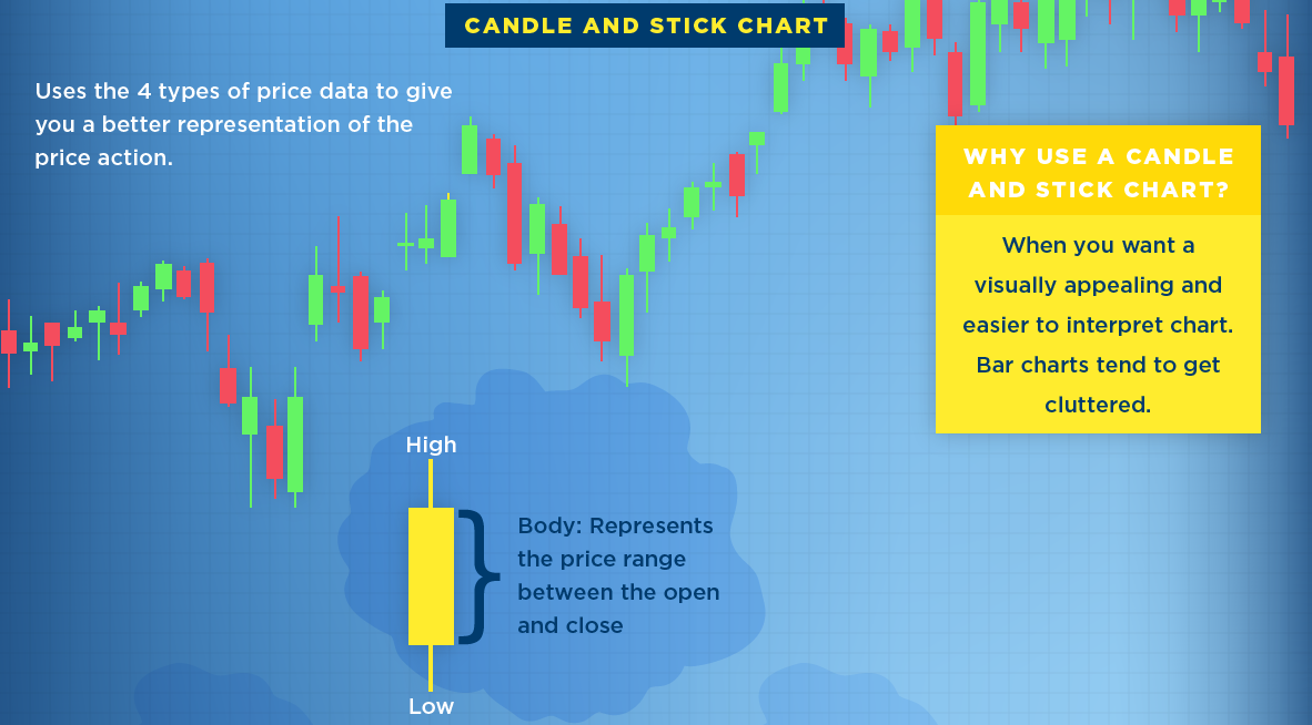
What is a stock chart? Here's three of the most common types of stock charts, along with a description of the data they typically provide investors.
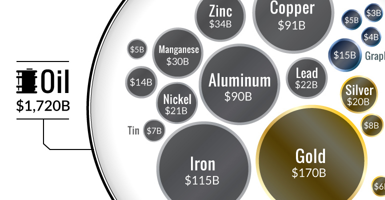
Ever wonder why the oil industry has so much influence? This chart shows that all metal markets combined don't even come close to touching the oil...
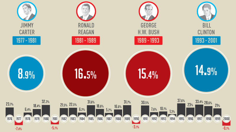
This infographic shows how the U.S. market performs in each year of a presidential term - and specifically, how the market does in election years.
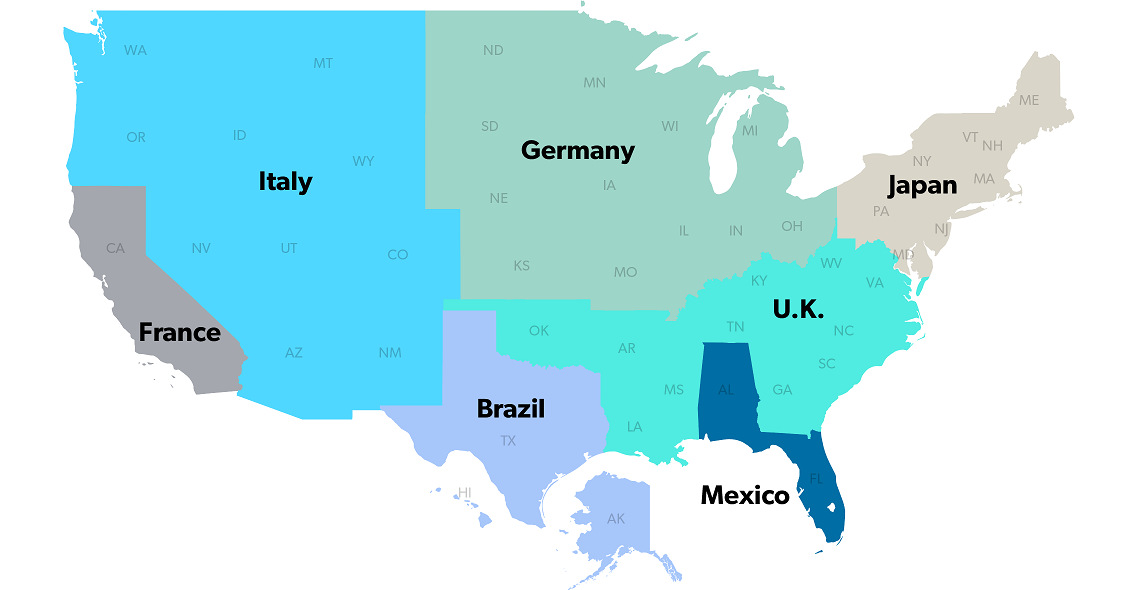
The United States has a $18 trillion economy - the biggest in the world. But here's another way of looking at it, using three interesting maps.
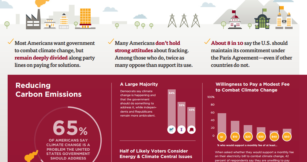
This survey of over 1,000 Americans tells you what people actually believe about fracking, coal, climate change, and other hot button energy issues in the U.S.
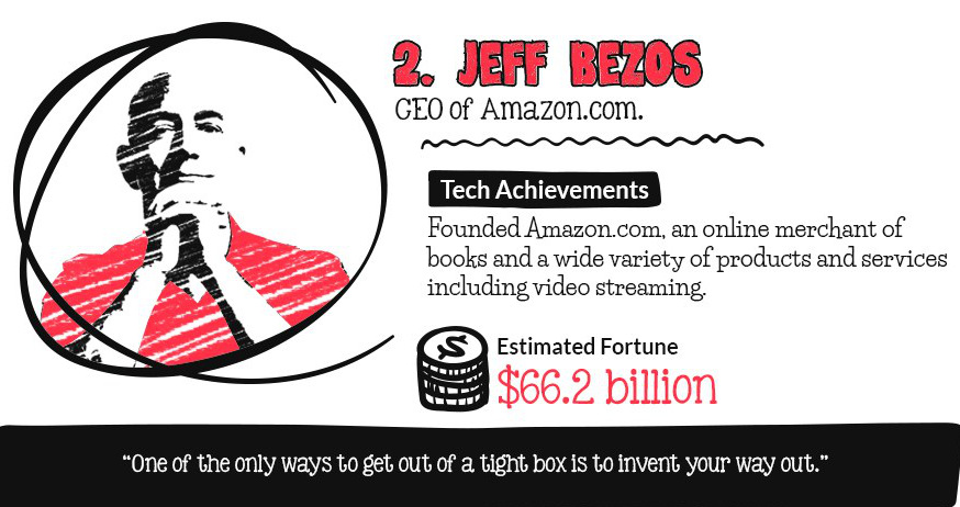
Which tech titans have the largest fortunes? This infographic counts down the top 10 billionaires in tech.
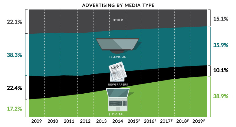
Digital media will be the largest advertising channel globally by 2019 - even bigger than television. This chart covers the death of traditional media.
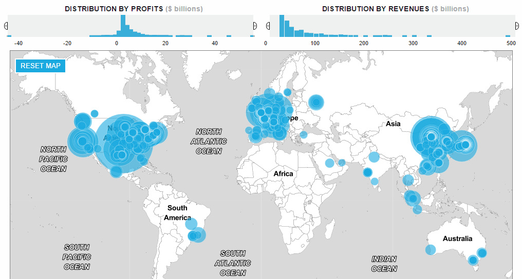
How has the list of the world's largest companies by revenue changed over the last 20 years? See the rise and fall of the companies on...

Here are nine 'black swan' events in recent memory that profoundly changed markets, ranging from the Asian financial crisis of 1997 to the more current Brexit.
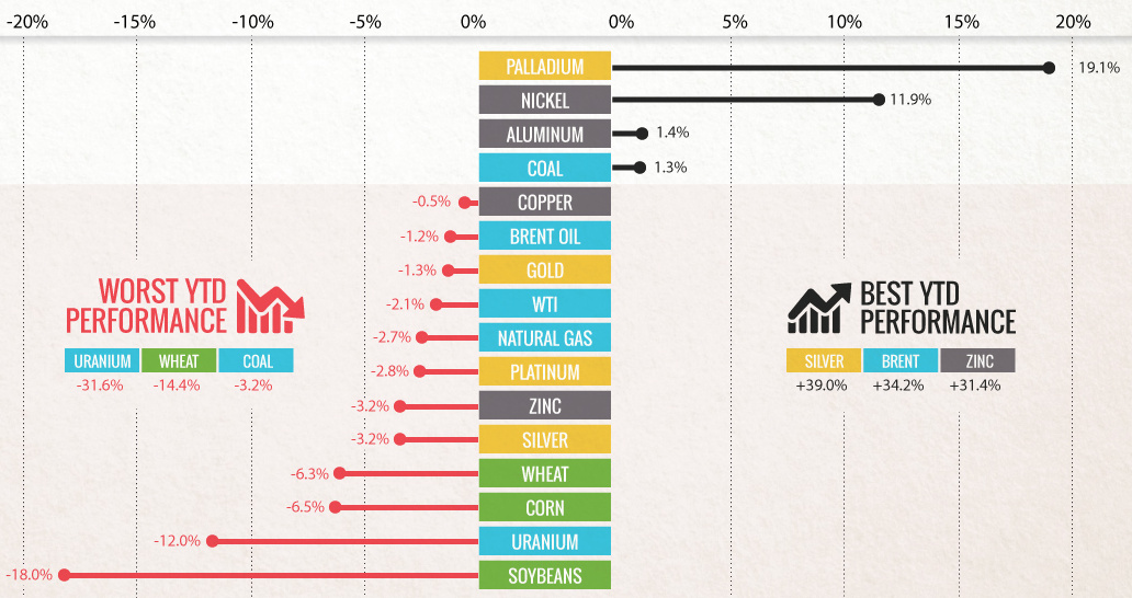
Commodities slumped in Q3 as buyers 'sold in May and went away'. Can commodities shake the summer slump with a U.S. election and OPEC deal in...
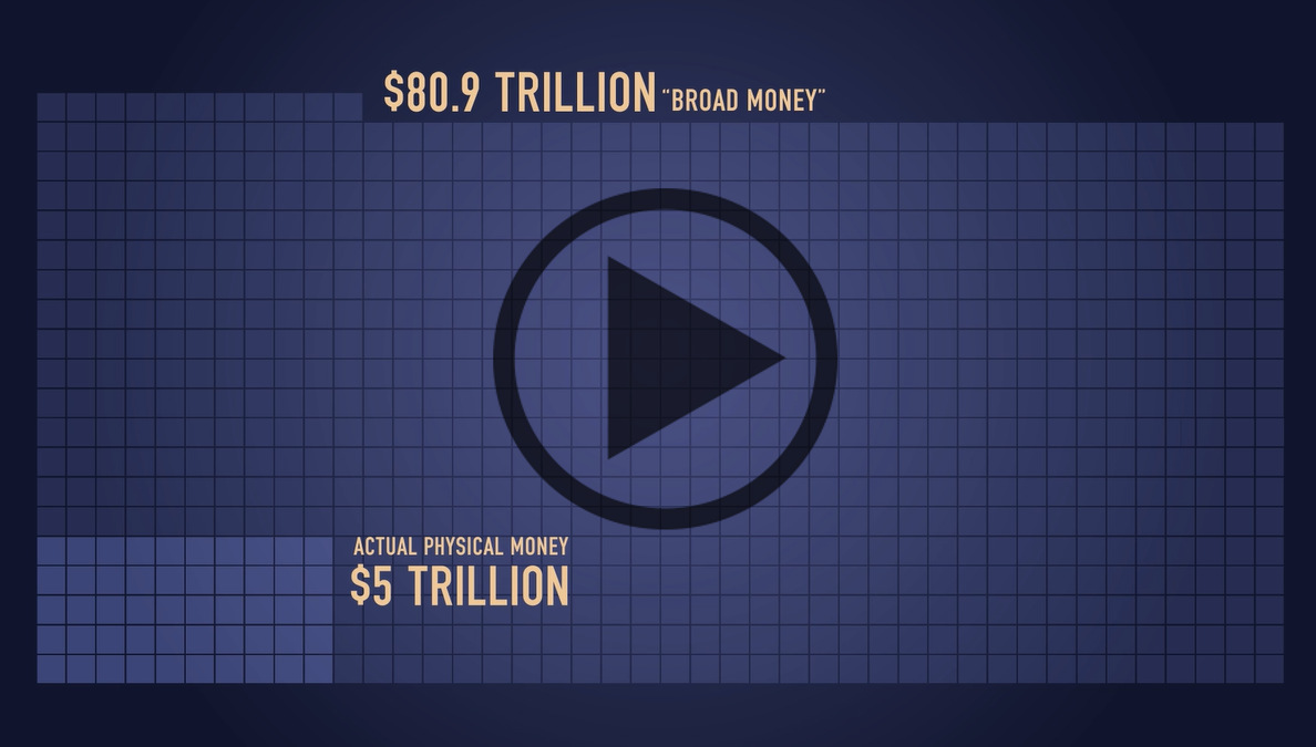
It's so much, that simply telling you wouldn't convey the magnitude. That's why we created this video, which visualizes how much money humans have created.


