Markets
What is a Stock Chart?
It’s not uncommon for us to get messages from people that are attracted to the idea of investing, but that lack the essential training or confidence to fully dive in.
For example, we hear from millennials all the time – many are starting to save and know they need to invest, but they’ve never had to look at a stock chart before. We also often hear from wealth managers that want to help their clients understand the financial landscape better.
Today’s post explains a concept that’s important for any person looking to dive headfirst into finance.
What is a stock chart?
The following infographic from StocksToTrade shares the three most common types of stock charts used, and the information typically found in them.
It’s the perfect step-by-step primer for someone that wants to learn the basics!
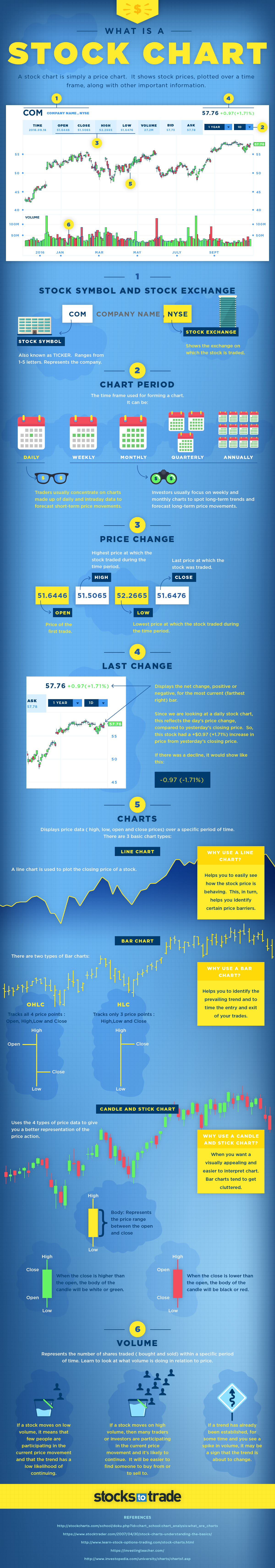
What is a stock chart?
It’s simply a price chart that shows a stock’s price plotted over a time frame, and it shows a few key sets of information:
1. Stock symbol and exchange
The symbol for the stock, as well as the specific exchange it trades on.
2. Chart period
Typically daily, weekly, monthly, quarterly, or annually. Traders usually concentrate on daily and intraday data to forecast short-term price movements. Investors usually concentrate on weekly and monthly charts to spot long-term price trends.
3. Price Change
There are four key data points from a day’s trading: open, high, low, and close. “Open” is the price at the start of the day and “close” is the price at the end of the day. The “high” is the highest price during the session, while the “low” is the lowest.
4. Last Change
Displays the net change, positive or negative, from a previous price. On a daily chart, it would be from the previous day’s close.
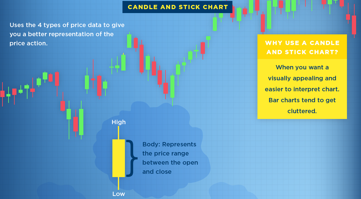
5. Types of Charts
There are three basic types of charts used:
- Line: Plots the closing price of a chart over time, helping you to see how a price is behaving.
- Bar chart: Plots the open, high, low, and close (OHLC) for each day using bars.
- Candle and stick chart: A visually appealing chart similar to a bar chart that shows OHLC data in an easy way.
6. Volume
Volume is the amount of stock that has been bought and sold within a specific period of time. If a stock moves on low volume, it means that few people are participating in the current price movement and the trend may not continue. Meanwhile, if a stock moves on high volume, it means many people are involved in the trade and the trend is more likely to continue.


Markets
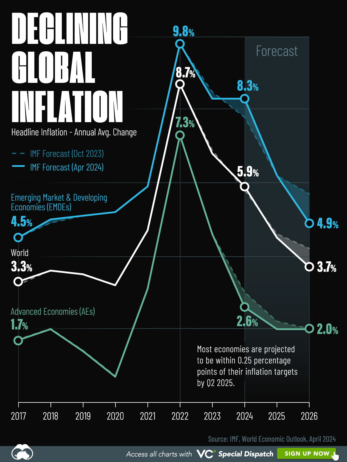
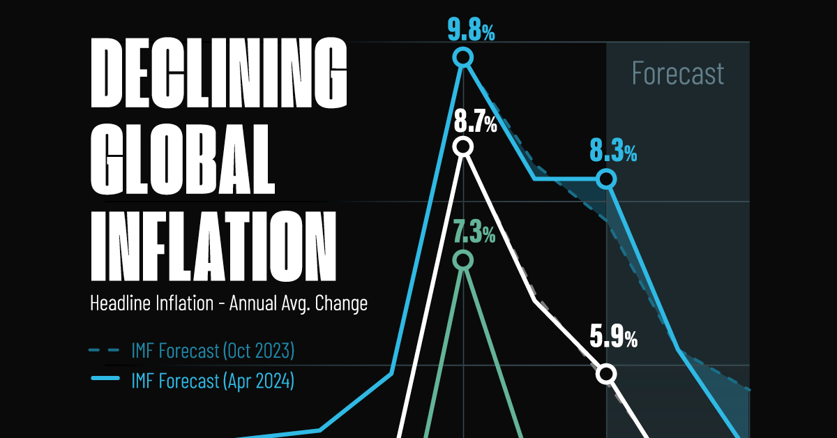
Visualizing Global Inflation Forecasts (2024-2026)
Here are IMF forecasts for global inflation rates up to 2026, highlighting a slow descent of price pressures amid resilient global growth.
Visualizing Global Inflation Forecasts (2024-2026)
Global inflation rates are gradually descending, but progress has been slow.
Today, the big question is if inflation will decline far enough to trigger easing monetary policy. So far, the Federal Reserve has held rates for nine months amid stronger than expected core inflation, which excludes volatile energy and food prices.
Yet looking further ahead, inflation forecasts from the International Monetary Fund (IMF) suggest that inflation will decline as price pressures ease, but the path of disinflation is not without its unknown risks.
This graphic shows global inflation forecasts, based on data from the April 2024 IMF World Economic Outlook.
Get the Key Insights of the IMF’s World Economic Outlook
Want a visual breakdown of the insights from the IMF’s 2024 World Economic Outlook report?
This visual is part of a special dispatch of the key takeaways exclusively for VC+ members.
Get the full dispatch of charts by signing up to VC+.
The IMF’s Inflation Outlook
Below, we show the IMF’s latest projections for global inflation rates through to 2026:
| Year | Global Inflation Rate (%) | Advanced Economies Inflation Rate (%) | Emerging Market and Developing Economies Inflation Rate (%) |
|---|---|---|---|
| 2019 | 3.5 | 1.4 | 5.1 |
| 2020 | 3.2 | 0.7 | 5.2 |
| 2021 | 4.7 | 3.1 | 5.9 |
| 2022 | 8.7 | 7.3 | 9.8 |
| 2023 | 6.8 | 4.6 | 8.3 |
| 2024 | 5.9 | 2.6 | 8.3 |
| 2025 | 4.5 | 2.0 | 6.2 |
| 2026 | 3.7 | 2.0 | 4.9 |
After hitting a peak of 8.7% in 2022, global inflation is projected to fall to 5.9% in 2024, reflecting promising inflation trends amid resilient global growth.
While inflation has largely declined due to falling energy and goods prices, persistently high services inflation poses challenges to mitigating price pressures. In addition, the IMF highlights the potential risk of an escalating conflict in the Middle East, which could lead to energy price shocks and higher shipping costs.
These developments could negatively affect inflation scenarios and prompt central banks to adopt tighter monetary policies. Overall, by 2026, global inflation is anticipated to decline to 3.7%—still notably above the 2% target set by several major economies.
Adding to this, we can see divergences in the path of inflation between advanced and emerging economies. While affluent nations are forecast to see inflation edge closer to the 2% target by 2026, emerging economies are projected to have inflation rates reach 4.9%—falling closer to their pre-pandemic averages.
Get the Full Analysis of the IMF’s Outlook on VC+
This visual is part of an exclusive special dispatch for VC+ members which breaks down the key takeaways from the IMF’s 2024 World Economic Outlook.
For the full set of charts and analysis, sign up for VC+.

-

 Culture7 days ago
The World’s Top Media Franchises by All-Time Revenue
-

 Science2 weeks ago
Visualizing the Average Lifespans of Mammals
-

 Brands2 weeks ago
How Tech Logos Have Evolved Over Time
-

 Energy2 weeks ago
Ranked: The Top 10 EV Battery Manufacturers in 2023
-

 Countries2 weeks ago
Countries With the Largest Happiness Gains Since 2010
-

 Economy2 weeks ago
VC+: Get Our Key Takeaways From the IMF’s World Economic Outlook
-

 Demographics2 weeks ago
The Countries That Have Become Sadder Since 2010
-

 Money1 week ago
Charted: Who Has Savings in This Economy?