Money
Chart: The End of World Poverty is in Sight
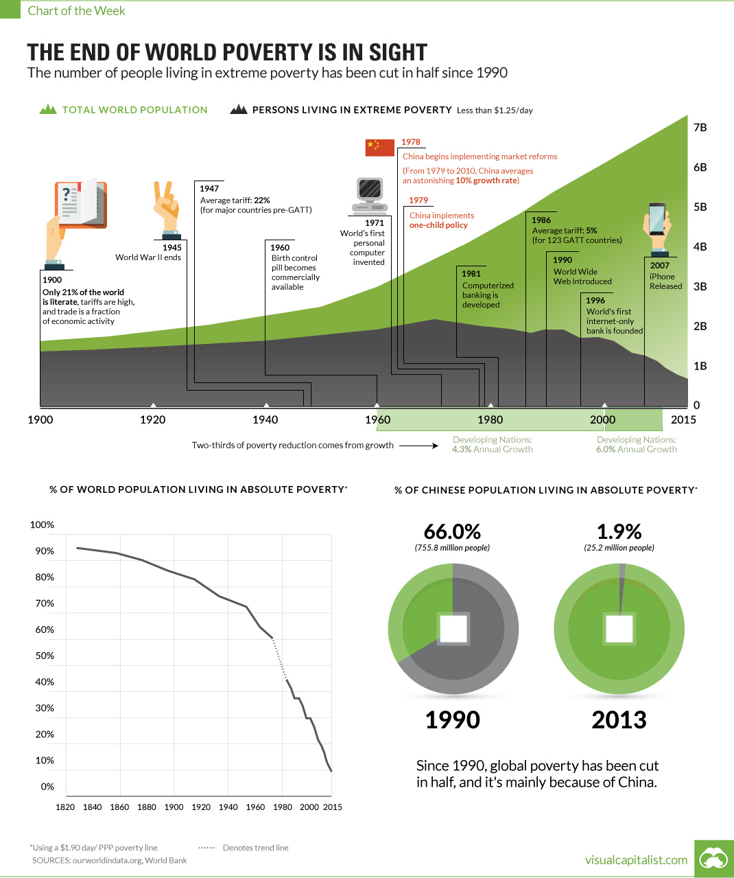
End of World Poverty is in Sight
The number of people in extreme poverty has been cut in half since 1990.
The Chart of the Week is a weekly Visual Capitalist feature on Fridays.
The world is not a perfect place, and there are many injustices that still must be combatted. Just some of these include racism, sexism, income inequality, climate change, terrorism, soaring debt, corruption, and food and water security.
Many groups of people have it rough, and they deservedly have an axe to grind. There’s plenty of work to still be done.
However, sometimes we get so caught up in our day-to-day battles and the negative news stories that we forget to look at the big picture – and the big picture actually provides a lot of optimism.
Despite the majority of Americans being pessimistic about the future, the world is actually getting better as a whole: people are living longer and healthier lives, crime and violence are down, and living standards are generally improving.
Could an End to World Poverty be near?
One particular area that is fascinating to look at is poverty.
In absolute terms, the total amount of people living in extreme poverty peaked in 1970 when 2.2 billion of the world’s 3.7 billion people lived on less than $1.25 per day.
Today, in an astonishing reversal, only 0.7 billion of 7.3 billion people are below this poverty-line worldwide.
While progress has been made in many countries, the story of China is of particular interest: after market reforms started being introduced in 1978, the country grew at an average pace of 10% per year until 2010. Over this period of time, at least 800 million people were lifted out of absolute poverty.
And while there is still much work to be done, this is an undeniable step in the right direction. The U.N. even has a bold target to end extreme world poverty by 2030.
Based on the progress so far, this doesn’t seem unrealistic.
Contributing Factors
Why have we made so much progress in this realm?
One of the most important factors is very simple: it’s estimated that two-thirds of poverty reduction comes from good old-fashioned economic growth. For every 1% increase in GDP per head, poverty is reduced by 1.7%.
From 1960 to 2000, developing nations grew at an average pace of 4.3% – and from 2000 to 2010, they grew at an even faster pace of 6.0% per year. This helped lift a lot of people out of extreme poverty.
The other factor for the remaining one-third? It’s income distribution. The degree to which economic growth helps the poorest depends on their chances of getting some of that benefit.
It’s estimated that a 1% increase in GDP per head in the least equal countries only reduces poverty by 0.6%, while it does so by 4.3% in the most equal of places.
More growth and more equality will make it possible for this powerful trend in poverty reduction to continue. And by 2030 – who knows – maybe extreme levels of poverty will be an afterthought for society.


Demographics
The Smallest Gender Wage Gaps in OECD Countries
Which OECD countries have the smallest gender wage gaps? We look at the 10 countries with gaps lower than the average.
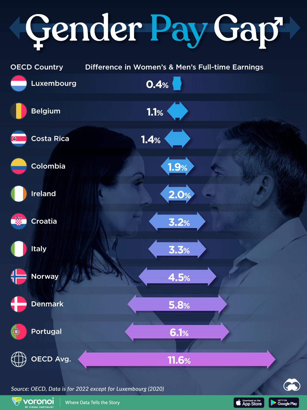
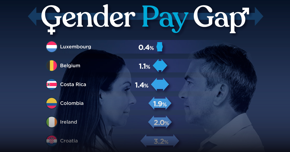
The Smallest Gender Pay Gaps in OECD Countries
This was originally posted on our Voronoi app. Download the app for free on iOS or Android and discover incredible data-driven charts from a variety of trusted sources.
Among the 38 member countries in the Organization for Economic Cooperation and Development (OECD), several have made significant strides in addressing income inequality between men and women.
In this graphic we’ve ranked the OECD countries with the 10 smallest gender pay gaps, using the latest data from the OECD for 2022.
The gender pay gap is calculated as the difference between median full-time earnings for men and women divided by the median full-time earnings of men.
Which Countries Have the Smallest Gender Pay Gaps?
Luxembourg’s gender pay gap is the lowest among OECD members at only 0.4%—well below the OECD average of 11.6%.
| Rank | Country | Percentage Difference in Men's & Women's Full-time Earnings |
|---|---|---|
| 1 | 🇱🇺 Luxembourg | 0.4% |
| 2 | 🇧🇪 Belgium | 1.1% |
| 3 | 🇨🇷 Costa Rica | 1.4% |
| 4 | 🇨🇴 Colombia | 1.9% |
| 5 | 🇮🇪 Ireland | 2.0% |
| 6 | 🇭🇷 Croatia | 3.2% |
| 7 | 🇮🇹 Italy | 3.3% |
| 8 | 🇳🇴 Norway | 4.5% |
| 9 | 🇩🇰 Denmark | 5.8% |
| 10 | 🇵🇹 Portugal | 6.1% |
| OECD Average | 11.6% |
Notably, eight of the top 10 countries with the smallest gender pay gaps are located in Europe, as labor equality laws designed to target gender differences have begun to pay off.
The two other countries that made the list were Costa Rica (1.4%) and Colombia (1.9%), which came in third and fourth place, respectively.
How Did Luxembourg (Nearly) Eliminate its Gender Wage Gap?
Luxembourg’s virtually-non-existent gender wage gap in 2020 can be traced back to its diligent efforts to prioritize equal pay. Since 2016, firms that have not complied with the Labor Code’s equal pay laws have been subjected to penalizing fines ranging from €251 to €25,000.
Higher female education rates also contribute to the diminishing pay gap, with Luxembourg tied for first in the educational attainment rankings of the World Economic Forum’s Global Gender Gap Index Report for 2023.
See More Graphics about Demographics and Money
While these 10 countries are well below the OECD’s average gender pay gap of 11.6%, many OECD member countries including the U.S. are significantly above the average. To see the full list of the top 10 OECD countries with the largest gender pay gaps, check out this visualization.

-

 Mining2 weeks ago
Charted: The Value Gap Between the Gold Price and Gold Miners
-

 Real Estate1 week ago
Ranked: The Most Valuable Housing Markets in America
-

 Business1 week ago
Charted: Big Four Market Share by S&P 500 Audits
-

 AI1 week ago
The Stock Performance of U.S. Chipmakers So Far in 2024
-

 Misc1 week ago
Almost Every EV Stock is Down After Q1 2024
-

 Money2 weeks ago
Where Does One U.S. Tax Dollar Go?
-

 Green2 weeks ago
Ranked: Top Countries by Total Forest Loss Since 2001
-

 Real Estate2 weeks ago
Visualizing America’s Shortage of Affordable Homes