Markets
Animated Maps: Fewer Americans Participating in Surging U.S. Markets
The Chart of the Week is a weekly Visual Capitalist feature on Fridays.
Over the course of the year, U.S. markets have hit new all-time highs on multiple occasions. The most recent iteration of this trend is the “Trump Rally”, which has the S&P 500 up 2.8% since Election Day.
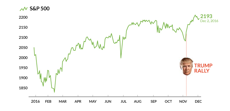
Fueled by expansionary monetary policy and the lowest interest rates in history, the bull market in U.S. equities is now the second-longest of all time. It’s hard to believe that almost eight years ago, the S&P 500 sat at a measly low of just 676.53 on March 9, 2009.
Rising Portfolios, Declining Participation
The stock market is proven to be the best way for investors to make returns over the long run, even through recessions and other catastrophic events.
This can be seen on the below map, showing portfolio value on a regional basis from 1989-2013:
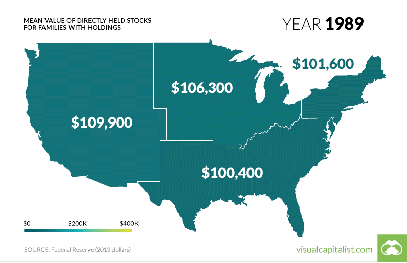
This data, which comes from the Fed every three years, shows the mean value of stocks for families that have holdings in the market. The most recent national number is $294,300 for 2013, and we can safely assume that mean portfolio values are even higher today given the continuation of the bull market.
But does this mean that everyone has benefited from rising stock prices?
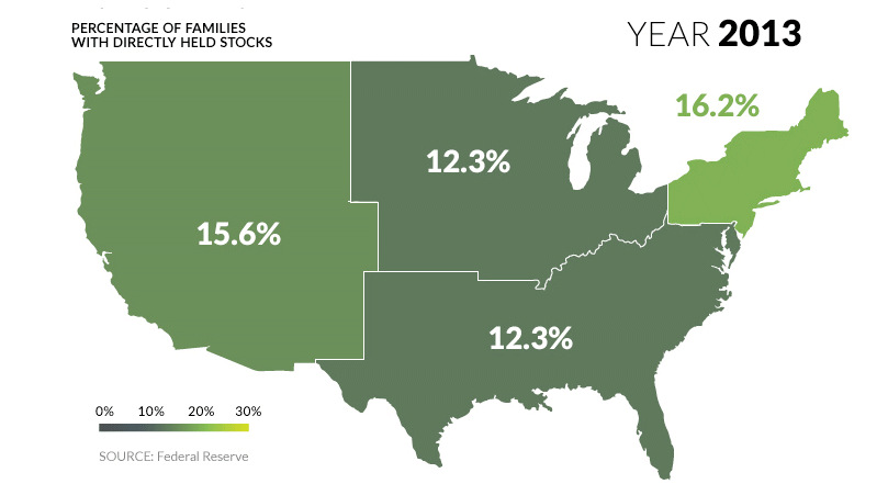
While the average value of stocks held by families has soared, there is an alarming countertrend: the percentage of families that actually own stocks has been shrinking since 2001:
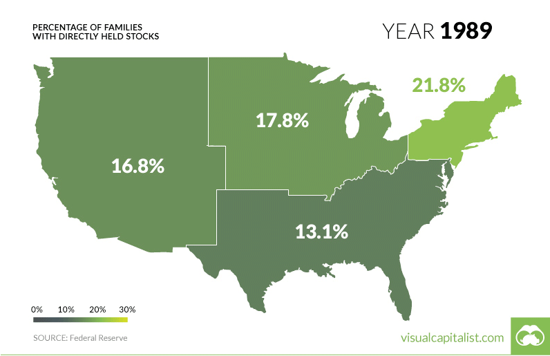
One particularly interesting regional case is that of the Midwest. In the span of nine years (from 2004-2013) the percentage of families with stock ownership halved from 23.4% to 12.3%.
But this has also happened on a broader level.
The percentage of families nationwide with directly-owned stocks peaked at 21.3% in 2001 – and since then, the number has consistently declined all the way until 2013, when only 13.8% of families owned stocks.
What Does It Mean?
Despite steady market gains since 2009, fewer families are participating in the markets.
Is it that people don’t have enough disposable income anymore to invest? Or is this because families are still skeptical of the economy and market even years after the 2008 crisis?
Regardless of the reasons, stock market gains have gone predominantly to one group of people:
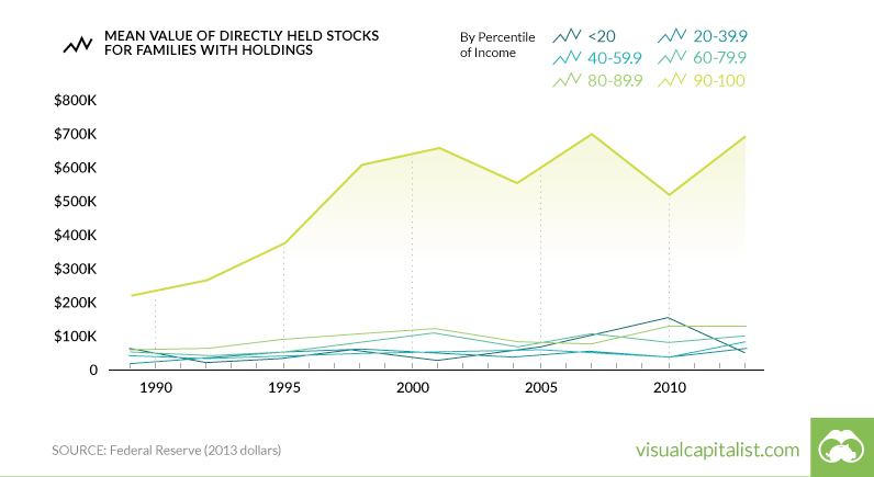
The 90-100% percentile income bracket – in other words, the people who make the most money – have had the value of their stocks triple in value since 1989.
A Slight Trend Reversal?
Though Fed numbers for this year won’t come out until late 2017, there is some evidence that stock ownership has started to increase again, even if it is just a tiny improvement. This recent Gallup poll shows 2014 and 2015 to have slightly higher numbers of people involved in the market, though it uses a different definition than the Federal Reserve for its figures.
So as the “Trump Rally” comes to a close, the question remains. Did enough Americans benefit from the most recent rise in stock prices, or did those returns go only to one group?


Markets
U.S. Debt Interest Payments Reach $1 Trillion
U.S. debt interest payments have surged past the $1 trillion dollar mark, amid high interest rates and an ever-expanding debt burden.


U.S. Debt Interest Payments Reach $1 Trillion
This was originally posted on our Voronoi app. Download the app for free on iOS or Android and discover incredible data-driven charts from a variety of trusted sources.
The cost of paying for America’s national debt crossed the $1 trillion dollar mark in 2023, driven by high interest rates and a record $34 trillion mountain of debt.
Over the last decade, U.S. debt interest payments have more than doubled amid vast government spending during the pandemic crisis. As debt payments continue to soar, the Congressional Budget Office (CBO) reported that debt servicing costs surpassed defense spending for the first time ever this year.
This graphic shows the sharp rise in U.S. debt payments, based on data from the Federal Reserve.
A $1 Trillion Interest Bill, and Growing
Below, we show how U.S. debt interest payments have risen at a faster pace than at another time in modern history:
| Date | Interest Payments | U.S. National Debt |
|---|---|---|
| 2023 | $1.0T | $34.0T |
| 2022 | $830B | $31.4T |
| 2021 | $612B | $29.6T |
| 2020 | $518B | $27.7T |
| 2019 | $564B | $23.2T |
| 2018 | $571B | $22.0T |
| 2017 | $493B | $20.5T |
| 2016 | $460B | $20.0T |
| 2015 | $435B | $18.9T |
| 2014 | $442B | $18.1T |
| 2013 | $425B | $17.2T |
| 2012 | $417B | $16.4T |
| 2011 | $433B | $15.2T |
| 2010 | $400B | $14.0T |
| 2009 | $354B | $12.3T |
| 2008 | $380B | $10.7T |
| 2007 | $414B | $9.2T |
| 2006 | $387B | $8.7T |
| 2005 | $355B | $8.2T |
| 2004 | $318B | $7.6T |
| 2003 | $294B | $7.0T |
| 2002 | $298B | $6.4T |
| 2001 | $318B | $5.9T |
| 2000 | $353B | $5.7T |
| 1999 | $353B | $5.8T |
| 1998 | $360B | $5.6T |
| 1997 | $368B | $5.5T |
| 1996 | $362B | $5.3T |
| 1995 | $357B | $5.0T |
| 1994 | $334B | $4.8T |
| 1993 | $311B | $4.5T |
| 1992 | $306B | $4.2T |
| 1991 | $308B | $3.8T |
| 1990 | $298B | $3.4T |
| 1989 | $275B | $3.0T |
| 1988 | $254B | $2.7T |
| 1987 | $240B | $2.4T |
| 1986 | $225B | $2.2T |
| 1985 | $219B | $1.9T |
| 1984 | $205B | $1.7T |
| 1983 | $176B | $1.4T |
| 1982 | $157B | $1.2T |
| 1981 | $142B | $1.0T |
| 1980 | $113B | $930.2B |
| 1979 | $96B | $845.1B |
| 1978 | $84B | $789.2B |
| 1977 | $69B | $718.9B |
| 1976 | $61B | $653.5B |
| 1975 | $55B | $576.6B |
| 1974 | $50B | $492.7B |
| 1973 | $45B | $469.1B |
| 1972 | $39B | $448.5B |
| 1971 | $36B | $424.1B |
| 1970 | $35B | $389.2B |
| 1969 | $30B | $368.2B |
| 1968 | $25B | $358.0B |
| 1967 | $23B | $344.7B |
| 1966 | $21B | $329.3B |
Interest payments represent seasonally adjusted annual rate at the end of Q4.
At current rates, the U.S. national debt is growing by a remarkable $1 trillion about every 100 days, equal to roughly $3.6 trillion per year.
As the national debt has ballooned, debt payments even exceeded Medicaid outlays in 2023—one of the government’s largest expenditures. On average, the U.S. spent more than $2 billion per day on interest costs last year. Going further, the U.S. government is projected to spend a historic $12.4 trillion on interest payments over the next decade, averaging about $37,100 per American.
Exacerbating matters is that the U.S. is running a steep deficit, which stood at $1.1 trillion for the first six months of fiscal 2024. This has accelerated due to the 43% increase in debt servicing costs along with a $31 billion dollar increase in defense spending from a year earlier. Additionally, a $30 billion increase in funding for the Federal Deposit Insurance Corporation in light of the regional banking crisis last year was a major contributor to the deficit increase.
Overall, the CBO forecasts that roughly 75% of the federal deficit’s increase will be due to interest costs by 2034.

-

 Green1 week ago
Ranked: The Countries With the Most Air Pollution in 2023
-

 Misc2 weeks ago
Almost Every EV Stock is Down After Q1 2024
-

 AI2 weeks ago
The Stock Performance of U.S. Chipmakers So Far in 2024
-

 Markets2 weeks ago
Charted: Big Four Market Share by S&P 500 Audits
-

 Real Estate2 weeks ago
Ranked: The Most Valuable Housing Markets in America
-

 Money2 weeks ago
Which States Have the Highest Minimum Wage in America?
-

 AI2 weeks ago
Ranked: Semiconductor Companies by Industry Revenue Share
-

 Travel2 weeks ago
Ranked: The World’s Top Flight Routes, by Revenue