Personal Finance
75 Years of How Americans Spend Their Money
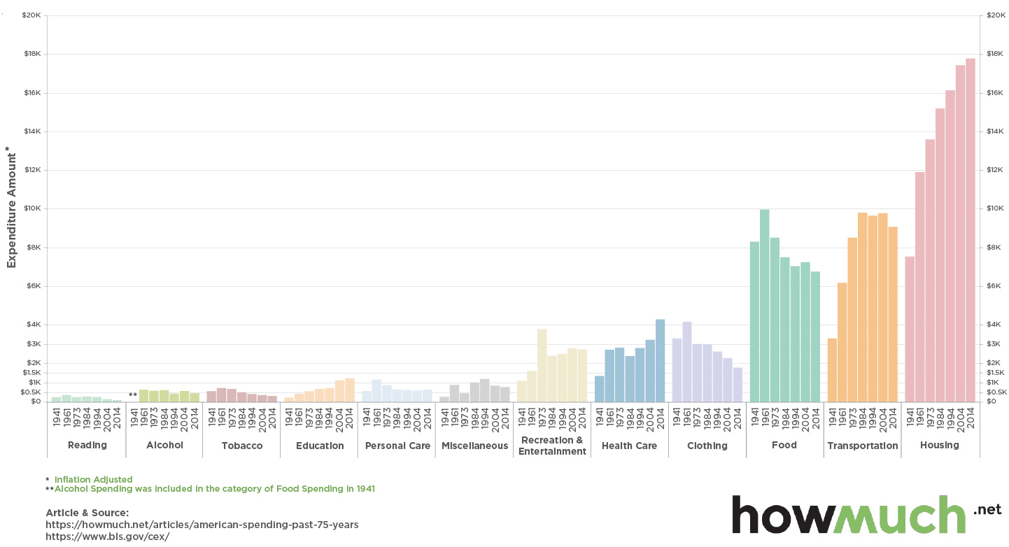
75 Years of How Americans Spend Their Money
Consumers are the foundation of the U.S. economy, and how they choose to spend their money is a telling indicator of the overall American economic story.
The above chart from HowMuch.net, a cost information site, plots data from the Bureau of Labor Statistics (BLS) for 12 different consumer categories over a period of nearly 75 years to show the changing way in which Americans spend their money.
The data reflects median spending, and is adjusted for inflation.
Back in the Day…
One of the most interesting things about this chart is the data from 1941. What did Americans spend their money on before entering WWII, and how does that contrast with today?
Interestingly, in 1941, more money was spent on food than anything else. That year, the cost of putting food on the table averaged $8,311, coinciding with a time when nearly 15% of the workforce was working in agriculture. Today, farming is obviously much more technologically advanced, and food is also grown cheaply in other countries for consumption in America.
Food is now only the third-most important spending category for Americans at $6,759 per year, and only 1.6% of Americans now work agriculture, according to the World Bank.
Housing has also changed dramatically over time. While it has always been a key component of spending, shelter was actually cheaper ($7,537 per year) than putting food on the table in 1941. Since then, rents and house prices have risen substantially, and Americans now spend $17,798 per year on housing. This makes it by far the largest expenditure, on average, for each person.
Trending Up, Trending Down
Over the years, cost reductions can be seen the most in both clothing and food categories, which have benefited from new technologies and cheap labor in other countries.
Meanwhile, significant increases in spending can be found in healthcare, education, and transportation categories.
Healthcare spending in the U.S. is a global outlier (and not in a good way), and we previously noted that textbook and tuition costs have increased 207% and 197% respectively since 1996.
Lastly, the trend for money spent on transportation appears to reflect the cost of oil, which hit its highest points in the early 1980s and late 2000s. The most recent year of data from 2014 shows a notable decrease in transportation costs, which likely reflects the collapse in oil prices that occurred in mid-2014.


Personal Finance
Chart: The Declining Value of the U.S. Federal Minimum Wage
This graphic compares the nominal vs. inflation-adjusted value of the U.S. minimum wage, from 1940 to 2023.
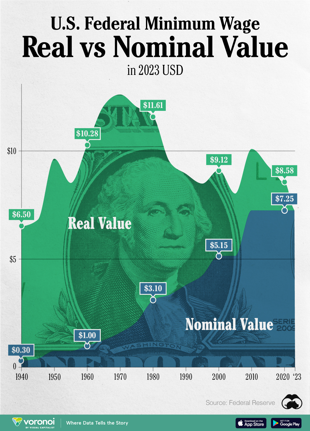
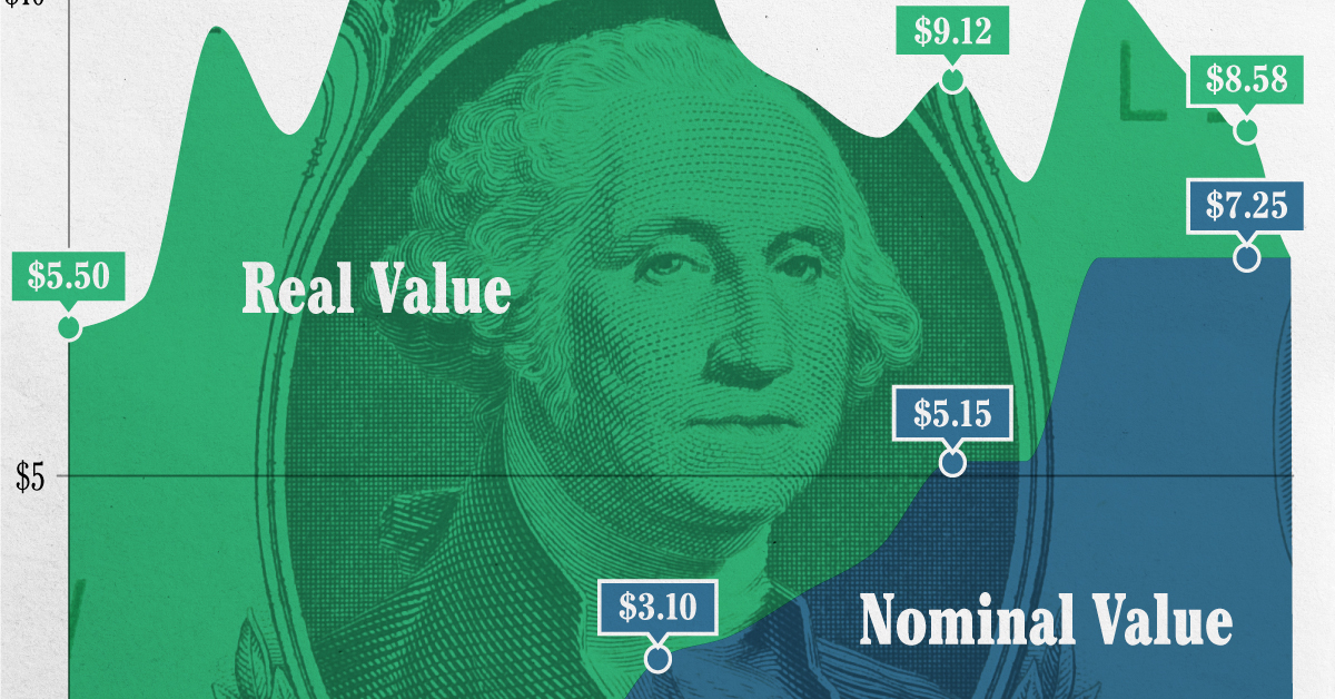
The Declining Value of the U.S. Federal Minimum Wage
This was originally posted on our Voronoi app. Download the app for free on iOS or Android and discover incredible data-driven charts from a variety of trusted sources.
This graphic illustrates the history of the U.S. federal minimum wage using data compiled by Statista, in both nominal and real (inflation-adjusted) terms. The federal minimum wage was raised to $7.25 per hour in July 2009, where it has remained ever since.
Nominal vs. Real Value
The data we used to create this graphic can be found in the table below.
| Year | Nominal value ($/hour) | Real value ($/hour) |
|---|---|---|
| 1940 | 0.3 | 6.5 |
| 1945 | 0.4 | 6.82 |
| 1950 | 0.75 | 9.64 |
| 1955 | 0.75 | 8.52 |
| 1960 | 1 | 10.28 |
| 1965 | 1.25 | 12.08 |
| 1970 | 1.6 | 12.61 |
| 1975 | 2.1 | 12.04 |
| 1980 | 3.1 | 11.61 |
| 1985 | 3.35 | 9.51 |
| 1990 | 3.8 | 8.94 |
| 1995 | 4.25 | 8.49 |
| 2000 | 5.15 | 9.12 |
| 2005 | 5.15 | 8.03 |
| 2010 | 7.25 | 10.09 |
| 2015 | 7.25 | 9.3 |
| 2018 | 7.25 | 8.78 |
| 2019 | 7.25 | 8.61 |
| 2020 | 7.25 | 8.58 |
| 2021 | 7.25 | 8.24 |
| 2022 | 7.25 | 7.61 |
| 2023 | 7.25 | 7.25 |
What our graphic shows is how inflation has eroded the real value of the U.S. minimum wage over time, despite nominal increases.
For instance, consider the year 1960, when the federal minimum wage was $1 per hour. After accounting for inflation, this would be worth around $10.28 today!
The two lines converge at 2023 because the nominal and real value are identical in present day terms.
Many States Have Their Own Minimum Wage
According to the National Conference of State Legislatures (NCSL), 30 states and Washington, D.C. have implemented a minimum wage that is higher than $7.25.
The following states have adopted the federal minimum: Georgia, Idaho, Indiana, Iowa, Kansas, Kentucky, New Hampshire, North Carolina, North Dakota, Oklahoma, Pennsylvania, Texas, Utah, Wisconsin, and Wyoming.
Meanwhile, the states of Alabama, Louisiana, Mississippi, South Carolina, and Tennessee have no wage minimums, but have to follow the federal minimum.
How Does the U.S. Minimum Wage Rank Globally?
If you found this topic interesting, check out Mapped: Minimum Wage Around the World to see which countries have the highest minimum wage in monthly terms, as of January 2023.

-

 Mining1 week ago
Gold vs. S&P 500: Which Has Grown More Over Five Years?
-

 Markets2 weeks ago
Ranked: The Most Valuable Housing Markets in America
-

 Money2 weeks ago
Which States Have the Highest Minimum Wage in America?
-

 AI2 weeks ago
Ranked: Semiconductor Companies by Industry Revenue Share
-

 Markets2 weeks ago
Ranked: The World’s Top Flight Routes, by Revenue
-

 Demographics2 weeks ago
Population Projections: The World’s 6 Largest Countries in 2075
-

 Markets2 weeks ago
The Top 10 States by Real GDP Growth in 2023
-

 Demographics2 weeks ago
The Smallest Gender Wage Gaps in OECD Countries