Money
The History of Money Explained in One Infographic
The History of Money Explained in One Infographic
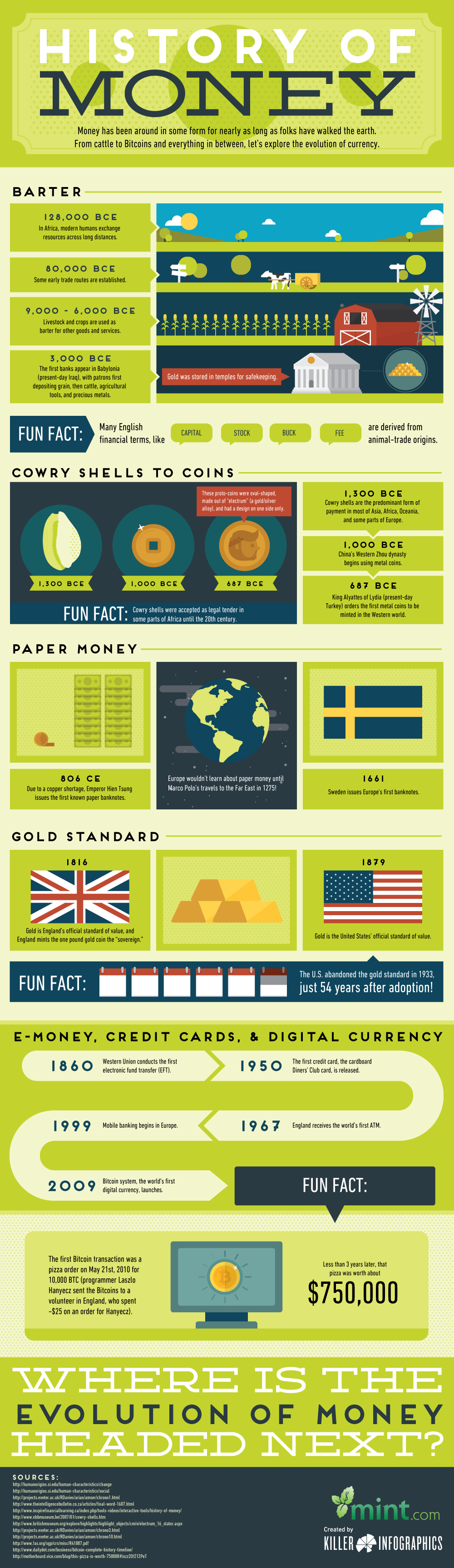
Today’s infographic from Mint.com highlights the history of money, including the many monetary experiments that have taken place since ancient times.
Some innovations have stood the test of time – precious metals, for example, have been used for thousands of years. Paper money and banknotes are also widespread in use, after first being turned to in China in 806 after a copper shortage prevented the minting of new coins.
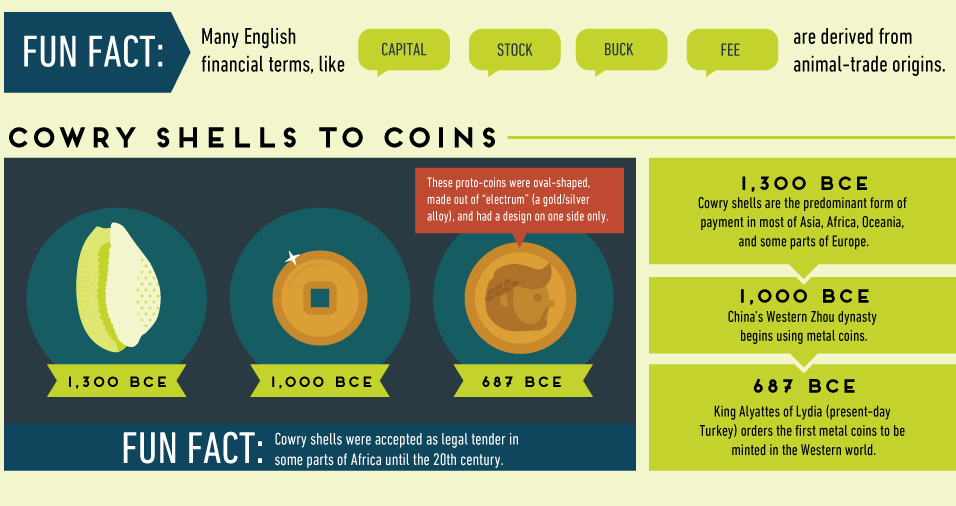
Other experiments didn’t have much staying power. The adoption of strange currencies such as squirrel pelts, cowry shells, or parmesan cheese are only remembered for their peculiarity.
Further, other attempts to stabilize the monetary system were abandoned early as well. The original U.S. gold standard lasted just 54 years, after FDR ditched it during the Great Depression. The Bretton Woods version (gold-exchange standard) lasted even shorter, abandoned after being in place for 26 years when Nixon ended all convertibility between the U.S. dollar and gold in 1971.
The Newest Chapter in Our Monetary History
Although the infographic ends with the introduction of cryptocurrency in 2009, it should be noted that the newest chapter in the history of money is taking place right before our eyes.
The “War on Cash” has been accelerating in recent years, as governments and central banks have called for the elimination of high denomination banknotes. While these anti-cash motions have also been made in many Western countries, the most vivid example of the demonetization is currently happening in India.
In November 2016, Indian Prime Minister Narendra Modi demonetized 500 and 1000 rupee notes, eliminating 86% of the country’s notes overnight. While Indians could theoretically exchange 500 and 1,000 rupee notes for higher denominations, it was only up to a limit of 4,000 rupees per person. Sums above that had to be routed through a bank account in a country where only 50% of Indians have such access.
There have been at least 112 reported deaths associated with this demonetization – including suicides and the passing of elderly people waiting in bank queues for days to exchange money. India’s largest organization of manufacturers, the All India Manufacturers Organization, also estimates in a report that micro-small scale industries suffered 35% jobs losses and a 50% dip in revenue in the first 34 days since demonetization.
While demonetization in India is off to a rough start, some believe it can still be ultimately successful in the long-term. Regardless, the “War on Cash” still has incredible global momentum – and the end result – however it turns out – will likely form another important chapter in the history of money.


Money
How Debt-to-GDP Ratios Have Changed Since 2000
See how much the debt-to-GDP ratios of advanced economies have grown (or shrank) since the year 2000.


How Debt-to-GDP Ratios Have Changed Since 2000
This was originally posted on our Voronoi app. Download the app for free on Apple or Android and discover incredible data-driven charts from a variety of trusted sources.
Government debt levels have grown in most parts of the world since the 2008 financial crisis, and even more so after the COVID-19 pandemic.
To gain perspective on this long-term trend, we’ve visualized the debt-to-GDP ratios of advanced economies, as of 2000 and 2024 (estimated). All figures were sourced from the IMF’s World Economic Outlook.
Data and Highlights
The data we used to create this graphic is listed in the table below. “Government gross debt” consists of all liabilities that require payment(s) of interest and/or principal in the future.
| Country | 2000 (%) | 2024 (%) | Change (pp) |
|---|---|---|---|
| 🇯🇵 Japan | 135.6 | 251.9 | +116.3 |
| 🇸🇬 Singapore | 82.3 | 168.3 | +86.0 |
| 🇺🇸 United States | 55.6 | 126.9 | +71.3 |
| 🇬🇧 United Kingdom | 36.6 | 105.9 | +69.3 |
| 🇬🇷 Greece | 104.9 | 160.2 | +55.3 |
| 🇫🇷 France | 58.9 | 110.5 | +51.6 |
| 🇵🇹 Portugal | 54.2 | 104.0 | +49.8 |
| 🇪🇸 Spain | 57.8 | 104.7 | +46.9 |
| 🇸🇮 Slovenia | 25.9 | 66.5 | +40.6 |
| 🇫🇮 Finland | 42.4 | 76.5 | +34.1 |
| 🇭🇷 Croatia | 35.4 | 61.8 | +26.4 |
| 🇨🇦 Canada | 80.4 | 103.3 | +22.9 |
| 🇨🇾 Cyprus | 56.0 | 70.9 | +14.9 |
| 🇦🇹 Austria | 65.7 | 74.0 | +8.3 |
| 🇸🇰 Slovak Republic | 50.5 | 56.5 | +6.0 |
| 🇩🇪 Germany | 59.3 | 64.0 | +4.7 |
| 🇧🇪 Belgium | 109.6 | 106.8 | -2.8 |
| 🇮🇱 Israel | 77.4 | 56.8 | -20.6 |
| 🇮🇸 Iceland | 75.8 | 54.6 | -21.2 |
The debt-to-GDP ratio indicates how much a country owes compared to the size of its economy, reflecting its ability to manage and repay debts. Percentage point (pp) changes shown above indicate the increase or decrease of these ratios.
Countries with the Biggest Increases
Japan (+116 pp), Singapore (+86 pp), and the U.S. (+71 pp) have grown their debt as a percentage of GDP the most since the year 2000.
All three of these countries have stable, well-developed economies, so it’s unlikely that any of them will default on their growing debts. With that said, higher government debt leads to increased interest payments, which in turn can diminish available funds for future government budgets.
This is a rising issue in the U.S., where annual interest payments on the national debt have surpassed $1 trillion for the first time ever.
Only 3 Countries Saw Declines
Among this list of advanced economies, Belgium (-2.8 pp), Iceland (-21.2 pp), and Israel (-20.6 pp) were the only countries that decreased their debt-to-GDP ratio since the year 2000.
According to Fitch Ratings, Iceland’s debt ratio has decreased due to strong GDP growth and the use of its cash deposits to pay down upcoming maturities.
See More Debt Graphics from Visual Capitalist
Curious to see which countries have the most government debt in dollars? Check out this graphic that breaks down $97 trillion in debt as of 2023.

-

 Maps1 week ago
The Largest Earthquakes in the New York Area (1970-2024)
-

 Money2 weeks ago
Where Does One U.S. Tax Dollar Go?
-

 Automotive2 weeks ago
Almost Every EV Stock is Down After Q1 2024
-

 AI2 weeks ago
The Stock Performance of U.S. Chipmakers So Far in 2024
-

 Markets2 weeks ago
Charted: Big Four Market Share by S&P 500 Audits
-

 Real Estate2 weeks ago
Ranked: The Most Valuable Housing Markets in America
-

 Money2 weeks ago
Which States Have the Highest Minimum Wage in America?
-

 AI2 weeks ago
Ranked: Semiconductor Companies by Industry Revenue Share