Markets
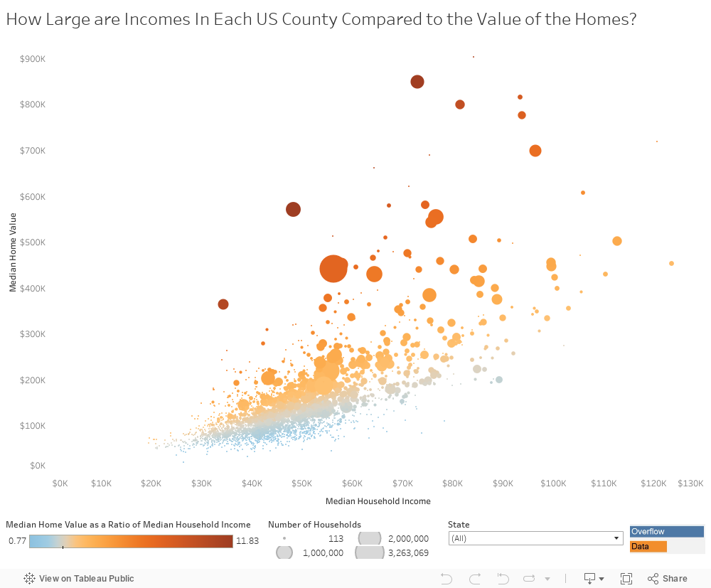
Interactive: Least Affordable Housing in the U.S.
var divElement = document.getElementById(‘viz1482860638798’); var vizElement = divElement.getElementsByTagName(‘object’)[0]; if ( divElement.offsetWidth > 800 ) { vizElement.style.width=’1004px’;vizElement.style.height=’869px’;} else if ( divElement.offsetWidth > 500 ) { vizElement.style.width=’1004px’;vizElement.style.height=’869px’;} else { vizElement.style.width=’100%’;vizElement.style.height=’794px’;} var scriptElement = document.createElement(‘script’); scriptElement.src = ‘https://public.tableau.com/javascripts/api/viz_v1.js’; vizElement.parentNode.insertBefore(scriptElement, vizElement);
Interactive: Least Affordable Housing in the U.S.
It doesn’t always make sense to measure affordability by a price in absolute dollars.
With real estate in particular, every county is different and value may be relative depending on the area in question. A ranch that seems expensive to a farmer in Nebraska may be a drop in the bucket for a lawyer from Manhattan.
Today’s interactive chart from Overflow Data shows median home values plotted against median household income, which helps give you a feel for where the least affordable housing in the U.S. is located. It’s also worth noting that in this visualization, that data comes from the ACS 2011-2015 5 year estimates from the U.S. Census Bureau.
Expensive by any Measure
The least affordable housing in the U.S. falls into two categories: places that you would expect (San Francisco, New York City) and counties that may be off your radar, such as a few in Massachusetts, Washington, or Wyoming.
The Bay Area, not surprisingly, has some of the least affordable housing in the country – both in absolute terms, and in terms relative to income. There is no shortage of anecdotes for the madness occurring in San Francisco and the surrounding area, and the data reflects that.
In San Francisco proper, the median home value is $800,000 with a median income of $81,000, giving a price-to-income ratio of 9.8. Meanwhile, in Silicon Valley, housing is nearly as pricey, but many people are able to make up for it with higher incomes: San Mateo County has a ratio of 8.3, and Santa Clara County has a ratio of 7.3.
New York City, with its five boroughs, is also interesting to look at. Here they are ranked by price-to-income:
- Kings County (Brooklyn): 11.8 (House value: $570,000, Income: $48,000)
- New York County (Manhattan): 11.7 (House value: $849,000, Income: $73,000)
- Bronx County (The Bronx): 10.6 (House value: $363,000, Income: $34,000)
- Queens County (Queens): 7.8 (House value: $450,000, Income: $58,000)
- Richmond County (Staten Island): 6.0 (House value: $440,000, Income: $73,000)
Brooklyn is the most expensive borough based on price-to-income, just nudging out Manhattan. The Bronx also has some of the least affordable housing in the country, mainly due to lower income levels than the rest of the city.
Pricey Enclaves
As mentioned before, states like Wyoming, Massachusetts, Colorado, and Washington also have counties that are quite expensive in terms of price-to-income.
- Teton County, Wyoming: 9.1 (House value: $689,000, Income: $75,000)
- Pitkin County, Colorado: 8.7 (House value: $621,000, Income: $71,000)
- San Miguel County, Colorado: 9.1 (House value: $513,000, Income: $56,000)
- Nantucket County, Massachusetts: 10.7 (House value: $903,000, Income: $84,000)
- Dukes County, Massachusetts: 10.3 (House value: $661,000, Income: $64,000)
- San Juan County, Washington: 8.3 (House value: $466,000, Income: $56,000)
Many of these, such as Teton County or Pitkin County, are located in the mountains.
Others, like the San Juans or Nantucket are made up of beautiful islands that are relatively close to major cities – in this case, Seattle and Providence/Boston respectively.


Markets
U.S. Debt Interest Payments Reach $1 Trillion
U.S. debt interest payments have surged past the $1 trillion dollar mark, amid high interest rates and an ever-expanding debt burden.


U.S. Debt Interest Payments Reach $1 Trillion
This was originally posted on our Voronoi app. Download the app for free on iOS or Android and discover incredible data-driven charts from a variety of trusted sources.
The cost of paying for America’s national debt crossed the $1 trillion dollar mark in 2023, driven by high interest rates and a record $34 trillion mountain of debt.
Over the last decade, U.S. debt interest payments have more than doubled amid vast government spending during the pandemic crisis. As debt payments continue to soar, the Congressional Budget Office (CBO) reported that debt servicing costs surpassed defense spending for the first time ever this year.
This graphic shows the sharp rise in U.S. debt payments, based on data from the Federal Reserve.
A $1 Trillion Interest Bill, and Growing
Below, we show how U.S. debt interest payments have risen at a faster pace than at another time in modern history:
| Date | Interest Payments | U.S. National Debt |
|---|---|---|
| 2023 | $1.0T | $34.0T |
| 2022 | $830B | $31.4T |
| 2021 | $612B | $29.6T |
| 2020 | $518B | $27.7T |
| 2019 | $564B | $23.2T |
| 2018 | $571B | $22.0T |
| 2017 | $493B | $20.5T |
| 2016 | $460B | $20.0T |
| 2015 | $435B | $18.9T |
| 2014 | $442B | $18.1T |
| 2013 | $425B | $17.2T |
| 2012 | $417B | $16.4T |
| 2011 | $433B | $15.2T |
| 2010 | $400B | $14.0T |
| 2009 | $354B | $12.3T |
| 2008 | $380B | $10.7T |
| 2007 | $414B | $9.2T |
| 2006 | $387B | $8.7T |
| 2005 | $355B | $8.2T |
| 2004 | $318B | $7.6T |
| 2003 | $294B | $7.0T |
| 2002 | $298B | $6.4T |
| 2001 | $318B | $5.9T |
| 2000 | $353B | $5.7T |
| 1999 | $353B | $5.8T |
| 1998 | $360B | $5.6T |
| 1997 | $368B | $5.5T |
| 1996 | $362B | $5.3T |
| 1995 | $357B | $5.0T |
| 1994 | $334B | $4.8T |
| 1993 | $311B | $4.5T |
| 1992 | $306B | $4.2T |
| 1991 | $308B | $3.8T |
| 1990 | $298B | $3.4T |
| 1989 | $275B | $3.0T |
| 1988 | $254B | $2.7T |
| 1987 | $240B | $2.4T |
| 1986 | $225B | $2.2T |
| 1985 | $219B | $1.9T |
| 1984 | $205B | $1.7T |
| 1983 | $176B | $1.4T |
| 1982 | $157B | $1.2T |
| 1981 | $142B | $1.0T |
| 1980 | $113B | $930.2B |
| 1979 | $96B | $845.1B |
| 1978 | $84B | $789.2B |
| 1977 | $69B | $718.9B |
| 1976 | $61B | $653.5B |
| 1975 | $55B | $576.6B |
| 1974 | $50B | $492.7B |
| 1973 | $45B | $469.1B |
| 1972 | $39B | $448.5B |
| 1971 | $36B | $424.1B |
| 1970 | $35B | $389.2B |
| 1969 | $30B | $368.2B |
| 1968 | $25B | $358.0B |
| 1967 | $23B | $344.7B |
| 1966 | $21B | $329.3B |
Interest payments represent seasonally adjusted annual rate at the end of Q4.
At current rates, the U.S. national debt is growing by a remarkable $1 trillion about every 100 days, equal to roughly $3.6 trillion per year.
As the national debt has ballooned, debt payments even exceeded Medicaid outlays in 2023—one of the government’s largest expenditures. On average, the U.S. spent more than $2 billion per day on interest costs last year. Going further, the U.S. government is projected to spend a historic $12.4 trillion on interest payments over the next decade, averaging about $37,100 per American.
Exacerbating matters is that the U.S. is running a steep deficit, which stood at $1.1 trillion for the first six months of fiscal 2024. This has accelerated due to the 43% increase in debt servicing costs along with a $31 billion dollar increase in defense spending from a year earlier. Additionally, a $30 billion increase in funding for the Federal Deposit Insurance Corporation in light of the regional banking crisis last year was a major contributor to the deficit increase.
Overall, the CBO forecasts that roughly 75% of the federal deficit’s increase will be due to interest costs by 2034.

-

 Maps1 week ago
The Largest Earthquakes in the New York Area (1970-2024)
-

 Money2 weeks ago
Where Does One U.S. Tax Dollar Go?
-

 Automotive2 weeks ago
Almost Every EV Stock is Down After Q1 2024
-

 AI2 weeks ago
The Stock Performance of U.S. Chipmakers So Far in 2024
-

 Markets2 weeks ago
Charted: Big Four Market Share by S&P 500 Audits
-

 Real Estate2 weeks ago
Ranked: The Most Valuable Housing Markets in America
-

 Money2 weeks ago
Which States Have the Highest Minimum Wage in America?
-

 AI2 weeks ago
Ranked: Semiconductor Companies by Industry Revenue Share