Misc
These 3 Animated Maps Show the World’s Largest Cities Throughout History
In 300 B.C., Carthage was one of the world’s largest cities with up to 700,000 people living within its walls. The Carthaginian republic was a force to be reckoned with, controlling inconceivable amounts of wealth and land all around the Mediterranean.
However, just over a century later in 146 B.C., Carthage was burnt to the ground by the Romans. The destruction of Carthage was so thorough that many things are still not known about their civilization today. Carthage went from being a major power to literally being wiped off of the map.
A few decades after the annihilation of Carthage, it was Rome’s turn to become the world’s largest city for close to 500 years. Of course, Rome itself would fall by 476 A.D. for a variety of reasons.
And so the title of the world’s largest city would transfer again, this time to Constantinople across the Mediterranean.
The World’s Largest Cities Throughout History
In the grand scheme of history, things change quite fast. One cataclysmic choice or event can turn even the greatest empire into a heap of rubble. Sometimes the decline of a world-class city is more gradual – and it is over time that it loses its title to another place in a far and distant land.
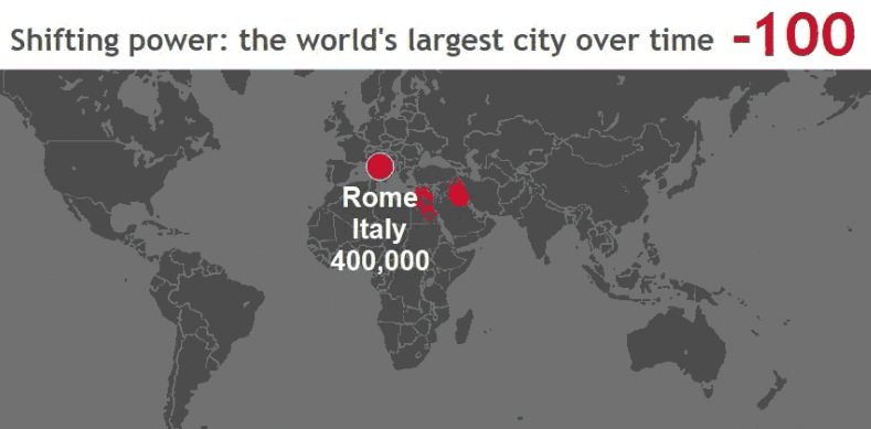
The following animated map from KPMG Demographics tracks the world’s largest cities from 4,000 BC to today, and it shows how temporary a city’s rise to prominence can be.
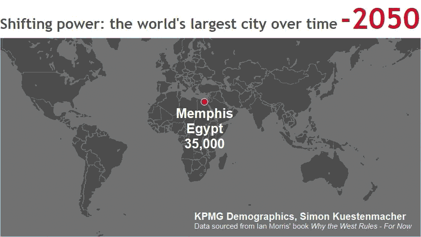
(Keep in mind that there is some disagreement by historians over which cities were the biggest in certain time periods.)
The power of industrialization and technology can be seen here. Up until the 1800s, it was almost unfathomable to have a city of more than a million inhabitants.
Sanitation was a major limiting factor, but other issues like transportation and a lack of density also made it a challenge. The Industrial Revolution changed that, and starting in the 1800s you see cities like London, New York, and Tokyo taking the title in an exponential fashion. It caps off with Delhi in 2050, expected to have a whopping 40 million inhabitants by that time.
However, it’s worth seeing this urban growth through a different lens. Instead of looking at the biggest cities overall, the below map from Max Galka’s Metrocosm blog looks at the founding of major cities to show the progress of urbanization from 3700 B.C. until today.
You can use the sliding bar to adjust the date. The real fireworks begin in the year 1200, with an explosion in cities between 1800 and today.
Here’s one final look at cities and their modern populations, this time an interactive 3d globe also from Metrocosm:
This gives an idea of where the largest concentrations of people live today. The globe also puts into perspective a small subsection of Asia, which holds more of the world’s population within a small circle than outside of it.


VC+
VC+: Get Our Key Takeaways From the IMF’s World Economic Outlook
A sneak preview of the exclusive VC+ Special Dispatch—your shortcut to understanding IMF’s World Economic Outlook report.

Have you read IMF’s latest World Economic Outlook yet? At a daunting 202 pages, we don’t blame you if it’s still on your to-do list.
But don’t worry, you don’t need to read the whole April release, because we’ve already done the hard work for you.
To save you time and effort, the Visual Capitalist team has compiled a visual analysis of everything you need to know from the report—and our upcoming VC+ Special Dispatch will be available exclusively to VC+ members on Thursday, April 25th.
If you’re not already subscribed to VC+, make sure you sign up now to receive the full analysis of the IMF report, and more (we release similar deep dives every week).
For now, here’s what VC+ members can expect to receive.
Your Shortcut to Understanding IMF’s World Economic Outlook
With long and short-term growth prospects declining for many countries around the world, this Special Dispatch offers a visual analysis of the key figures and takeaways from the IMF’s report including:
- The global decline in economic growth forecasts
- Real GDP growth and inflation forecasts for major nations in 2024
- When interest rate cuts will happen and interest rate forecasts
- How debt-to-GDP ratios have changed since 2000
- And much more!

Get the Full Breakdown in the Next VC+ Special Dispatch
VC+ members will receive the full Special Dispatch on Thursday, April 25th.
Make sure you join VC+ now to receive exclusive charts and the full analysis of key takeaways from IMF’s World Economic Outlook.
Don’t miss out. Become a VC+ member today.
What You Get When You Become a VC+ Member
VC+ is Visual Capitalist’s premium subscription. As a member, you’ll get the following:
- Special Dispatches: Deep dive visual briefings on crucial reports and global trends
- Markets This Month: A snappy summary of the state of the markets and what to look out for
- The Trendline: Weekly curation of the best visualizations from across the globe
- Global Forecast Series: Our flagship annual report that covers everything you need to know related to the economy, markets, geopolitics, and the latest tech trends
- VC+ Archive: Hundreds of previously released VC+ briefings and reports that you’ve been missing out on, all in one dedicated hub
You can get all of the above, and more, by joining VC+ today.

-

 Green1 week ago
Ranked: The Countries With the Most Air Pollution in 2023
-

 Automotive2 weeks ago
Almost Every EV Stock is Down After Q1 2024
-

 AI2 weeks ago
The Stock Performance of U.S. Chipmakers So Far in 2024
-

 Markets2 weeks ago
Charted: Big Four Market Share by S&P 500 Audits
-

 Real Estate2 weeks ago
Ranked: The Most Valuable Housing Markets in America
-

 Money2 weeks ago
Which States Have the Highest Minimum Wage in America?
-

 AI2 weeks ago
Ranked: Semiconductor Companies by Industry Revenue Share
-

 Travel2 weeks ago
Ranked: The World’s Top Flight Routes, by Revenue