Energy
Animation: How Solar Panels Work
Humans have been trying to harness the sun’s energy for most of history, but it was the invention of the first photovoltaic cell by French physicist Edmond Becquerel in 1839 that finally made solar energy possible on a grander scale.
Since then, solar has come a long way.
Not only has the cost of producing solar panels dropped like a rock, manufacturers are now routinely pumping out new innovations such as flexible solar cells, ultra-thin cells, and transparent photovoltaic windows. These could be game-changers for the industry, adding to the already incredible 39% annual growth occurring in U.S. solar capacity between 2013-2017.
Animated Infographic: How Solar Panels Work
Today’s infographic comes from SaveOnEnergy, and it covers the science behind how solar panels work.
While it is fairly technical, the handy animations will help you understand the principles behind photovoltaic cells in no time at all.
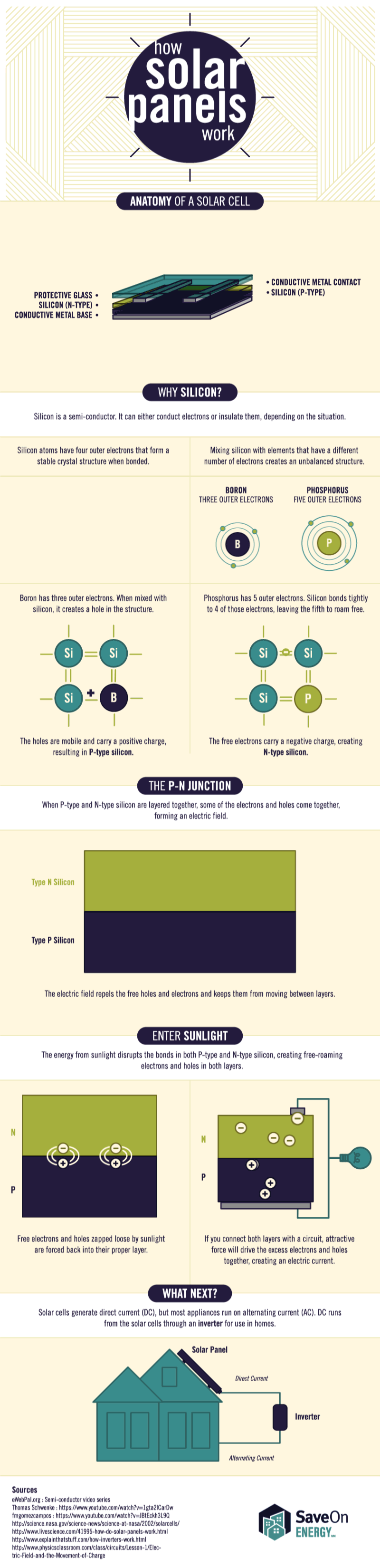
In terms of our understanding of how different energy sources work, perhaps the photovoltaic effect is one of the least intuitive processes for the average person to comprehend. After all, something like capturing wind energy is much more straightforward. The wind spins a turbine, and that turbine generates electricity.
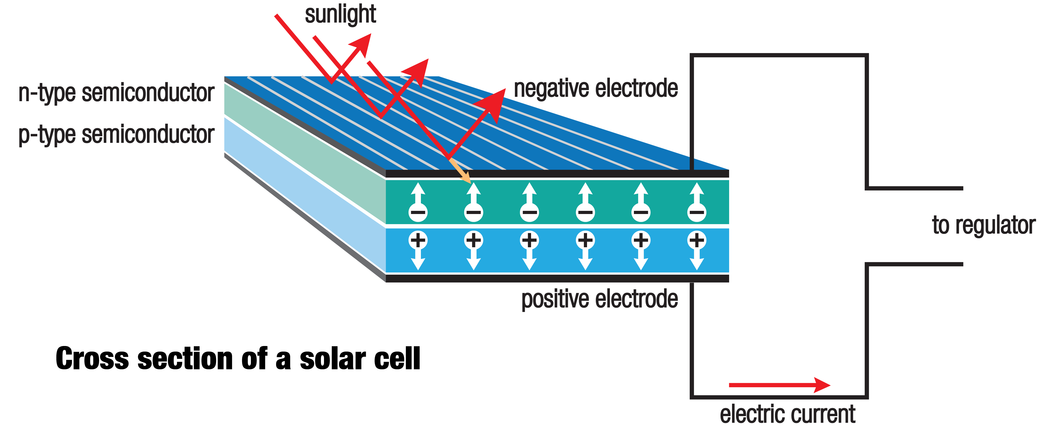
But solar panels have no moving parts. So how do these thin, glassy arrays turn sunlight into energy we can use?
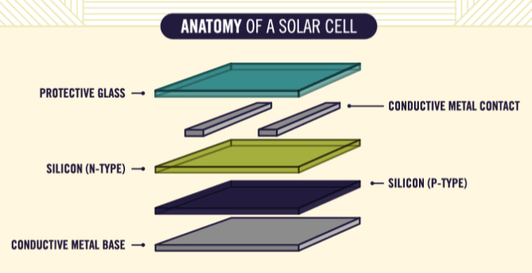
Each solar cell is made of multiple layers. The top semiconductor is a negative layer, which means the material contains extra electrons. The sun’s energy “shakes” these electrons loose, and these electrons become naturally attracted to the bottom semiconductor layer, which is positively charged. The design of the cell forces electrons to move in a specific direction, creating an electrical current.
Why are solar panels getting so much cheaper? Technological advances have made cells more efficient in using the photovoltaic effect to create electricity, and manufacturing processes are improving as well.
Interestingly, in the future, it is expected that cost reductions will be tilted more to “soft” costs such as those related to the financing, permitting, and selling of solar projects.


Lithium
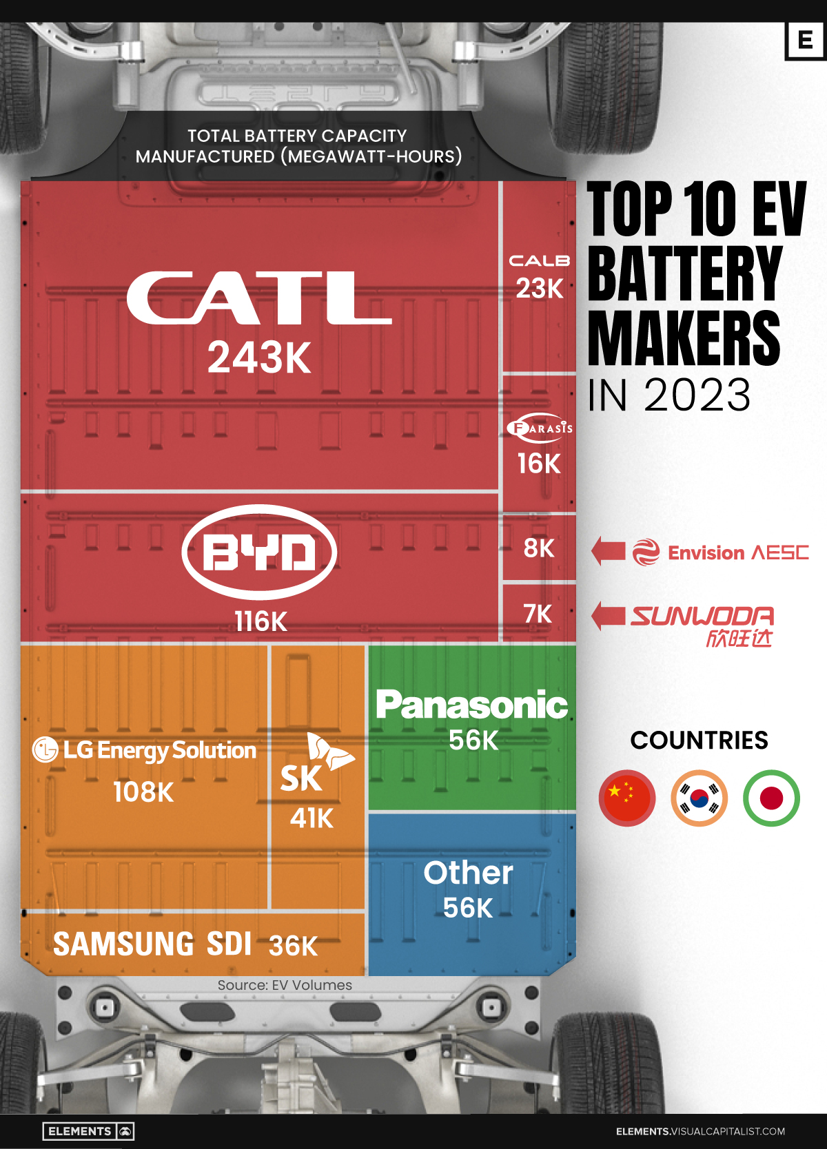
Ranked: The Top 10 EV Battery Manufacturers in 2023
Asia dominates this ranking of the world’s largest EV battery manufacturers in 2023.
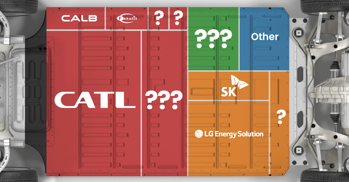
The Top 10 EV Battery Manufacturers in 2023
This was originally posted on our Voronoi app. Download the app for free on iOS or Android and discover incredible data-driven charts from a variety of trusted sources.
Despite efforts from the U.S. and EU to secure local domestic supply, all major EV battery manufacturers remain based in Asia.
In this graphic we rank the top 10 EV battery manufacturers by total battery deployment (measured in megawatt-hours) in 2023. The data is from EV Volumes.
Chinese Dominance
Contemporary Amperex Technology Co. Limited (CATL) has swiftly risen in less than a decade to claim the title of the largest global battery group.
The Chinese company now has a 34% share of the market and supplies batteries to a range of made-in-China vehicles, including the Tesla Model Y, SAIC’s MG4/Mulan, and various Li Auto models.
| Company | Country | 2023 Production (megawatt-hour) | Share of Total Production |
|---|---|---|---|
| CATL | 🇨🇳 China | 242,700 | 34% |
| BYD | 🇨🇳 China | 115,917 | 16% |
| LG Energy Solution | 🇰🇷 Korea | 108,487 | 15% |
| Panasonic | 🇯🇵 Japan | 56,560 | 8% |
| SK On | 🇰🇷 Korea | 40,711 | 6% |
| Samsung SDI | 🇰🇷 Korea | 35,703 | 5% |
| CALB | 🇨🇳 China | 23,493 | 3% |
| Farasis Energy | 🇨🇳 China | 16,527 | 2% |
| Envision AESC | 🇨🇳 China | 8,342 | 1% |
| Sunwoda | 🇨🇳 China | 6,979 | 1% |
| Other | - | 56,040 | 8% |
In 2023, BYD surpassed LG Energy Solution to claim second place. This was driven by demand from its own models and growth in third-party deals, including providing batteries for the made-in-Germany Tesla Model Y, Toyota bZ3, Changan UNI-V, Venucia V-Online, as well as several Haval and FAW models.
The top three battery makers (CATL, BYD, LG) collectively account for two-thirds (66%) of total battery deployment.
Once a leader in the EV battery business, Panasonic now holds the fourth position with an 8% market share, down from 9% last year. With its main client, Tesla, now sourcing batteries from multiple suppliers, the Japanese battery maker seems to be losing its competitive edge in the industry.
Overall, the global EV battery market size is projected to grow from $49 billion in 2022 to $98 billion by 2029, according to Fortune Business Insights.

-

 Travel1 week ago
Airline Incidents: How Do Boeing and Airbus Compare?
-

 Markets2 weeks ago
Visualizing America’s Shortage of Affordable Homes
-

 Green2 weeks ago
Ranked: Top Countries by Total Forest Loss Since 2001
-

 Money2 weeks ago
Where Does One U.S. Tax Dollar Go?
-

 Misc2 weeks ago
Almost Every EV Stock is Down After Q1 2024
-

 AI2 weeks ago
The Stock Performance of U.S. Chipmakers So Far in 2024
-

 Markets2 weeks ago
Charted: Big Four Market Share by S&P 500 Audits
-

 Real Estate2 weeks ago
Ranked: The Most Valuable Housing Markets in America