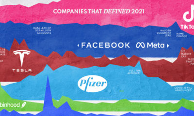

In 2021, a handful of companies dominated the conversation and influenced society in both positive and negative ways.
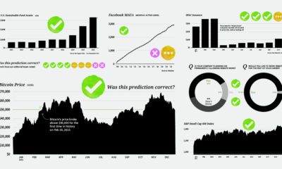

We analyze the results of predictions made by experts for 2021, to see what they got right—and what they ended up whiffing on.
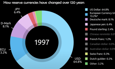

Today, the U.S. dollar makes up 60% of held reserve currency. See how global preferences have shifted since 1900.
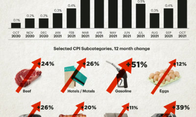

The U.S. inflation rate has seen its fastest annual increase in over 30 years. Which consumer spending categories have been hit the hardest?
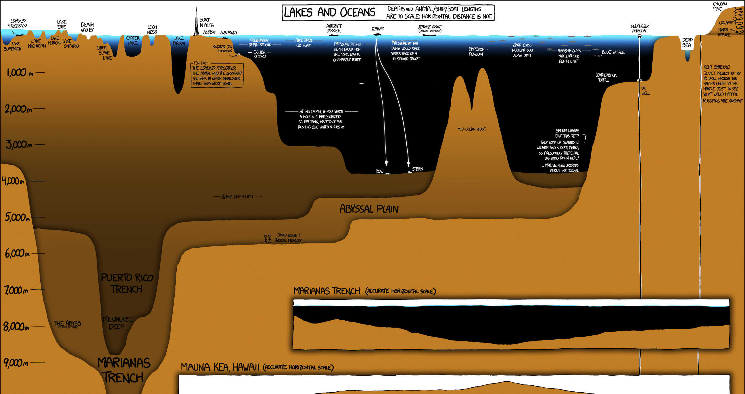
A unique and entertaining graphic that compares the depth of the world's lakes and oceans, as well as the deepest holes ever drilled.
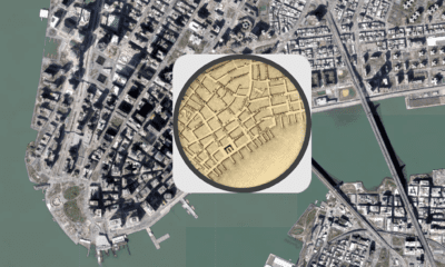

The early 1800s were a time of rapid change in New York City. This map shows the city in 1836, alongside the modern day metropolis.
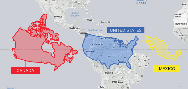
Conventional cartographic techniques have caused many to have a skewed perception of the true size of countries. Can an equal-area map provide clarity?
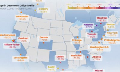

All North American downtowns are facing a sluggish recovery, but some are still seeing more than 80% less foot traffic than pre-pandemic times
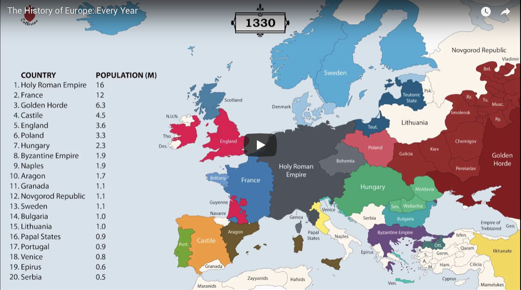
The history of Europe is breathtakingly complex, but this animation helps makes sense of 2,400 years of change on the European map.

Facebook's impending rebrand will impact the company's future. Why do companies change their name, and what can we learn from past examples?
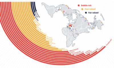

According to UBS, there are nine real estate markets that are in bubble territory with prices rising to unsustainable levels.
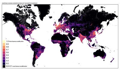

This detailed map looks at where humans have (and haven't) modified Earth's terrestrial environment. See human impact in incredible detail.
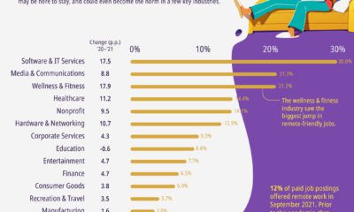

Remote job postings are up nearly across the board, but a few key industries are have seen a significant shift over the last year.
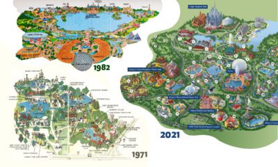

Historical maps highlight the Magic Kingdom's dramatic transformation from swampland to the biggest theme park in the world.
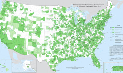

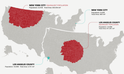
Fitting a complex population center into a tidy statistical box is no easy feat. Thankfully, this U.S. Census Bureau map is up to the challenge.


This timeline visualization is a high-level record of what happened on the fateful morning of September 11, 2001


This unique map graphic uses the Great Lakes region as a point of comparison for the top 25 largest lakes in the world.
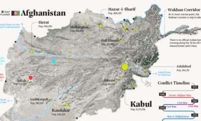

This map explainer looks at Afghanistan from a structural point of view, delving into geography and population patterns.

The world map you know is totally wrong. Check out this clever graphic, which helps put into perspective the true size of countries.
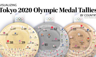

After 17 days and 339 events, the Tokyo Olympics have come to an end. Here we visualize the final medal tallies for every participating country.
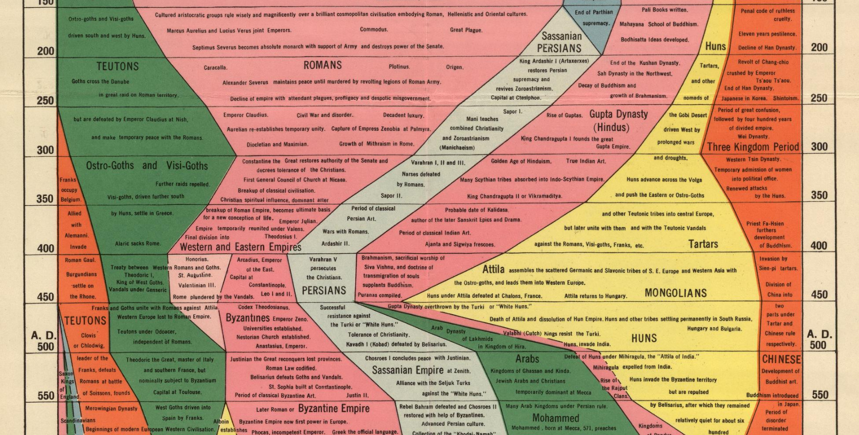
We examine an ambitious timeline that details the power of various civilizations going all the way back to 2,000 B.C.
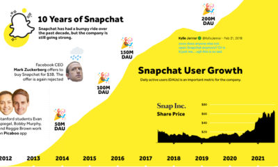

A high level look at Snapchat's 10-year history, including user growth, innovative product design, and the twists and turns along the way.
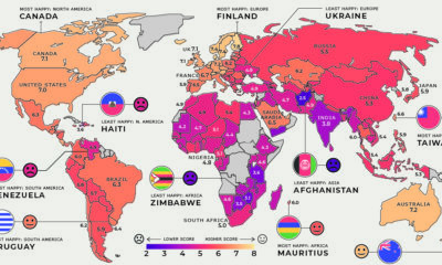

Global happiness levels are determined by many diverse factors. These maps look at the happiest and unhappiest countries in every region.
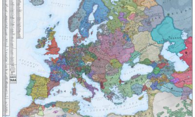

What did Europe look like in the Middle Ages? This map is a snapshot of medieval Europe back in 1444, during the rise of the Ottoman...
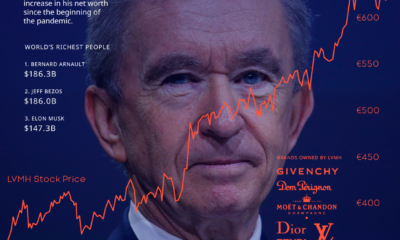

Step aside Bezos and Musk, at least for the time being. Bernard Arnault, the French luxury tycoon, is the world's richest person with $186.3 billion in...
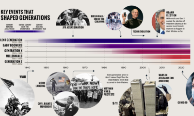

This timeline, from our Generational Power Index report, explores defining events in U.S. history that impacted each generation.

The U.S. population is spread across a huge amount of land, but its distribution is far from equal. These maps are a unique look at population...
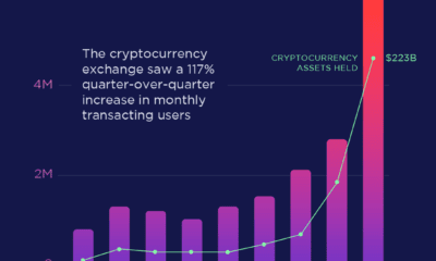

Coinbase, America's largest cryptocurrency exchange, saw a 117% growth in transacting users from Q4 2020 to Q1 2021.
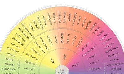

For years, humans have attempted to categorize and codify human emotion. Here are those attempts, visualized.
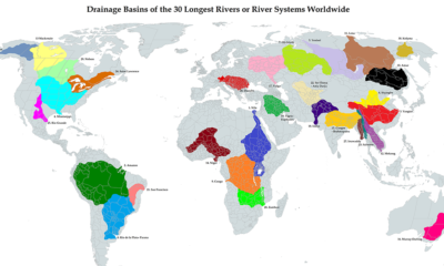

This unique map illustrates the immense size of drainage basins that feed the world's longest river systems
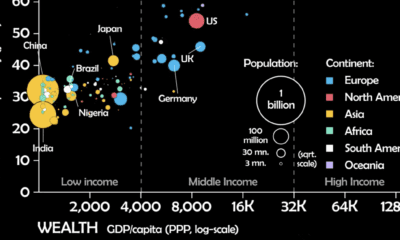

This unique animated visualization uses health and wealth measurements to chart the evolution of countries over time.
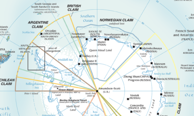

Antarctica is the most inhospitable region on Earth, but that hasn't stopped countries from making territorial claims. This maps shows them all.
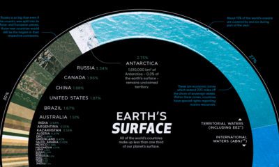

There are 510 million km² of area on the Earth, but less than 30% of this is land. Here's the share countries make up of the...
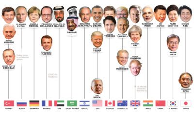

Who has led the world's 15 most powerful countries over the last 50 years? This visual looks at world leaders from 1970 to today.
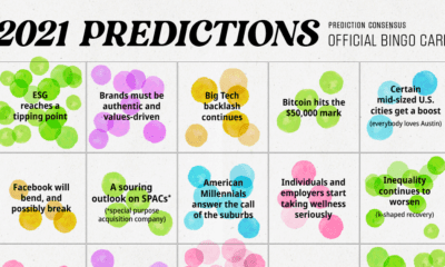

We analyzed 200+ articles, reports, and interviews to answer the question: Is there a consensus on what we can expect in 2021? Here are the results.
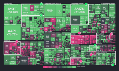

This treemap visualization shows the best and worst performing sectors of the stock market in 2020. We break down the winners and losers.

In a complex world, the combined forces of data and visual communication take on new importance. See our top 20 visualizations for 2020.
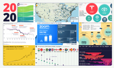

These 20 charts, maps, and visualizations help capture what happened in a tumultuous year around the globe.


In some cases, COVID-19 has sped up societal and economic trends that were already in motion. Here we examine five examples.
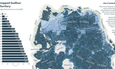

We know more about the surface of Mars than we do on the ocean floor. Which countries are mapping the ocean floor, and what's still unknown?
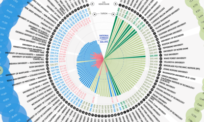

What school has the highest tuition in America? From Columbia to Ohio State, we rank college tuition across the top schools in the country.
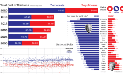

Buckle up your seatbelts—we look at 9 key data-driven charts to get you prepped for this consequential day in U.S. election history.

This interactive visualization tracks two decades of home price changes in hundreds of cities in the United States.


Most of us will experience impostor syndrome at some point in our careers. This flow chart helps identify which of 5 archetypes you fit with.
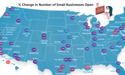

Across the U.S., 37% of small businesses are still shuttered. This map demonstrates how uneven that closure rate is in cities around the country.
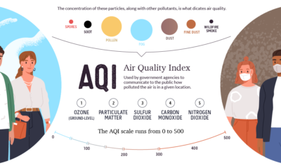

This graphic breaks down how the air quality index is measured, and looks at which regions are hardest hit by atmospheric pollution and wildfires.
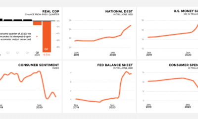

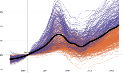
As COVID-19 spreads around the U.S. leaving economic upheaval in its wake, this snapshot reveals how major economic indicators are trending
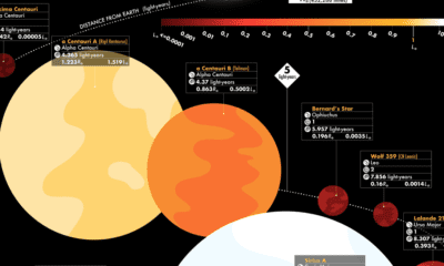

This graphic visualizes the 44 closest stars, revealing key facts such as distance from Earth, brightness, and whether potential planets are in orbit.
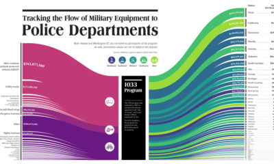

This visualization tracks the last decade of the 1033 Program, which provides free military equipment to police departments around the U.S.
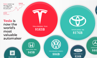

Thanks to a surging stock price, Tesla is now the world's most valuable automaker – surpassing industry giants Toyota and Volkswagen.


 Creator Program