Green
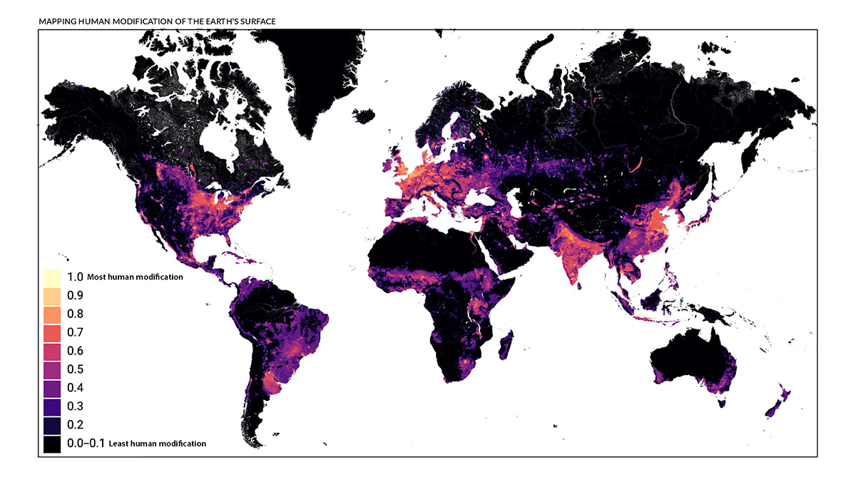
Mapped: Human Impact on the Earth’s Surface
View the full-size infographic
Mapped: Human Impact on the Earth’s Surface
With human population on Earth now past eight billion, our impact on the planet is becoming harder to ignore with each passing year.
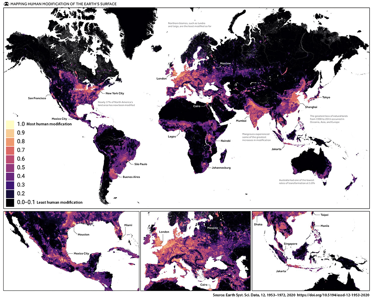
Our cities, infrastructure, agriculture, and pollution are all forms of stress we place on the natural world. This map, by David M. Theobald et al., shows just how much of the planet we’ve now modified. The researchers estimate that 14.6% or 18.5 million km² of land area has been modified – an area greater than Russia.
Defining Human Impact
Human impact on the Earth’s surface can take a number of different forms, and researchers took a nuanced approach to classifying the “modifications” we’ve made. In the end, 10 main stressors were used to create this map:
- Built-Up Areas: All of our cities and towns
- Agriculture: Areas devoted to crops and pastures
- Energy and extractive resources: Primarily locations where oil and gas are extracted
- Mines and quarries: Other ground-based natural resource extraction, excluding oil and gas
- Power plants: Areas where energy is produced – both renewable and non-renewable
- Transportation and service corridors: Primarily roads and railways
- Logging: This measures commodity-based forest loss (excludes factors like wildfire and urbanization)
- Human intrusion: Typically areas adjacent to population centers and roads that humans access
- Natural systems modification: Primarily modifications to water flow, including reservoir creation
- Pollution: Phenomenon such as acid rain and fog caused by air pollution
The classification descriptions above are simplified. See the methodology for full descriptions and calculations.
A Closer Look at Human Impact on the Earth’s Surface
To help better understand the level of impact humans can have on the planet, we’ll take a closer look three regions, and see how the situation on the ground relates to these maps.
Land Use Contrasts: Egypt
Almost all of Egypt’s population lives along the Nile and its delta, making it an interesting place to examine land use and human impact.
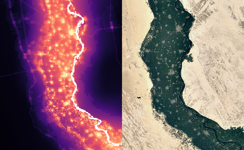
The towns and high intensity agricultural land following the river stand out clearly on the human modification map, while the nearby desert shows much less impact.
Intensive Modification: Netherlands
The Netherlands has some of the heavily modified landscapes on Earth, so the way it looks on this map will come as no surprise.
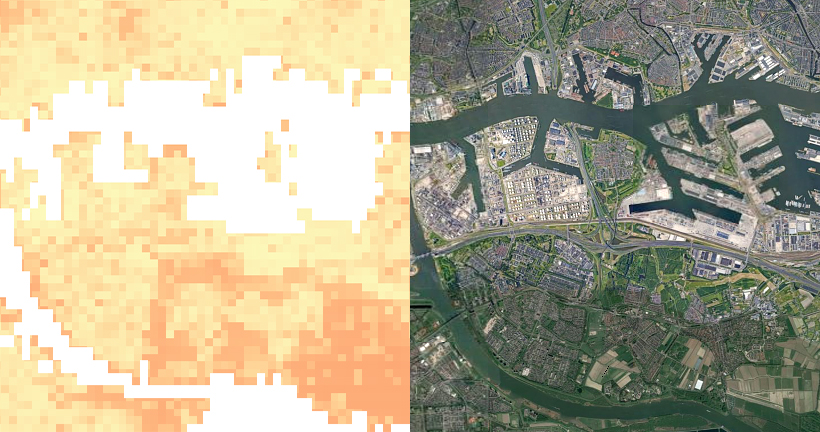
The area shown above, Rotterdam’s distinctive port and surround area, renders almost entirely in colors at the top of the human modification scale.
Resource Extraction: West Virginia
It isn’t just cities and towns that show up clearly on this map, it’s also the areas we extract our raw materials from as well. This mountainous region of West Virginia, in the United States, offers a very clear visual example.
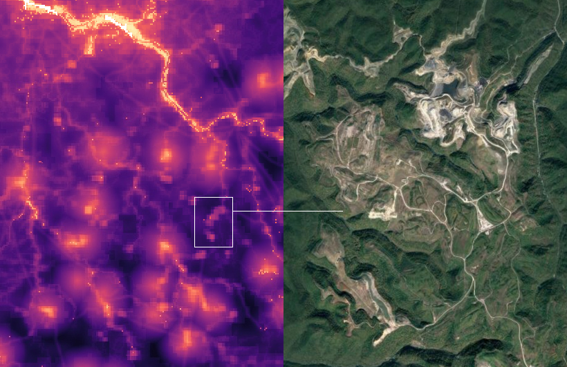
The mountaintop removal method of mining—which involves blasting mountains in order to retrieve seams of bituminous coal—is common in this region, and mine sites show up clearly in the map.
You can explore the interactive version of this map yourself to view any area on the globe. What surprises you about these patterns of human impact?


Green
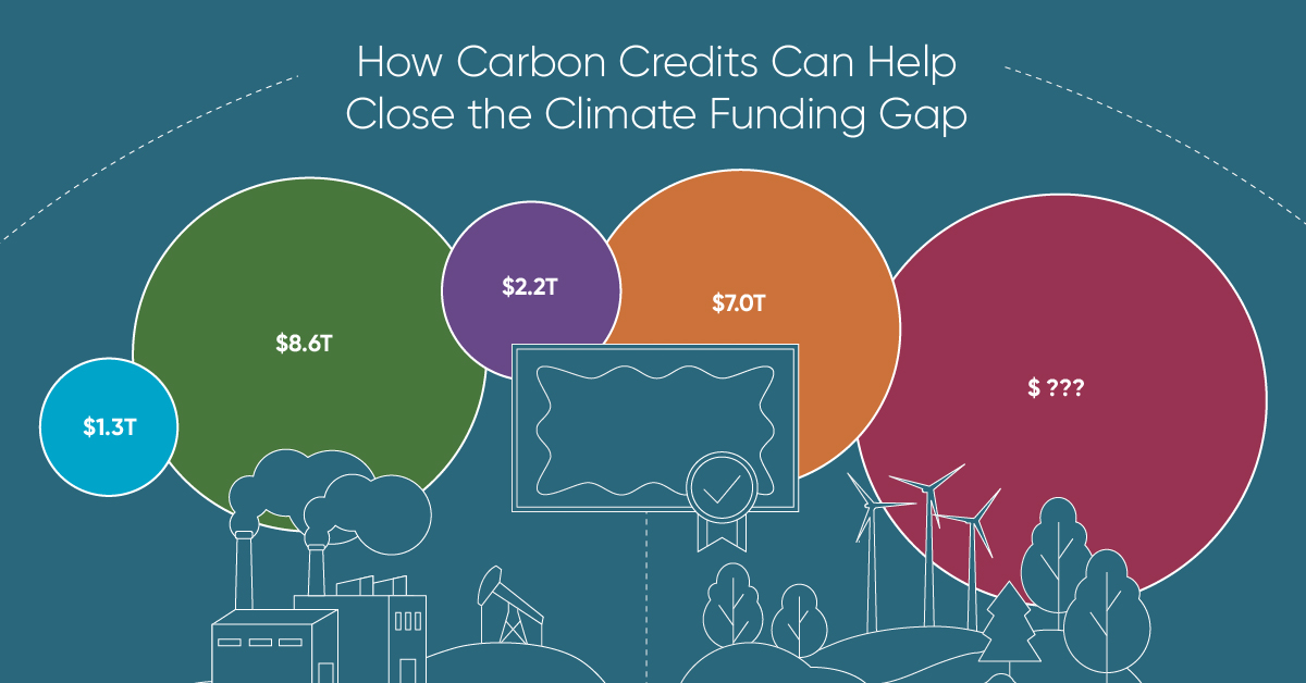
How Carbon Credits Can Help Close the Climate Funding Gap
To keep a 1.5℃ world within reach, global emissions need to fall by as much as 45% by 2030, and carbon credits could help close the gap.
How Carbon Credits Can Help Close the Climate Funding Gap
Governments around the world have committed to the goals of the Paris Agreement, but their climate pledges are insufficient. To keep a 1.5℃ world within reach, global emissions need to fall by as much as 45% by 2030.
Bold and immediate action is essential, but so are resources that will make it happen.
In this graphic, we have partnered with Carbon Streaming to look at the role that the voluntary carbon market and carbon credits can play in closing that gap.
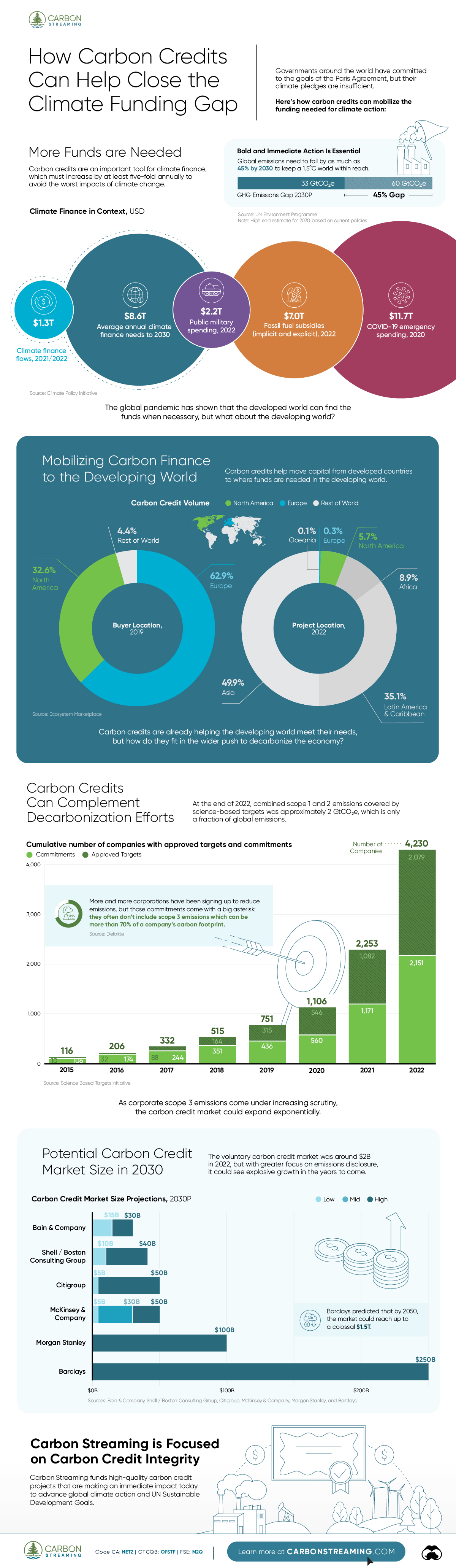
More Funds are Needed for Climate Finance
According to data from the Climate Policy Initiative, climate finance, which includes funds for both adaptation and mitigation, needs to increase at least five-fold, from $1.3T in 2021/2022, to an average $8.6T annually until 2030, and then to just over $10T in the two decades leading up to 2050.
That adds up to a very large number, but consider that in 2022, $7.0T went to fossil fuel subsidies, which almost covers the annual estimated outlay. And the world has shown that when pressed, governments can come up with the money, if the global pandemic is any indication.
Mobilizing Carbon Finance to the Developing World
But the same cannot be said of the developing world, where debt, inequality, and poverty reduce the ability of governments to act. And this is where carbon credits can play an important role. According to analyses from Ecosystem Marketplace, carbon credits help move capital from developed countries, to where funds are needed in the developing world.
For example, in 2019, 69.2% of the carbon credits by volume in the voluntary carbon market were purchased by buyers in Europe, and nearly a third from North America. Compare that to over 90% of the volume of carbon credits sold in the voluntary carbon market in 2022 came from projects that were located outside of those two regions.
Carbon Credits Can Complement Decarbonization Efforts
Carbon credits can also complement decarbonization efforts in the corporate world, where more and more companies have been signing up to reduce emissions. According to the 2022 monitoring report from the Science Based Targets initiative, 4,230 companies around the world had approved targets and commitments, which represented an 88% increase from the prior year. However, as of year end 2022, combined scope 1 and 2 emissions covered by science-based targets totaled approximately 2 GtCO2e, which represents just a fraction of global emissions.
The fine print is that this is just scope 1 and 2 emissions, and doesn’t include scope 3 emissions, which can account for more than 70% of a company’s total emissions. And as these emissions come under greater and greater scrutiny the closer we get to 2030 and beyond, the voluntary carbon credit market could expand exponentially to help meet the need to compensate for these emissions.
Potential Carbon Credit Market Size in 2030
OK, but how big? In 2022, the voluntary carbon credit market was around $2B, but some analysts predict that it could grow to between $5–250 billion by 2030.
| Firm | Low Estimate | High Estimate |
|---|---|---|
| Bain & Company | $15B | $30B |
| Barclays | N/A | $250B |
| Citigroup | $5B | $50B |
| McKinsey & Company | $5B | $50B |
| Morgan Stanley | N/A | $100B |
| Shell / Boston Consulting Group | $10B | $40B |
Morgan Stanley and Barclays were the most bullish on the size of the voluntary carbon credit market in 2030, but the latter firm was even more optimistic about 2050, and predicted that the voluntary carbon credit market could grow to a colossal $1.5 trillion.
Carbon Streaming is Focused on Carbon Credit Integrity
Ultimately, carbon credits could have an important role to play in marshaling the resources needed to keep the world on track to net zero by 2050, and avoiding the worst consequences of a warming world.
Carbon Streaming uses streaming transactions, a proven and flexible funding model, to scale high-integrity carbon credit projects to advance global climate action and UN Sustainable Development Goals.
Learn more at www.carbonstreaming.com.

-

 Green1 week ago
Ranking the Top 15 Countries by Carbon Tax Revenue
This graphic highlights France and Canada as the global leaders when it comes to generating carbon tax revenue.
-

 Green2 weeks ago
Ranked: The Countries With the Most Air Pollution in 2023
South Asian nations are the global hotspot for pollution. In this graphic, we rank the world’s most polluted countries according to IQAir.
-

 Environment2 weeks ago
Top Countries By Forest Growth Since 2001
One country is taking reforestation very seriously, registering more than 400,000 square km of forest growth in two decades.
-

 Green3 weeks ago
Ranked: Top Countries by Total Forest Loss Since 2001
The country with the most forest loss since 2001 lost as much forest cover as the next four countries combined.
-

 Markets2 months ago
The World’s Top Cocoa Producing Countries
Here are the largest cocoa producing countries globally—from Côte d’Ivoire to Brazil—as cocoa prices hit record highs.
-
 Environment2 months ago
Charted: Share of World Forests by Country
We visualize which countries have the biggest share of world forests by area—and while country size plays a factor, so too, does the environment.

-

 Education1 week ago
How Hard Is It to Get Into an Ivy League School?
-

 Technology2 weeks ago
Ranked: Semiconductor Companies by Industry Revenue Share
-

 Markets2 weeks ago
Ranked: The World’s Top Flight Routes, by Revenue
-

 Demographics2 weeks ago
Population Projections: The World’s 6 Largest Countries in 2075
-

 Markets2 weeks ago
The Top 10 States by Real GDP Growth in 2023
-

 Demographics2 weeks ago
The Smallest Gender Wage Gaps in OECD Countries
-

 Economy2 weeks ago
Where U.S. Inflation Hit the Hardest in March 2024
-
Environment2 weeks ago
Top Countries By Forest Growth Since 2001