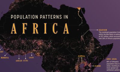

We map out Africa’s population density, spotlighting the continent’s most populous countries and cities.
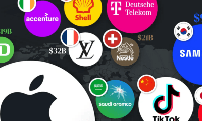

This graphic visualizes the most valuable brands by country in 12 major economies, from tech and energy giants to automakers and banks.
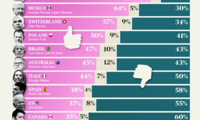

This chart highlights the approval ratings of world leaders in 2024, showing how the citizens of major countries feel about their leaders.
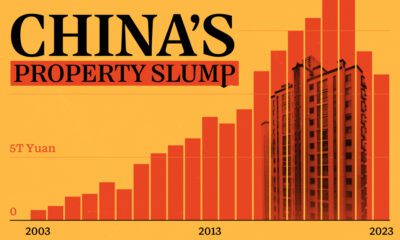

These charts show China's real estate boom in the 21st century and the subsequent slowdown since 2022.
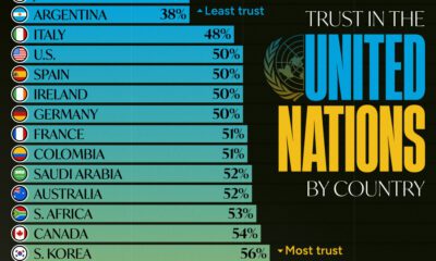

Which countries trust the United Nations to do the right thing the most, and the least?
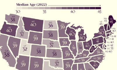

The U.S. might have a median age of 39, but the median age by state ranges from the low 30s to the mid 40s.
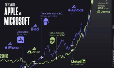

Apple and Microsoft have been switching places as the world’s most valuable company for years. We explore Apple vs. Microsoft over 20 years.
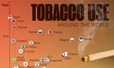

This visual shows tobacco use by country and sex, highlighting which countries still have a high prevalence of smoking.
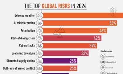

Here are global risk projections for 2024 as tensions in the Middle East escalate and major economies face elections this year.
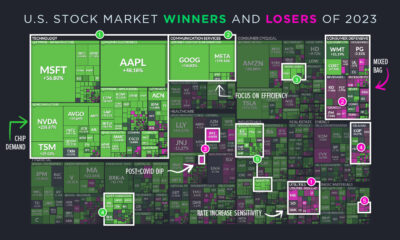

Here are the best performing sectors of 2023—and the ones that fell behind—in a year defined by AI, high interest rates, and resilience.
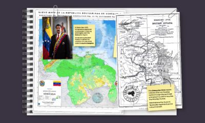

In this series of maps, we explain the dispute that has spanned nearly two centuries over the vast Essequibo region.
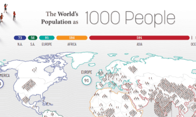

How would all the people in the world be spread out if there were only 1,000 people on Earth? This interactive map examines the breakdown.


This map explainer looks at the Gaza Strip from a structural point of view, delving into geography, infrastructure, demographics, and more.


Discover the five rising apps eating away at Twitter's market share, from Meta's new Threads app to the open-source platforms BlueSky and Mastodon.
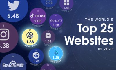

OpenAI is now one of the world's top websites, rapidly approaching the level of traffic received by TikTok and Amazon.
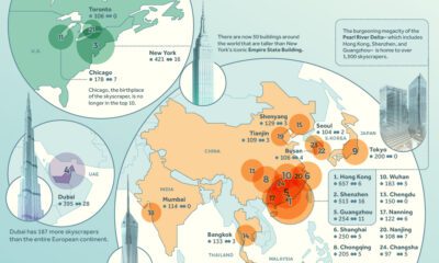

We rank the world's leading cities with the most skyscrapers, highlighting China's remarkable dominance in building vertically.
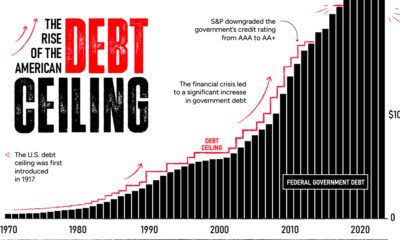

By June 1, a debt ceiling agreement must be finalized. The U.S. could default if politicians fail to act—causing many stark consequences.
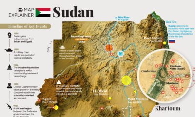

This comprehensive map explainer covers both key facts about Sudan, as well as information on the violent power struggle unfolding there
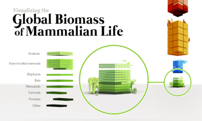

When the world's biomass—the stuff we're made of—is tallied up, humans and cattle outweigh wild mammals by a massive margin.
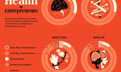

Research explores the link between entrepreneurship and mental health conditions such as ADHD and bipolar disorder
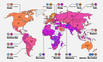

Where do the happiest people on earth live? This map is a snapshot of the world's most (and least) happy countries in 2023.
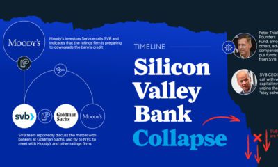

Silicon Valley Bank was shuttered by regulators becoming the largest bank to fail since the height of the Financial Crisis. What happened?


Despite having 4% of the world's population, the value of U.S. equities still make up over 40% of the global total.
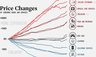

This century has seen divergent price movement. Many consumer goods are cheaper, while critical categories like health and education have skyrocketed.


A train transporting a number of potentially dangerous chemicals derailed near the Ohio–Pennsylvania border. This infographic explains what happened
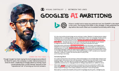

In a recent letter, Sundar Pichai reveals more than meets the eye. Here we read between the lines to provide more context into Google's position on...
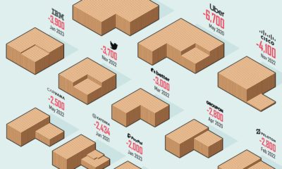

How bad are the current layoffs in the tech sector? This visual reveals the 20 biggest tech layoffs since the start of the pandemic.
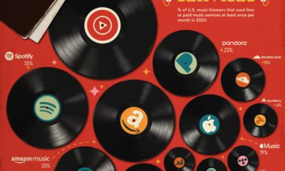

This graphic shows the percentage of Americans that are monthly music listeners for each service. Which online music service is most popular?


What exactly is generative AI and how does it work? This infographic, created using generative AI tools such as Midjourney and ChatGPT, explains it all.
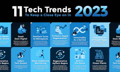

This infographic highlights eleven exciting areas within the world of technology worth keeping an eye on in 2023.
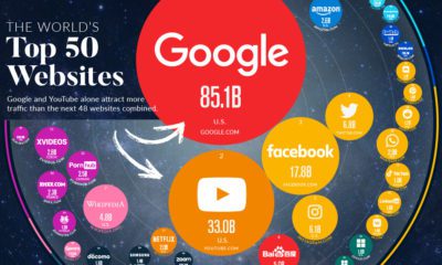

In this visualization, we rank the top 50 websites that receive the most internet traffic, from Google to CNN.
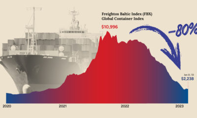

After a dramatic spike during the pandemic, shipping costs have now fallen back to Earth. What does that mean for shippers and the economy?
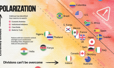

This chart plots polarization for various countries based on the Edelman Trust Institute's annual survey of 32,000+ people.
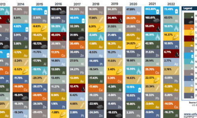

This table shows the fluctuating returns for various commodities over the past decade, from energy fuels to industrial and precious metals.
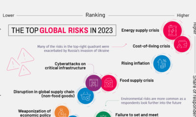

This year's Global Risks Report highlights ongoing economic issues, such as inflation, as well as existential threats like biological weapons
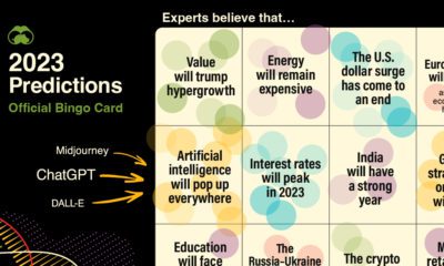

Using our database of 500+ predictions from reports, articles, interviews, and more, we highlight what experts think will happen in 2023
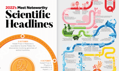

Join us as we look back at some of the most exciting, inspiring, and biggest science stories that made headlines in 2022.
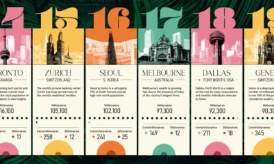

This ranking of the world's wealthiest cities leverages a robust data set that tracks the location and net worth of ultra-wealthy individuals
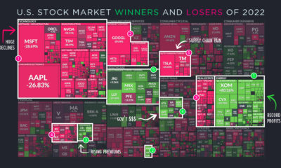

The markets in 2022 were characterized by a lot more pain than gain. That said, there were winners to be found, even during a turbulent year
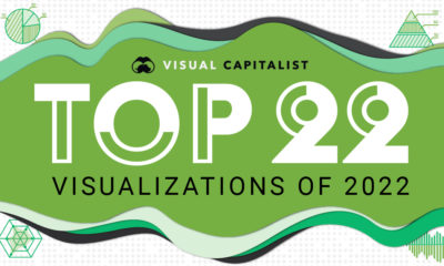

In this ninth edition of our yearly round-up, we highlight visualizations that broke new ground in design and data-driven reporting.
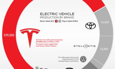

Tesla is still the dominant player in electric vehicles. However, it may not be long until the rest of the industry catches up.


This map juxtaposes nations and Indian states to provide a new perspective on the world's soon-to-be most populous country
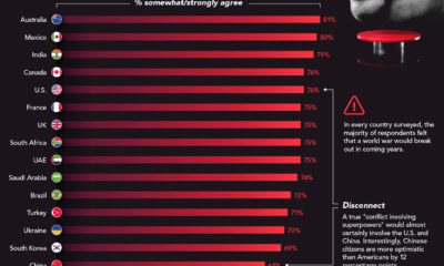

In every single country surveyed, the majority of respondents believed a global conflict would break out between superpowers in coming years
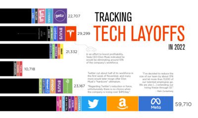

Mass layoffs in the tech industry have accelerated as the end of 2022 approaches. See which companies let people go in 2022.
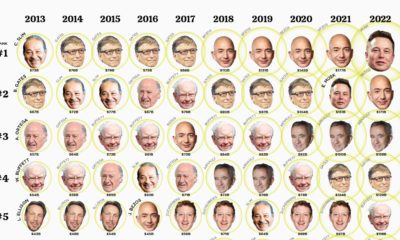

This visualization looks at the ballooning wealth and ranking of the top 10 billionaires over the past 10 years.
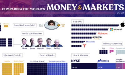

From the wealth held to billionaires to all debt in the global financial system, we look at the vast universe of money and markets in 2022.
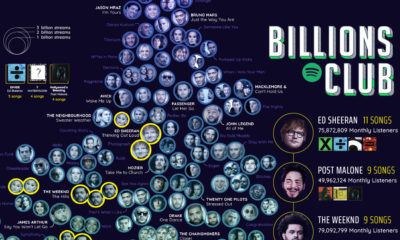

Spotify’s 'Billions Club' playlist tracks every song with over 1 billion streams. We took the data and broke it down by decade and artist.
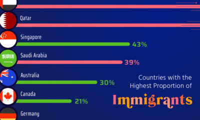

Here, we highlight countries that are magnets for immigration, such as UAE and Qatar, as well as nations with very few foreign born residents.
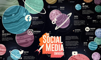

From Twitter to TikTok, this infographic compares the universe of social media and messaging platforms by number of monthly active users.
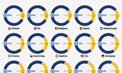

New polling data shows that, in many parts of the world, people feel that their countries are on a downward trajectory.


