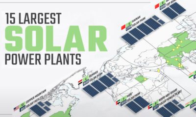

Solar power has grown rapidly over the last decade, and so have solar plants. This map shows the world's 15 largest solar power plants.
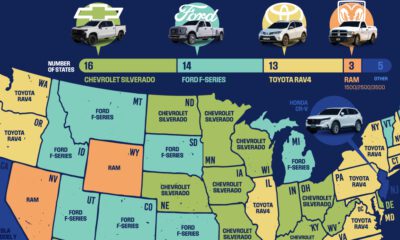

SUVs and trucks were the best selling vehicle in almost every US state for 2022, but a few surprises remain.


In this visual, we've ranked the top U.S. metropolitan areas in terms of their GDP. How does your city rank?


This map juxtaposes nations and Indian states to provide a new perspective on the world's soon-to-be most populous country
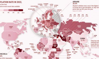

Many countries around the world are facing double or triple-digit inflation. See which countries have the highest inflation rates on this map.


This graphic shows the 32 teams that will be playing in the 2022 FIFA World Cup, and breaks down the groups and each team's World Ranking
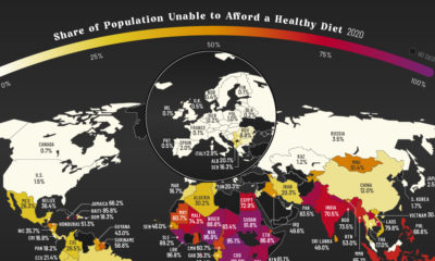

More than three billion people across the globe are unable to afford a healthy diet. See which countries are most affected.
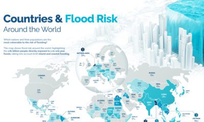

Recent floods in Pakistan have affected more than 33 million people. Where is the risk of flooding highest around the world?
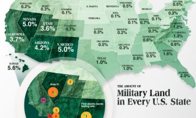

The U.S. military's real estate portfolio is valued at $749 billion. Here's a look at how much land the U.S. military controls in each state.
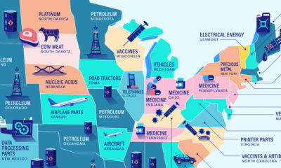

Petroleum is the top import in twelve states, making it the most commonly imported commodity across America. Here are America’s top imports.


 Creator Program