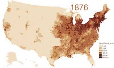

This animation shows the population density of U.S. counties between 1790 and 2010, showing the westward expansion of the country's population.
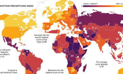

Which countries are the most (and least) corrupt? This world map shows the figures for the Corruption Perceptions Index (CPI) for 2018.
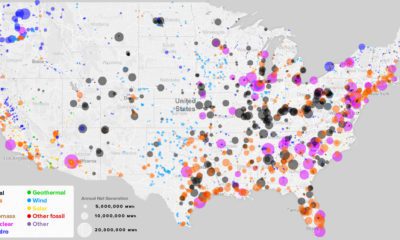

What sources of power are closest to you, and how has this mix changed over the last 10 years? See every power plant in the U.S....
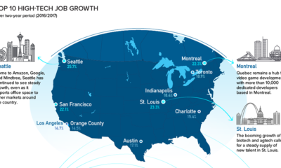

Silicon Valley is no longer the only place to be for a career in tech. Here are the fastest growing tech markets across North America, and...
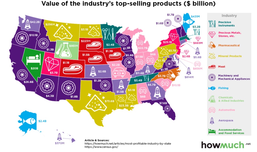
Which industries reign supreme in the United States? This map breaks down the most profitable industry, state by state.
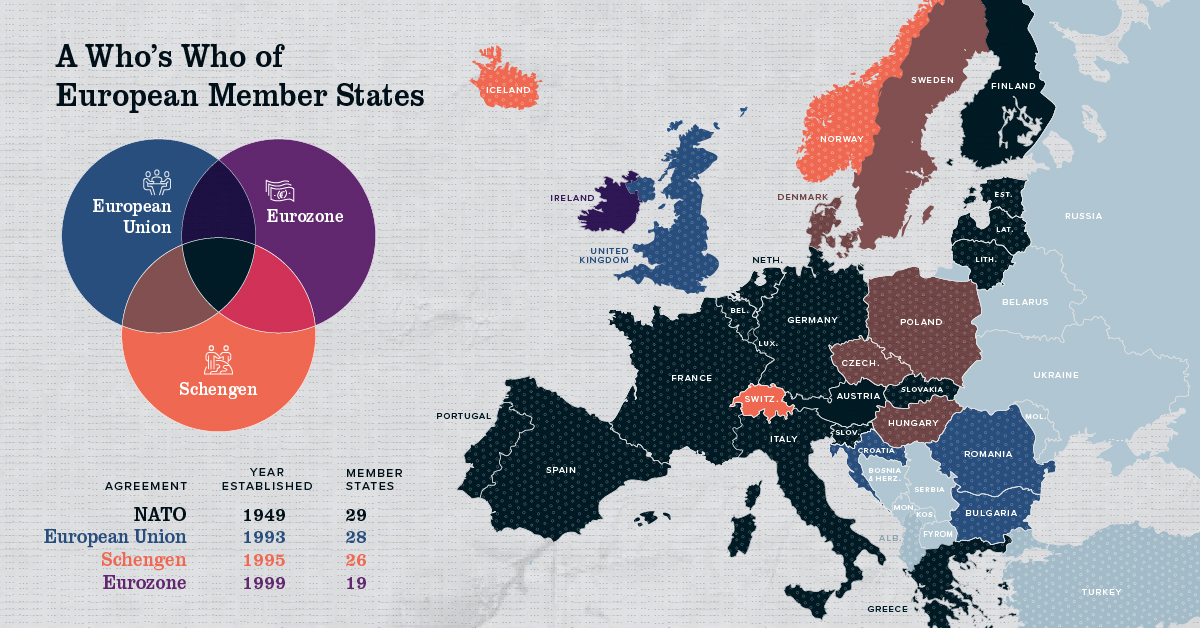
Europe has members in at least four major treaty groups. This map shows how these groups fit into the big picture of Europe's member states.
Which countries receive the most money from international tourism? Each country is resized on this map based on dollars coming in from travelers.
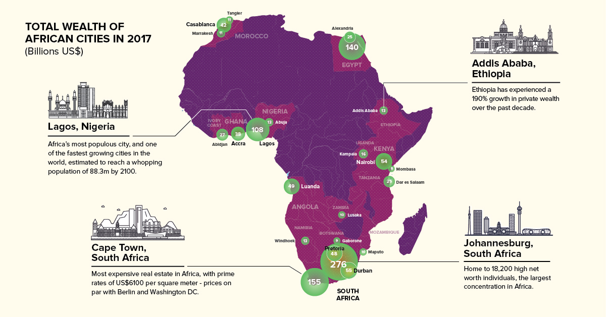
Private wealth in Africa is set to grow $800 billion in the next decade. Here are the continent's 23 richest cities mapped, along with other key...
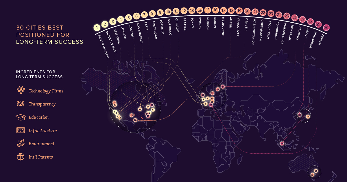
Which cities will be able to attract top-end talent and foster future innovation in order to stay atop a changing and increasingly digital global economy?
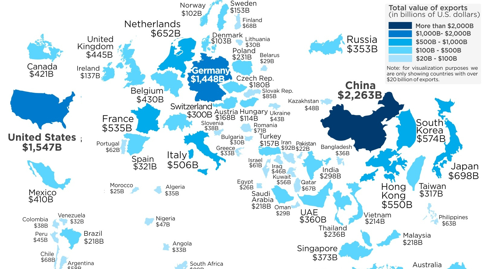
This map re-sizes countries based on the amount of goods they export abroad, giving a clear look at the world's biggest exporters of 2017.


