Green
Understanding How the Air Quality Index Works
Understanding How the Air Quality Index Works
Air quality levels have received a lot of attention in recent years.
In the wake of COVID-19 lockdowns, many places reported a marked increase in air quality. Northern India captured the world’s attention when it was reported that the Himalayan mountain range was visible for the first time in decades.
On the flipside, later that summer, wildfires swept over the Pacific Northwest and California, blanketing entire regions with a thick shroud of smoke that spanned hundreds of miles.
How is air quality measured, and what goes into the health scores we see?
Measuring the Air Quality Index
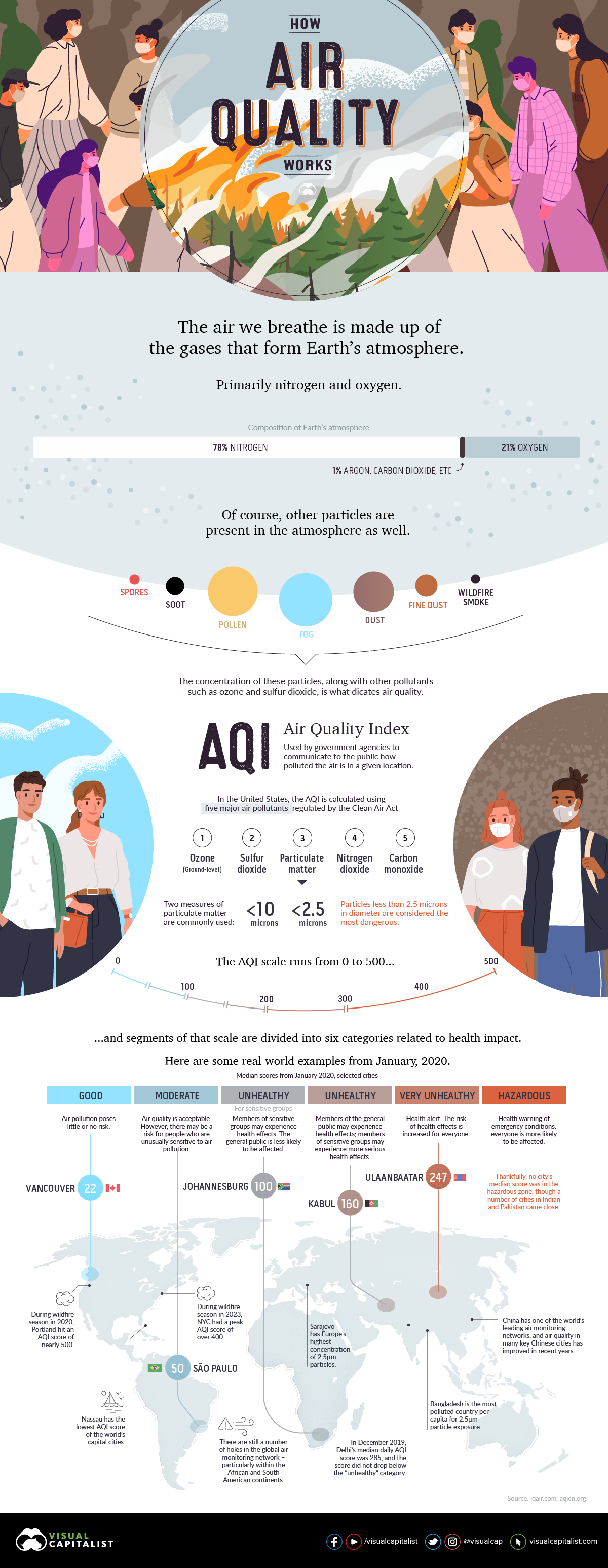
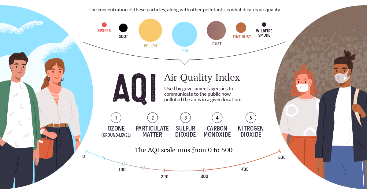
When we see that air quality is “good” or “unhealthy”, those public health categories are derived from the Air Quality Index (AQI).
In the U.S., the AQI is calculated using five major air pollutants regulated by the Clean Air Act:
- Ground-level ozone
- Carbon monoxide
- Sulfur dioxide
- Particle pollution, also known as particulate matter
- Nitrogen dioxide
Some countries have a slightly different way of calculating their scores. For example, India also measures levels of ammonia and lead in the air.
To make these readings more accessible, the AQI has a scoring system that runs from 0 to 500, using data collected from air monitoring stations in cities around the world. Scores below 50 are considered good, with very little impact to human health. The higher the score gets, the worse the air quality is.
To make communicating potential health risks to the public even easier, ranges of scores have been organized into descriptive categories.
| AQI Score Range | AQI Category | PM2.5 (μg/m³) | Health Risks |
|---|---|---|---|
| 0-50 | Good | 0-12.0 | Air quality is satisfactory and poses little or no risk. |
| 51-100 | Moderate | 12.1-35.4 | Sensitive individuals should avoid outdoor activity. |
| 101-150 | Unhealthy | 35.5-55.4 | General public and sensitive individuals in particular are at risk to experience irritation and respiratory problems. |
| 151-200 | Unhealthy | 55.5-150.4 | Increased likelihood of adverse effects and aggravation to the heart and lungs among general public. |
| 201-300 | Very Unhealthy | 150.5-250.4 | General public will be noticeably affected. Sensitive groups should restrict outdoor activities. |
| 301+ | Hazardous | 250.5+ | General public is at high risk to experience strong irritations and adverse health effects. Everyone should avoid outdoor activities. |
Particulate Matter
While all the forms of atmospheric pollution are a cause for concern, it’s the smaller 2.5μm particles that get the most attention. For one, we can see visible evidence in the form of haze and smoke when PM2.5 levels increase. As well, these fine particles have a much easier time entering our bodies via breathing.
There are a number of factors that can increase the concentration of a region’s particulate matter. Some common examples include:
- Coal-fired power stations
- Cooking stoves (Many people around the world burn organic material for cooking and heating)
- Smoke from wildfires and slash-and-burn land clearing
Wildfires and Air Quality
Air quality scores can fluctuate a lot from season to season. For example, regions that are reliant on coal for power generation tend to see AQI score spikes during peak periods.
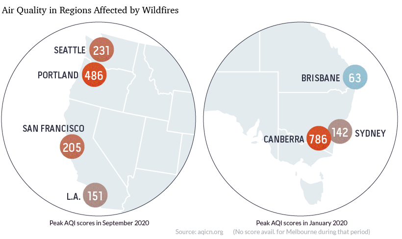
One of the biggest fluctuations occurs during wildfire season, when places that typically have scores in the “good” category can see scores reach unsafe levels. In 2020, Eastern Australia and the West Coast of the U.S. both saw massive drops in air quality during their respective wildfire seasons.
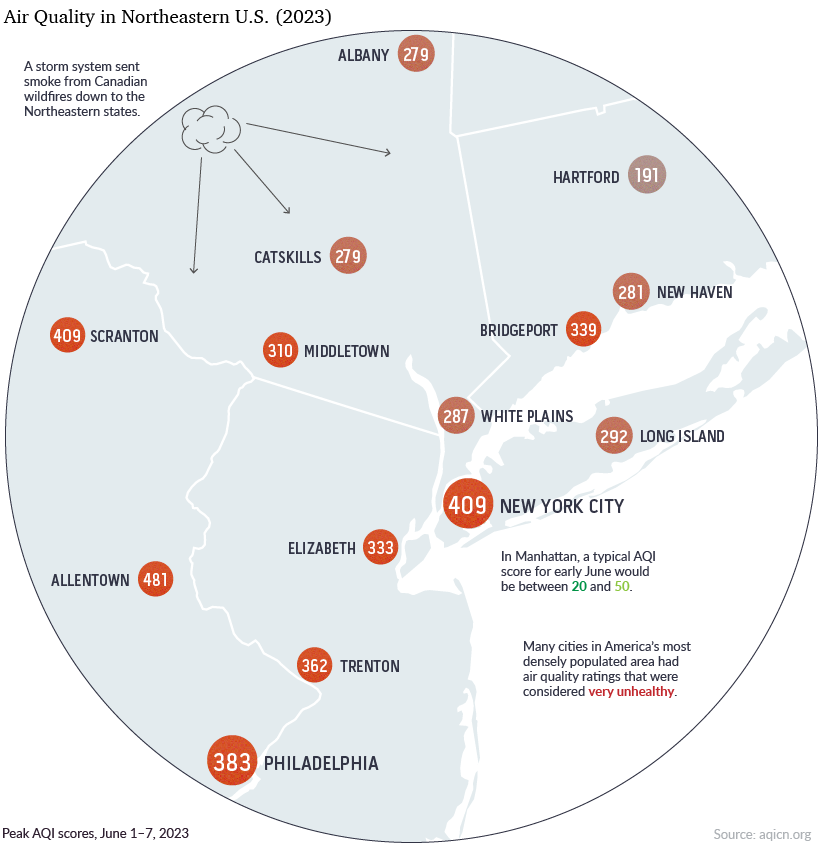
In June 2023, a storm system sent a thick blanket of smoke from Canadian wildfires down to Northeastern states, blocking out the sun and turning the sky over Manhattan into a dull shade of orange.
Luckily, while these types of fluctuations are extreme, they are also temporary.
Correction: Graphics and article updated to include nitrogen dioxide.


Green
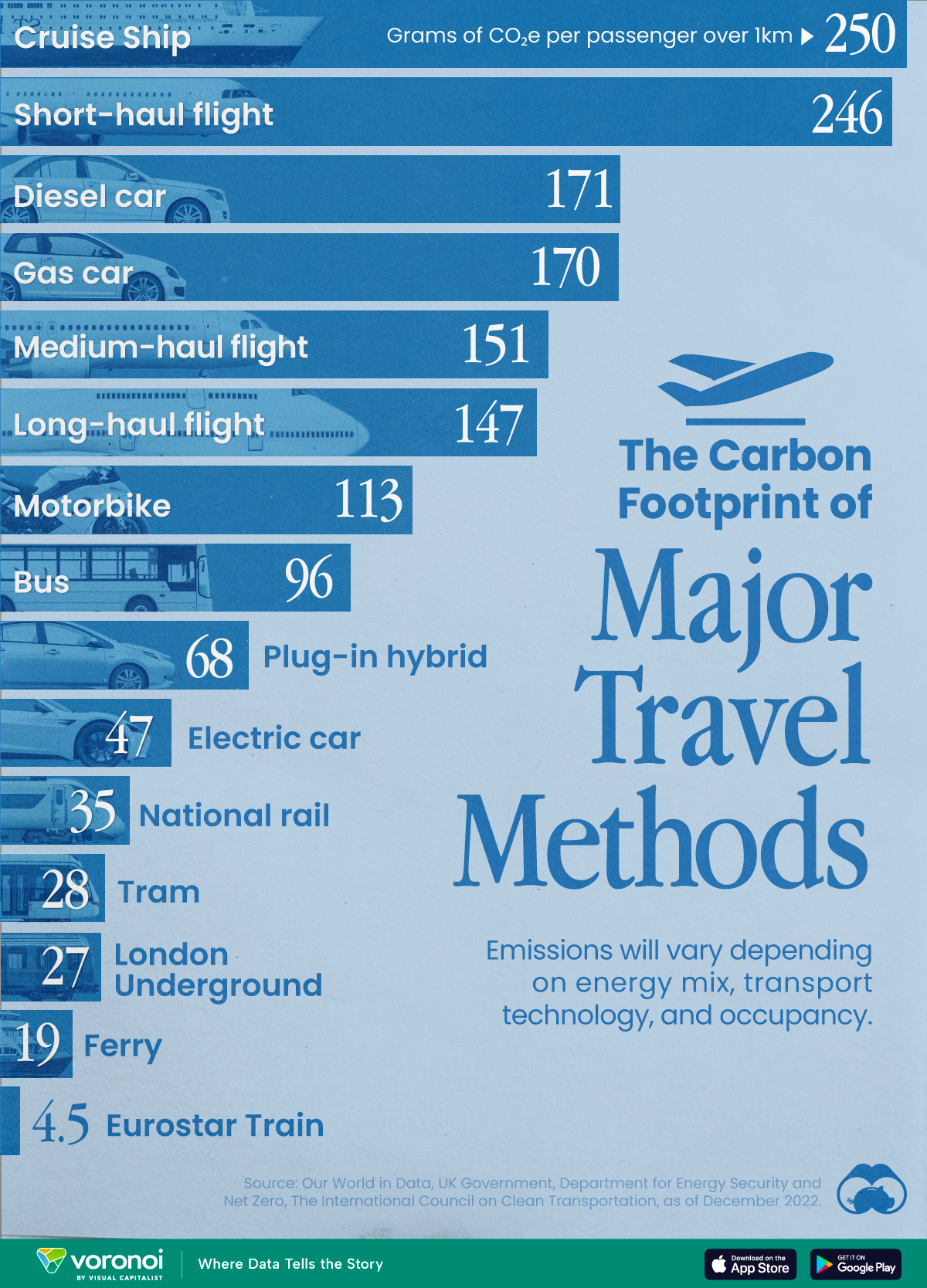
The Carbon Footprint of Major Travel Methods
Going on a cruise ship and flying domestically are the most carbon-intensive travel methods.
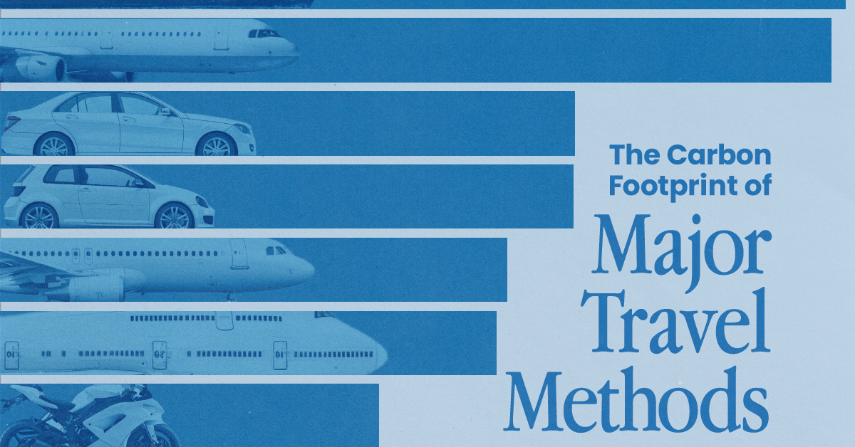
The Carbon Footprint of Major Travel Methods
This was originally posted on our Voronoi app. Download the app for free on iOS or Android and discover incredible data-driven charts from a variety of trusted sources.
Did you know that transport accounts for nearly one-quarter of global energy-related carbon dioxide (CO₂) emissions?
This graphic illustrates the carbon footprints of major travel methods measured in grams of carbon dioxide equivalent (CO₂e) emitted per person to travel one kilometer. This includes both CO₂ and other greenhouse gases.
Data is sourced from Our World in Data, the UK Government’s Department for Energy Security and Net Zero, and The International Council on Clean Transportation, as of December 2022.
These figures should be interpreted as approximations, rather than exact numbers. There are many variables at play that determine the actual carbon footprint in any individual case, including vehicle type or model, occupancy, energy mix, and even weather.
Cruise Ships are the Most Carbon-Intensive Travel Method
According to these estimates, taking a cruise ship, flying domestically, and driving alone are some of the most carbon-intensive travel methods.
Cruise ships typically use heavy fuel oil, which is high in carbon content. The average cruise ship weighs between 70,000 to 180,000 metric tons, meaning they require large engines to get moving.
These massive vessels must also generate power for onboard amenities such as lighting, air conditioning, and entertainment systems.
Short-haul flights are also considered carbon-intensive due to the significant amount of fuel consumed during initial takeoff and climbing altitude, relative to a lower amount of cruising.
| Transportation method | CO₂ equivalent emissions per passenger km |
|---|---|
| Cruise Ship | 250 |
| Short-haul flight (i.e. within a U.S. state or European country) | 246 |
| Diesel car | 171 |
| Gas car | 170 |
| Medium-haul flight (i.e. international travel within Europe, or between U.S. states) | 151 |
| Long-haul flight (over 3,700 km, about the distance from LA to NY) | 147 |
| Motorbike | 113 |
| Bus (average) | 96 |
| Plug-in hybrid | 68 |
| Electric car | 47 |
| National rail | 35 |
| Tram | 28 |
| London Underground | 27 |
| Ferry (foot passenger) | 19 |
| Eurostar (International rail) | 4.5 |
Are EVs Greener?
Many experts agree that EVs produce a lower carbon footprint over time versus traditional internal combustion engine (ICE) vehicles.
However, the batteries in electric vehicles charge on the power that comes straight off the electrical grid—which in many places may be powered by fossil fuels. For that reason, the carbon footprint of an EV will depend largely on the blend of electricity sources used for charging.
There are also questions about how energy-intensive it is to build EVs compared to a comparable ICE vehicle.

-

 Debt1 week ago
How Debt-to-GDP Ratios Have Changed Since 2000
-

 Markets2 weeks ago
Ranked: The World’s Top Flight Routes, by Revenue
-

 Countries2 weeks ago
Population Projections: The World’s 6 Largest Countries in 2075
-

 Markets2 weeks ago
The Top 10 States by Real GDP Growth in 2023
-

 Demographics2 weeks ago
The Smallest Gender Wage Gaps in OECD Countries
-

 United States2 weeks ago
Where U.S. Inflation Hit the Hardest in March 2024
-

 Green2 weeks ago
Top Countries By Forest Growth Since 2001
-

 United States2 weeks ago
Ranked: The Largest U.S. Corporations by Number of Employees