Green
Mapped: Which Countries Have the Worst Air Pollution?
View the full-resolution version of this infographic.
Mapped: Which Countries Have the Worst Air Pollution?
View the high-resolution of the infographic by clicking here.
In many parts of the world, blue skies are a rarity. Instead, accumulated levels of air pollution from industrial processes and motor vehicle traffic cloak cities in smog year-round.
But to what extent does air pollution impact the human population around the world?
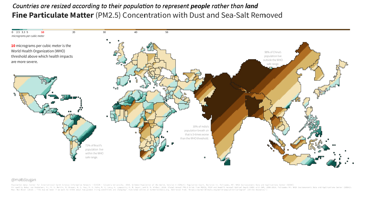
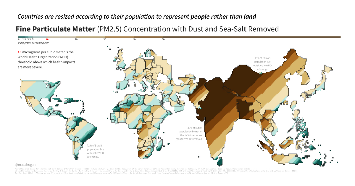
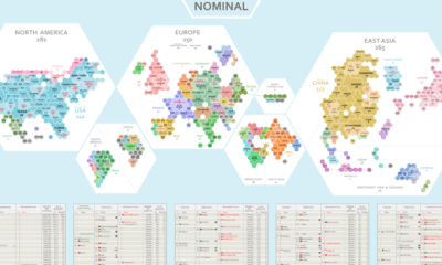
To answer this question, data scientist Matt Dzugan has created a cartogram that shades each country based on levels of fine particulate matter (PM2.5) air pollution experienced by the population living there.
Carto-What?
First off, let’s talk about the visualization style itself.
Not your everyday map, this unconventional cartogram resizes the borders of countries based on their total populations. In this style, a single square represents 500,000 people. According to Matt Dzugan, the cartogram view is meant to provide a bird’s eye perspective of the impact of air pollution and fine particulate matter (PM2.5) on human lives.
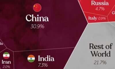
A clear correlation emerges: some of the most inhabited places in the world also experience the most pollution. Highly populated China and India show up the most prominently, while other countries like Australia and Canada seem to disappear off the map entirely.
To put this into perspective, 800 dark brown squares on this cartogram (a PM2.5 concentration of 50 μg/m³) represent 400 million people in India that are exposed to polluted air at levels five times past thresholds set by the World Health Organization.
Top 20 Countries with Cleanest Air
So how do countries on each end of the PM2.5 spectrum shake out? Pulling supplemental data from the WHO, here’s how the top 20 countries with the cleanest air rank.
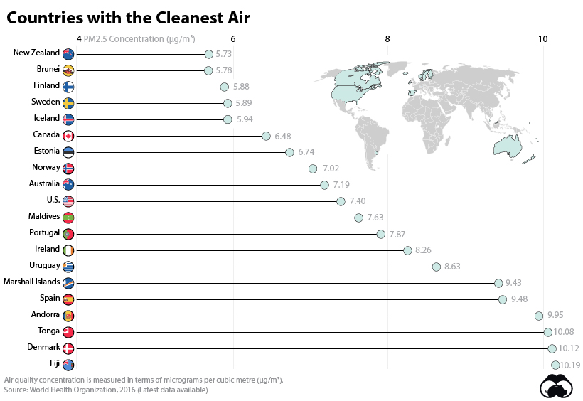
New Zealand tops the above list. And as you can see, air quality tends to be highest in advanced coastal economies with low population densities—and being an island or bordering less habitable Arctic tundra also helps as well.
That said, there are temporary bouts when air quality can dip in even the best of countries. For example, recent wildfires on the West Coast of the United States and Australia resulted in reddish-orange skies and hazardous levels of air quality for weeks at a time.
The 20 Countries with the Most Air Pollution
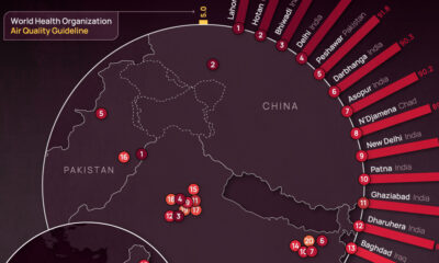
On the other hand, it may be surprising that Nepal lands all the way at the bottom of the air quality list. Why is this landlocked country—home to less than 30 million—suffering from hazardous air pollution reaching 100μg/m³?
In short, the emissions from fossil-fuel driven traffic and manufacturing operations are trapped within the Kathmandu valley, which causes air quality issues for people living in the region.
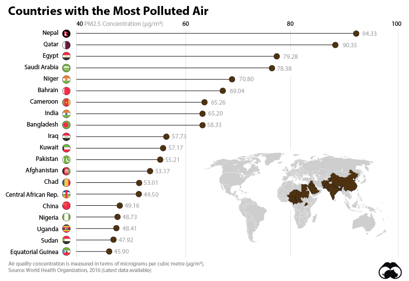
The regions with lower air quality tend to be more landlocked with developing economies, such as some countries in central Africa and Asia, as well as in the Middle East.
Finally, while China is lower on this overall list, it’s worth noting that it is one of the most prominent on the cartogram due to its sheer population size.


Green
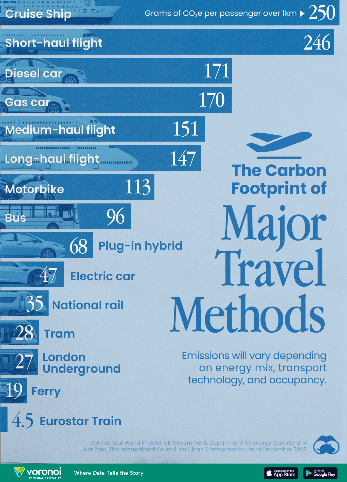
The Carbon Footprint of Major Travel Methods
Going on a cruise ship and flying domestically are the most carbon-intensive travel methods.
The Carbon Footprint of Major Travel Methods
This was originally posted on our Voronoi app. Download the app for free on iOS or Android and discover incredible data-driven charts from a variety of trusted sources.
Did you know that transport accounts for nearly one-quarter of global energy-related carbon dioxide (CO₂) emissions?
This graphic illustrates the carbon footprints of major travel methods measured in grams of carbon dioxide equivalent (CO₂e) emitted per person to travel one kilometer. This includes both CO₂ and other greenhouse gases.
Data is sourced from Our World in Data, the UK Government’s Department for Energy Security and Net Zero, and The International Council on Clean Transportation, as of December 2022.
These figures should be interpreted as approximations, rather than exact numbers. There are many variables at play that determine the actual carbon footprint in any individual case, including vehicle type or model, occupancy, energy mix, and even weather.
Cruise Ships are the Most Carbon-Intensive Travel Method
According to these estimates, taking a cruise ship, flying domestically, and driving alone are some of the most carbon-intensive travel methods.
Cruise ships typically use heavy fuel oil, which is high in carbon content. The average cruise ship weighs between 70,000 to 180,000 metric tons, meaning they require large engines to get moving.
These massive vessels must also generate power for onboard amenities such as lighting, air conditioning, and entertainment systems.
Short-haul flights are also considered carbon-intensive due to the significant amount of fuel consumed during initial takeoff and climbing altitude, relative to a lower amount of cruising.
| Transportation method | CO₂ equivalent emissions per passenger km |
|---|---|
| Cruise Ship | 250 |
| Short-haul flight (i.e. within a U.S. state or European country) | 246 |
| Diesel car | 171 |
| Gas car | 170 |
| Medium-haul flight (i.e. international travel within Europe, or between U.S. states) | 151 |
| Long-haul flight (over 3,700 km, about the distance from LA to NY) | 147 |
| Motorbike | 113 |
| Bus (average) | 96 |
| Plug-in hybrid | 68 |
| Electric car | 47 |
| National rail | 35 |
| Tram | 28 |
| London Underground | 27 |
| Ferry (foot passenger) | 19 |
| Eurostar (International rail) | 4.5 |
Are EVs Greener?
Many experts agree that EVs produce a lower carbon footprint over time versus traditional internal combustion engine (ICE) vehicles.
However, the batteries in electric vehicles charge on the power that comes straight off the electrical grid—which in many places may be powered by fossil fuels. For that reason, the carbon footprint of an EV will depend largely on the blend of electricity sources used for charging.
There are also questions about how energy-intensive it is to build EVs compared to a comparable ICE vehicle.

-

 Science1 week ago
Visualizing the Average Lifespans of Mammals
-

 Markets2 weeks ago
The Top 10 States by Real GDP Growth in 2023
-

 Demographics2 weeks ago
The Smallest Gender Wage Gaps in OECD Countries
-

 United States2 weeks ago
Where U.S. Inflation Hit the Hardest in March 2024
-

 Green2 weeks ago
Top Countries By Forest Growth Since 2001
-

 United States2 weeks ago
Ranked: The Largest U.S. Corporations by Number of Employees
-

 Maps2 weeks ago
The Largest Earthquakes in the New York Area (1970-2024)
-

 Green2 weeks ago
Ranked: The Countries With the Most Air Pollution in 2023