Markets
Mapped: Distribution of Global GDP by Region
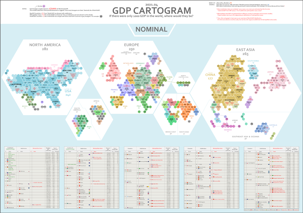
Mapped: The Distribution of Global GDP by Region
Gross domestic product (GDP) measures the value of goods and services that an economy produces in a given year, but in a global context, it is typically shown using country-level data.
As a result, we don’t often get to see the nuances of the global economy, such as how much specific regions and metro areas contribute to global GDP.
In these cartograms, global GDP has been normalized to a base number of 1,000 in order to show a more regional breakdown of economic activity. Created by Reddit user /BerryBlue_Blueberry, the two maps show the distribution in different ways: by nominal GDP and by GDP adjusted for purchasing power parity (PPP).
Methodology
Before diving in, let us give you some context on how these maps were designed. Each hexagon on the two maps represents 0.1% of the world’s overall GDP.
The number below each region, country or metropolitan area represents the number of hexagons covered by that entity. So in the nominal GDP map, the state of New York represents 20 hexagons (i.e. 2.0% of global GDP), while Munich’s metro area is 3 hexagons (0.3%).
Countries are further broken down based on size. Countries that make up more than 0.95% of global GDP are broken down into subdivisions, while countries that are smaller than 0.1% of GDP are grouped together. Metro areas that account for over 0.25% of global GDP are featured.
Finally, it should be noted that to account for some outdated subdivision participation data, the map creator calculated 2021 estimates for this using the formula: national GDP (2021) x % of subdivision participation (2017-2020).
Nominal vs. PPP
The above map is using nominal data, while the below map accounts for differences in purchasing power (PPP).
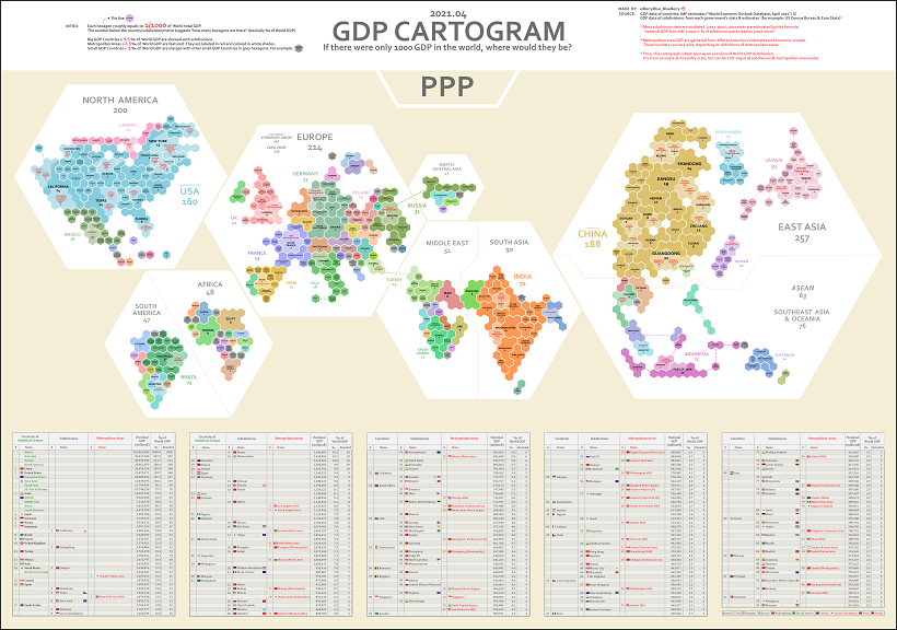
Adjusting for PPP takes into account the relative value of currencies and purchasing power in countries around the world. For example, $100 (or its exchange equivalent in Indian rupees) is generally going to be able to buy more in India than it is in the United States.
This is because goods and services are cheaper in India, meaning you can actually purchase more there for the same amount of money.
Anomalies in Global GDP Distribution
Breaking down global GDP distribution into cartograms highlights some interesting anomalies worth considering:
- North America, Europe, and East Asia, with a combined GDP of nearly $75 trillion, make up 80% of the world’s GDP in nominal terms.
- The U.S. State of California accounts for 3.7% of the world’s GDP by itself, which ranks higher than the United Kingdom’s total contribution of 3.3%.
- Canada as a country accounts for 2% of the world’s GDP, which is comparable to the GDP contribution of the Greater Tokyo Area at 2.2%.
- With a GDP of $3 trillion, India’s contribution overshadows the GDP of the whole African continent ($2.6 trillion).
- This visualization highlights the economic might of cities better than a conventional map. One standout example of this is in Ontario, Canada. The Greater Toronto Area completely eclipses the economy of the rest of the province.
Inequality of GDP Distribution
The fact that certain countries generate most of the world’s economic output is reflected in the above cartograms, which resize countries or regions accordingly.
Compared to wealthier nations, emerging economies still account for just a tiny sliver of the pie.
India, for example, accounts for 3.2% of global GDP in nominal terms, even though it contains 17.8% of the world’s population.
That’s why on the nominal map, India is about the same size as France, the United Kingdom, or Japan’s two largest metro areas (Tokyo and Osaka-Kobe)—but of course, these wealthier places have a far higher GDP per capita.


Markets
The European Stock Market: Attractive Valuations Offer Opportunities
On average, the European stock market has valuations that are nearly 50% lower than U.S. valuations. But how can you access the market?
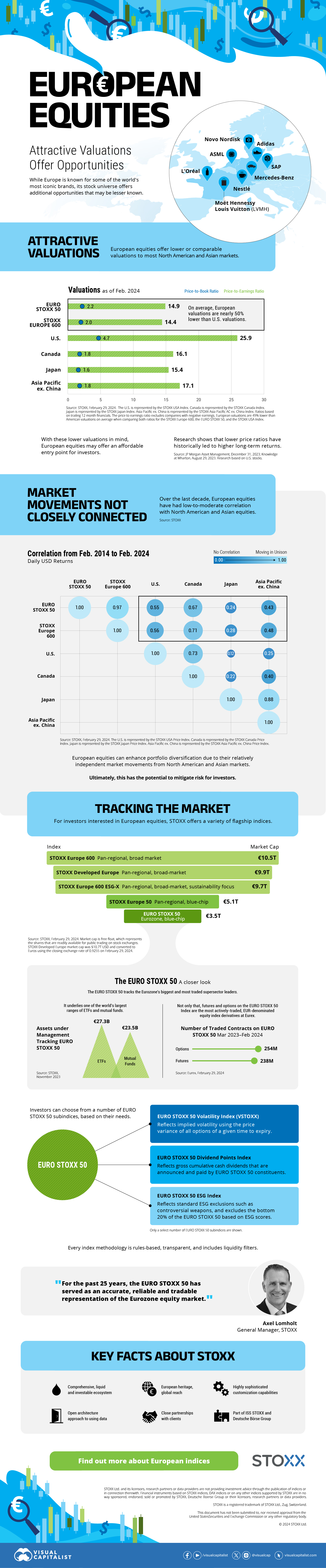
European Stock Market: Attractive Valuations Offer Opportunities
Europe is known for some established brands, from L’Oréal to Louis Vuitton. However, the European stock market offers additional opportunities that may be lesser known.
The above infographic, sponsored by STOXX, outlines why investors may want to consider European stocks.
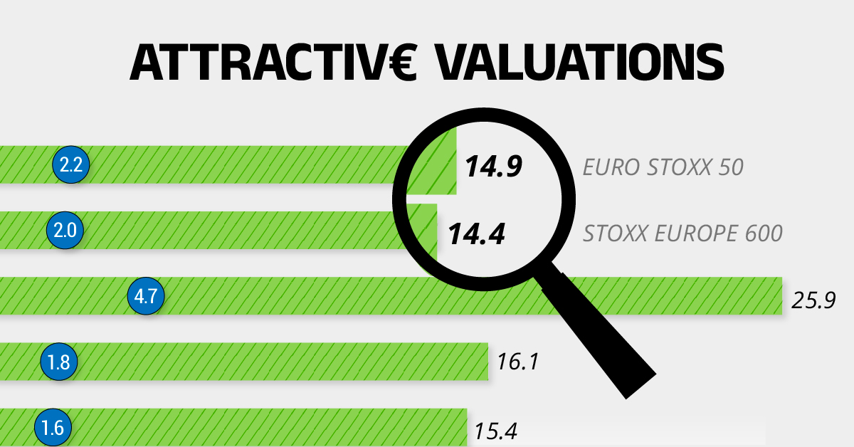
Attractive Valuations
Compared to most North American and Asian markets, European stocks offer lower or comparable valuations.
| Index | Price-to-Earnings Ratio | Price-to-Book Ratio |
|---|---|---|
| EURO STOXX 50 | 14.9 | 2.2 |
| STOXX Europe 600 | 14.4 | 2 |
| U.S. | 25.9 | 4.7 |
| Canada | 16.1 | 1.8 |
| Japan | 15.4 | 1.6 |
| Asia Pacific ex. China | 17.1 | 1.8 |
Data as of February 29, 2024. See graphic for full index names. Ratios based on trailing 12 month financials. The price to earnings ratio excludes companies with negative earnings.
On average, European valuations are nearly 50% lower than U.S. valuations, potentially offering an affordable entry point for investors.
Research also shows that lower price ratios have historically led to higher long-term returns.
Market Movements Not Closely Connected
Over the last decade, the European stock market had low-to-moderate correlation with North American and Asian equities.
The below chart shows correlations from February 2014 to February 2024. A value closer to zero indicates low correlation, while a value of one would indicate that two regions are moving in perfect unison.
| EURO STOXX 50 | STOXX EUROPE 600 | U.S. | Canada | Japan | Asia Pacific ex. China |
|
|---|---|---|---|---|---|---|
| EURO STOXX 50 | 1.00 | 0.97 | 0.55 | 0.67 | 0.24 | 0.43 |
| STOXX EUROPE 600 | 1.00 | 0.56 | 0.71 | 0.28 | 0.48 | |
| U.S. | 1.00 | 0.73 | 0.12 | 0.25 | ||
| Canada | 1.00 | 0.22 | 0.40 | |||
| Japan | 1.00 | 0.88 | ||||
| Asia Pacific ex. China | 1.00 |
Data is based on daily USD returns.
European equities had relatively independent market movements from North American and Asian markets. One contributing factor could be the differing sector weights in each market. For instance, technology makes up a quarter of the U.S. market, but health care and industrials dominate the broader European market.
Ultimately, European equities can enhance portfolio diversification and have the potential to mitigate risk for investors.
Tracking the Market
For investors interested in European equities, STOXX offers a variety of flagship indices:
| Index | Description | Market Cap |
|---|---|---|
| STOXX Europe 600 | Pan-regional, broad market | €10.5T |
| STOXX Developed Europe | Pan-regional, broad-market | €9.9T |
| STOXX Europe 600 ESG-X | Pan-regional, broad market, sustainability focus | €9.7T |
| STOXX Europe 50 | Pan-regional, blue-chip | €5.1T |
| EURO STOXX 50 | Eurozone, blue-chip | €3.5T |
Data is as of February 29, 2024. Market cap is free float, which represents the shares that are readily available for public trading on stock exchanges.
The EURO STOXX 50 tracks the Eurozone’s biggest and most traded companies. It also underlies one of the world’s largest ranges of ETFs and mutual funds. As of November 2023, there were €27.3 billion in ETFs and €23.5B in mutual fund assets under management tracking the index.
“For the past 25 years, the EURO STOXX 50 has served as an accurate, reliable and tradable representation of the Eurozone equity market.”
— Axel Lomholt, General Manager at STOXX
Partnering with STOXX to Track the European Stock Market
Are you interested in European equities? STOXX can be a valuable partner:
- Comprehensive, liquid and investable ecosystem
- European heritage, global reach
- Highly sophisticated customization capabilities
- Open architecture approach to using data
- Close partnerships with clients
- Part of ISS STOXX and Deutsche Börse Group
With a full suite of indices, STOXX can help you benchmark against the European stock market.
Learn how STOXX’s European indices offer liquid and effective market access.

-

 Economy2 days ago
Economic Growth Forecasts for G7 and BRICS Countries in 2024
The IMF has released its economic growth forecasts for 2024. How do the G7 and BRICS countries compare?
-

 Markets1 week ago
U.S. Debt Interest Payments Reach $1 Trillion
U.S. debt interest payments have surged past the $1 trillion dollar mark, amid high interest rates and an ever-expanding debt burden.
-

 United States2 weeks ago
Ranked: The Largest U.S. Corporations by Number of Employees
We visualized the top U.S. companies by employees, revealing the massive scale of retailers like Walmart, Target, and Home Depot.
-

 Markets2 weeks ago
The Top 10 States by Real GDP Growth in 2023
This graphic shows the states with the highest real GDP growth rate in 2023, largely propelled by the oil and gas boom.
-

 Markets2 weeks ago
Ranked: The World’s Top Flight Routes, by Revenue
In this graphic, we show the highest earning flight routes globally as air travel continued to rebound in 2023.
-

 Markets3 weeks ago
Ranked: The Most Valuable Housing Markets in America
The U.S. residential real estate market is worth a staggering $47.5 trillion. Here are the most valuable housing markets in the country.


-

 Education1 week ago
How Hard Is It to Get Into an Ivy League School?
-

 Technology2 weeks ago
Ranked: Semiconductor Companies by Industry Revenue Share
-
Markets2 weeks ago
Ranked: The World’s Top Flight Routes, by Revenue
-

 Demographics2 weeks ago
Population Projections: The World’s 6 Largest Countries in 2075
-
Markets2 weeks ago
The Top 10 States by Real GDP Growth in 2023
-

 Demographics2 weeks ago
The Smallest Gender Wage Gaps in OECD Countries
-

 Economy2 weeks ago
Where U.S. Inflation Hit the Hardest in March 2024
-

 Green2 weeks ago
Top Countries By Forest Growth Since 2001