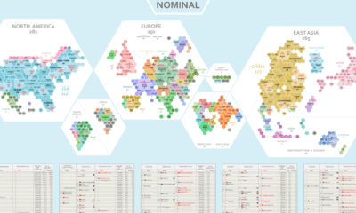

Where does the world's economic activity take place? This cartogram shows the $94 trillion global economy divided into 1,000 hexagons.
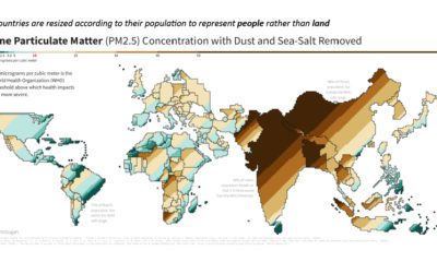

This population-weighted cartogram shows the countries with the worst air pollution, based on fine particulate matter (PM2.5) concentration.
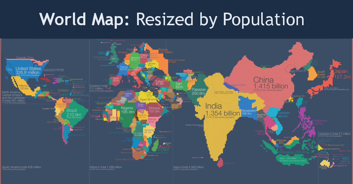
Look at global population in a whole new light, when countries on the world map are drawn based on population numbers instead of their usual borders.
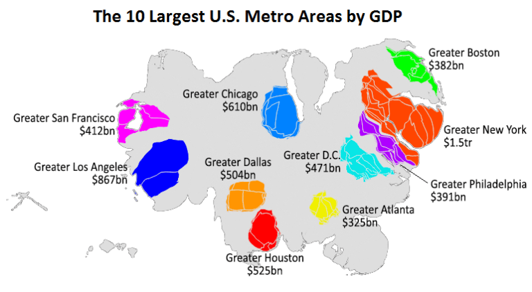
This animation uses county-level GDP data to re-size a U.S. map based on the economic contributions at a local level.


