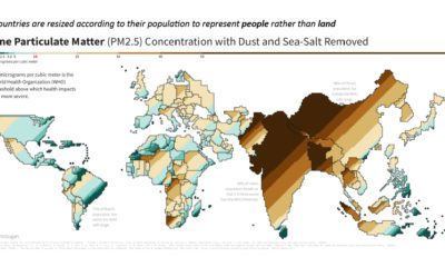

This population-weighted cartogram shows the countries with the worst air pollution, based on fine particulate matter (PM2.5) concentration.
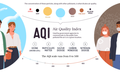

This graphic breaks down how the air quality index is measured, and looks at which regions are hardest hit by atmospheric pollution and wildfires.


