Misc
This Clever Map is a Window into 19th Century New York City
The early 19th century was a time of great change for New York, which had already cemented its status as America’s largest city.
The opening of the Erie Canal helped turn the city into a shipping powerhouse, and there was a building boom on the horizon. Cholera epidemics, fires, and riots swept through the city at various points.
This fascinating interactive map, from Esri, is a snapshot of New York City during the tumultuous time (1836 to be exact), overlaid on the modern-day satellite map.
Getting the Lay of the Land
The base map used above is the stunning “Topographical Map Of The City and County Of New–York, and the adjacent Country”, published by the prodigious mapmaker, Joseph Colton.
For easy viewing, the map’s legend is below:
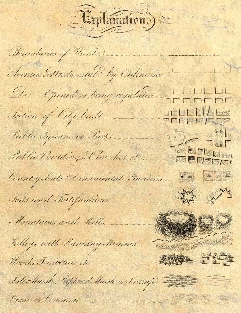
This map includes all the usual features, such as roads and prominent buildings, but it also has some clever secondary information built in as well. For one, shading indicates ares that were more built-up at the time. There are also a number of visual techniques to indicate topographical features as well. After all, NYC wasn’t as extensive as it is today, and much of the land depicted in the map is still undeveloped.
The full map is well worth exploring as well, as there are a number of beautiful illustrations throughout.
Tool tip: Click the X on the info bar to hide it. (Mobile: Click the map, then the magnifying glass.)
The Big Picture: New York City in 1836
At this point in time, development in Lower Manhattan extended until about 14th Street, where buildings began to give way to open spaces. The city’s grid pattern was beginning to take shape, following the Commissioners’ Plan laid out in 1811. At the time, New York was anticipating massive growth, and the straightforward grid pattern was an efficient way to prepare the city for rapid expansion.
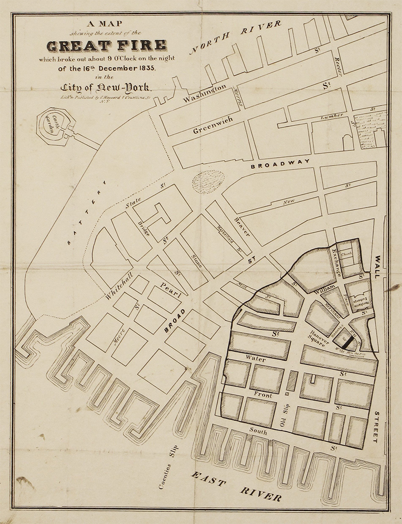
In the 1800s, fire was an ever-present danger for city dwellers. In fact, a major fire tore through Lower Manhattan a year prior to when this map was published.
Points of Interest
There are a number of points worth visiting on this map.
Transit Begins to Take Shape
In the 1830s, New York City’s first railroad line—horse powered for its first few years—connected Prince Street to the Harlem River, accelerating the city’s expansion northward from Lower Manhattan. This route is still recognizable today as the Harlem Line.
Evolving Shorelines
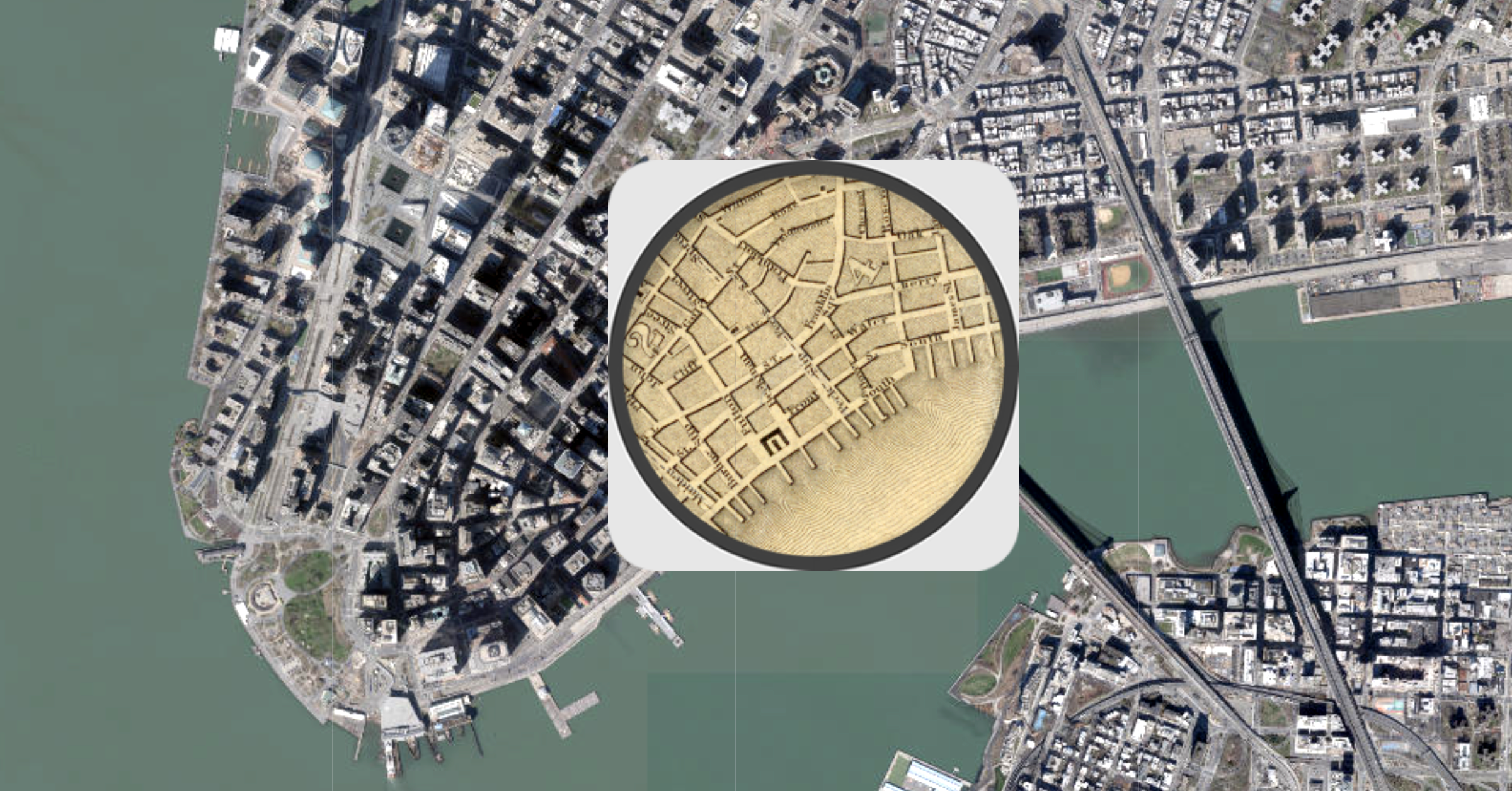
One very obvious difference between the two maps is how much land has been reclaimed along shorelines in the area. Battery Park City, on the west side of downtown, and the Brooklyn Navy Yard are two prominent examples of infill. Randall’s Island, located near the top of Manhattan, is also an interesting place to observe changes in topography. Randall’s Island is actually made up of three islands that were eventually conjoined in the 1960s.
This interactive map is a great place to explore changes to NYC’s shoreline over time.
Taming the Landscape
Midtown Manhattan is worth zooming into for a couple of reasons. First, the outline of Central Park is visible, although the park would officially be approved until almost 20 years later.
As well, this topographical map clearly shows the numerous outcroppings spread across the island. Manhattan was far from flat in the 1800s, and it took a tremendous amount of effort—starting with gunpowder, pickaxes, and horse-drawn carts—to level the land.
Looking at these historical maps is a reminder that the New York City we know today is the product of hundreds of years of human effort, and that cities continue to evolve over time.


Misc
Visualizing the Most Common Pets in the U.S.
Lions, tigers, and bears, oh my!—these animals do not feature on this list of popular American household pets.


Visualizing The Most Common Pets in the U.S.
This was originally posted on our Voronoi app. Download the app for free on iOS or Android and discover incredible data-driven charts from a variety of trusted sources.
In this graphic, we visualized the most common American household pets, based on 2023-2024 data from the American Pet Products Association (accessed via Forbes Advisor).
Figures represent the number of households that own each pet type, rather than the actual number of each animal. The “small animal” category includes hamsters, gerbils, rabbits, guinea pigs, chinchillas, mice, rats, and ferrets.
What is the Most Popular American Household Pet?
Based on this data, dogs—one of the first domesticated animals—are the most common pets in the United States. In fact, around 65 million households own a dog, and spend an average of $900 a year on their care.
| Rank | Species | Households |
|---|---|---|
| 1 | 🐶 Dog | 65M |
| 2 | 🐱 Cat | 47M |
| 3 | 🐟 Freshwater Fish | 11M |
| 4 | 🐰 Small Animals | 7M |
| 5 | 🐦 Bird | 6M |
| 6 | 🦎 Reptile | 6M |
| 7 | 🐴 Horse | 2M |
| 8 | 🐠 Saltwater Fish | 2M |
Note: Households can own multiple pets, and are counted for all relevant categories.
Cats rank second, at 47 million households, and these smaller felines are a little less expensive to own at $700/year according to Forbes estimates.
But aside from these two juggernauts, there are plenty of other common pet types found in households across the country.
Freshwater fish can be found in 11 million households, along with small animals—rabbits, hamsters, guinea pigs—in 7 million. Meanwhile, nearly 6 million homes have birds or reptiles.
Pet Ownership is on the Rise in America
Forbes found that 66% of all American households (numbering 87 million) own at least one pet, up from 56% in 1988. One third of these (29 million) own multiple pets.
A combination of factors is driving this increase: rising incomes, delayed childbirth, and of course the impact of the pandemic which nearly cleared out animal shelters across the globe.
America’s loneliness epidemic may also be a factor. Fledgling research has shown that single-individual households with pets recorded lower rates of loneliness during the pandemic than those without a pet.

-

 Science7 days ago
Visualizing the Average Lifespans of Mammals
-

 Markets2 weeks ago
The Top 10 States by Real GDP Growth in 2023
-

 Demographics2 weeks ago
The Smallest Gender Wage Gaps in OECD Countries
-

 United States2 weeks ago
Where U.S. Inflation Hit the Hardest in March 2024
-

 Green2 weeks ago
Top Countries By Forest Growth Since 2001
-

 United States2 weeks ago
Ranked: The Largest U.S. Corporations by Number of Employees
-

 Maps2 weeks ago
The Largest Earthquakes in the New York Area (1970-2024)
-

 Green2 weeks ago
Ranked: The Countries With the Most Air Pollution in 2023