Misc
Data Visualization and Cholera: An Unexpected Connection
View a high resolution version of this graphic
Data Visualization and Cholera: An Unexpected Connection
Necessity is the mother of invention, and in the mid-1800s, understanding the spread of cholera was a matter of life and death.
Ruthless Efficiency
Cholera was a ruthlessly efficient killer, with both rapid onset and severe symptoms. By the time the disease made its way to London and New York in the early 1830s, hundreds of thousands of people had died across Europe, Africa, and Asia.
Not only our personal and national interests, […] it may be said without exaggeration, [that cholera] concerns the whole human race.
– Thomas Whiteside Hime
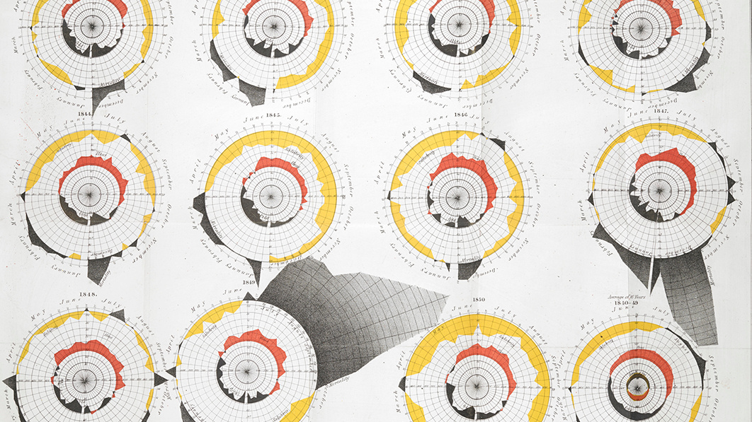
Needless to say, the human race was concerned. Thanks to high-speed printing press technology, daily newspaper circulations were rising dramatically, and this allowed journalists to experiment with new reporting techniques, including charting data.
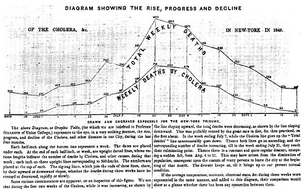
At the time, the chart above was such a novel approach that it required four paragraphs to explain how to read it. People of that era were simply not used to seeing data in a visual form. At a glance though, the chart is extremely effective at communicating a grim message: cholera had ravaged New York City over the summer of 1849.
Despite the concerted push to eradicate the disease, the medical community was still largely in the dark about how to prevent future outbreaks. Because doctors could treat numerous patients without falling ill, it was assumed that a miasmic environment (i.e. slums, densely-packed housing) was causing the spread.
Data Viz in the Time of Cholera
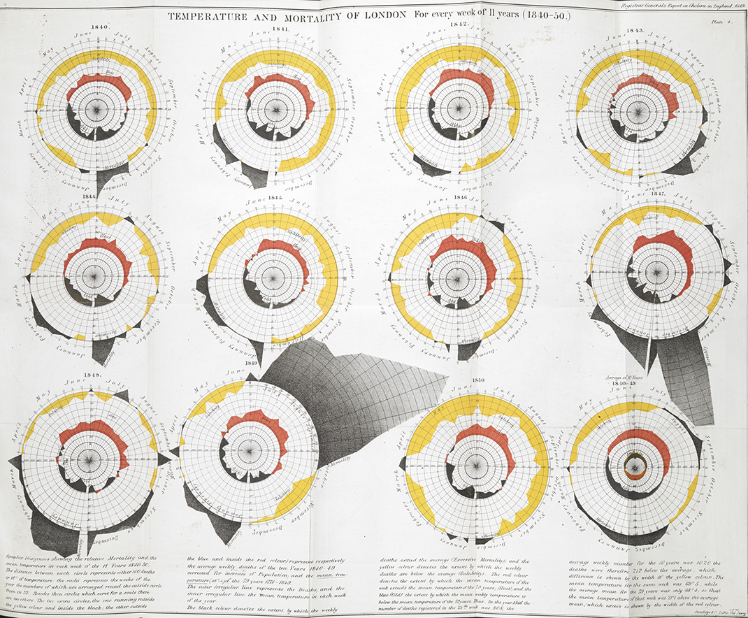
Today, we have tools that allow us to map just about anything, but in the mid-1800s, mapping data was still an innovative concept.
As early as the 1830s, geographers began using spatial analysis to study cholera epidemiology. The heat map below shows which sections of Paris were hardest hit by a recent outbreak of cholera.
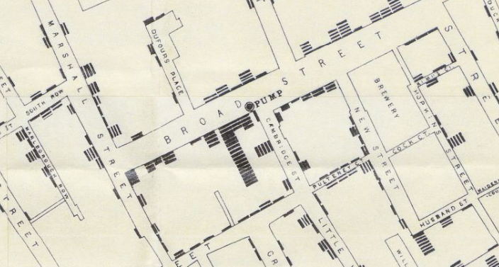
In 1854, Dr. John Snow was convinced that cholera was spreading via tainted water and decided to display neighborhood mortality data directly on a map. This method clearly revealed a cluster of cases around a specific pump.
View the full version of the map here
The result is one of the most influential maps in modern history.
In addition to the real-world utility the map provided in helping physicians understand how cholera was spreading, it also exemplified a seismic shift in thinking that opened up new avenues for data to be analyzed and displayed.
Despite the tragic circumstances of the time period, we can be thankful that the urgency of the situation allowed the world’s pioneering researchers, journalists, and physicians to experiment with new data visualization techniques to better understand the world.


Misc
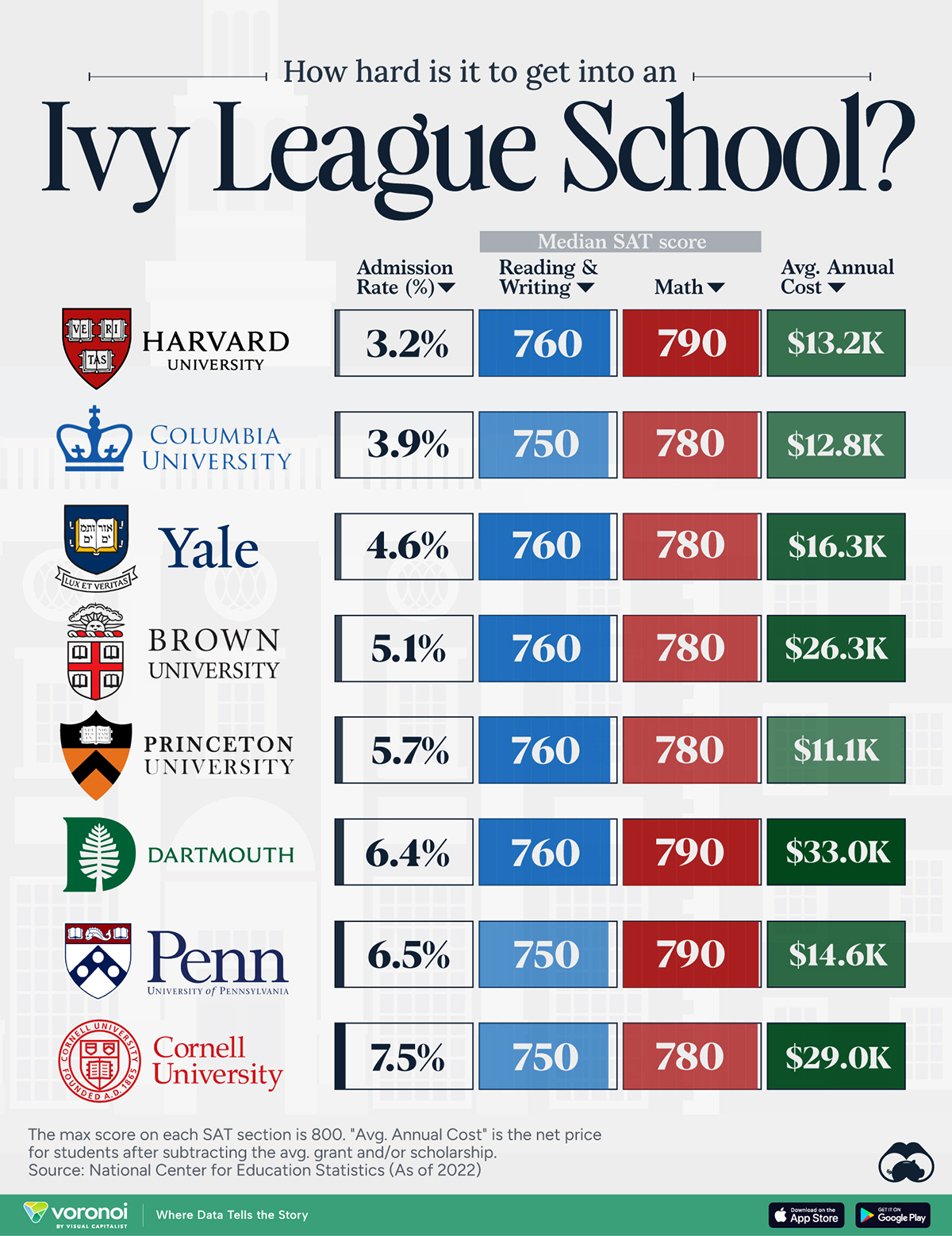
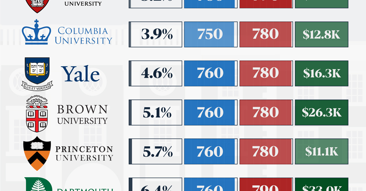
How Hard Is It to Get Into an Ivy League School?
We detail the admission rates and average annual cost for Ivy League schools, as well as the median SAT scores required to be accepted.
How Hard Is It to Get Into an Ivy League School?
This was originally posted on our Voronoi app. Download the app for free on iOS or Android and discover incredible data-driven charts from a variety of trusted sources.
Ivy League institutions are renowned worldwide for their academic excellence and long-standing traditions. But how hard is it to get into one of the top universities in the U.S.?
In this graphic, we detail the admission rates and average annual cost for Ivy League schools, as well as the median SAT scores required to be accepted. The data comes from the National Center for Education Statistics and was compiled by 24/7 Wall St.
Note that “average annual cost” represents the net price a student pays after subtracting the average value of grants and/or scholarships received.
Harvard is the Most Selective
The SAT is a standardized test commonly used for college admissions in the United States. It’s taken by high school juniors and seniors to assess their readiness for college-level academic work.
When comparing SAT scores, Harvard and Dartmouth are among the most challenging universities to gain admission to. The median SAT scores for their students are 760 for reading and writing and 790 for math. Still, Harvard has half the admission rate (3.2%) compared to Dartmouth (6.4%).
| School | Admission rate (%) | SAT Score: Reading & Writing | SAT Score: Math | Avg Annual Cost* |
|---|---|---|---|---|
| Harvard University | 3.2 | 760 | 790 | $13,259 |
| Columbia University | 3.9 | 750 | 780 | $12,836 |
| Yale University | 4.6 | 760 | 780 | $16,341 |
| Brown University | 5.1 | 760 | 780 | $26,308 |
| Princeton University | 5.7 | 760 | 780 | $11,080 |
| Dartmouth College | 6.4 | 760 | 790 | $33,023 |
| University of Pennsylvania | 6.5 | 750 | 790 | $14,851 |
| Cornell University | 7.5 | 750 | 780 | $29,011 |
*Costs after receiving federal financial aid.
Additionally, Dartmouth has the highest average annual cost at $33,000. Princeton has the lowest at $11,100.
While student debt has surged in the United States in recent years, hitting $1.73 trillion in 2023, the worth of obtaining a degree from any of the schools listed surpasses mere academics. This is evidenced by the substantial incomes earned by former students.
Harvard grads, for example, have the highest average starting salary in the country, at $91,700.

-

 Mining2 weeks ago
Charted: The Value Gap Between the Gold Price and Gold Miners
-

 Real Estate1 week ago
Ranked: The Most Valuable Housing Markets in America
-

 Business1 week ago
Charted: Big Four Market Share by S&P 500 Audits
-

 AI1 week ago
The Stock Performance of U.S. Chipmakers So Far in 2024
-

 Misc1 week ago
Almost Every EV Stock is Down After Q1 2024
-

 Money2 weeks ago
Where Does One U.S. Tax Dollar Go?
-

 Green2 weeks ago
Ranked: Top Countries by Total Forest Loss Since 2001
-

 Real Estate2 weeks ago
Visualizing America’s Shortage of Affordable Homes